CAPYVOYAGE 巴西旅行海报:分区构图 hero/headline/CTA
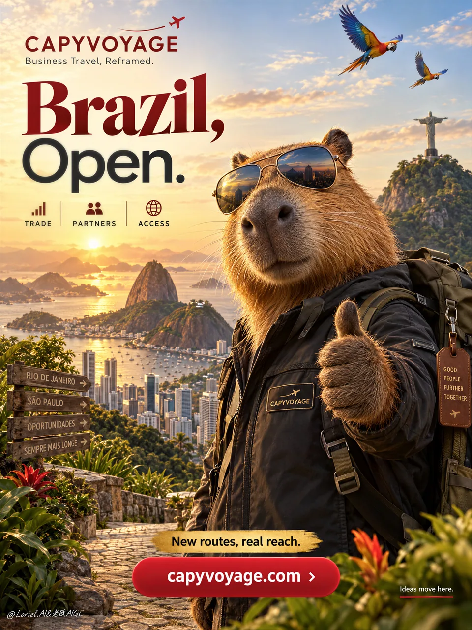
右前景锁英雄水豚、左半留给大标题、地标压进远景下沿,CTA 底部安静区——分区不抢戏才是旅行海报的真本事。目的地 campaign / 品牌大使竖版直接抄。
Prompt
A premium vertical travel poster for fictional business-travel brand CAPYVOYAGE, promoting Brazil through a bold destination campaign led by a charismatic Brazilian capybara ambassador. Preserve the exact commercial layout: small brand block with minimal airplane trail in the upper left, one large concise headline dominating the left half, dramatic Brazil skyline in back, a large capybara in the right foreground as the main anchor, layered Brazil landmarks in the lower landscape, and one strong bottom CTA button.

Use a medium-wide promotional composition with strong hierarchy, deep foreground-background separation, and generous negative space. The hero capybara is photoreal, polished, and non-cartoonish, wearing aviator sunglasses, a dark travel jacket with a small CAPYVOYAGE patch, and a travel backpack, giving a confident thumbs-up to the viewer. It must feel warm, intelligent, trustworthy, and aspirational, with realistic dense fur, subtle whiskers, glossy nose, believable paws, and correct anatomy. The character dominates the right side.

Celebrate Brazil in the background: golden sunrise or sunset over Rio de Janeiro, Christ the Redeemer in the distance, Sugarloaf Mountain, a refined modern skyline with Sao Paulo energy, and one or two macaws or toucans crossing the upper sky as discreet accents. In the lower landscape, integrate warm tropical foliage, stone pathways, and lush Brazilian terrain. The world should feel expansive, prosperous, emotionally magnetic, and clean enough for poster design.

Typography is reduced, sharp, and international. Upper-left brand line: “CAPYVOYAGE” with one short support line such as “Business Travel, Reframed.” Main headline on the left: “Brazil, Open.” with “Brazil” larger and more expressive, “Open.” clean and modern. Remove long copy blocks. Keep only three small icon labels beneath: “TRADE”, “PARTNERS”, “ACCESS”. Add one concise golden promo strip above the CTA, such as “New routes, real reach”. Place a large rounded red CTA button at the bottom center reading “capyvoyage.com”. If needed, add one very small lower-right side line: “Ideas move here.” All text must be elegant, globally legible, minimal, integrated into the visual flow, and never cover the capybara face or key landmarks.

Lighting is cinematic and commercial: warm golden key light from the horizon, soft frontal fill on the capybara face and jacket, reflective highlights on the sunglasses, subtle rim light on fur edges, glowing skyline atmosphere, and rich contrast without muddy blacks. Color hierarchy: 60% golden sunrise and warm tropical neutrals, 30% deep reds and terracotta brand accents, 10% cool reflective blues in skyline glass and sunglass reflections. Materials must feel hyperreal and premium: glossy lenses, textured travel fabric, dense fur, humid glowing atmosphere, crisp architectural silhouettes, polished button surfaces, and clean brand graphics.

The final image should feel like a Cannes-level global destination campaign: bold, optimistic, premium, persuasive, internationally styled, visually clean, and commercially precise, presenting Brazil as both emotional adventure and strategic opportunity. No copied source wording, no real company names, no broken text, no malformed animal anatomy, no distorted sunglasses, no chaotic landmarks, no muddy skyline, no cluttered layout, no weak CTA, no generic stock-travel look.
Attribution
- Author
- ou_zhen599
- Published
- 2026-09-30
- Original post
- View original ↗
- Collected from
- xianyu110/awesome-gpt-image2.5 · 2105221406929953154 · MIT