UGC 広告グリッド:2.0 High vs Sunburst Max
3x3 の UGC 風素材、Max の枠に価値はあるか。
プロンプト
I tested how two different image models handle loose creative direction by running the exact same, bare-bones prompt through GPT Image 2.0 High and GPT Image 2.5 Sunburst Max:

“Create a 3x3 grid of very realistic UGC models for social media ad. Be creative, they should be different from each other.”

No reference imagery, no individual shot instructions, and zero guardrails on demographics, lighting, or setting. The difference in how each model interpreted "different" was telling.

The Problem With Superficial Variety
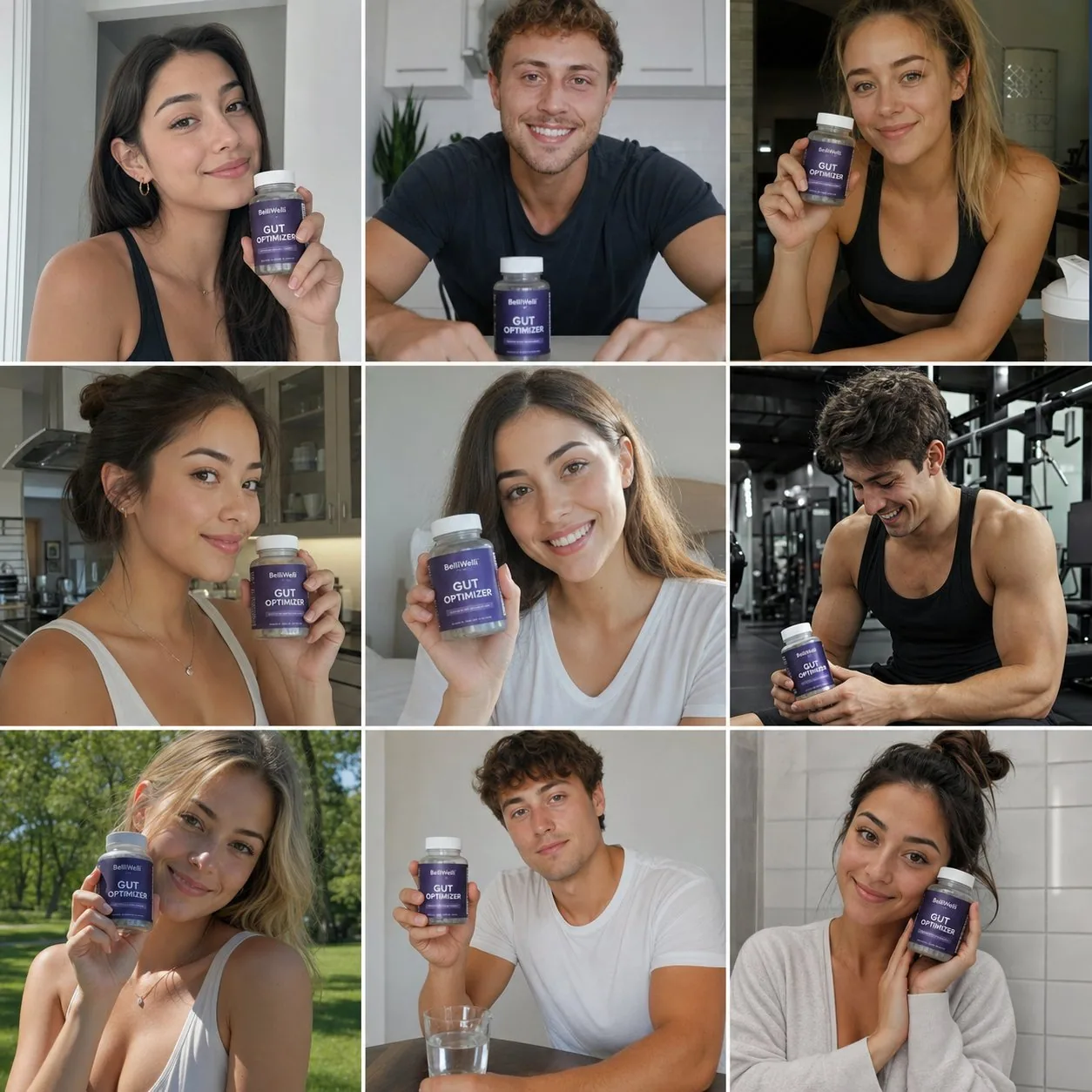
GPT Image 2.0 High gave me a technically sound, remarkably cohesive grid. The lighting was balanced, the subjects looked clean, and the composition was stable.

The issue? It delivered nine variations of one single ad.

Almost every frame featured a model facing forward, smiling, and presenting a product like a standard testimonial. The model interpreted diversity purely as facial features and skin tones, completely missing the variety of scenarios that make user-generated content effective.

Why Context Trumps Polish
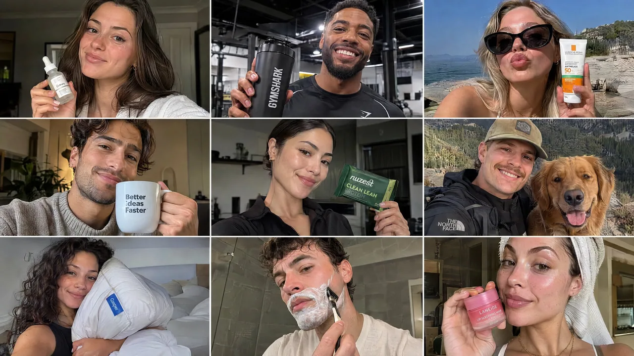
Sunburst Max took the brief much further. Instead of just swapping faces, it diversified the entire context:

Environments spanned gyms, bedrooms, bathrooms, and outdoor settings.

Perspectives shifted naturally between selfie angles, candid mid-shots, and lifestyle framing.

The use cases covered skincare routines, fitness, casual daily habits, and aspirational moments.

In performance marketing, a batch of nine identical product poses gives you virtually zero testing leverage. A selfie framed in a mirror tests a completely different psychological hook than an over-the-shoulder shot outdoors. Technical quality and photorealism are table stakes now; the real utility lies in whether an engine can unpack a vague creative brief into actionable testing angles.

Takeaway
If you need a unified look for a single campaign concept, 2.0 High holds stylistic consistency well. But if you need an asset library to test hooks and find winning angles, Sunburst Max understands the commercial intent of a brief much better.

For a paid social campaign, which grid are you putting ad spend behind?
日本語訳
GPT Image 2.0 High と GPT Image 2.5 Sunburst Max に、まったく同じ最小限のプロンプトを通して、2 つの異なる画像モデルが緩いクリエイティブディレクションをどう扱うかをテストしました:

「SNS 広告向けの非常にリアルな UGC モデルの 3x3 グリッドを作成してください。創造的に、それぞれが互いに異なるようにしてください。」

参照画像なし、個別ショットの指示なし、属性・ライティング・設定に関するガードレールも一切なし。各モデルが "different" をどう解釈したかの違いは雄弁でした。

表面的な多様性の問題
GPT Image 2.0 High は、技術的に堅実で驚くほど統一感のあるグリッドを返しました。ライティングはバランスが取れ、被写体はクリーンに見え、構図は安定していました。

問題は? たった 1 本の広告の 9 パターンを出してきたのです。

ほぼすべてのフレームが、正面を向いて微笑み、標準的な testimonial のように製品を提示するモデルでした。モデルは多様性を純粋に顔立ちと肌の色として解釈し、UGC を効果的にするシナリオの多様性を完全に取り逃していました。

なぜ文脈が磨き込みに勝るのか
Sunburst Max はブリーフをはるかに遠くまで運びました。顔を差し替えるだけでなく、文脈全体を多様化しました:

環境はジム、寝室、浴室、屋外の設定にまで及びました。

視点は自撮りアングル、自然なミッドショット、ライフスタイルのフレーミングへと自然に移り変わりました。

ユースケースはスキンケアのルーティン、フィットネス、日常の気軽な習慣、憧れの瞬間をカバーしました。

パフォーマンスマーケティングでは、同一の製品ポーズ 9 枚の束は、テストのてこをほぼゼロにします。鏡に映した自撮りは、屋外での肩越しショットとはまったく異なる心理的フックをテストします。技術的な品質とフォトリアリズムは今や前提条件であり、真の有用性は、エンジンが曖昧なクリエイティブブリーフを実行可能なテスト角度に分解できるかどうかにあります。

結論
単一のキャンペーンコンセプトに統一されたルックが必要なら、2.0 High はスタイルの一貫性をよく保ちます。しかしフックをテストし勝ち筋の角度を見つけるためのアセットライブラリが必要なら、Sunburst Max のほうがブリーフの商業的意図をはるかによく理解しています。

有料ソーシャルキャンペーンなら、どちらのグリッドに広告費を投じますか?
出典
- 原作者
- saranshvfx
- 公開日
- 2026-09-09
- 原典
- 元の投稿を見る ↗
- 収録元
- xianyu110/awesome-gpt-image2.5 · 2097604682646528030 · MIT