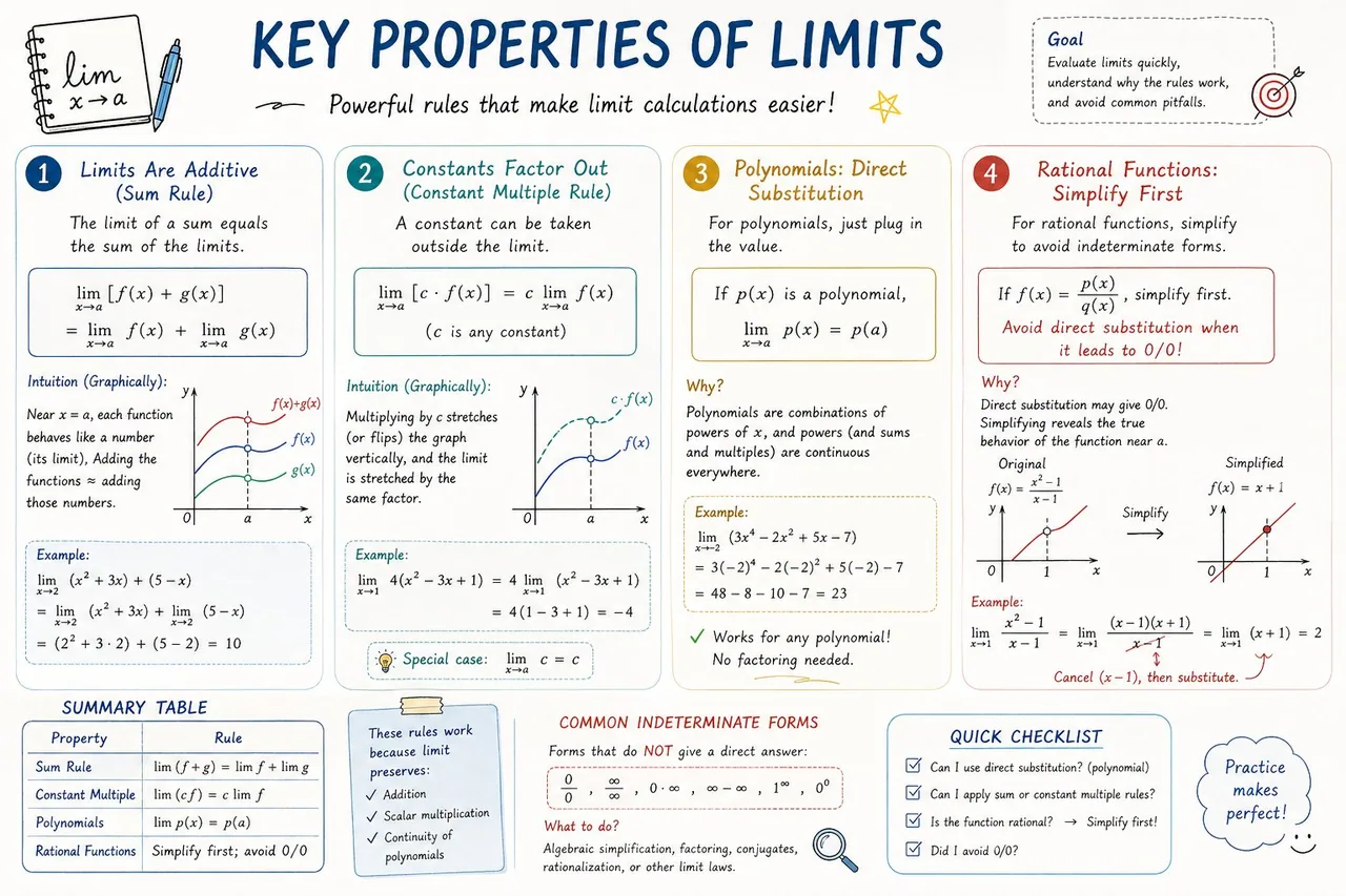
Please create a mathematical visualization infographic about "[math concept / topic]." The goal is to help the viewer intuitively understand what it is, why it works, its geometric or structural intuition, and how it behaves in different contexts. The visual should feel like a high-quality math lecture handout combined with a hand-drawn educational poster. It should be elegant, clear, and information-rich, but not cluttered. Visual style: either portrait or landscape is fine. Use a clean, light paper-like background, with a deep blue title and black or dark gray lines for the main content. Add a small number of refined accent colors such as blue, teal, gold, and red. Incorporate rounded-corner cards, thin borders, numbered labels, hand-drawn arrows, zoom-in callout boxes, and a summary section. The overall design should be aesthetically pleasing, balanced, and academic, allowing the viewer to grasp the structure of the concept and why it works at a glance.
한국어 번역
"[수학 개념 / 주제]"에 관한 수학 시각화 인포그래픽을 만들어 주세요. 목표는 보는 사람이 그것이 무엇인지, 왜 성립하는지, 기하학적·구조적 직관은 무엇인지, 그리고 다양한 맥락에서 어떻게 작동하는지를 직관적으로 이해하도록 돕는 것입니다. 비주얼은 고품질 수학 강의 유인물과 손으로 그린 교육 포스터가 결합된 느낌이어야 합니다. 우아하고 명료하며 정보가 풍부하되 산만하지 않아야 합니다. 비주얼 스타일: 세로 또는 가로 모두 괜찮습니다. 깨끗하고 밝은 종이 같은 배경을 사용하고, 제목은 짙은 파란색, 주요 내용은 검은색 또는 짙은 회색 선으로 표현하세요. 파란색, 청록색, 금색, 빨간색 등 세련된 포인트 컬러를 소량 추가하세요. 둥근 모서리 카드, 얇은 테두리, 번호 라벨, 손으로 그린 화살표, 확대 콜아웃 박스, 요약 섹션을 포함하세요. 전체 디자인은 미적으로 아름답고 균형 잡혀 있으며 학술적이어야 하고, 보는 사람이 개념의 구조와 그것이 왜 성립하는지를 한눈에 파악할 수 있어야 합니다.