UGC 광고 그리드: 2.0 High vs Sunburst Max
3x3 UGC 스타일 소재, Max 등급이 그만한 가치가 있는지.
프롬프트
I tested how two different image models handle loose creative direction by running the exact same, bare-bones prompt through GPT Image 2.0 High and GPT Image 2.5 Sunburst Max:

“Create a 3x3 grid of very realistic UGC models for social media ad. Be creative, they should be different from each other.”

No reference imagery, no individual shot instructions, and zero guardrails on demographics, lighting, or setting. The difference in how each model interpreted "different" was telling.

The Problem With Superficial Variety
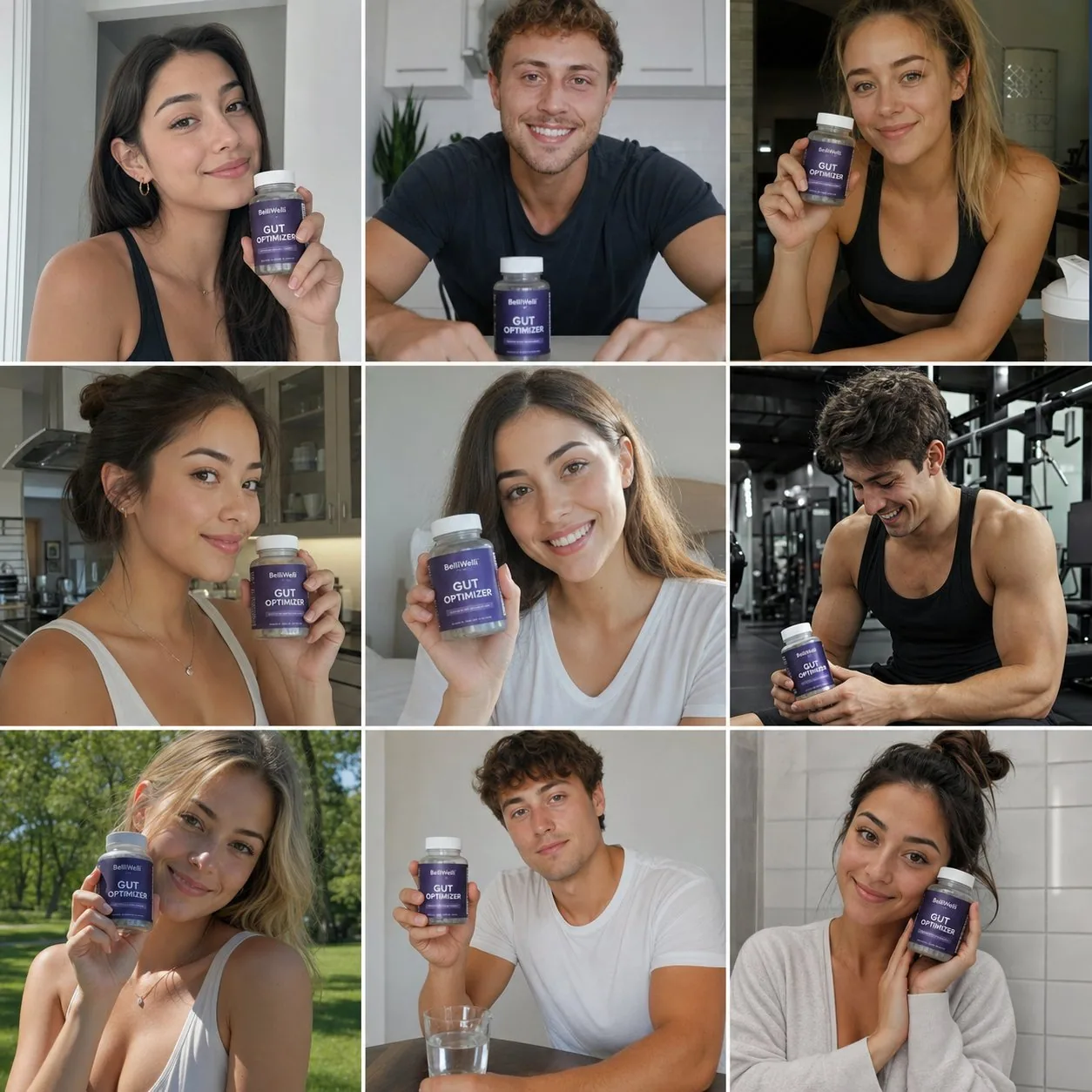
GPT Image 2.0 High gave me a technically sound, remarkably cohesive grid. The lighting was balanced, the subjects looked clean, and the composition was stable.

The issue? It delivered nine variations of one single ad.

Almost every frame featured a model facing forward, smiling, and presenting a product like a standard testimonial. The model interpreted diversity purely as facial features and skin tones, completely missing the variety of scenarios that make user-generated content effective.

Why Context Trumps Polish
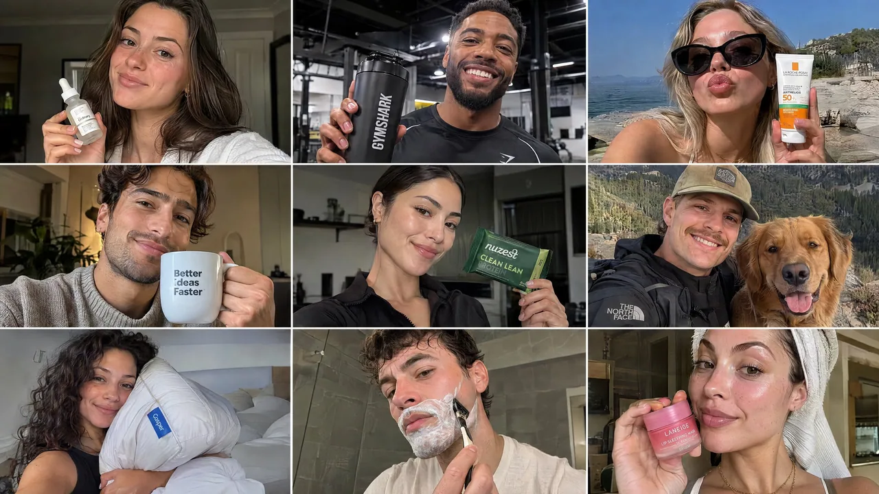
Sunburst Max took the brief much further. Instead of just swapping faces, it diversified the entire context:

Environments spanned gyms, bedrooms, bathrooms, and outdoor settings.

Perspectives shifted naturally between selfie angles, candid mid-shots, and lifestyle framing.

The use cases covered skincare routines, fitness, casual daily habits, and aspirational moments.

In performance marketing, a batch of nine identical product poses gives you virtually zero testing leverage. A selfie framed in a mirror tests a completely different psychological hook than an over-the-shoulder shot outdoors. Technical quality and photorealism are table stakes now; the real utility lies in whether an engine can unpack a vague creative brief into actionable testing angles.

Takeaway
If you need a unified look for a single campaign concept, 2.0 High holds stylistic consistency well. But if you need an asset library to test hooks and find winning angles, Sunburst Max understands the commercial intent of a brief much better.

For a paid social campaign, which grid are you putting ad spend behind?
한국어 번역
저는 완전히 동일한, 군더더기 없는 프롬프트를 GPT Image 2.0 High와 GPT Image 2.5 Sunburst Max에 각각 넣어 두 이미지 모델이 느슨한 크리에이티브 디렉션을 어떻게 처리하는지 테스트했습니다:

“소셜 미디어 광고용으로 매우 사실적인 UGC 모델 3x3 그리드를 만들어줘. 창의적으로, 서로 달라야 해.”

레퍼런스 이미지도, 개별 샷 지시도 없었고 인구통계, 조명, 배경에 대한 가드레일도 전혀 없었습니다. 각 모델이 "different"를 해석한 방식의 차이는 시사하는 바가 컸습니다.

피상적 다양성의 문제
GPT Image 2.0 High는 기술적으로 완성도 있고 놀랄 만큼 응집력 있는 그리드를 내놨습니다. 조명은 균형 잡혔고 피사체는 깔끔해 보였으며 구도는 안정적이었습니다.

문제는? 하나의 광고를 아홉 가지로 변주한 결과물이었다는 점입니다.

거의 모든 프레임에 정면을 향해 웃으며 제품을 일반적인 후기처럼 보여주는 모델이 등장했습니다. 이 모델은 다양성을 순전히 얼굴 생김새와 피부톤으로만 해석했고, UGC를 효과적으로 만드는 시나리오의 다양성은 완전히 놓쳤습니다.

왜 맥락이 매끄러움보다 중요한가
Sunburst Max는 브리프를 훨씬 멀리까지 밀어붙였습니다. 단순히 얼굴만 바꾸는 대신 전체 맥락을 다양화했습니다:

환경은 헬스장, 침실, 욕실, 야외 세팅에 걸쳐 있었습니다.

시점은 셀피 앵글, 자연스러운 미드 샷, 라이프스타일 프레이밍 사이를 자연스럽게 오갔습니다.

활용 사례는 스킨케어 루틴, 피트니스, 일상적인 습관, 동경을 담은 순간들을 아우렀습니다.

퍼포먼스 마케팅에서 똑같은 제품 포즈 아홉 장은 사실상 테스트 레버리지가 전혀 없습니다. 거울에 비친 셀피는 야외에서 어깨 너머로 찍은 샷과 완전히 다른 심리적 훅을 검증합니다. 기술적 품질과 포토리얼리즘은 이제 기본 전제이고, 진짜 유용성은 엔진이 모호한 크리에이티브 브리프를 실행 가능한 테스트 앵글로 풀어낼 수 있는지에 달려 있습니다.

핵심 정리
단일 캠페인 콘셉트를 위한 통일된 룩이 필요하다면 2.0 High가 스타일 일관성을 잘 지킵니다. 하지만 훅을 테스트하고 승리하는 앵글을 찾기 위한 소재 라이브러리가 필요하다면 Sunburst Max가 브리프의 상업적 의도를 훨씬 더 잘 이해합니다.

유료 소셜 캠페인이라면, 어느 그리드에 광고비를 태우시겠습니까?
출처
- 원작자
- saranshvfx
- 게시일
- 2026-09-09
- 원문 출처
- 원문 보기 ↗
- 수록 출처
- xianyu110/awesome-gpt-image2.5 · 2097604682646528030 · MIT