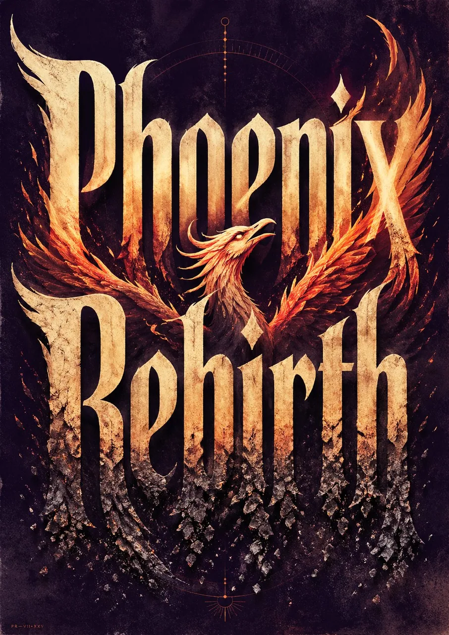
Create ONE finished premium conceptual typography poster for the exact title:

“[INPUT_TEXT]”

Single poster only. No moodboard, grid, presentation board, mockup, captions, prompt text, process sheet, or sample labels.

The title “[INPUT_TEXT]” must be the dominant visual structure of the poster: huge, readable, powerful, and spelled exactly. Do not translate, shorten, replace, or misspell it. Do not add other large readable text. Optional micro catalog text is allowed only if it stays subtle and secondary.

Silently interpret the title’s meaning, mood, cultural aura, symbolic associations, psychological tension, and visual rhythm. Turn that interpretation into one strong visual metaphor.

Typography is the hero. Design custom-looking letterforms whose weight, width, contrast, spacing, rhythm, distortion, negative space, edge quality, and ink texture express the temperament of the title. The type should feel intentionally designed, not like a default font.

If “[INPUT_TEXT]” refers to a widely known person, make a large editorial portrait or full / half-body figure a major visual presence, occupying roughly 40–70% of the composition. The figure should feel recognizable through aura, posture, styling, era, expression, lighting, and symbolic atmosphere, but should not copy a specific existing photograph, official poster, campaign image, logo, slogan, or copyrighted composition. The portrait must interact with the typography: overlapping the letters, emerging from them, being framed by them, casting shadows on them, breaking through them, or being partially hidden behind them.

For all other titles, use a human figure, landscape, object, or atmospheric setting only when it strengthens the meaning. It must interact with the typography and deepen the concept, not decorate it.

Use a rich but restrained 4–6 color system matched to the theme: dominant background color, primary typography color, figure / landscape tone, emotional accent color, muted support color, and subtle paper / ink texture tone. Avoid flat black-white-red defaults unless conceptually necessary.

Composition style: high-end editorial poster, museum-quality graphic design, dramatic scale, strong hierarchy, few elements, intelligent whitespace, bold flat color areas, sharp cropping, silkscreen / lithograph / risograph grain, paper fibers, subtle ink imperfections, refined visual tension.

The final image should feel like a complete visual sentence: the title, the figure or setting, the color, and the typography explain each other.

Avoid generic word art, glossy 3D lettering, random icons, stock-photo realism, cluttered collage, excessive grunge, tourist clichés, official logos, copied slogans, copied campaign aesthetics, unrelated text, and misspelled typography.

-----

INPUT_TEXT:Phoenix Rebirth
한국어 번역
정확히 다음 제목을 위한, 완성된 프리미엄 컨셉 타이포그래피 포스터를 하나만 제작하세요:

“[INPUT_TEXT]”

포스터 한 장만. 무드보드, 그리드, 프레젠테이션 보드, 목업, 캡션, 프롬프트 텍스트, 프로세스 시트, 샘플 라벨은 안 됩니다.

제목 “[INPUT_TEXT]”는 포스터의 지배적인 시각 구조여야 합니다: 거대하고, 읽을 수 있고, 강렬하며, 철자가 정확해야 합니다. 번역하거나, 줄이거나, 대체하거나, 철자를 틀리게 쓰지 마세요. 다른 큰 읽을 수 있는 텍스트를 추가하지 마세요. 선택적인 초소형 카탈로그 텍스트는 미묘하고 부차적으로 유지될 때만 허용됩니다.

제목의 의미, 분위기, 문화적 아우라, 상징적 연상, 심리적 긴장감, 시각적 리듬을 조용히 해석하세요. 그 해석을 하나의 강력한 시각적 은유로 바꾸세요.

타이포그래피가 주인공입니다. 굵기, 너비, 대비, 자간, 리듬, 왜곡, 네거티브 스페이스, 가장자리 질감, 잉크 텍스처가 제목의 기질을 표현하는, 커스텀처럼 보이는 서체를 디자인하세요. 서체는 기본 폰트가 아니라 의도적으로 디자인된 것처럼 느껴져야 합니다.

“[INPUT_TEXT]”가 널리 알려진 인물을 가리킨다면, 커다란 에디토리얼 초상이나 전신/반신 인물을 주요 시각적 존재로 만들어 구도의 약 40–70%를 차지하게 하세요. 인물은 아우라, 자세, 스타일링, 시대, 표정, 조명, 상징적 분위기를 통해 알아볼 수 있어야 하지만, 특정 기존 사진, 공식 포스터, 캠페인 이미지, 로고, 슬로건 또는 저작권이 있는 구도를 모방해서는 안 됩니다. 초상은 타이포그래피와 상호작용해야 합니다: 글자와 겹치거나, 글자에서 나오거나, 글자에 의해 프레이밍되거나, 글자에 그림자를 드리우거나, 글자를 뚫고 나오거나, 글자 뒤에 부분적으로 가려지는 방식으로.

그 밖의 모든 제목의 경우에는 인간 형상, 풍경, 사물 또는 분위기 있는 배경을 의미를 강화할 때만 사용하세요. 그것은 타이포그래피와 상호작용하며 컨셉을 심화시켜야 하고, 장식에 그쳐서는 안 됩니다.

테마에 맞는 풍부하지만 절제된 4–6색 시스템을 사용하세요: 지배적인 배경색, 주요 타이포그래피 색, 인물/풍경 톤, 감정적 악센트 색, 절제된 보조 색, 미묘한 종이/잉크 텍스처 톤. 개념적으로 필요하지 않다면 평면적인 흑백적 조합을 기본값으로 쓰지 마세요.

구성 스타일: 하이엔드 에디토리얼 포스터, 박물관 수준의 그래픽 디자인, 극적인 스케일, 강한 위계, 적은 요소, 지적인 여백, 대담한 평면 색면, 과감한 크로핑, 실크스크린/석판/리소그래프 그레인, 종이 섬유, 미묘한 잉크 불완전함, 정제된 시각적 긴장.

최종 이미지는 하나의 완성된 시각적 문장처럼 느껴져야 합니다: 제목, 인물 또는 배경, 색, 타이포그래피가 서로를 설명해 주어야 합니다.

일반적인 워드 아트, 광택 나는 3D 레터링, 무작위 아이콘, 스톡 사진식 사실주의, 어수선한 콜라주, 과도한 그런지, 관광지 클리셰, 공식 로고, 표절한 슬로건, 표절한 캠페인 미학, 무관한 텍스트, 철자가 틀린 타이포그래피는 피하세요.

-----

INPUT_TEXT:Phoenix Rebirth