CAPYVOYAGE 巴西旅行海報:分區構圖 hero/headline/CTA
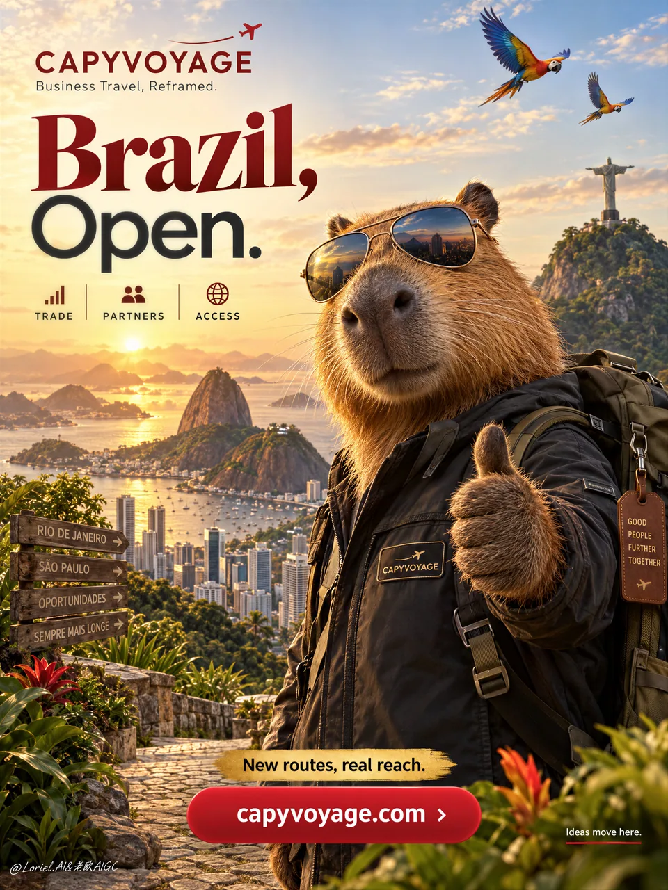
右前景鎖英雄水豚、左半留給大標題、地標壓進遠景下沿,CTA 底部安靜區——分區不搶戲纔是旅行海報的真本事。目的地 campaign / 品牌大使豎版直接抄。
提示詞
A premium vertical travel poster for fictional business-travel brand CAPYVOYAGE, promoting Brazil through a bold destination campaign led by a charismatic Brazilian capybara ambassador. Preserve the exact commercial layout: small brand block with minimal airplane trail in the upper left, one large concise headline dominating the left half, dramatic Brazil skyline in back, a large capybara in the right foreground as the main anchor, layered Brazil landmarks in the lower landscape, and one strong bottom CTA button.

Use a medium-wide promotional composition with strong hierarchy, deep foreground-background separation, and generous negative space. The hero capybara is photoreal, polished, and non-cartoonish, wearing aviator sunglasses, a dark travel jacket with a small CAPYVOYAGE patch, and a travel backpack, giving a confident thumbs-up to the viewer. It must feel warm, intelligent, trustworthy, and aspirational, with realistic dense fur, subtle whiskers, glossy nose, believable paws, and correct anatomy. The character dominates the right side.

Celebrate Brazil in the background: golden sunrise or sunset over Rio de Janeiro, Christ the Redeemer in the distance, Sugarloaf Mountain, a refined modern skyline with Sao Paulo energy, and one or two macaws or toucans crossing the upper sky as discreet accents. In the lower landscape, integrate warm tropical foliage, stone pathways, and lush Brazilian terrain. The world should feel expansive, prosperous, emotionally magnetic, and clean enough for poster design.

Typography is reduced, sharp, and international. Upper-left brand line: “CAPYVOYAGE” with one short support line such as “Business Travel, Reframed.” Main headline on the left: “Brazil, Open.” with “Brazil” larger and more expressive, “Open.” clean and modern. Remove long copy blocks. Keep only three small icon labels beneath: “TRADE”, “PARTNERS”, “ACCESS”. Add one concise golden promo strip above the CTA, such as “New routes, real reach”. Place a large rounded red CTA button at the bottom center reading “capyvoyage.com”. If needed, add one very small lower-right side line: “Ideas move here.” All text must be elegant, globally legible, minimal, integrated into the visual flow, and never cover the capybara face or key landmarks.

Lighting is cinematic and commercial: warm golden key light from the horizon, soft frontal fill on the capybara face and jacket, reflective highlights on the sunglasses, subtle rim light on fur edges, glowing skyline atmosphere, and rich contrast without muddy blacks. Color hierarchy: 60% golden sunrise and warm tropical neutrals, 30% deep reds and terracotta brand accents, 10% cool reflective blues in skyline glass and sunglass reflections. Materials must feel hyperreal and premium: glossy lenses, textured travel fabric, dense fur, humid glowing atmosphere, crisp architectural silhouettes, polished button surfaces, and clean brand graphics.

The final image should feel like a Cannes-level global destination campaign: bold, optimistic, premium, persuasive, internationally styled, visually clean, and commercially precise, presenting Brazil as both emotional adventure and strategic opportunity. No copied source wording, no real company names, no broken text, no malformed animal anatomy, no distorted sunglasses, no chaotic landmarks, no muddy skyline, no cluttered layout, no weak CTA, no generic stock-travel look.
中文翻譯
爲虛構商務旅行品牌 CAPYVOYAGE 打造的高級豎版旅行海報,通過一場由魅力十足的巴西水豚代言人領銜的大膽目的地營銷戰役來推廣巴西。需保留精確的商業版式:左上角爲小型品牌區塊並帶極簡的飛機尾跡,一條簡短有力的大標題佔據左半部分,背景是氣勢磅礴的巴西天際線,右前景一隻巨大的水豚作爲主視覺錨點,下方景觀中疊置多層次的巴西地標,底部一個強有力的 CTA 按鈕。

採用中廣度的推廣構圖,層次感強烈,前景與背景深度分離,並留出充裕的負空間。主視覺水豚爲照片級寫實、精緻且非卡通化,戴着飛行員墨鏡,身穿帶小號 CAPYVOYAGE 徽章的深色旅行夾克,揹着旅行背包,自信地向觀者豎起大拇指。它必須給人溫暖、聰明、可信、令人嚮往的感覺,擁有逼真的濃密毛髮、細微的鬍鬚、光亮的鼻子、可信的爪子和正確的解剖結構。角色佔據畫面右側主導。

背景中禮讚巴西:裏約熱內盧上空的黃金色日出或日落,遠處的救世基督像,糖麪包山,帶有聖保羅氣息的精緻現代天際線,以及一兩隻在畫面上方天空掠過的金剛鸚鵡或巨嘴鳥作爲含蓄點綴。在下方景觀中融入溫暖的熱帶植被、石徑和茂密的巴西地形。整個世界應顯得開闊、繁榮、富有情感吸引力,並且足夠乾淨以適合海報設計。

字體排版剋制、銳利且國際化。左上角品牌行:“CAPYVOYAGE”,並配一句簡短輔助語,例如“Business Travel, Reframed.”。左側主標題:“Brazil, Open.”,其中“Brazil”更大、更具表現力,“Open.”乾淨現代。移除長段文案。下方僅保留三個小圖標標籤:“TRADE”、“PARTNERS”、“ACCESS”。在 CTA 上方加一條簡潔的金色促銷條,例如“New routes, real reach”。在底部居中放置一個大的圓角紅色 CTA 按鈕,文字爲“capyvoyage.com”。如有需要,在右下角加一行非常小的側注:“Ideas move here.”。所有文字都必須優雅、全球可讀、極簡、融入視覺動線,且絕不遮擋水豚面部或關鍵地標。

光線兼具電影感與商業感:來自地平線的溫暖金色主光,水豚面部與夾克上的柔和正面補光,墨鏡上的反射高光,毛髮邊緣的細微輪廓光,發光的天際線氛圍,以及豐富對比而不渾濁發黑的暗部。色彩層級:60% 金色日出與溫暖熱帶中性色,30% 深紅與陶土色品牌點綴,10% 天際線玻璃與墨鏡反光中的冷調反射藍。材質必須呈現超寫實與高級質感:光澤鏡片、有紋理的旅行面料、濃密毛髮、溼潤發光的氛圍、清晰銳利的建築剪影、拋光按鈕表面以及乾淨的品牌圖形。

最終圖像應像一場戛納級別的全球目的地營銷戰役:大膽、樂觀、高級、有說服力、國際化風格、視覺乾淨、商業精準,將巴西同時呈現爲情感冒險與戰略機遇。不得抄襲來源文案,不得出現真實公司名稱,不得有錯亂文字,不得有畸形的動物解剖結構,不得有扭曲的墨鏡,不得有混亂的地標,不得有渾濁的天際線,不得有雜亂的版式,不得有軟弱的 CTA,不得有千篇一律的圖庫旅行照觀感。
溯源
- 原作者
- ou_zhen599
- 發佈日期
- 2026-09-30
- 原始出處
- 查看原帖 ↗
- 收錄來源
- xianyu110/awesome-gpt-image2.5 · 2105221406929953154 · MIT