UGC 廣告網格:2.0 High vs Sunburst Max
九宮格 UGC 風素材,Max 檔位是否值得。
提示詞
I tested how two different image models handle loose creative direction by running the exact same, bare-bones prompt through GPT Image 2.0 High and GPT Image 2.5 Sunburst Max:

“Create a 3x3 grid of very realistic UGC models for social media ad. Be creative, they should be different from each other.”

No reference imagery, no individual shot instructions, and zero guardrails on demographics, lighting, or setting. The difference in how each model interpreted "different" was telling.

The Problem With Superficial Variety
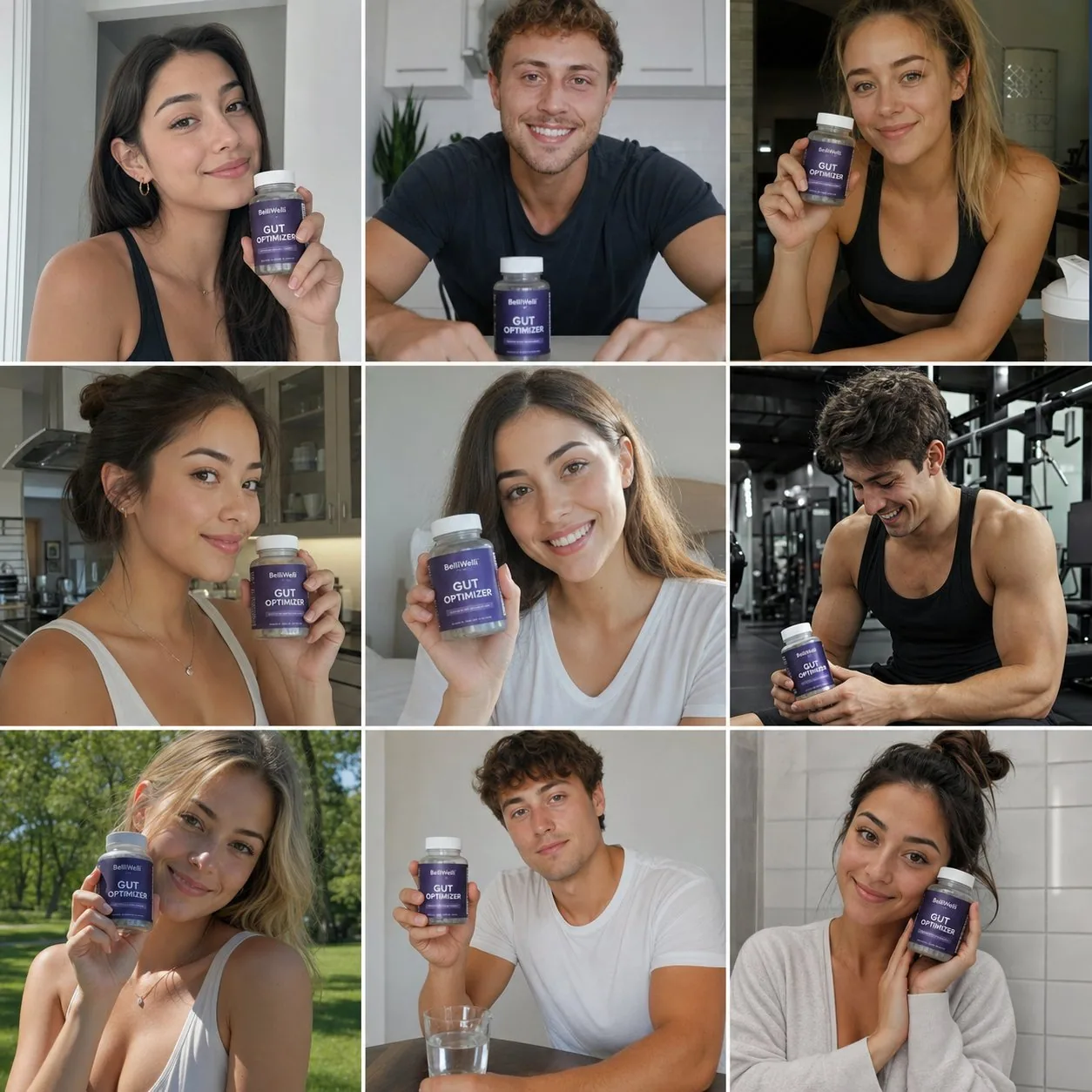
GPT Image 2.0 High gave me a technically sound, remarkably cohesive grid. The lighting was balanced, the subjects looked clean, and the composition was stable.

The issue? It delivered nine variations of one single ad.

Almost every frame featured a model facing forward, smiling, and presenting a product like a standard testimonial. The model interpreted diversity purely as facial features and skin tones, completely missing the variety of scenarios that make user-generated content effective.

Why Context Trumps Polish
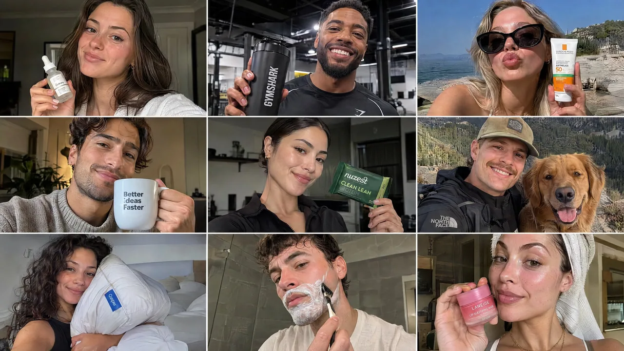
Sunburst Max took the brief much further. Instead of just swapping faces, it diversified the entire context:

Environments spanned gyms, bedrooms, bathrooms, and outdoor settings.

Perspectives shifted naturally between selfie angles, candid mid-shots, and lifestyle framing.

The use cases covered skincare routines, fitness, casual daily habits, and aspirational moments.

In performance marketing, a batch of nine identical product poses gives you virtually zero testing leverage. A selfie framed in a mirror tests a completely different psychological hook than an over-the-shoulder shot outdoors. Technical quality and photorealism are table stakes now; the real utility lies in whether an engine can unpack a vague creative brief into actionable testing angles.

Takeaway
If you need a unified look for a single campaign concept, 2.0 High holds stylistic consistency well. But if you need an asset library to test hooks and find winning angles, Sunburst Max understands the commercial intent of a brief much better.

For a paid social campaign, which grid are you putting ad spend behind?
中文翻譯
我測試了兩個不同的圖像模型如何處理寬鬆的創意方向:把完全相同、極簡的 prompt 分別交給 GPT Image 2.0 High 和 GPT Image 2.5 Sunburst Max:

“生成一個 3x3 網格,包含非常逼真的 UGC 模特,用於社交媒體廣告。要有創意,它們彼此之間應該各不相同。”

沒有參考圖,沒有逐張鏡頭的指令,對人羣、燈光或場景也完全沒有約束。兩個模型對“不同”一詞的理解差異很能說明問題。

表層多樣性的問題
GPT Image 2.0 High 給出的網格在技術上無懈可擊,整體統一度極高。燈光均衡,主體乾淨,構圖穩定。

問題在哪?它給出的只是同一支廣告的九個變體。

幾乎每一幀都是模特正面朝前、微笑,並像標準證言那樣展示產品。模型把多樣性僅僅理解爲面部特徵和膚色,完全忽略了讓用戶生成內容真正有效的場景多樣性。

爲什麼語境勝過精緻感
Sunburst Max 把這份 brief 推進得遠得多。它不只是替換面孔,而是讓整個場景語境多樣化:

環境涵蓋健身房、臥室、浴室和戶外場景。

視角在自拍角度、抓拍中景和生活化構圖之間自然切換。

使用場景涵蓋護膚流程、健身、隨性日常習慣和令人嚮往的時刻。

在效果營銷中,一批九張一模一樣的擺拍產品圖幾乎帶來零測試槓桿。鏡子中的自拍與戶外過肩鏡頭測試的是完全不同的心理鉤子。技術質量與照片級寫實如今只是入場門檻;真正的價值在於引擎能否把含糊的創意 brief 拆解爲可執行的測試角度。

要點
如果你需要爲單一 campaign 概念保持統一視覺,2.0 High 能很好地維持風格一致性。但如果你需要一套素材庫來測試鉤子、找到制勝角度,Sunburst Max 更懂一份 brief 的商業意圖。

對於付費社交投放,你會把廣告預算押在哪一組網格上?
溯源
- 原作者
- saranshvfx
- 發佈日期
- 2026-09-09
- 原始出處
- 查看原帖 ↗
- 收錄來源
- xianyu110/awesome-gpt-image2.5 · 2097604682646528030 · MIT