單人像一鍵四聯海報:SIGNAL/MOTION/ECHO/MINT
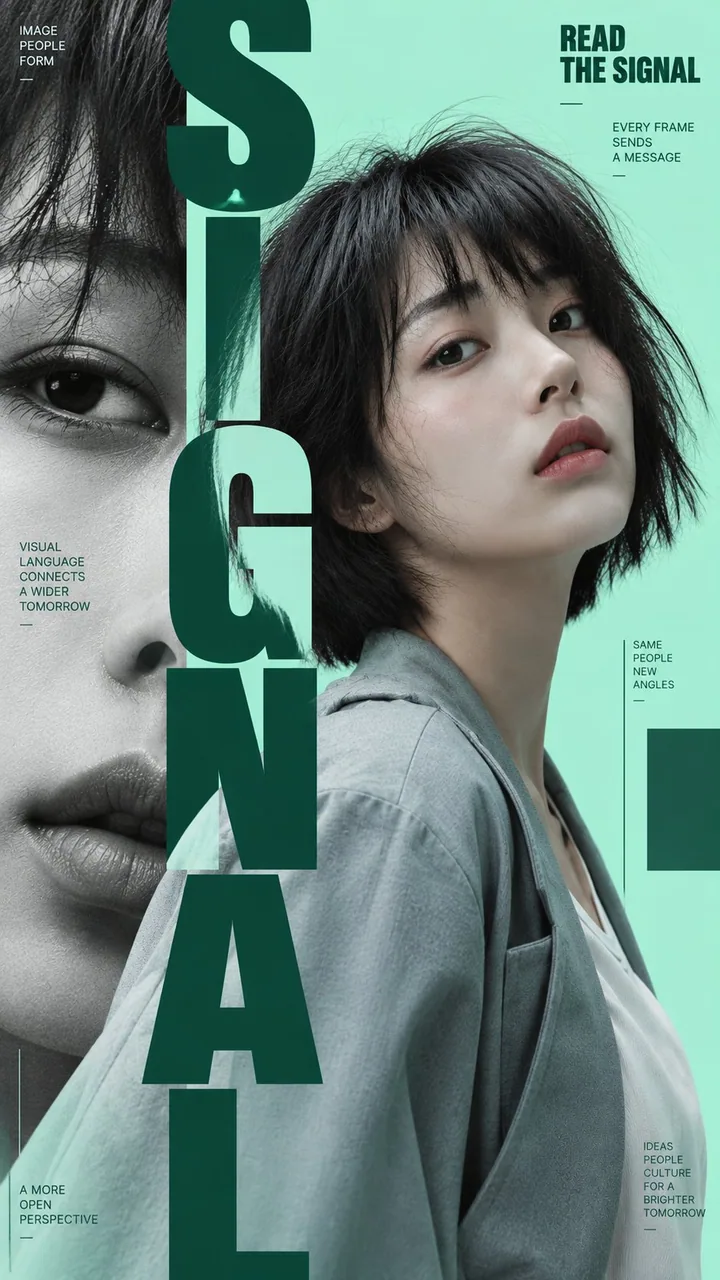
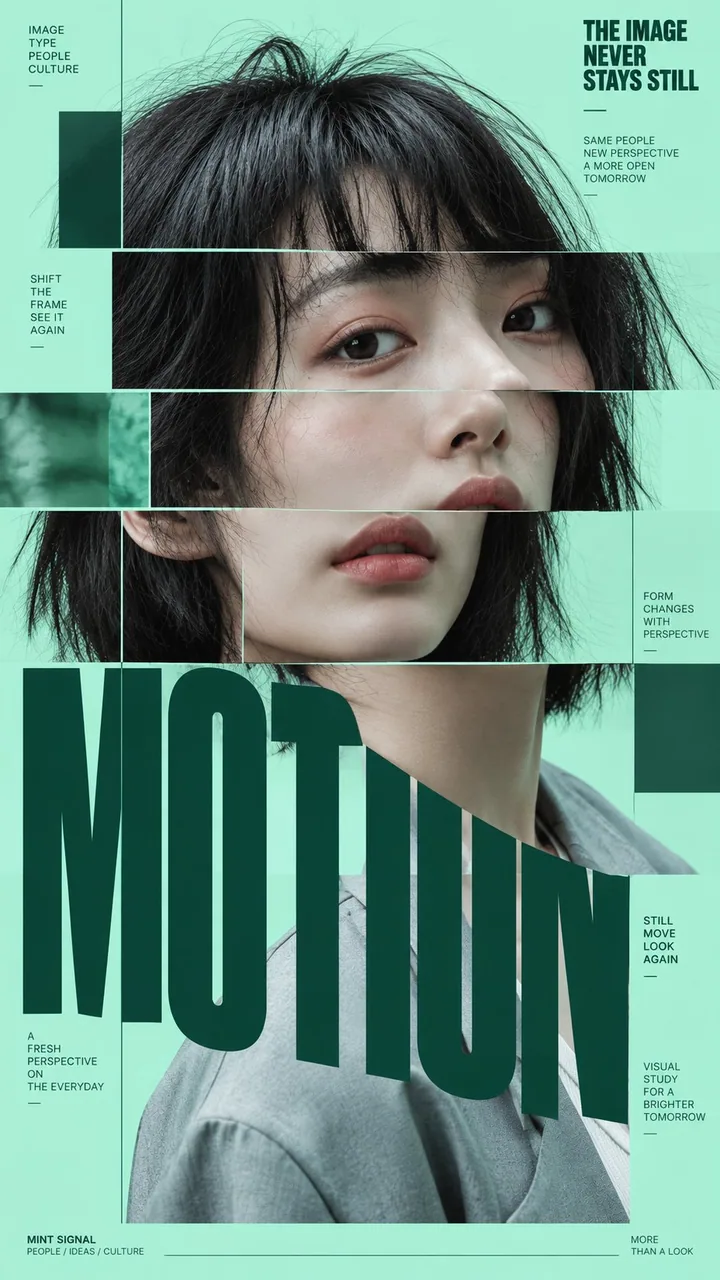
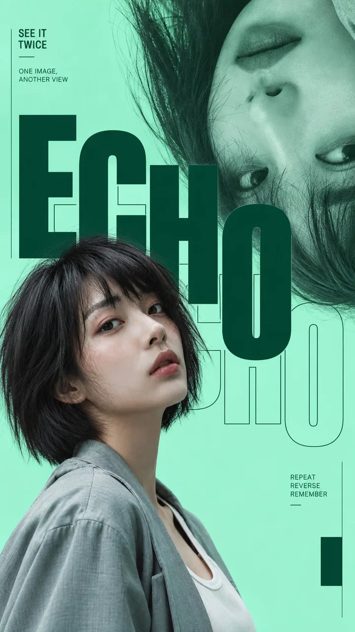
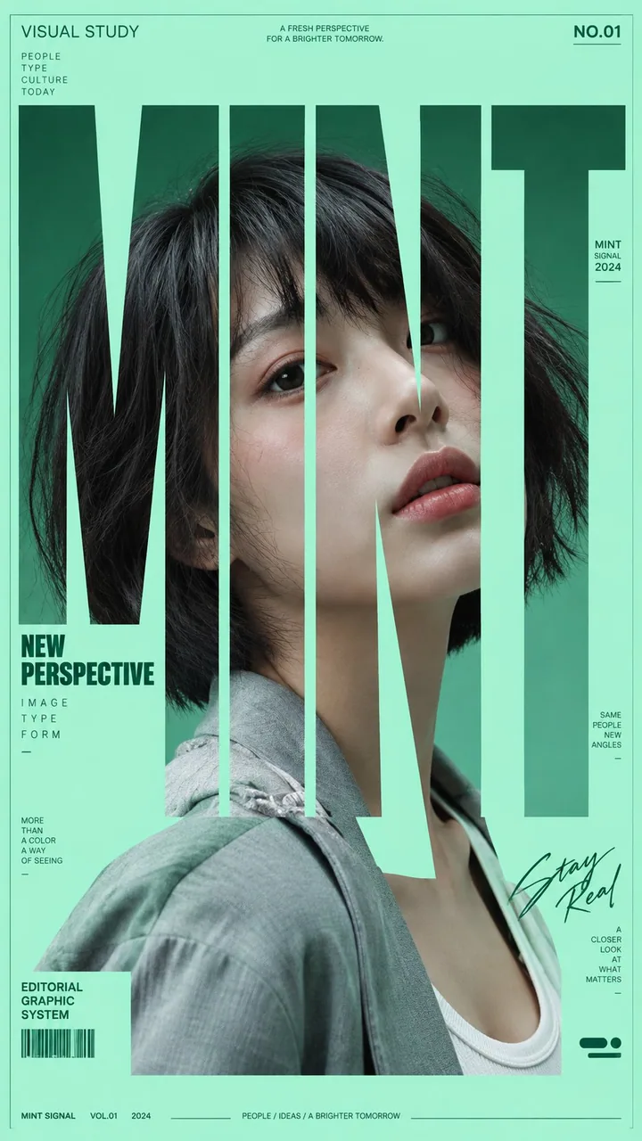
同一肖像同一視覺系統,一口氣出四種版式:豎排疊字、切片錯位、鏡像回聲、巨型字母嵌臉。時裝社論/封面連更直接抄,9:16 分開發不要拼成一張。
提示詞
Prompt:

Create four independent portrait poster variations from the uploaded photo, all belonging to the same visual system.

Portrait: [use uploaded portrait]
Main color: [mint green / red / blue / yellow / custom]
Typography theme: [SIGNAL / MOTION / ECHO / MINT, or custom words]
Aspect ratio: 9:16

Keep the same person, facial identity, hairstyle, outfit, photographic realism, color palette, typography family, and editorial art direction across all four posters.

The four posters must feel like one cohesive fashion editorial series, but each must use a clearly different layout concept:

1. Vertical Type Layering
   Use oversized condensed typography as a strong vertical spine. Let letters move in front of and behind the portrait, creating clear depth and layered interaction.

2. Sliced Portrait
   Split the portrait into several clean horizontal sections and slightly offset each slice. Keep the face recognizable and beautiful. Avoid RGB glitch, noise, or digital distortion.

3. Echo Portrait
   Show the same subject twice using contrasting scale or orientation, such as one normal portrait and one enlarged flipped portrait. Use repeated typography or outline type to create a visual “echo.”

4. Portrait Inside Oversized Type
   Use huge bold typography as the main composition. Let parts of the face, eyes, lips, hair, or shoulders appear through and between the letterforms, so the portrait becomes integrated into the typography.

Use a modern fashion-editorial aesthetic with oversized condensed sans-serif type, strong portrait photography, clean geometric structure, generous negative space, fine rules, small meaningful editorial text, and subtle graphic blocks.

Keep the information hierarchy clear: large typography first, portrait second, small editorial text third.

Use meaningful supporting copy related to the visual concept rather than random placeholder text.

Keep skin realistic with natural texture, realistic hair strands, natural fabric folds, and photographic lighting. Avoid plastic skin, CGI appearance, excessive retouching, random symbols, meaningless text, heavy UI graphics, sparkles, numbering, NO., VOL., and decorative clutter.

Generate all four as separate standalone 9:16 posters, not combined into a single collage.
中文翻譯
Prompt:

根據上傳的照片創作四個獨立的人像海報版本,它們都屬於同一套視覺系統。

人像:[use uploaded portrait]
主色:[mint green / red / blue / yellow / 自定義]
字體主題:[SIGNAL / MOTION / ECHO / MINT,或自定義詞]
寬高比:9:16

四張海報要保持同一個人、面部身份、髮型、服裝、攝影寫實感、配色、字體家族和雜誌式藝術指導一致。

四張海報必須像一組統一的時尚雜誌大片系列,但每一張都要採用明顯不同的版式概念:

1. 豎排字體層疊
   將超大號窄體字體作爲強有力的豎向主幹。讓字母在人物的前方和後方穿插移動,營造清晰的縱深與層疊互動。

2. 切分人像
   將人像切成若幹乾淨的水平條塊,並讓每一塊略微錯位。保持面部可辨認且美觀。避免 RGB 故障、噪點或數字失真。

3. 回聲人像
   用對比鮮明的比例或方向呈現同一個主體兩次,例如一張正常人像和一張放大並翻轉的人像。使用重複的字體或描邊字體營造視覺上的“回聲”。

4. 超大字體中的人像
   以巨大的粗體字作爲主要構圖。讓面部、眼睛、嘴脣、頭髮或肩膀的局部從字形之間和字形之中透出,使人像融入字體之中。

採用現代時尚雜誌美學:超大號窄體無襯線字體、強烈的人像攝影、乾淨的幾何結構、充裕的留白、纖細的分隔線、小巧而有意義的雜誌文字,以及低調的圖形色塊。

保持清晰的信息層級:大字體第一,人像第二,小號雜誌文字第三。

使用與視覺概念相關的有意義的輔助文案,而不是隨機的佔位文字。

保持皮膚真實,具有自然紋理、真實的髮絲、自然的布料褶皺和攝影感光照。避免塑料感皮膚、CGI 外觀、過度修圖、隨機符號、無意義文字、厚重的 UI 圖形、閃光特效、編號、NO.、VOL. 和裝飾性雜亂元素。

將四張全部分別生成爲獨立的 9:16 海報,不要合併成一張拼貼圖。
溯源
- 原作者
- MrLarus
- 發佈日期
- 2026-09-21
- 原始出處
- 查看原帖 ↗
- 收錄來源
- xianyu110/awesome-gpt-image2.5 · 2101971646999363637 · MIT