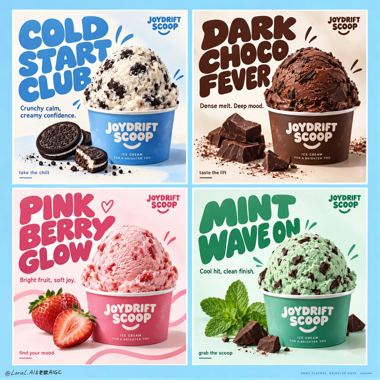
飲料フレーバー 2×2 グリッド広告:flavor 変数だけを変える
4等分・同一カップ比率・固定タイトル領域とコーナーマーク・白いガターの整列——構造を固定し、フレーバー色と小道具だけを差し替え。シリーズ商品ポスター/FMCG キャンペーンボードにそのまま流用可能、完全な英語 campaign prompt 付き。
プロンプト
Create a premium commercial poster board for a fictional ice cream brand called JOYDRIFT SCOOP, redesigned into a unified four-panel campaign grid that merges Orbit-level commercial punch with Port-level curated restraint. The full composition is a strict 2x2 poster system on a soft sky-blue master background, with four equal rectangular panels, clean white gutters, perfect alignment, and a highly controlled visual rhythm. Each panel behaves like an individual flavor advertisement, but the whole page reads as one collectible brand campaign with stronger hierarchy, cleaner negative space, larger typography, fewer decorative distractions, and a more gallery-like sense of control. The ice cream remains the absolute hero in every panel.

The campaign concept is flavor as mood architecture. Each panel contains one centered or lower-centered hero scoop in a branded paper cup, oversized custom display typography, one concise support line, a few restrained doodle accents, and only the most essential ingredient props. Keep the composition bold, product-led, playful, and premium. Reduce unnecessary splash clutter and busy micro-elements; every graphic mark must support the scoop, not compete with it.

Panel system:
Top-left panel: cookies-and-cream scoop in a branded paper cup, cool blue-and-cream flavor world, minimal cookie crumb accents, campaign headline exactly: "COLD START CLUB". Support copy exactly: "Crunchy calm, creamy confidence."
Top-right panel: rich chocolate scoop in a branded cup with a few dark chocolate chunks and restrained cocoa accents, campaign headline exactly: "DARK CHOCO FEVER". Support copy exactly: "Dense melt. Deep mood."
Bottom-left panel: strawberry scoop in a branded cup with two or three clean fresh strawberry elements and restrained pink ribbon-like graphic curves, campaign headline exactly: "PINK BERRY GLOW". Support copy exactly: "Bright fruit, soft joy."
Bottom-right panel: mint chocolate scoop in a branded cup with crisp mint leaves and a few precise chocolate chip cues, campaign headline exactly: "MINT WAVE ON". Support copy exactly: "Cool hit, clean finish."

Brand design and typography: every panel includes a small consistent top-corner brand mark reading exactly: "JOYDRIFT SCOOP". Use large rounded custom display lettering with flavor-specific color shifts, thicker mass, tighter hierarchy, and stronger sculptural presence than before. Use a smaller clean sans-serif for support lines and tiny CTA microcopy such as "take the chill", "taste the lift", "find your mood", or "grab the scoop", but keep these sparse and secondary. Typography must behave as a graphic object integrated into the composition, wrapping around the scoop without touching the main product silhouette.

Product styling: ultra-real premium ice cream with believable scoop geometry, creamy micro-texture, gentle edge softness, realistic inclusions, minimal appetizing melt, and crisp branded cups. Cookies-and-cream shows visible cookie chunks in cool white cream; chocolate feels velvety, dense, and dark; strawberry feels airy, fruit-forward, and luminous; mint feels cool, fresh, and slightly sharper in texture with chocolate fragments. The scoops must feel physically convincing and highly edible, with no collapse, over-melt, or messy drips.

Color system: each panel operates as its own controlled flavor universe while the whole board remains harmonized. Use a refined 60/30/10 balance inside each quadrant: dominant flavor hue, white/cream support, and one accent note. Across the full four-panel board, maintain a candy-clean campaign palette built from sky blue, cream white, cocoa brown, berry pink, and mint green, with the overall master background tying the set together. The image should feel brighter, more premium, and more curated than a typical FMCG flavor poster sheet.

Lighting and finish: bright studio-commercial lighting with soft frontal fill, subtle top highlights on each scoop, gentle shadow grounding under the cups, clean white handling inside the panels, and extremely polished product retouching. Show creamy micro-texture, matte paper cup print, fresh mint leaf surfaces, glossy berry freshness, and crisp chocolate edges. The final image should feel like a Cannes-level FMCG campaign: playful yet disciplined, tactile yet clean, youthful yet art-directed.

Output and constraints: one complete four-panel ice cream campaign board, product-first, highly graphic, clean luxury execution, no people, no extra unrelated props, no copied original poster text, no real brand names, no cluttered doodle overload, no broken grid alignment, no unreadable text, no malformed scoops, no duplicated ingredients, no warped cups, no muddy colors, no messy drips, no cheap clip-art feel, no AI text gibberish, and no style drift between panels.
日本語訳
JOYDRIFT SCOOP という架空のアイスクリームブランドのための、プレミアムな商業広告ポスターボードを制作してください。Orbit 級の商業的インパクトと Port 級のキュレーションされた抑制を融合させた、統一された4パネルのキャンペーングリッドとして再設計します。全体の構成は、柔らかなスカイブルーのマスター背景上の厳密な 2x2 ポスターシステムであり、4つの等しい長方形パネル、クリーンな白いガター、完全な整列、高度に制御された視覚的リズムを備えます。各パネルは個別フレーバーの広告として振る舞いますが、ページ全体としては、より強いヒエラルキー、よりクリーンなネガティブスペース、より大きなタイポグラフィ、より少ない装飾的ノイズ、よりギャラリー的な統制感を備えた、1つのコレクタブルなブランドキャンペーンとして読めなければなりません。アイスクリームはすべてのパネルにおいて絶対的な主役であり続けます。

キャンペーンのコンセプトは「フレーバーをムードの建築として扱う」ことです。各パネルには、ブランド入りペーパーカップに入った、中央または下寄りに配置された主役のスクープを1つ、特大のカスタムディスプレイタイポグラフィ、簡潔なサポートコピー1行、抑えた落書きアクセントを少数、そして最も本質的な素材の小道具のみを配置します。構図は大胆に、製品主導で、遊び心があり、かつプレミアムに保ってください。不要な飛沫の雑多さや細かすぎる要素は減らし、すべてのグラフィック要素はスクープを引き立てるものでなければならず、決して競合してはなりません。

パネルシステム:
左上パネル:ブランド入りペーパーカップに入ったクッキーアンドクリームのスクープ、クールなブルーとクリームのフレーバー世界、最小限のクッキー粉のアクセント、キャンペーン見出しは正確に: "COLD START CLUB"。サポートコピーは正確に: "Crunchy calm, creamy confidence."
右上パネル:ブランド入りカップに入った濃厚なチョコレートのスクープ、ダークチョコレートの塊をいくつかと抑えたココアのアクセント、キャンペーン見出しは正確に: "DARK CHOCO FEVER"。サポートコピーは正確に: "Dense melt. Deep mood."
左下パネル:ブランド入りカップに入ったストロベリーのスクープ、清潔でフレッシュないちごの要素を2〜3個と、抑えたピンクのリボン状グラフィックカーブ、キャンペーン見出しは正確に: "PINK BERRY GLOW"。サポートコピーは正確に: "Bright fruit, soft joy."
右下パネル:ブランド入りカップに入ったミントチョコレートのスクープ、みずみずしいミントの葉といくつかの正確なチョコチップの手がかり、キャンペーン見出しは正確に: "MINT WAVE ON"。サポートコピーは正確に: "Cool hit, clean finish."

ブランドデザインとタイポグラフィ:すべてのパネルには、正確に "JOYDRIFT SCOOP" と記された、小さく一貫した上隅のブランドマークを含めます。フレーバーごとに色が変化する、大きく丸みのあるカスタムディスプレイレタリングを使用し、より厚みのあるマス、より引き締まったヒエラルキー、以前よりも強い彫刻的な存在感を持たせてください。サポート行と、"take the chill"、"taste the lift"、"find your mood"、"grab the scoop" などの小さな CTA マイクロコピーには、より小さくクリーンなサンセリフ体を使用しますが、これらは控えめで二次的なものに留めてください。タイポグラフィは構図に統合されたグラフィックオブジェクトとして振る舞い、主要な製品シルエットに触れることなくスクープの周囲を回り込むように配置する必要があります。

製品のスタイリング:説得力のあるスクープの造形、クリーミーな微細テクスチャ、穏やかなエッジの柔らかさ、リアルな混ぜ込み、食欲をそそる最小限の溶け、そしてパリッとしたブランド入りカップを備えた、超リアルでプレミアムなアイスクリーム。クッキーアンドクリームはクールなホワイトクリームの中に目に見えるクッキーの塊を見せ、チョコレートはベルベットのように滑らかで濃厚かつダークに、ストロベリーは軽やかで果実感があり輝くように、ミントはクールでフレッシュ、チョコレート片を伴いややシャープなテクスチャに感じさせます。スクープは物理的に説得力があり、非常に食べたくなるものでなければならず、崩れ、溶けすぎ、雑な垂れは避けてください。

カラーシステム:各パネルはそれぞれ統制されたフレーバー宇宙として機能しつつ、ボード全体は調和を保ちます。各クアドラント内では洗練された 60/30/10 のバランス(支配的なフレーバー色相、白/クリームのサポート、1つのアクセント)を使用してください。4パネル全体では、スカイブルー、クリームホワイト、ココアブラウン、ベリーピンク、ミントグリーンから成る、キャンディのようにクリーンなキャンペーンパレットを維持し、全体のマスター背景でセット全体を結び付けます。画像は、典型的な FMCG フレーバーポスターシートよりも、より明るく、よりプレミアムで、よりキュレーションされた印象であるべきです。

ライティングと仕上げ:柔らかな正面フィル、各スクープの繊細なトップハイライト、カップの下の穏やかな影による接地、パネル内のクリーンな白処理、そして極めて丁寧な製品レタッチを伴う、明るいスタジオ商業ライティング。クリーミーな微細テクスチャ、マットな紙カップの印刷、フレッシュなミントの葉の表面、艶やかなベリーの鮮度、くっきりしたチョコレートのエッジを見せてください。最終的な画像は、カンヌ級の FMCG キャンペーンのように感じられるべきです:遊び心がありながら規律正しく、触感がありながらクリーン、若々しいながらアートディレクションが効いている。

出力と制約:完全な4パネルのアイスクリームキャンペーンボードを1点。製品第一、極めてグラフィック、クリーンでラグジュアリーな仕上げ。人物なし、無関係な余計な小道具なし、元ポスターのテキストのコピーなし、実在ブランド名なし、雑然とした落書きの過多なし、グリッド整列の崩れなし、判読不能なテキストなし、崩れたスクープなし、素材の重複なし、歪んだカップなし、濁った色なし、雑な垂れなし、安っぽいクリップアート感なし、AI による意味不明なテキストなし、パネル間のスタイルの揺らぎなし。
出典
- 原作者
- ou_zhen599
- 公開日
- 2026-09-17
- 原典
- 元の投稿を見る ↗
- 収録元
- xianyu110/awesome-gpt-image2.5 · 2100525164324913662 · MIT