GPT-Image-2 酒類ポスター生成プロンプト
GPT Image 2 で酒類広告ポスターを生成するための、素材の質感と光の屈折を重視した非常に詳細なプロンプト。
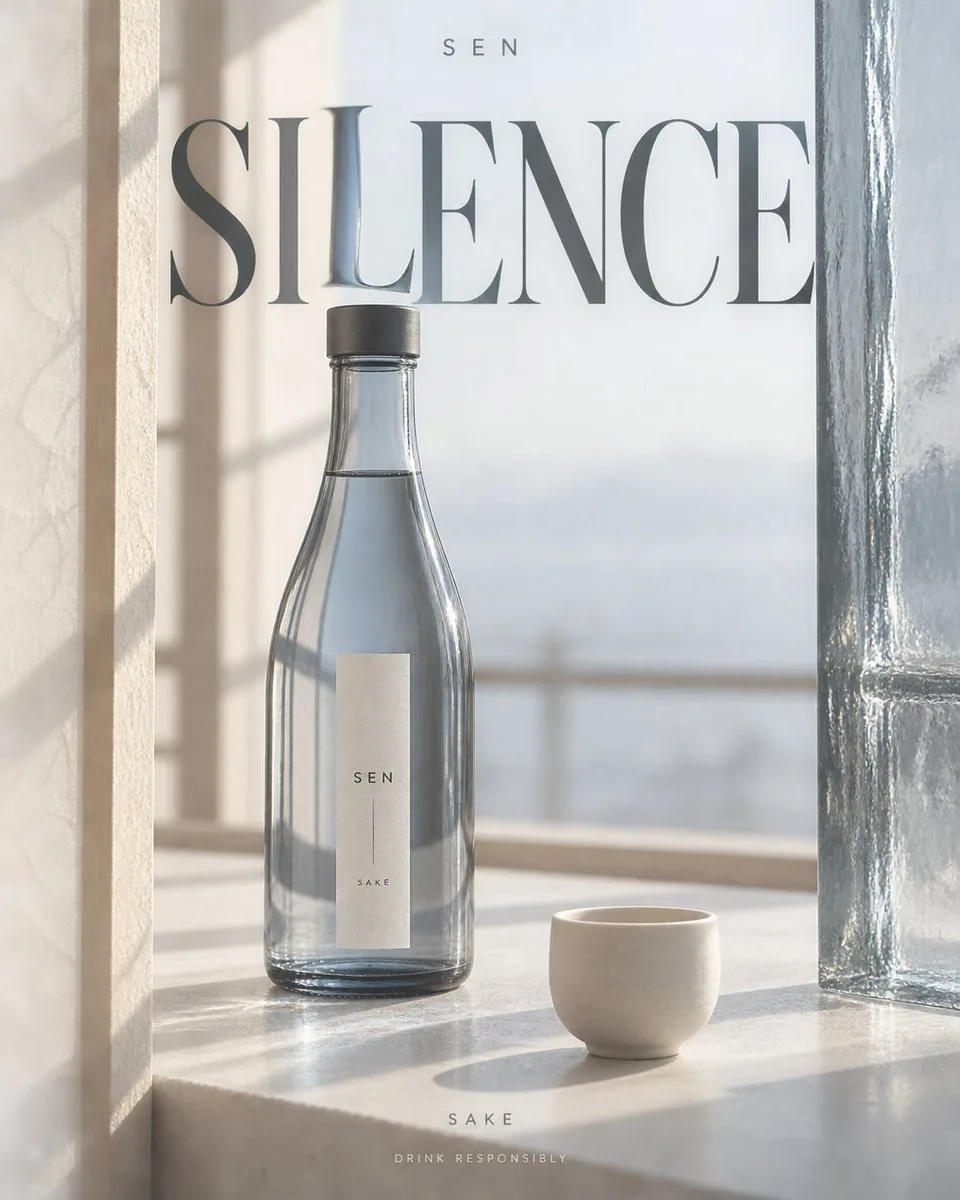
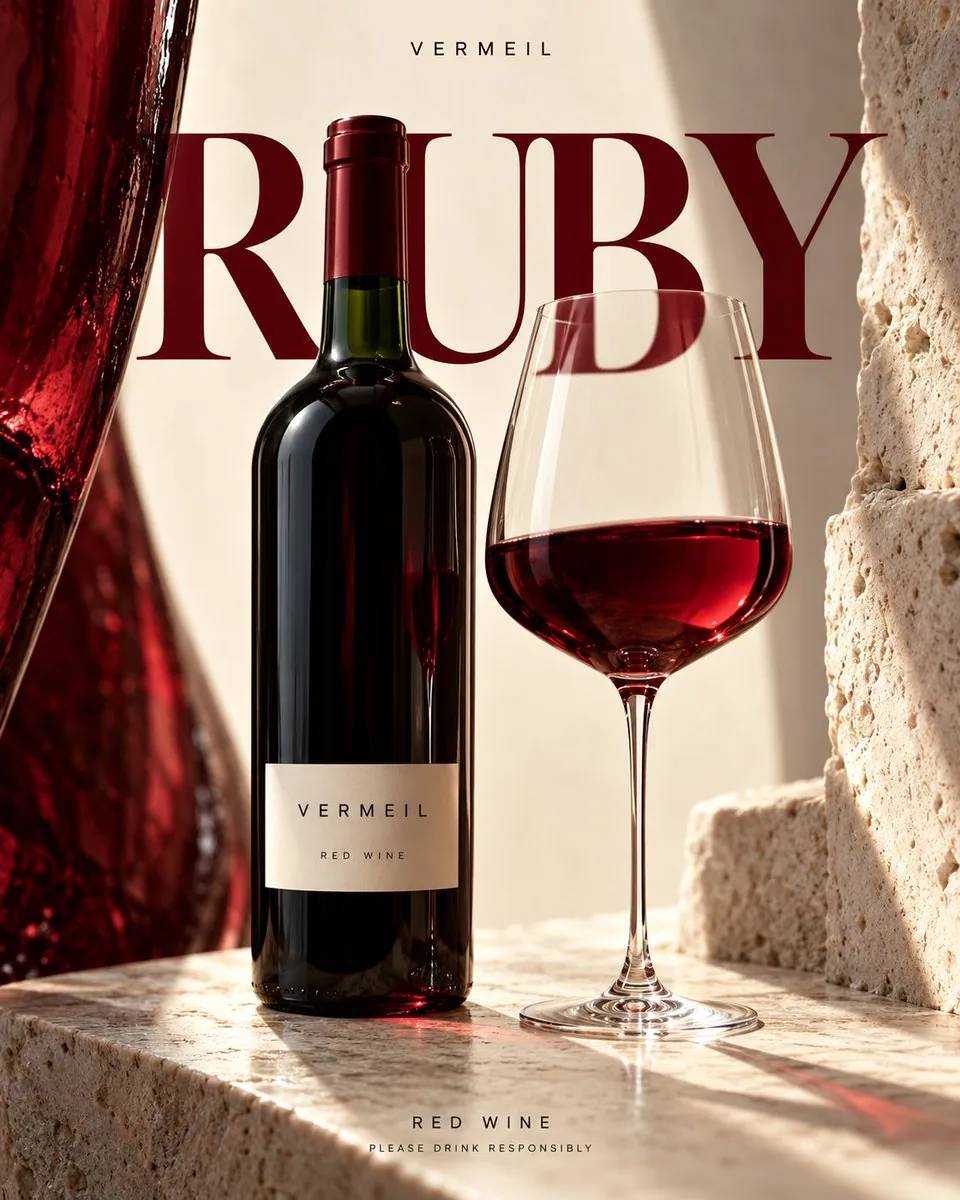
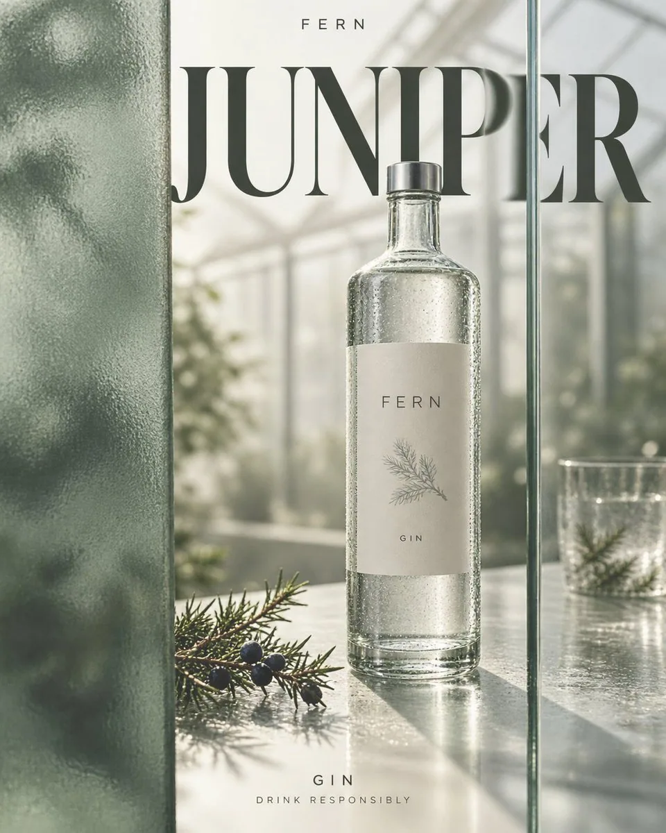
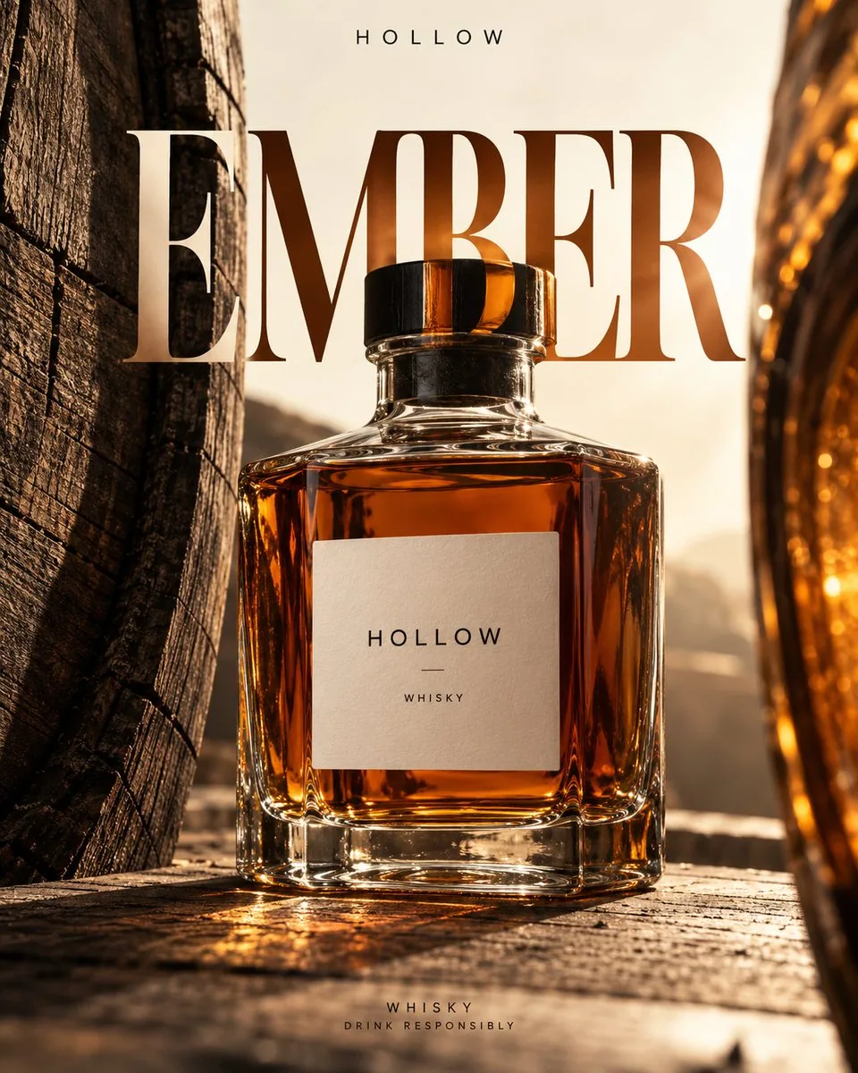
プロンプト
Create a 4:5 vertical alcohol promotional poster, outputting only one independent finished piece at a time.

Fixed visual language: Realistic commercial still life photography, warm ivory negative space, huge high-contrast serif titles, restrained editorial typography. Use the wine bottle and transparent medium to refract text, combined with bright channels formed by materials on both sides; no neon, glowing outlines, generic e-commerce cards, or golden luxury decorations.

Arrange [product] according to [scene and lens]. Let [materials on both sides] enter the frame in close-up, partially cropped, forming asymmetric vertical negative space. The opening can slowly expand and contract with the lens, do not make it a mirrored doorframe. The bottle occupies about half to two-thirds of the screen height, fully recognizable in the negative space, with slight occlusion from one side's material; the upper part should still have breathing room. The materials on both sides must come from the storage, packaging, or drinking context of this liquor, without adding irrelevant caves, flower fields, or uniformly replicated photographic backgrounds.

Place the large title [title] across layers in the upper middle section, letting a small segment of its strokes pass behind the wine bottle or transparent medium, undergoing local magnification, displacement, or color filtering in the [optical event]. Parts of the text not passing through the medium remain normally clear; deformation is limited to the light-transmitting area, cannot twist the entire title into waves. Use [primary color] as the only strong color, assisted by warm ivory and charcoal black; light transmission through the liquid, glass thickness, contact shadows, condensation, and projections must be credible, do not draw optical effects as lasers.

[Brand] is placed at the top in a small, sparse sans-serif font; [Category] and "Drink Responsibly" are at the bottom as two lines of small text. The bottle label uses only the brand and category, leaving clean information density. Only the above text is allowed in the entire image, do not automatically add slogans, vintages, alcohol content, awards, origins, prices, or unprovided product claims. No people in the scene, do not depict excessive drinking.

Preserve delicate natural material textures and precise glass highlights, avoid heavy CGI, floating products, extra bottles, random letters, glare stacking, collages, and watermarks. Scene, lens, bottle shape, and optical events change with variables, but the visual language of warm ivory negative space, serif main titles, and local refraction remains consistent.
日本語訳
4:5 の縦長の酒類プロモーションポスターを作成し、一度に独立した完成作品を 1 点だけ出力する。

固定の視覚言語:写実的な商業スチルライフ写真、温かみのあるアイボリーのネガティブスペース、巨大で高コントラストのセリフ体タイトル、抑制の効いたエディトリアルなタイポグラフィ。ワインボトルと透明な媒質を用いて文字を屈折させ、両側の素材がつくる明るいチャネルと組み合わせる。ネオン、発光する輪郭線、ありふれた EC カード、金色の高級装飾は使用しない。

[product] を [scene and lens] に従って配置する。[materials on both sides] をクローズアップでフレームに入れ、部分的にトリミングして、非対称な縦のネガティブスペースを形成する。開口部はレンズに合わせてゆっくり拡大・収縮してよいが、鏡合わせのドアフレームにしてはならない。ボトルは画面の高さの約半分から 3 分の 2 を占め、ネガティブスペースの中で完全に認識でき、片側の素材によってわずかに遮蔽される。上部にはなお息のできる余白を残す。両側の素材はこの酒の保管、包装、または飲用の文脈に由来するものでなければならず、無関係な洞窟、花畑、一律に複製された撮影背景を追加してはならない。

大きなタイトル [title] を上部中間セクションにレイヤーをまたいで配置し、そのストロークの小さな一部分をワインボトルまたは透明な媒質の背後に通し、[optical event] の中で局所的な拡大、変位、または色フィルタリングを生じさせる。媒質を通らない文字部分は通常どおり鮮明なままであり、変形は透光領域に限定され、タイトル全体を波打たせてはならない。[primary color] を唯一の強い色として使用し、温かみのあるアイボリーとチャコールブラックで補助する。液体を通した光の透過、ガラスの厚み、接地影、結露、投影は信憑性がなければならず、光学効果をレーザーのように描いてはならない。

[Brand] は上部に小さく疎らなサンセリフ体で配置する。[Category] と "Drink Responsibly" は下部に 2 行の小さな文字として配置する。ボトルのラベルにはブランドとカテゴリのみを使用し、情報密度を清潔に保つ。画像全体で許可される文字は上記のみであり、スローガン、ヴィンテージ、アルコール度数、受賞歴、産地、価格、または提供されていない製品の主張を自動的に追加してはならない。画面内に人物を入れず、過度の飲酒を描写してはならない。

繊細で自然な素材の質感と精密なガラスのハイライトを保持し、重い CGI、浮遊する製品、余分なボトル、ランダムな文字、グレアの積み重ね、コラージュ、ウォーターマークを避ける。シーン、レンズ、ボトルの形状、光学イベントは変数に応じて変化するが、温かみのあるアイボリーのネガティブスペース、セリフ体のメインタイトル、局所的な屈折という視覚言語は一貫したままである。
出典
- 原作者
- 蛋黄堡
- 公開日
- 2026-10-16
- 原典
- 元の投稿を見る ↗
- 収録元
- YouMind-OpenLab/awesome-gpt-image-2 · 36498 · CC-BY-4.0