# OBLT E-bike Header

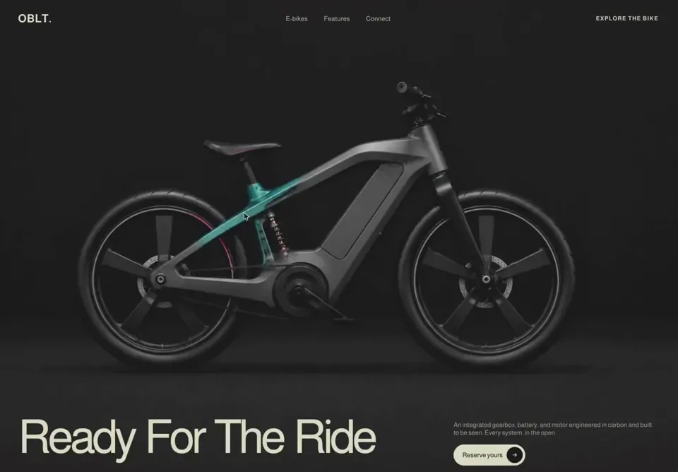
A full-viewport, dark, cinematic e-bike product header for the brand **OBLT**, built in React (client component) with pure CSS and an interactive cursor-following "x-ray" spotlight reveal — moving the mouse wipes away the bike's exterior photo to expose its internal carbon/gearbox structure underneath. Built with React only (no animation libraries).

## Tech stack (libraries actually imported)
- React only — `useRef`, `useState`, and the `MouseEvent` type. No framer-motion, no GSAP, no icon library. All animation is hand-written CSS keyframes + an inline CSS `mask-image`.
- SVG icon (the CTA arrow) is hand-inlined, not from a library.

## Fonts & global styles
- Single Google font, imported inside a `<style>` block:
  ```
  @import url('https://fonts.googleapis.com/css2?family=Almarai:wght@300;400;700;800&display=swap');
  ```
- Font stack: `"Almarai","Helvetica Neue",Helvetica,Arial,sans-serif`.
- `-webkit-font-smoothing: antialiased`. `box-sizing: border-box` applied to the root and all descendants (scoped to `.vt-header`, never global).

## Section container
- Root `<header className="vt-header">` is the mouse-tracking element (handlers: `onMouseEnter`, `onMouseMove`, `onMouseLeave`).
- Styles: `position: relative; display: flex; flex-direction: column; min-height: 100vh; overflow: hidden; padding: 32px 56px 44px; background-color: #272727; color: #fff;`.
- Internal vertical flow: top nav, then a flex-grow spacer "stage", then bottom content pinned to the base.

## Structure, section by section

### 1. Reveal background (`.vt-bg`, absolute inset:0, z-index 0, pointer-events:none)
Three stacked layers:
- **Base exterior image** (`.vt-bg-img`): the full bike exterior photo, `object-fit: cover; object-position: center;`, fills the layer. `user-select:none`, `-webkit-user-drag:none`, `referrerPolicy="no-referrer"`.
- **X-ray layer** (`.vt-bg-xray`, z-index 1): contains the bike x-ray/internal image (same cover/center sizing). This layer is masked by a radial gradient driven by cursor position (see Animations). `will-change: -webkit-mask-image, mask-image;` and `transition: -webkit-mask-image .12s linear, mask-image .12s linear;`.
- **Veil overlay** (`.vt-bg-veil`, z-index 2): a vertical darkening gradient so text stays legible top & bottom:
  ```
  linear-gradient(180deg, rgba(39,38,38,.62) 0%, rgba(39,38,38,.10) 26%, rgba(39,38,38,.10) 60%, rgba(39,38,38,.82) 100%)
  ```

### 2. Top nav (`.vt-nav`, z-index 30)
- `display: grid; grid-template-columns: 1fr auto 1fr; align-items: center; gap: 24px;`.
- **Logo** (left, `.vt-logo`): text `OBLT` followed by a `.` span. `font-size: 28px; font-weight: 700; letter-spacing: 0.5px; color: #E0E1CC;` (dot is also `#E0E1CC`).
- **Center menu** (`.vt-menu`, gap 40px): three links — `E-bikes`, `Features`, `Connect`. Each: `font-size: 16px; font-weight: 400; letter-spacing: .3px; color: #E0E1CC; opacity: .85; transition: opacity .2s ease;` hover → opacity 1.
- **Right cluster** (`.vt-nav-right`, gap 18px): an uppercase explore link plus a hamburger button.
  - `.vt-explore` link text: `Explore the bike` — `font-size: 14px; font-weight: 700; letter-spacing: 1.5px; text-transform: uppercase; color: #E0E1CC;` hover → opacity .65.
  - **Hamburger** (`.vt-burger`, hidden on desktop): 34×34px, three `#E0E1CC` bars 22×2px, radius 2px, gap 5px. On `.open`: bar 1 `translateY(7px) rotate(45deg)`, bar 2 `opacity:0`, bar 3 `translateY(-7px) rotate(-45deg)`. Transition `transform .25s ease, opacity .2s ease`.
- **Mobile dropdown** (`.vt-mobile-menu`, rendered only when `menuOpen`): absolutely positioned below the nav (`top:100%; margin-top:16px; z-index:40`), `background: rgba(20,19,19,.97); backdrop-filter: blur(10px); border: 1px solid rgba(255,255,255,.1); border-radius: 16px; padding: 8px 18px;`. Links (`E-bikes`, `Features`, `Connect`, `Explore the bike`): `color:#E0E1CC; font-size:18px; padding:14px 4px; border-bottom:1px solid rgba(255,255,255,.08)`; last link `border-bottom:none; font-weight:700`. Each link closes the menu on click.

### 3. Stage spacer (`.vt-stage`, z-index 30, `flex: 1 1 0%`)
- `display: flex; align-items: flex-start; justify-content: flex-end; padding-top: 22px;`. In the current markup it is an empty `aria-hidden` spacer (the `.vt-hint` pulsing-dot styles exist in CSS but the hint element is not rendered).
- (Reference: `.vt-hint` styled as an uppercase 11px/600 label with a 36px circle dot, `border:1px solid rgba(46,211,176,.5); color:#2ed3b1;` running `vtPulse 1.8s ease-in-out infinite`.)

### 4. Bottom content (`.vt-bottom`, z-index 30)
12-column grid: `grid-template-columns: repeat(12, 1fr); align-items: end; gap: 18px 32px;`.
- **Headline** (`.vt-headline`, `grid-column: 1 / span 8`): `<h1>` containing the word-stagger component. h1 style: `color: #E0E1CC; font-weight: 500; font-size: clamp(36px, 7vw, 116px); line-height: 0.85; letter-spacing: -0.07em; white-space: nowrap; margin:0;`. Text: **Ready For The Ride**.
- **Right block** (`.vt-right`, `grid-column: 9 / span 4; align-self: end; transform: translateY(22px);`):
  - Paragraph (verbatim): `An integrated gearbox, battery, and motor engineered in carbon and built to be seen. Every system, in the open.` Style: `font-size: 16px; line-height: 1.2; color: rgba(225,224,204,.7);` animates in via `vtFadeUp .8s cubic-bezier(.16,1,.3,1) both` with `animation-delay: .5s`.
  - **CTA button** (`.vt-cta`): label **Reserve yours** plus a circular arrow. Pill: `color:#000; background:#E0E1CC; border:none; border-radius:9999px; padding:6px 6px 6px 22px; font-size: clamp(14px, 1vw, 16px); font-weight:500; display:inline-flex; align-items:center; gap:10px;`. Animates via `vtFadeUp .8s cubic-bezier(.16,1,.3,1) both`, `animation-delay: .7s`. Hover → `gap: 14px`. Inner circle `.circ`: 40×40px, `border-radius:50%; background:#000;` containing the SVG (stroke `#E0E1CC`); on button hover `.circ` scales to `1.1` (`transition: transform .25s ease`).

## Assets (every URL)
- Exterior photo (base layer): `https://cdn.jiro.build/ARS/OBLT%20E%20Bike/bike-exterior.png`
- X-ray / internals photo (revealed layer): `https://cdn.jiro.build/ARS/OBLT%20E%20Bike/bike-xray-original.png`
- CTA arrow icon: inline SVG, 16×16, `viewBox="0 0 24 24"`, `stroke="currentColor"`, `stroke-width="2.2"`, round caps/joins, path:
  ```
  M5 12h14M13 6l6 6-6 6
  ```

## Animations

### Cursor "x-ray" spotlight (signature interaction)
- State: `hovering` (bool) and `pos` ({x,y} in px relative to the section's bounding rect). `handleMove` computes `e.clientX - rect.left`, `e.clientY - http://rect.top`.
- Constants: `RADIUS = 165` px (spotlight radius), `FEATHER = 45` px (soft edge). Inner fully-clear radius = `RADIUS - FEATHER` = 120px.
- The x-ray layer's `maskImage` / `WebkitMaskImage` is set inline. When hovering:
  ```
  radial-gradient(circle 165px at {x}px {y}px, #000 0, #000 120px, transparent 165px)
  ```
  When not hovering (collapsed to nothing):
  ```
  radial-gradient(circle 0px at 50% 50%, transparent 0, transparent 0)
  ```
- Mask transitions at `.12s linear` so the reveal trails the cursor smoothly. NOTE: in CSS `mask`, opaque (`#000`) areas KEEP the layer — so the circle reveals the x-ray image while the rest of that layer is hidden (showing the exterior beneath).

### Headline word pull-up (`WordsPullUp` component)
- Splits the headline on spaces; each word is an `inline-block` span (`margin-right: 0.22em`, last word 0). Each word animates `wpuUp` with `cubic-bezier(.16,1,.3,1) both`, default `duration = 0.6s`, staggered by `delayStep = 0.08s` (`animationDelay: i * 0.08s`).
- Keyframes:
  ```
  @keyframes wpuUp { from { transform: translateY(20px); opacity: 0; } to { transform: translateY(0); opacity: 1; } }
  ```
- Optional superscript asterisk (`.wpu-ast`, `font-size:0.31em; vertical-align:top; top:0.15em; left:-0.05em;`) — not enabled here (`asterisk` defaults false).
- Respects `@media (prefers-reduced-motion: reduce)` → `.wpu-word { animation: none; }`.

### Fade-up for right block (`vtFadeUp`)
```
@keyframes vtFadeUp { from { transform: translateY(20px); opacity: 0; } to { transform: translateY(0); opacity: 1; } }
```
Paragraph delay `.5s`, CTA delay `.7s`; both `.8s cubic-bezier(.16,1,.3,1) both`.

### Pulse (defined for hint dot)
```
@keyframes vtPulse { 0%,100%{transform:scale(1);opacity:.7} 50%{transform:scale(1.12);opacity:1} }
```
Applied `vtPulse 1.8s ease-in-out infinite`.

## Responsive
- **≤1000px**: padding `24px 28px 32px`; nav becomes `1fr auto` (logo + right); center `.vt-menu` and `.vt-explore` hidden; hamburger shown; `.vt-bottom` collapses to single column (`gap:16px`); headline & right span full width; `.vt-right` `transform:none; align-self:start; margin-top:4px; max-width:520px`.
- **≤600px**: padding `18px 20px 26px`; logo `font-size:22px`; headline `white-space:normal; font-size: clamp(40px, 13vw, 72px); line-height:0.92`; paragraph `font-size:15px; margin-bottom:16px`; CTA `font-size:14px; padding:5px 5px 5px 20px`; `.circ` 36×36px.

## Key design principles
- Dark stage (`#272727`) with a single warm-cream accent (`#E0E1CC`) and a teal accent (`#2ed3b1`) reserved for the (optional) pulse hint.
- The product reveal IS the hero: cursor acts as an x-ray torch over a layered photo pair.
- Editorial oversized headline (line-height 0.85, tight `-0.07em` tracking) anchored bottom-left; supporting copy + CTA bottom-right.
- Staggered, eased (`cubic-bezier(.16,1,.3,1)`) entrance for hierarchy.

## Common mistakes to avoid
- Don't invert the mask logic: opaque `#000` in the radial gradient REVEALS the x-ray layer; the transparent ring hides it. Getting this backwards shows internals everywhere except under the cursor.
- Keep `RADIUS - FEATHER` (120px) as the inner solid stop and `RADIUS` (165px) as the transparent stop — that 45px band is the soft feather.
- Mouse coordinates must be relative to the section rect (`getBoundingClientRect`), not the viewport.
- Mask transition is `.12s linear` only — a longer/eased transition makes the spotlight feel laggy.
- `white-space: nowrap` on the headline is intentional on desktop; only switch to `normal` at ≤600px.
- Scope all resets and the Almarai `@import` to the component; do not touch global `body`/`html`.

## Page title
OBLT — Ready For The Ride

## Integration (build-safety — do not skip)
- Add this section as a **new** component file with a unique name. Don't edit or overwrite any existing file except to add its import and render it.
- Render it **after** all existing sections; keep every previously built section exactly as-is — never replace or remove them.
- If no project exists, create a minimal React + Tailwind app; if one exists, use it as-is — don't re-scaffold or change the Tailwind/build config or version.
- Keep it self-contained: scope its fonts and any resets to this section; never set global `body`/`html`/`*` styles or a global font.
- Install only the libraries this section names.