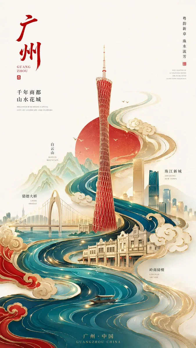
Neo-Chinese minimalist style high-end city poster, 9:16 vertical composition, with Guangzhou as the core theme, the center of the image is an abstract geometric Canton Tower, simple in shape but highly recognizable,

The overall adopts an S-shaped flowing composition, extending from bottom to top, the Pearl River water system is designed as flowing water ripples fused with traditional auspicious cloud patterns, surrounding the entire image to form a visual dynamic line,

Guangzhou landmark buildings are embellished in it in the way of "blank space + line drawing + local color blocks": Zhujiang New Town Twin Towers, Liede Bridge, Baiyun Mountain outline, Lingnan arcade houses,
Traditional and modern architecture naturally blend, progressive layers, clear distinction between far and near, virtual and real,

Style control: minimalist + high-end + Eastern artistic conception, not cluttered and not overly realistic,

Color scheme (key point):
High saturation but restrained, Chinese red, cyan blue, and gilded gold as the main colors,
Supplemented by a small amount of warm gold highlight embellishments, forming a strong visual impact but not tacky,

Background: large area of pure blank space or light Xuan paper texture, enhancing a sense of breathing and high-end feel,

Details: auspicious clouds and water ripples have a slight relief/gold stamping texture,
Locally add faint light particles or flowing light lines to enhance modernity,

Light and shadow: soft gradient light + local highlights, highlighting a magnificent and grand atmosphere,

Overall style: Guochao high-end illustration / brand poster-level texture / 8K / ultra-clear details