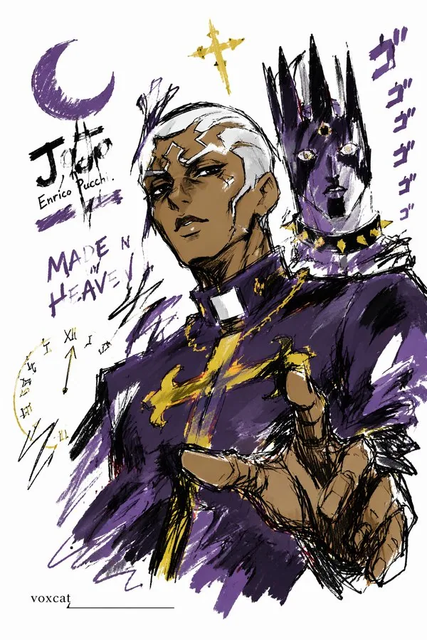
Express [Subject/Theme] in a graffiti sketch style, presenting an overall visual effect of quick outlining, free deformation, impromptu hand-drawing, and draft-like appearance. The lines are casual, exaggerated, and can vary in thickness, slightly messy but rhythmic and expressive, emphasizing generalization, exaggeration, playfulness, and spontaneity, rather than rigorous realism or detailed rendering. Colors are expressed in rough blocks with a distinct dry-brush feel, retaining uneven smearing traces, brush strokes, dry-brush effects, and a sense of coverage. Colors automatically adapt to [Subject/Theme], but the overall expression remains graffiti-style, sketch-style, and generalized. Do not use transparent watercolor blooming effects, do not use delicate watercolor transitions, do not use paper textures, do not use soft atomization, and do not use dreamy textures. The background is mainly left blank, maintaining a sense of simplicity, relaxation, incompleteness, and design. A small number of auxiliary symbols, arrows, marks, circled areas, repeated lines, casually written text, or other graffiti elements can be added to enhance the visual language of a sketchbook or jotting style, but it must not be too crowded, and must not destroy the subject and the blank space temperament. The image content does not need to be written out in advance; the most suitable subject image, actions, related elements, symbols, or simplified scenes are automatically deduced and generated by [Subject/Theme], keeping the overall unified graffiti sketch style and exaggerated generalized expression, avoiding complex realistic backgrounds and over-elaboration. The exclusive signature "voxcat" needs to be naturally added to the image as a part of the picture. The position should be low-key but clear, and can be placed in the bottom left corner, bottom right corner, or near the title. The style must be consistent with the overall layout, like an artwork signature or a design sign-off; the signature font should be exquisite, restrained, and high-end, must not be too large, must not destroy the subject composition, and must not appear abrupt or cheap.