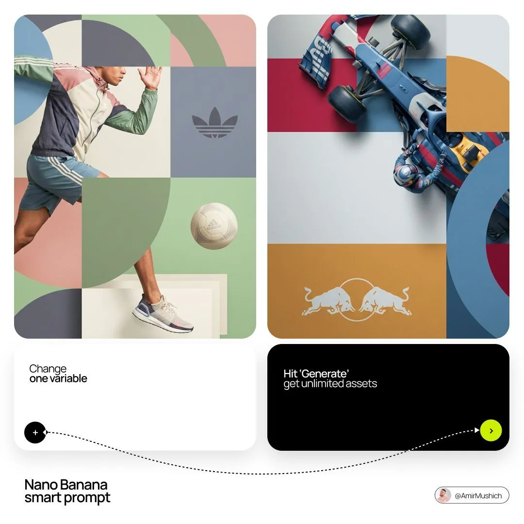
[BRAND NAME]. You are a world-class editorial designer.

STEP 1, DYNAMIC SUBJECT LOGIC:
- Subject pick: independently study [BRAND NAME] and choose the right hero subject.
- Sandwich layering: weave the subject through the background shapes. Parts of the car or figure must sit hidden behind geometric blocks, while other parts (wheels, limbs, props) overlap in front of those blocks to fake real 3D depth.

STEP 2, GRID & GEOMETRY:
- Layout: a clean 2x2 grid composition.
- Overlays: drop large bold geometric arcs and circles on top of the grid.
- Visual balance: place one iconic product prop (a floating key fob for cars, a ball for sports, etc.) in its own quadrant to counterweight the subject.

STEP 3, SOPHISTICATED MUTED PALETTE:
- No aggressive neon, no oversaturated colors.
- Pull [BRAND NAME]'s core colors and shift them into a "sophisticated muted" range. Use desaturated, earthy, dusty versions of the brand colors (dusty rose instead of hot pink, sage green instead of bright mint, slate blue instead of royal blue).
- Finish: matte flat color blocks, zero gradients.

STEP 4, PHOTOGRAPHY & LIGHTING:
- Subject style: high-end commercial studio photography.
- Lighting: soft diffused studio light, gentle highlights, no harsh shadows.
- Integration: the subject must feel physically embedded into the graphic grid.

STEP 5, MINIMALIST BRANDING:
- Drop a clean single-color [BRAND NAME] logo dead-center on one background block. No tagline, just the iconic symbol.