上半分は原画+下半分は手描き:作品集用分割ポスター
3:4 厳密に50/50:上半分でスタイルのアイデンティティを保ち、下半分はミニマルな手描きで再解釈+大きな余白。キャラクター画像がワンクリックで「画集の表紙」風に。
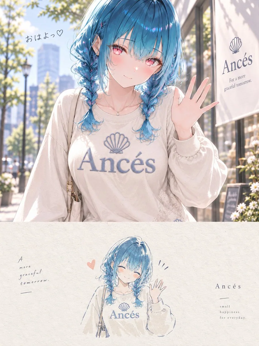
プロンプト
Use the uploaded reference image.

Create one independent high-end editorial poster per image. Do not make a collage.

FORMAT
- Strict 3:4 vertical
- Exact 50/50 horizontal split
- Top half: original illustration
- Bottom half: minimalist hand-drawn reinterpretation

TOP HALF
Preserve the original image as faithfully as possible:
character identity, face, hair, eyes, expression, proportions, pose, outfit, accessories, objects, composition, art style, linework, coloring, lighting, atmosphere, and color mood.

Do not redesign the character, change the outfit or pose, make it photorealistic, convert it to 3D, or change the art style.

Apply only subtle editorial color grading.
If needed, extend only the background naturally. Do not distort the main subject.

BOTTOM HALF
Reinterpret the most recognizable elements as a small minimalist handmade illustration.

Use:
- delicate imperfect hand-drawn lines
- flat acrylic-style color shapes
- subtle brush marks
- rough off-white paper texture
- organic edges
- strong simplification

Keep only the essential silhouette, distinctive features, key pose, and important objects.

The illustrated subject should occupy only about 10–20% of the bottom half and be surrounded by generous negative space.

COLOR
Use no more than 4 main colors extracted from the original image.

TYPOGRAPHY
Optional. If used, keep it very small, minimal, and editorial.

MOOD
Quiet, poetic, refined, minimal, soft, artistic, premium.

Final result: a contemporary art-book cover combining the original digital illustration above with a small handmade reinterpretation below.
日本語訳
アップロードされた参照画像を使用する。

画像ごとに独立したハイエンドなエディトリアルポスターを1枚作成する。コラージュにはしない。

形式
- 厳密に3:4の縦長
- 水平方向に正確に50/50で分割
- 上半分:元のイラスト
- 下半分:ミニマルな手描きによる再解釈

上半分
元の画像をできる限り忠実に保持する:
キャラクターのアイデンティティ、顔、髪、目、表情、プロポーション、ポーズ、衣装、アクセサリー、オブジェクト、構図、アートスタイル、線画、彩色、ライティング、雰囲気、色調。

キャラクターを再デザインしたり、衣装やポーズを変更したり、フォトリアルにしたり、3Dに変換したり、アートスタイルを変えたりしない。

繊細なエディトリアルカラーグレーディングのみを適用する。
必要に応じて背景だけを自然に拡張する。主要な被写体を歪めない。

下半分
最も認識しやすい要素を、小さなミニマルな手描きイラストとして再解釈する。

使用するもの:
- 繊細で不完全な手描きの線
- フラットなアクリル風の色面
- さりげない筆跡
- ざらついたオフホワイトの紙の質感
- 有機的なエッジ
- 強い単純化

本質的なシルエット、特徴的なディテール、重要なポーズ、重要なオブジェクトのみを残す。

描かれた被写体は下半分の約10〜20%だけを占め、その周囲に十分な余白を置く。

色
元の画像から抽出した最大4色までを使用する。

タイポグラフィ
任意。使用する場合は、非常に小さく、ミニマルで、エディトリアルに保つ。

雰囲気
静かで、詩的で、洗練され、ミニマルで、柔らかく、芸術的で、プレミアム。

最終結果:元のデジタルイラストを上に、小さな手描きの再解釈を下に組み合わせた、現代的なアートブックの表紙。
出典
- 原作者
- tokotoko_aiil
- 公開日
- 2026-09-16
- 原典
- 元の投稿を見る ↗
- 収録元
- xianyu110/awesome-gpt-image2.5 · 2100185428188168203 · MIT