写真×ミニマルイラストのメモリーカード:縦型3:4の完全レシピ
Harboris は上半分のリアル写真を固定し、下半分は抽出したカラーパレットで素朴な editorial イラストに——構図/被写体/ネガティブまで全部決め打ち。生活写真を一枚差し替えるだけでメモリーカードが作れる。旅行/結婚式/ブランドの記念アルバムは9分割だけではダメ。まずこの半分分割カードを真似よう。
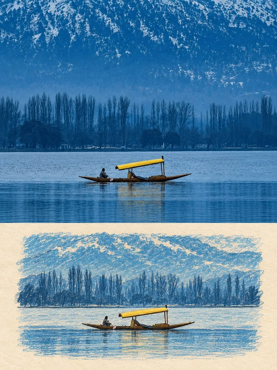
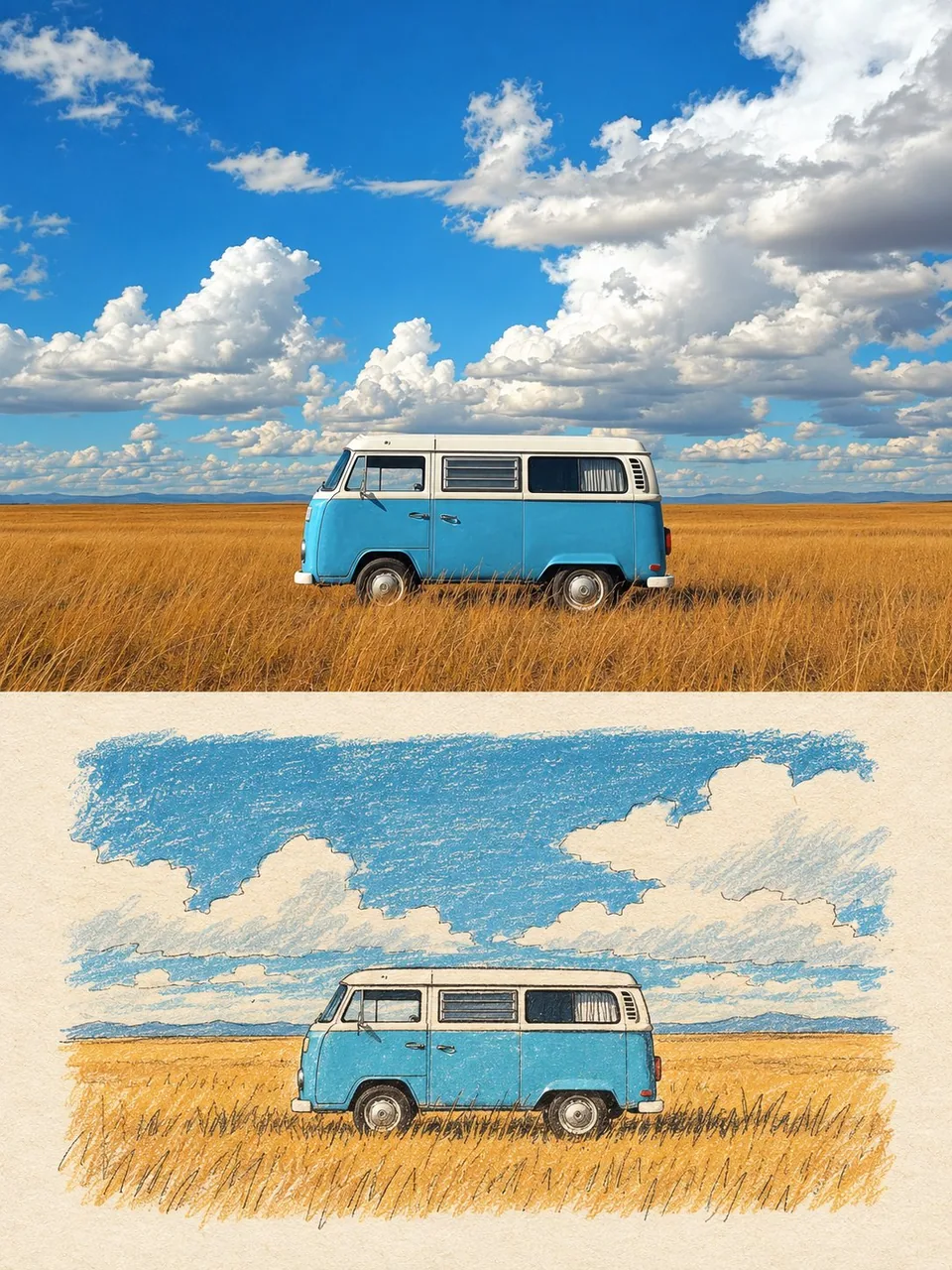
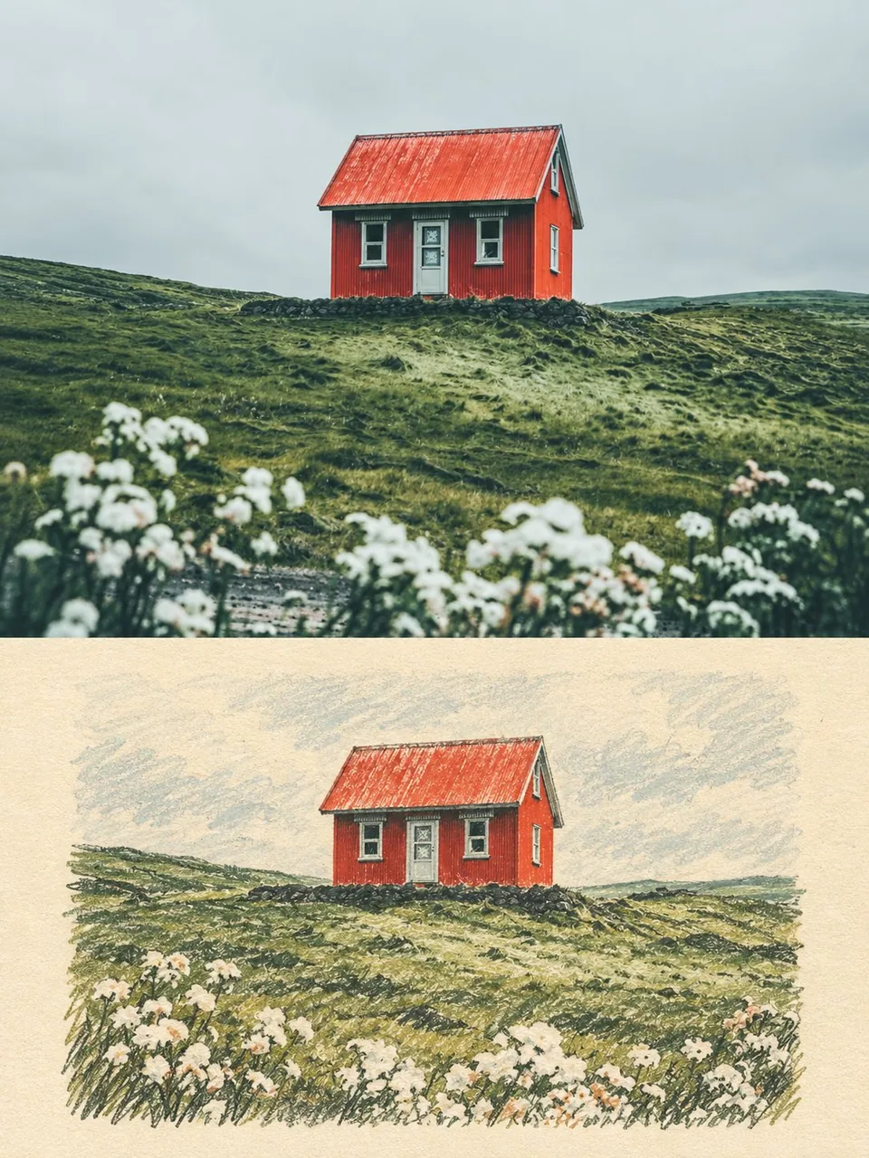
プロンプト
Use the uploaded photo as the only content source. Create a vertical 3:4 “real photo + minimal illustration” memory card based entirely on that image. Preserve the main subjects, subject count, pose, viewpoint, spatial relationships, and overall scene logic. Do not redesign the source or add unrelated content.
Layout
Split the card into two horizontal sections, about 50% top and 50% bottom. The top half keeps the uploaded photo with photographic texture. Crop naturally to fit, but do not stretch, mirror, rearrange, or alter the main subjects. Keep natural lighting, real materials, and the original color mood, with subtle editorial grading. The lower half uses a warm ivory handmade-paper background and shows a centered horizontal illustration of the same scene. The illustration occupies about 63-67% of the lower width, with generous blank space around it.
Scene Translation
In the lower illustration, preserve the most recognizable subjects, major structures, important objects, viewpoint, depth, relative scale, and key positions from the source. Remove tiny clutter, fine photographic texture, reflections, and complex shadows. Simplify the scene into slightly awkward geometric color blocks and thin hand-drawn lines. People and animals, when present, remain identifiable through silhouette, pose, hair or fur shape, clothing color, and placement, but facial detail may be reduced. Outlines may wobble, break, shift, or misalign slightly while the scene stays recognizable.
Illustration Style
Use restrained naive editorial drawing with soft geometric simplification and handmade quality. Combine thin sketchy linework with flat shapes. The lower scene should feel calm, clean, slightly imperfect, and visually reduced rather than technically precise. Avoid realistic rendering.
Color
Extract 4-6 representative colors from the uploaded photo and reinterpret them as a soft low-saturation palette. Use muted tones derived from the source, with flat fills and enough contrast to separate major subjects and scene layers. No complex gradients, glossy highlights, or heavy 3D modeling.
Texture
Blend crayon, pastel, screen-print, and old-book illustration qualities. Keep paper show-through, fine grain, slight pigment unevenness, worn edges, and subtle off-register shifts. The result should feel like an independent editorial illustration printed on aged paper: warm, quiet, nostalgic, and collectible.
Typography
Below the illustration, you may include exactly two short English lines related to the scene, mood, place, or moment. Use a small vintage serif font, left-aligned. If clean readable text cannot be rendered, leave the area blank. No other readable text.
Cleanup
Remove phone UI, subtitles, screenshot traces, and interface elements when present. Do not invent missing scenery or decorative props.
Negative
No major layout change, no added or missing primary subjects, no photoreal painting, no polished watercolor, no anime, no manga, no vector clip-art, no oil paint, no impasto, no 3D, no logo, no watermark, no black border, no UI, no unrelated decoration.
Vertical 3:4 split card · photo top / naive illustration bottom · aged paper texture
日本語訳
アップロードされた写真を唯一の内容ソースとして使用します。その画像だけに基づいて、縦長3:4の「リアル写真+ミニマルイラスト」メモリーカードを作成します。主要な被写体、被写体の数、ポーズ、視点、空間関係、シーン全体の論理を保持します。元画像を再設計したり、無関係な内容を追加したりしないでください。
レイアウト
カードを上下2つの水平セクションに分割し、上約50%、下約50%とします。上半分はアップロードされた写真を写真の質感のまま保持します。自然にフィットするようトリミングしますが、主要な被写体を引き伸ばしたり、鏡像反転したり、並べ替えたり、改変したりしないでください。自然光、リアルな素材、元の色の雰囲気を保ち、控えめなエディトリアルグレーディングを施します。下半分は温かみのあるアイボリーの手漉き紙の背景を使い、同じシーンの横位置中央のイラストを表示します。イラストは下半分の幅の約63〜67%を占め、その周囲に十分な余白を取ります。
シーンの翻訳
下のイラストでは、元画像から最も認識しやすい被写体、主要な構造、重要なオブジェクト、視点、奥行き、相対的なスケール、主要な位置を保持します。細かな雑多な要素、細密な写真の質感、反射、複雑な影は取り除きます。シーンをやや不格好な幾何学的な色ブロックと細い手描きの線に単純化します。人や動物がいる場合は、シルエット、ポーズ、髪や毛の形、衣服の色、配置によって識別可能なままにしますが、顔のディテールは簡略化してかまいません。輪郭はわずかに揺れ、途切れ、ずれ、位置が合わなくてもよいですが、シーンは認識可能なままにします。
イラストのスタイル
抑制の効いた素朴なエディトリアルドローイングを用い、柔らかな幾何学的単純化と手作り感を出します。細いスケッチ風の線とフラットな形を組み合わせます。下のシーンは、技術的に正確というより、落ち着き、清潔で、少し不完全で、視覚的に削ぎ落とされた印象であるべきです。写実的なレンダリングは避けます。
色彩
アップロードされた写真から代表的な色を4〜6色抽出し、柔らかく低彩度なパレットとして再解釈します。元画像由来の落ち着いた色調を用い、フラットな塗りと、主要な被写体とシーンのレイヤーを分離するのに十分なコントラストを持たせます。複雑なグラデーション、光沢のあるハイライト、重い3Dモデリングは使いません。
質感
クレヨン、パステル、シルクスクリーン、古書の挿絵の質感をブレンドします。紙の透け感、細かな粒子、わずかな顔料のムラ、擦り切れたエッジ、微妙な版ずれを保ちます。結果は、経年した紙に印刷されたインディペンデントなエディトリアルイラストのように感じられるべきです:温かく、静かで、ノスタルジックで、コレクタブル。
タイポグラフィ
イラストの下に、シーン、雰囲気、場所、瞬間に関連する短い英語をちょうど2行だけ入れてかまいません。小さめのヴィンテージセリフ体、左揃えで。クリーンで読みやすいテキストをレンダリングできない場合は、その領域を空白のままにします。他の読み取れるテキストは入れません。
クリーンアップ
スマホのUI、字幕、スクリーンショットの痕跡、インターフェース要素がある場合は削除します。欠けている風景や装飾的な小道具を勝手に作らないでください。
ネガティブ
レイアウトの大きな変更なし、主要な被写体の追加や欠落なし、写実的なペインティングなし、磨き上げられた水彩なし、アニメなし、マンガなし、ベクタークリップアートなし、油絵なし、厚塗りなし、3Dなし、ロゴなし、ウォーターマークなし、黒い枠線なし、UIなし、無関係な装飾なし。
縦長3:4の分割カード · 上は写真/下は素朴なイラスト · 経年した紙の質感
出典
- 原作者
- harboriis
- 公開日
- 2026-09-28
- 原典
- 元の投稿を見る ↗
- 収録元
- xianyu110/awesome-gpt-image2.5 · 2104455859447501166 · MIT