사진 × 미니멀 일러스트 메모리 카드: 세로 3:4 완전 레시피
Harboris는 상단 실사 사진을 단단히 고정하고, 하단은 색상 팔레트를 뽑아 순박한 editorial 일러스트로 만들었다 — 구도/주체/네거티브까지 전부 고정, 생활 사진 한 장만 바꾸면 메모리 카드 완성. 여행/웨딩/브랜드 기념 앨범은 9칸 그리드만 쓰지 말고, 이 반반 카드 공식을 먼저 따라 하라.
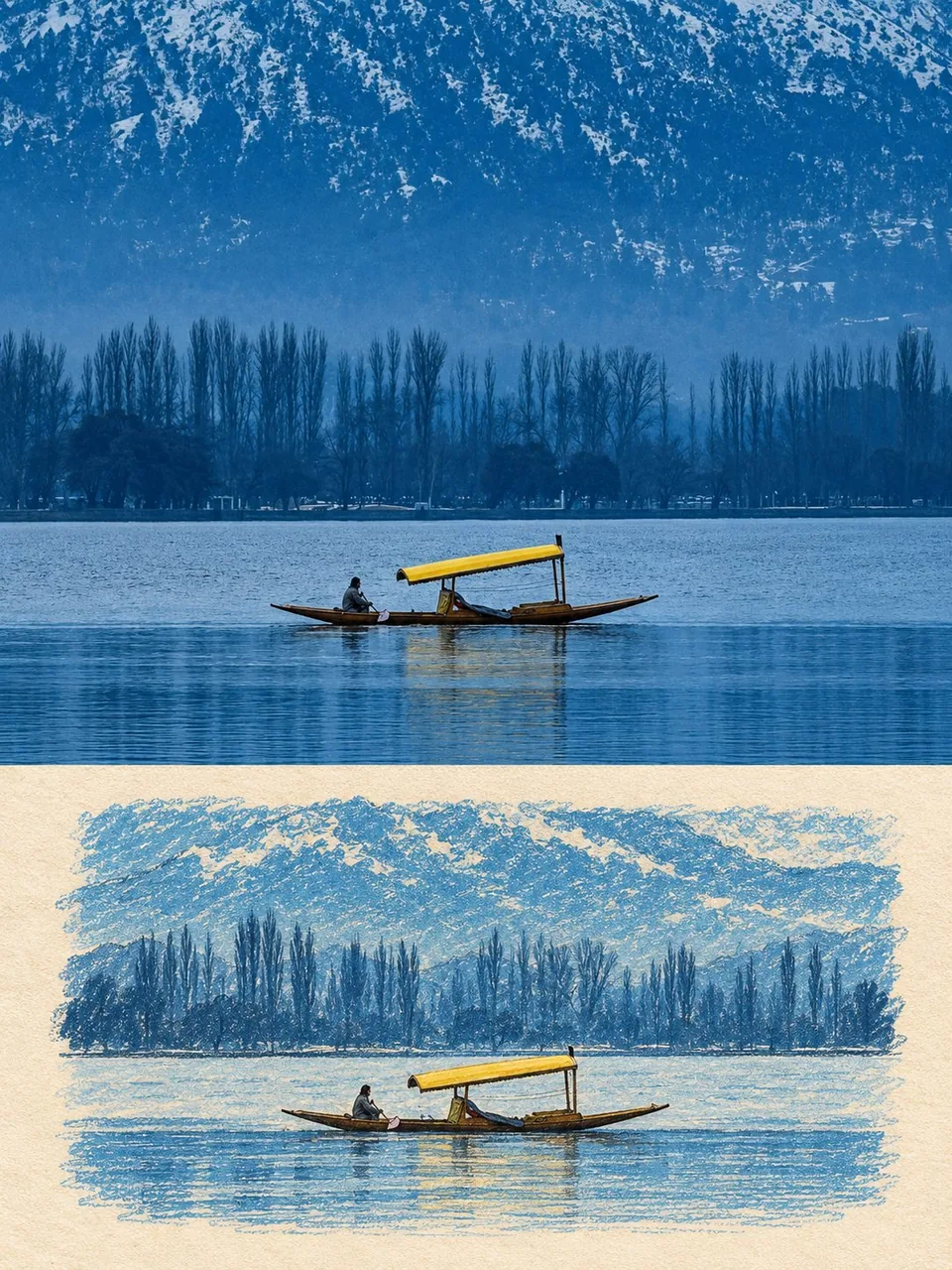
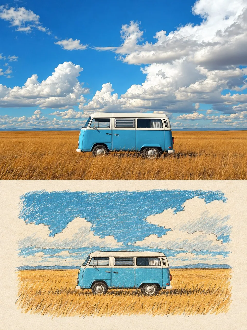
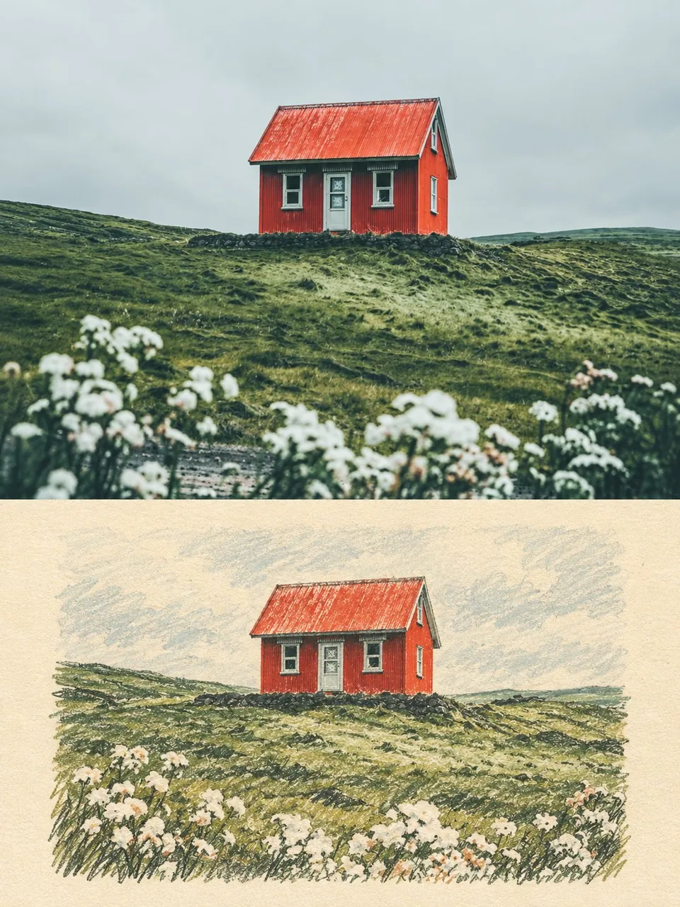
프롬프트
Use the uploaded photo as the only content source. Create a vertical 3:4 “real photo + minimal illustration” memory card based entirely on that image. Preserve the main subjects, subject count, pose, viewpoint, spatial relationships, and overall scene logic. Do not redesign the source or add unrelated content.
Layout
Split the card into two horizontal sections, about 50% top and 50% bottom. The top half keeps the uploaded photo with photographic texture. Crop naturally to fit, but do not stretch, mirror, rearrange, or alter the main subjects. Keep natural lighting, real materials, and the original color mood, with subtle editorial grading. The lower half uses a warm ivory handmade-paper background and shows a centered horizontal illustration of the same scene. The illustration occupies about 63-67% of the lower width, with generous blank space around it.
Scene Translation
In the lower illustration, preserve the most recognizable subjects, major structures, important objects, viewpoint, depth, relative scale, and key positions from the source. Remove tiny clutter, fine photographic texture, reflections, and complex shadows. Simplify the scene into slightly awkward geometric color blocks and thin hand-drawn lines. People and animals, when present, remain identifiable through silhouette, pose, hair or fur shape, clothing color, and placement, but facial detail may be reduced. Outlines may wobble, break, shift, or misalign slightly while the scene stays recognizable.
Illustration Style
Use restrained naive editorial drawing with soft geometric simplification and handmade quality. Combine thin sketchy linework with flat shapes. The lower scene should feel calm, clean, slightly imperfect, and visually reduced rather than technically precise. Avoid realistic rendering.
Color
Extract 4-6 representative colors from the uploaded photo and reinterpret them as a soft low-saturation palette. Use muted tones derived from the source, with flat fills and enough contrast to separate major subjects and scene layers. No complex gradients, glossy highlights, or heavy 3D modeling.
Texture
Blend crayon, pastel, screen-print, and old-book illustration qualities. Keep paper show-through, fine grain, slight pigment unevenness, worn edges, and subtle off-register shifts. The result should feel like an independent editorial illustration printed on aged paper: warm, quiet, nostalgic, and collectible.
Typography
Below the illustration, you may include exactly two short English lines related to the scene, mood, place, or moment. Use a small vintage serif font, left-aligned. If clean readable text cannot be rendered, leave the area blank. No other readable text.
Cleanup
Remove phone UI, subtitles, screenshot traces, and interface elements when present. Do not invent missing scenery or decorative props.
Negative
No major layout change, no added or missing primary subjects, no photoreal painting, no polished watercolor, no anime, no manga, no vector clip-art, no oil paint, no impasto, no 3D, no logo, no watermark, no black border, no UI, no unrelated decoration.
Vertical 3:4 split card · photo top / naive illustration bottom · aged paper texture
한국어 번역
업로드한 사진을 유일한 콘텐츠 소스로 사용한다. 그 이미지에만 기반해 세로 3:4 “실사 사진 + 미니멀 일러스트” 메모리 카드를 만든다. 주요 피사체, 피사체 수, 포즈, 시점, 공간 관계, 전체 장면 논리를 유지한다. 원본을 재설계하거나 무관한 콘텐츠를 추가하지 않는다.
레이아웃
카드를 위아래 두 개의 수평 구역으로 나누고, 위 약 50%, 아래 약 50%로 한다. 상단 절반은 업로드한 사진을 사진 질감 그대로 유지한다. 자연스럽게 맞게 크롭하되, 주요 피사체를 늘리거나, 반전하거나, 재배열하거나, 변형하지 않는다. 자연광, 실제 재질감, 원래 색 분위기를 유지하고 은은한 editorial 그레이딩을 더한다. 하단 절반은 따뜻한 아이보리 수제 종이 배경을 사용하고 같은 장면의 중앙 정렬된 가로형 일러스트를 보여준다. 일러스트는 하단 폭의 약 63-67%를 차지하고 주위에 넉넉한 여백을 둔다.
장면 번역
하단 일러스트에서는 원본에서 가장 알아보기 쉬운 피사체, 주요 구조물, 중요한 사물, 시점, 깊이, 상대적 크기, 핵심 위치를 유지한다. 자잘한 잡동사니, 미세한 사진 질감, 반사, 복잡한 그림자는 제거한다. 장면을 다소 어설픈 기하학적 색면과 가는 손그림 선으로 단순화한다. 사람과 동물이 있을 경우 실루엣, 포즈, 머리카락이나 털 형태, 의상 색, 위치로 식별 가능하게 남기되 얼굴 디테일은 줄여도 된다. 윤곽선은 흔들리거나, 끊기거나, 밀리거나, 약간 어긋나도 장면은 알아볼 수 있어야 한다.
일러스트 스타일
절제된 순박한 editorial 드로잉에 부드러운 기하학적 단순화와 수작업 감성을 사용한다. 가는 스케치 선과 평면 도형을 결합한다. 하단 장면은 기술적으로 정밀하기보다 차분하고, 깨끗하고, 약간 불완전하고, 시각적으로 축약된 느낌이어야 한다. 사실적 렌더링을 피한다.
색상
업로드한 사진에서 대표 색상 4-6개를 추출해 부드러운 저채도 팔레트로 재해석한다. 원본에서 비롯된 차분한 톤을 사용하고, 평면 채색과 주요 피사체 및 장면 레이어를 구분할 만큼의 대비를 확보한다. 복잡한 그라데이션, 광택 하이라이트, 무거운 3D 모델링은 쓰지 않는다.
질감
크레용, 파스텔, 실크스크린, 오래된 책 삽화의 특성을 섞는다. 종이 비침, 고운 입자, 약간의 안료 불균일, 닳은 가장자리, 은은한 인쇄 어긋남을 남긴다. 결과물은 오래된 종이에 인쇄한 독립 editorial 일러스트처럼 느껴져야 한다: 따뜻하고, 고요하고, 향수 어리고, 소장하고 싶은.
타이포그래피
일러스트 아래에 장면, 분위기, 장소 또는 순간과 관련된 짧은 영어 두 줄을 정확히 두 줄까지만 넣을 수 있다. 작은 빈티지 세리프 서체를 왼쪽 정렬로 사용한다. 깨끗하고 읽을 수 있는 텍스트를 렌더링할 수 없다면 그 영역을 비워 둔다. 다른 판독 가능한 텍스트는 넣지 않는다.
정리
휴대폰 UI, 자막, 스크린샷 흔적, 인터페이스 요소가 있으면 제거한다. 없는 풍경이나 장식 소품을 지어내지 않는다.
네거티브
큰 레이아웃 변경 없음, 주요 피사체 추가나 누락 없음, 사실적 회화 없음, 매끈한 수채화 없음, 애니메 없음, 만화 없음, 벡터 클립아트 없음, 유화 없음, 임파스토 없음, 3D 없음, 로고 없음, 워터마크 없음, 검은 테두리 없음, UI 없음, 무관한 장식 없음.
세로 3:4 분할 카드 · 상단 사진 / 하단 순박한 일러스트 · 오래된 종이 질감
출처
- 원작자
- harboriis
- 게시일
- 2026-09-28
- 원문 출처
- 원문 보기 ↗
- 수록 출처
- xianyu110/awesome-gpt-image2.5 · 2104455859447501166 · MIT