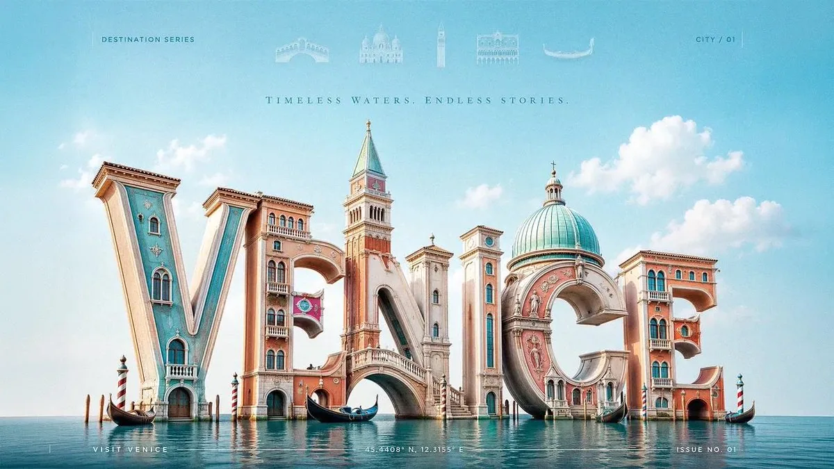
Create a 3:2 premium 3D typography-based travel poster for [CITY], using luxury editorial destination advertising fused with realistic sculptural letterform architecture. The city name “[CITY]” must be the dominant subject, occupying most of the canvas. Build the letters as large, realistic, three-dimensional sculptural forms made from glossy painted material, polished ceramic, soft plaster, carved stone, sunlit architectural surfaces, or city-adaptive materials. Each letter should physically transform into the city’s identity: landmarks, skyline silhouettes, arches, towers, domes, bridges, windows, balconies, cultural patterns, coastal forms, or street details must grow directly out of the letterforms. Landmarks should feel architecturally integrated, not pasted behind or around the word. A tower may rise from a vertical stem, a bridge may connect two letters, a dome may form the curve of a rounded letter, rooftops may shape the top edges, and windows or ornamental details may be embedded into the letter faces. Use a low-angle three-quarter camera view so the typography feels monumental, cinematic, premium, and friendly. Place the 3D city-name sculpture slightly low in the frame, filling the central and lower portions of the poster, with generous negative space above. At the top header, add a refined horizontal row of faded landmark symbols related to the city: tiny vector icons, or translucent architectural glyphs. Keep them very soft, elegant, and secondary, like premium magazine header details. Add each landmark name below its icon. Keep all faded and premium. Remove any visible sun from the top-left corner. Use bright natural daylight with a soft key light from the upper-left, gentle fill light, clean highlights, subtle ambient occlusion, and soft contact shadows beneath the letters. The lighting should feel cheerful, fresh, and editorial, not dark or overly cinematic. Use a bright city-adaptive palette based on [CITY]: coastal cities use aqua, coral, cream, and sunny yellow; historic cities use warm stone, terracotta, olive, and soft sky blue; tropical cities use turquoise, mango, palm green, and white; mountain cities use alpine blue, meadow green, snow white, and golden warmth; nightlife cities use violet, cyan, peach, and amber. Keep colors clean, optimistic, premium, and controlled. Add subtle editorial text elements to improve the poster: small uppercase header text such as “DESTINATION SERIES”, a tiny location code like “CITY / 01”, delicate vertical divider lines, a minimal footer line such as “VISIT [CITY]”, and small microtype coordinates or issue number near the bottom edge. These text elements must remain quiet and secondary so the large 3D city name stays the hero. Background should be clean and spacious with a soft sky gradient, delicate clouds, or abstract color field only. Do not place extra landmarks in the background; all major city identity must come from the typography itself, except the faded symbolic header row. Style: premium editorial travel advertising, luxury magazine cover, realistic 3D typographic sculpture, bright modern optimism, cheerful wanderlust, cultural identity, clean art direction. Negative prompt: avoid generic travel posters, separate landmark collages, landmarks pasted behind text, flat typography, cluttered backgrounds, visible sun in the top-left corner, excessive icons, dark cinematic lighting, muddy colors, cheap souvenir aesthetics, unreadable city name, distorted letters, random gradients, noisy textures, stock-template layouts, and overdecorated tourist graphics.
한국어 번역
3:2 비율의 프리미엄 3D 타이포그래피 기반 여행 포스터를 [CITY]를 위해 제작하세요. 럭셔리 에디토리얼 여행지 광고와 사실적인 조형 레터폼 건축을 융합한 스타일입니다. 도시 이름 “[CITY]”가 압도적인 주제가 되어 캔버스의 대부분을 차지해야 합니다. 글자를 크고 사실적인 입체 조형 형태로 만들되, 광택이 나는 도장 재료, 연마된 세라믹, 부드러운 석고, 조각된 석재, 햇빛을 받는 건축 표면 또는 도시에 맞는 재료를 사용하세요. 각 글자는 도시의 정체성으로 물리적으로 변형되어야 합니다: 랜드마크, 스카이라인 실루엣, 아치, 탑, 돔, 다리, 창문, 발코니, 문화적 패턴, 해안 형태, 거리 디테일이 레터폼에서 직접 자라나야 합니다. 랜드마크는 단어 뒤나 주위에 붙여 넣은 것이 아니라 건축적으로 통합된 느낌이어야 합니다. 탑은 수직 기둥에서 솟아오르고, 다리는 두 글자를 연결하고, 돔은 둥근 글자의 곡선을 이루고, 지붕은 상단 가장자리를 형성하며, 창문이나 장식적 디테일은 글자 면에 새겨질 수 있습니다. 낮은 앵글의 3/4 카메라 뷰를 사용해 타이포그래피가 기념비적이고 시네마틱하며 프리미엄하고 친근하게 느껴지도록 하세요. 3D 도시 이름 조형물을 프레임에서 약간 낮게 배치해 포스터의 중앙과 하단을 채우고, 위쪽에는 넉넉한 여백을 두세요. 상단 헤더에는 도시와 관련된 흐릿한 랜드마크 심볼을 세련된 가로 한 줄로 추가하세요: 아주 작은 벡터 아이콘 또는 반투명 건축 글리프. 매우 부드럽고 우아하며 부차적인 요소로 유지해, 프리미엄 잡지 헤더 디테일처럼 보이게 하세요. 각 랜드마크 이름을 아이콘 아래에 추가하세요. 모두 흐릿하고 프리미엄하게 유지하세요. 왼쪽 상단 모서리에 보이는 태양은 제거하세요. 밝은 자연 주광과 왼쪽 상단에서 오는 부드러운 키 라이트, 은은한 필 라이트, 깨끗한 하이라이트, 미세한 앰비언트 오클루전, 글자 아래의 부드러운 접촉 그림자를 사용하세요. 조명은 어둡거나 과도하게 시네마틱하지 않고 밝고 산뜻하며 에디토리얼하게 느껴져야 합니다. [CITY]에 기반한 밝은 도시 적응형 팔레트를 사용하세요: 해안 도시는 아쿠아, 코랄, 크림, 햇살 같은 노랑을 사용하고, 역사 도시는 따뜻한 석재, 테라코타, 올리브, 부드러운 하늘색을, 열대 도시는 터키석, 망고, 야자수 초록, 흰색을, 산악 도시는 알파인 블루, 초원 초록, 설백, 황금빛 따뜻함을, 나이트라이프 도시는 바이올렛, 시안, 피치, 앰버를 사용합니다. 색상은 깨끗하고 낙관적이며 프리미엄하고 절제되게 유지하세요. 포스터를 개선할 미세한 에디토리얼 텍스트 요소를 추가하세요: “DESTINATION SERIES”와 같은 작은 대문자 헤더 텍스트, “CITY / 01” 같은 작은 위치 코드, 섬세한 세로 구분선, “VISIT [CITY]” 같은 미니멀한 푸터 문구, 하단 가장자리 근처의 작은 마이크로타이프 좌표나 호수 번호. 이러한 텍스트 요소는 조용하고 부차적으로 남아 커다란 3D 도시 이름이 주인공이 되도록 하세요. 배경은 부드러운 하늘 그라데이션, 섬세한 구름 또는 추상 색면만으로 깔끔하고 여유롭게 구성하세요. 배경에 추가 랜드마크를 배치하지 마세요. 흐릿한 상징적 헤더 행을 제외하고 모든 주요 도시 정체성은 타이포그래피 자체에서 나와야 합니다. 스타일: 프리미엄 에디토리얼 여행 광고, 럭셔리 잡지 커버, 사실적 3D 타이포그래피 조형, 밝고 현대적인 낙관주의, 즐거운 방랑벽, 문화적 정체성, 깔끔한 아트 디렉션. 네거티브 프롬프트: 흔한 여행 포스터, 분리된 랜드마크 콜라주, 텍스트 뒤에 붙여 넣은 랜드마크, 평면 타이포그래피, 어수선한 배경, 왼쪽 상단 모서리의 보이는 태양, 과도한 아이콘, 어두운 시네마틱 조명, 탁한 색상, 저렴한 기념품 미학, 읽을 수 없는 도시 이름, 왜곡된 글자, 무작위 그라데이션, 노이즈 많은 텍스처, 스톡 템플릿 레이아웃, 과도하게 장식된 관광 그래픽은 피하세요.