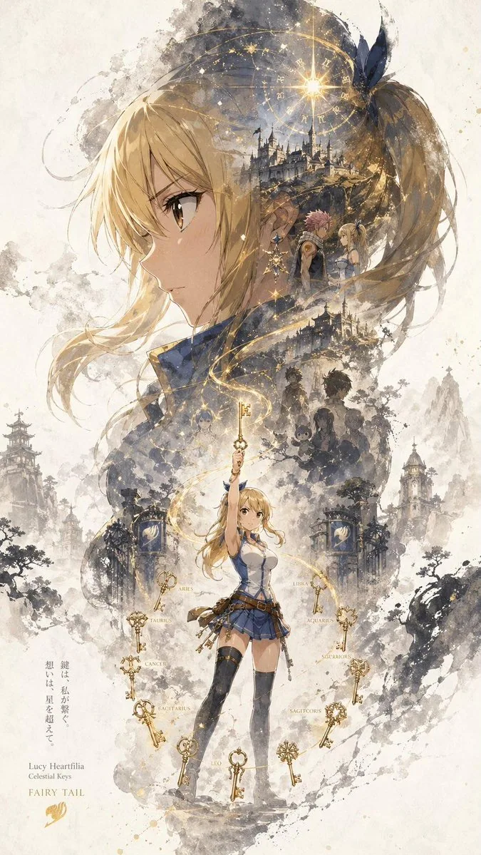
A character promotional poster titled “INPUT NAME,” designed in a unified vertical key visual composition (9:16). The upper half features the most recognizable element of the character as a dominant oversized visual silhouette. The middle to lower section contains the full character as a secondary subject. Inside the large silhouette and around the character, use a double-exposure and collage-style narrative composition with scenes, symbolic imagery, supporting elements, and environmental details blended into mist, ink wash, and negative space. The left and right sides include complementary secondary elements to create narrative tension and spatial variation. A continuous flowing visual line runs from top to bottom, connecting the main character, internal collage, and the large upper silhouette. Preserve large areas of negative space with ink diffusion, soft blurring, and fragmented transitions inspired by Eastern aesthetics. The style is cohesive, refined, restrained, and poster-worthy.
한국어 번역
“INPUT NAME”이라는 제목의 캐릭터 홍보 포스터로, 통일된 세로형 키 비주얼 구도(9:16)로 디자인한다. 상단 절반에는 캐릭터의 가장 알아보기 쉬운 요소를 압도적인 대형 실루엣 비주얼로 배치한다. 중단에서 하단 구간에는 캐릭터 전체를 보조 피사체로 담는다. 큰 실루엣 내부와 캐릭터 주변에는 이중 노출과 콜라주 스타일의 서사적 구성을 사용하여 장면, 상징적 이미지, 보조 요소, 환경 디테일을 안개, 수묵, 여백에 녹여낸다. 좌우 양쪽에는 보완적인 보조 요소를 배치하여 서사적 긴장감과 공간적 변화를 만든다. 위에서 아래로 이어지는 연속적인 흐르는 시각적 선이 메인 캐릭터, 내부 콜라주, 상단의 대형 실루엣을 연결한다. 동양적 미학에서 영감을 받은 잉크 번짐, 부드러운 블러, 파편화된 전환으로 넓은 여백을 유지한다. 스타일은 응집력 있고 세련되며 절제되어 있어 포스터로 손색이 없다.