GPT Image 2 펜 포스터 프롬프트: 잉크 폴드 패스
고급 만년필 포스터를 창작하기 위한 프롬프트로, Z자형으로 접힌 종이 경로와 그 위를 흐르는 잉크가 특징이며, 특정한 빛과 그림자 및 구도 디테일을 담고 있습니다.
프롬프트
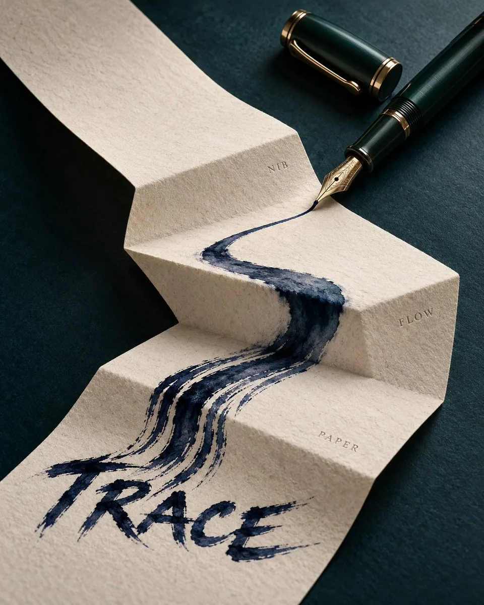
Create a 4:5 vertical premium fountain pen promotional poster, with the core composition being "Ink Fold Path." A dark ink-green metallic fountain pen is placed diagonally from the top right to the bottom left of the frame, with the cap open and parallel in the top right corner, and the gold nib positioned in the center. Below the pen is a continuous sheet of warm white cotton paper, entering from the top left and undergoing three wide folds to form a high-to-low Z-shaped paper path, with realistic fold thickness, fibers, and soft shadows.

A deep blue-black ink flow starts from the nib and moves strictly along the center of the paper path. The ink begins as a thin line in the first segment, spreads into broad strokes in the second fold, splits into several parallel dry brush marks in the third fold, and finally converges into the clear word "TRACE" in the bottom left. The text must be formed naturally by the same ink flow, without adding computer fonts. The ink accumulates realistically and slightly penetrates at the creases but does not flow off the paper.

Only three tiny embossed coordinates are added on both sides of the paper path: NIB, FLOW, PAPER; no arrows or explanatory boxes. The background is a matte dark cyan tabletop, with a color palette limited to dark cyan, warm white, blue-black ink, and a touch of gold.

Use close-up still life photography, with soft light from the top right emphasizing the metal body, nib engraving, and paper fibers, while retaining deeper shadows in the bottom left. Full opaque rectangular background covering the canvas, no transparent corners, no Alpha masks, no edge feathering. No hands, no calligraphy scrolls, no ink splatters, no Eastern decorative patterns, no existing brand logos, no watermarks.
한국어 번역
4:5 세로형 프리미엄 만년필 홍보 포스터를 제작하세요. 핵심 구성은 "잉크 폴드 패스"입니다. 짙은 잉크 그린 색상의 금속 만년필이 화면 오른쪽 위에서 왼쪽 아래로 대각선으로 놓여 있고, 뚜껑은 열린 채 오른쪽 위 모서리에 나란히 있으며, 금색 닙은 중앙에 위치합니다. 펜 아래에는 따뜻한 흰색 면 종이 한 장이 이어져 왼쪽 위에서 들어와 세 번의 넓은 접힘을 거치며 높은 곳에서 낮은 곳으로 이어지는 Z자형 종이 경로를 만듭니다. 접힘의 두께, 섬유질, 부드러운 그림자가 사실적으로 표현됩니다.

짙은 청흑색 잉크 흐름이 닙에서 시작하여 종이 경로의 중심을 따라 엄격하게 이동합니다. 잉크는 첫 번째 구간에서 가는 선으로 시작하고, 두 번째 접힘에서 넓은 붓터치로 퍼지며, 세 번째 접힘에서 여러 개의 평행한 드라이 브러시 자국으로 갈라진 뒤 마지막에는 왼쪽 아래에서 선명한 단어 "TRACE"로 모입니다. 텍스트는 반드시 동일한 잉크 흐름에 의해 자연스럽게 형성되어야 하며, 컴퓨터 폰트를 추가해서는 안 됩니다. 잉크는 사실적으로 고이며 접힌 자국에서 약간 스며들지만 종이 밖으로 흘러나오지 않습니다.

종이 경로 양옆에는 아주 작은 양각 좌표 세 개만 추가합니다: NIB, FLOW, PAPER. 화살표나 설명 상자는 없습니다. 배경은 매트한 짙은 청록색 탁자 상판이며, 색상 팔레트는 짙은 청록, 따뜻한 흰색, 청흑색 잉크, 그리고 약간의 금색으로 제한됩니다.

클로즈업 정물 사진을 사용하고, 오른쪽 위에서 오는 부드러운 빛으로 금속 몸체, 닙 각인, 종이 섬유를 강조하며 왼쪽 아래에는 더 깊은 그림자를 남깁니다. 캔버스를 덮는 완전 불투명한 직사각형 배경, 투명한 모서리 없음, 알파 마스크 없음, 가장자리 페더링 없음. 손 없음, 서예 두루마리 없음, 잉크 튄 자국 없음, 동양적 장식 문양 없음, 기존 브랜드 로고 없음, 워터마크 없음.
출처
- 원작자
- 蛋黄堡
- 게시일
- 2026-10-17
- 원문 출처
- 원문 보기 ↗
- 수록 출처
- YouMind-OpenLab/awesome-gpt-image-2 · 36590 · CC-BY-4.0