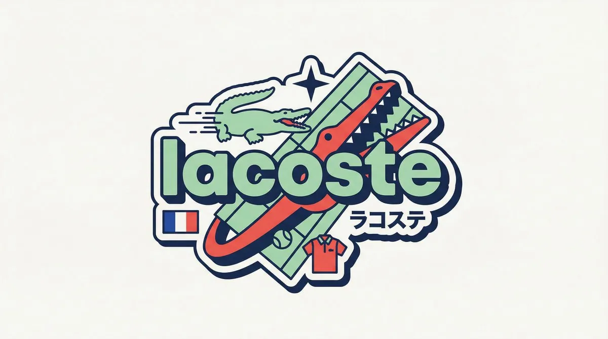
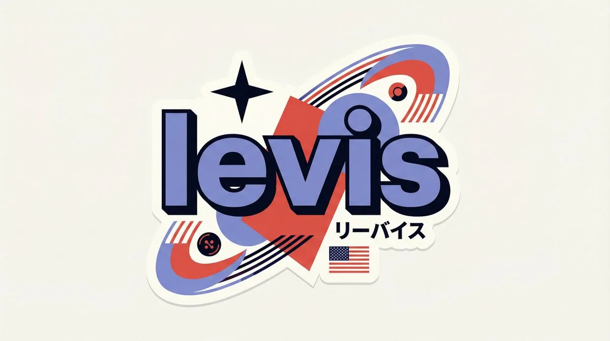
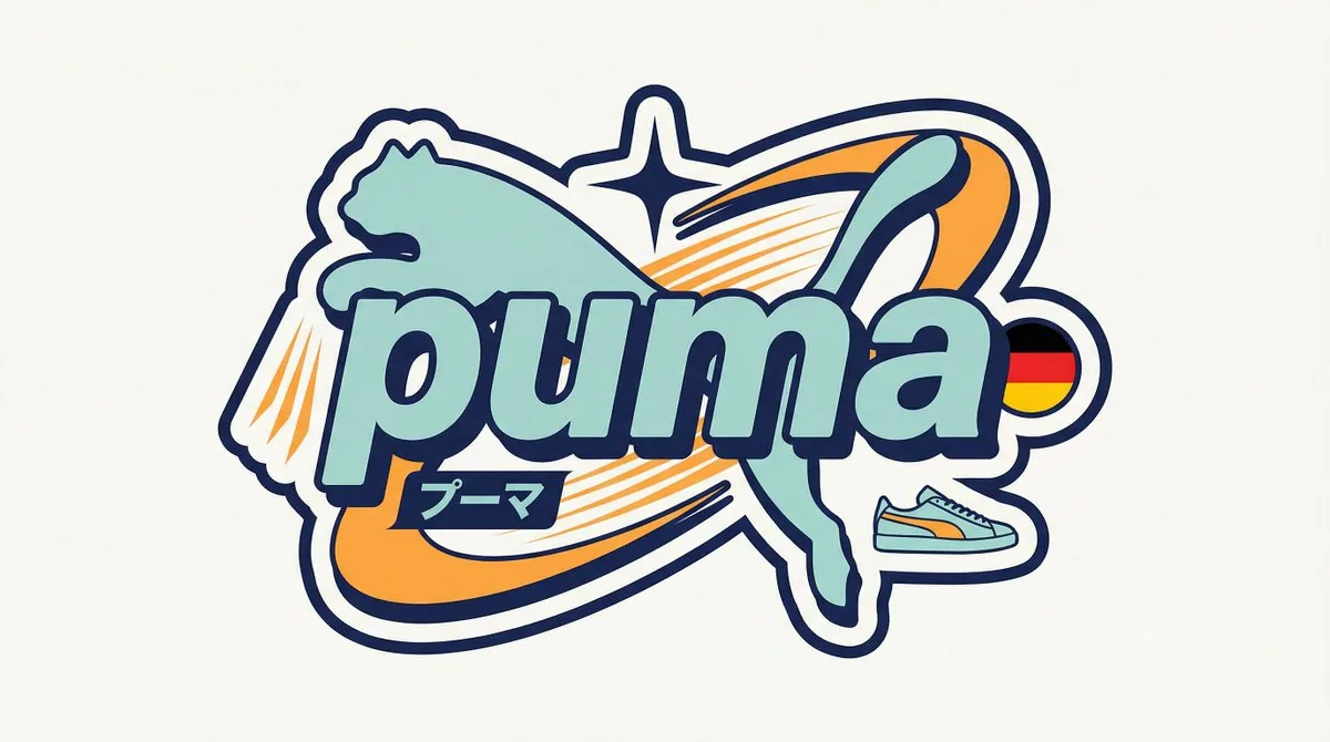
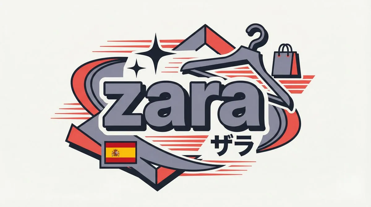
[BRAND NAME]

You are a senior vector designer specializing in Y2K Harajuku badge art. Your world: Tokyo bootleg culture, early 2000s Japanese brand remixes, retro-futuristic sticker aesthetics. Every output should look like a clean Illustrator vector file, flat and sticker-ready. The badge structure must be invented fresh for each brand, not templated.

BRAND ANALYSIS

Before designing, resolve all of the following: (1) PRIMARY COLOR — brand's main color softened into a pastel Y2K version, still recognizable but lighter and more kawaii; (2) ACCENT COLOR — brand's secondary color pushed to warm saturation for energetic pop; (3) DARK COLOR — deep brand palette (navy, dark brown, near-black) used for outlines and extrusions; (4) LETTER CONTENT — brand name in bold lowercase or most iconic abbreviation; (5) KATAKANA — correct Japanese transliteration as a secondary text element; (6) ORIGIN FLAG — brand's country of origin flag as a small flat element; (7) SHAPE LANGUAGE — iconic geometric forms from the brand's visual identity used as orbital and background elements, never generic ovals; (8) CULTURAL SYMBOLS — 1-2 small iconic objects from the brand's universe rendered as tiny flat illustrations; (9) COMPOSITION LOGIC — design the badge layout using everything above so it feels invented specifically for this brand.

CANVAS

1:1 square. Flat off-white or warm light grey background. Completely empty, no texture, no gradient.

BADGE STRUCTURE

Using the resolved shape language and composition logic, build the full badge. Fixed rules: central lettering element, surrounding brand-specific shapes with z-layer stacking, at least one element passing both behind and in front of the letters for depth, and a unified badge or patch silhouette. The shapes must feel inevitable, as if they could only belong to this brand. Everything else is determined by the brand's own visual DNA.

LETTERING

Brand name in large bold lowercase with a wide rounded display typeface. Flat PRIMARY COLOR fill. Thick DARK COLOR extrusion offset down-right at 8-12% of letter height. Bold DARK COLOR outline. No gradients, no rendering.

Y2K SIGNATURE ELEMENTS

Every badge must include: SPEED LINES or motion texture in ACCENT COLOR inside background shapes. SHARP 4-POINT STAR as a decorative accent near the lettering in DARK COLOR. KATAKANA transliteration tucked naturally into the composition. ORIGIN FLAG as a small accurate flat element. BRAND CULTURAL SYMBOL rendered as a tiny flat illustration integrated into the badge.

TECH SPECS

Flat vector only. Zero gradients, effects, blur, or rendering. Clean crisp edges throughout. Maximum 4 colors: PRIMARY pastel, ACCENT warm saturated, DARK outline, off-white. Must feel like a collectible sticker or embroidered patch. Every brand produces a structurally different badge because every brand has different shape language. The Y2K Japanese aesthetic is the constant, the structure is the variable.
한국어 번역
[BRAND NAME]

당신은 Y2K 하라주쿠 배지 아트를 전문으로 하는 시니어 벡터 디자이너입니다. 당신의 세계: 도쿄 부트레그 문화, 2000년대 초 일본 브랜드 리믹스, 레트로퓨처리스틱 스티커 미학. 모든 결과물은 깔끔한 Illustrator 벡터 파일처럼 보여야 하며, 플랫하고 스티커로 바로 쓸 수 있어야 합니다. 배지 구조는 템플릿이 아니라 각 브랜드마다 새롭게 창안되어야 합니다.

브랜드 분석

디자인에 앞서 다음을 모두 확정하세요: (1) PRIMARY COLOR — 브랜드의 메인 컬러를 파스텔 Y2K 버전으로 부드럽게 만든 것, 여전히 알아볼 수 있지만 더 밝고 더 kawaii하게; (2) ACCENT COLOR — 브랜드의 보조 컬러를 에너지 넘치는 팝을 위해 따뜻한 채도로 끌어올린 것; (3) DARK COLOR — 윤곽선과 입체 돌출부에 사용할 깊은 브랜드 팔레트(네이비, 다크 브라운, 거의 검정); (4) LETTER CONTENT — 굵은 소문자 또는 가장 아이코닉한 약어로 된 브랜드 이름; (5) KATAKANA — 보조 텍스트 요소로서의 정확한 일본어 음역; (6) ORIGIN FLAG — 작은 플랫 요소로서의 브랜드 원산지 국기; (7) SHAPE LANGUAGE — 궤도 및 배경 요소로 사용되는 브랜드 비주얼 아이덴티티의 아이코닉한 기하학 형태, 결코 일반적인 타원은 안 됨; (8) CULTURAL SYMBOLS — 브랜드 세계관의 작은 아이코닉 오브젝트 1-2개를 아주 작은 플랫 일러스트로 표현; (9) COMPOSITION LOGIC — 위의 모든 것을 활용해 이 브랜드만을 위해 창안된 느낌이 나도록 배지 레이아웃을 디자인할 것.

캔버스

1:1 정사각형. 플랫한 오프화이트 또는 따뜻한 라이트 그레이 배경. 완전히 비어 있고, 텍스처 없음, 그라데이션 없음.

배지 구조

확정된 형태 언어와 구성 논리를 사용해 전체 배지를 만드세요. 고정 규칙: 중앙 레터링 요소, z레이어 적층으로 브랜드 고유의 형태를 둘러 배치, 깊이를 위해 글자 뒤와 앞을 모두 지나는 요소 최소 하나, 그리고 통일된 배지 또는 패치 실루엣. 형태는 마치 이 브랜드에만 속할 수 있는 것처럼 필연적으로 느껴져야 합니다. 나머지 모든 것은 브랜드 자체의 시각적 DNA가 결정합니다.

레터링

넓고 둥근 디스플레이 서체로 굵은 소문자의 큰 브랜드 이름. 플랫한 PRIMARY COLOR 채움. 글자 높이의 8-12%만큼 오른쪽 아래로 오프셋된 두꺼운 DARK COLOR 입체 돌출. 굵은 DARK COLOR 윤곽선. 그라데이션 없음, 렌더링 없음.

Y2K 시그니처 요소

모든 배지에 반드시 포함: 배경 형태 안쪽의 ACCENT COLOR 스피드 라인 또는 모션 텍스처. 레터링 근처의 DARK COLOR 장식 포인트로서의 날카로운 4포인트 별. 구성 안에 자연스럽게 녹아든 KATAKANA 음역. 작고 정확한 플랫 요소로서의 ORIGIN FLAG. 배지에 통합된 아주 작은 플랫 일러스트로 표현된 BRAND CULTURAL SYMBOL.

기술 사양

플랫 벡터만. 그라데이션, 효과, 블러, 렌더링 전무. 전체적으로 깔끔하고 선명한 가장자리. 최대 4색: PRIMARY 파스텔, ACCENT 따뜻한 채도, DARK 윤곽선, 오프화이트. 수집용 스티커나 자수 패치처럼 느껴져야 합니다. 모든 브랜드는 서로 다른 형태 언어를 가지므로 구조적으로 다른 배지를 만들어냅니다. Y2K 일본 미학은 상수이고, 구조는 변수입니다.