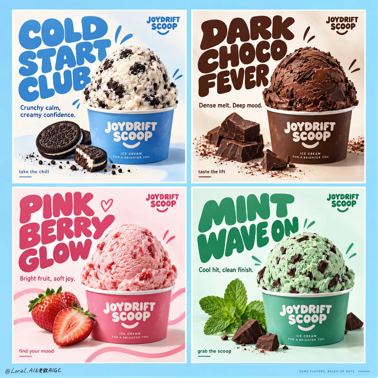
음료 맛 2×2 그리드 광고: flavor 변수만 교체
4칸 균등 분할, 동일한 컵 비율, 고정된 헤드라인 영역과 코너 마크, 흰색 거터 정렬——구조는 잠그고 맛 색상과 소품만 바꾼다. 시리즈 제품 포스터/FMCG 캠페인 보드에 그대로 응용 가능하며, 전체 영어 campaign prompt를 포함한다.
프롬프트
Create a premium commercial poster board for a fictional ice cream brand called JOYDRIFT SCOOP, redesigned into a unified four-panel campaign grid that merges Orbit-level commercial punch with Port-level curated restraint. The full composition is a strict 2x2 poster system on a soft sky-blue master background, with four equal rectangular panels, clean white gutters, perfect alignment, and a highly controlled visual rhythm. Each panel behaves like an individual flavor advertisement, but the whole page reads as one collectible brand campaign with stronger hierarchy, cleaner negative space, larger typography, fewer decorative distractions, and a more gallery-like sense of control. The ice cream remains the absolute hero in every panel.

The campaign concept is flavor as mood architecture. Each panel contains one centered or lower-centered hero scoop in a branded paper cup, oversized custom display typography, one concise support line, a few restrained doodle accents, and only the most essential ingredient props. Keep the composition bold, product-led, playful, and premium. Reduce unnecessary splash clutter and busy micro-elements; every graphic mark must support the scoop, not compete with it.

Panel system:
Top-left panel: cookies-and-cream scoop in a branded paper cup, cool blue-and-cream flavor world, minimal cookie crumb accents, campaign headline exactly: "COLD START CLUB". Support copy exactly: "Crunchy calm, creamy confidence."
Top-right panel: rich chocolate scoop in a branded cup with a few dark chocolate chunks and restrained cocoa accents, campaign headline exactly: "DARK CHOCO FEVER". Support copy exactly: "Dense melt. Deep mood."
Bottom-left panel: strawberry scoop in a branded cup with two or three clean fresh strawberry elements and restrained pink ribbon-like graphic curves, campaign headline exactly: "PINK BERRY GLOW". Support copy exactly: "Bright fruit, soft joy."
Bottom-right panel: mint chocolate scoop in a branded cup with crisp mint leaves and a few precise chocolate chip cues, campaign headline exactly: "MINT WAVE ON". Support copy exactly: "Cool hit, clean finish."

Brand design and typography: every panel includes a small consistent top-corner brand mark reading exactly: "JOYDRIFT SCOOP". Use large rounded custom display lettering with flavor-specific color shifts, thicker mass, tighter hierarchy, and stronger sculptural presence than before. Use a smaller clean sans-serif for support lines and tiny CTA microcopy such as "take the chill", "taste the lift", "find your mood", or "grab the scoop", but keep these sparse and secondary. Typography must behave as a graphic object integrated into the composition, wrapping around the scoop without touching the main product silhouette.

Product styling: ultra-real premium ice cream with believable scoop geometry, creamy micro-texture, gentle edge softness, realistic inclusions, minimal appetizing melt, and crisp branded cups. Cookies-and-cream shows visible cookie chunks in cool white cream; chocolate feels velvety, dense, and dark; strawberry feels airy, fruit-forward, and luminous; mint feels cool, fresh, and slightly sharper in texture with chocolate fragments. The scoops must feel physically convincing and highly edible, with no collapse, over-melt, or messy drips.

Color system: each panel operates as its own controlled flavor universe while the whole board remains harmonized. Use a refined 60/30/10 balance inside each quadrant: dominant flavor hue, white/cream support, and one accent note. Across the full four-panel board, maintain a candy-clean campaign palette built from sky blue, cream white, cocoa brown, berry pink, and mint green, with the overall master background tying the set together. The image should feel brighter, more premium, and more curated than a typical FMCG flavor poster sheet.

Lighting and finish: bright studio-commercial lighting with soft frontal fill, subtle top highlights on each scoop, gentle shadow grounding under the cups, clean white handling inside the panels, and extremely polished product retouching. Show creamy micro-texture, matte paper cup print, fresh mint leaf surfaces, glossy berry freshness, and crisp chocolate edges. The final image should feel like a Cannes-level FMCG campaign: playful yet disciplined, tactile yet clean, youthful yet art-directed.

Output and constraints: one complete four-panel ice cream campaign board, product-first, highly graphic, clean luxury execution, no people, no extra unrelated props, no copied original poster text, no real brand names, no cluttered doodle overload, no broken grid alignment, no unreadable text, no malformed scoops, no duplicated ingredients, no warped cups, no muddy colors, no messy drips, no cheap clip-art feel, no AI text gibberish, and no style drift between panels.
한국어 번역
JOYDRIFT SCOOP이라는 가상 아이스크림 브랜드를 위한 프리미엄 상업용 포스터 보드를 제작하세요. Orbit급의 상업적 타격감과 Port급의 큐레이션된 절제를 결합한 통일된 4패널 캠페인 그리드로 재설계합니다. 전체 구도는 부드러운 하늘색 마스터 배경 위에 놓인 엄격한 2x2 포스터 시스템으로, 네 개의 동일한 직사각형 패널, 깔끔한 흰색 거터, 완벽한 정렬, 그리고 고도로 통제된 시각적 리듬을 갖춥니다. 각 패널은 개별 맛 광고처럼 작동하지만, 페이지 전체는 더 강한 위계, 더 깨끗한 네거티브 스페이스, 더 큰 타이포그래피, 더 적은 장식적 방해 요소, 더 갤러리 같은 통제감을 갖춘 하나의 수집하고 싶은 브랜드 캠페인으로 읽혀야 합니다. 아이스크림은 모든 패널에서 절대적인 주인공으로 남습니다.

캠페인 콘셉트는 맛을 분위기의 건축으로 보는 것입니다. 각 패널에는 브랜드 종이컵에 담긴 중앙 또는 하단 중앙의 히어로 스쿱 하나, 과장된 커스텀 디스플레이 타이포그래피, 간결한 서포트 문구 한 줄, 절제된 낙서 액센트 몇 개, 그리고 가장 필수적인 재료 소품만 담깁니다. 구도를 대담하고 제품 중심적이며 유쾌하고 프리미엄하게 유지하세요. 불필요한 스플래시 잡동사니와 복잡한 미세 요소를 줄이세요. 모든 그래픽 요소는 스쿱을 뒷받침해야 하며, 스쿱과 경쟁해서는 안 됩니다.

패널 시스템:
좌상단 패널: 브랜드 종이컵에 담긴 쿠키 앤 크림 스쿱, 시원한 블루 앤 크림 맛의 세계, 최소한의 쿠키 부스러기 액센트, 캠페인 헤드라인은 정확히: "COLD START CLUB". 서포트 카피는 정확히: "Crunchy calm, creamy confidence."
우상단 패널: 브랜드 컵에 담긴 진한 초콜릿 스쿱과 다크 초콜릿 청크 몇 조각, 절제된 코코아 액센트, 캠페인 헤드라인은 정확히: "DARK CHOCO FEVER". 서포트 카피는 정확히: "Dense melt. Deep mood."
좌하단 패널: 브랜드 컵에 담긴 딸기 스쿱과 깔끔하고 신선한 딸기 요소 두세 개, 절제된 분홍 리본 모양 그래픽 곡선, 캠페인 헤드라인은 정확히: "PINK BERRY GLOW". 서포트 카피는 정확히: "Bright fruit, soft joy."
우하단 패널: 브랜드 컵에 담긴 민트 초콜릿 스쿱과 선명한 민트 잎, 정교한 초콜릿 칩 큐 몇 개, 캠페인 헤드라인은 정확히: "MINT WAVE ON". 서포트 카피는 정확히: "Cool hit, clean finish."

브랜드 디자인과 타이포그래피: 모든 패널에는 정확히 "JOYDRIFT SCOOP"이라고 적힌 작고 일관된 상단 코너 브랜드 마크가 포함됩니다. 크고 둥근 커스텀 디스플레이 레터링을 사용하되, 맛별 색상 변화, 더 두꺼운 매스, 더 타이트한 위계, 이전보다 더 강한 조형적 존재감을 담으세요. 서포트 라인과 "take the chill", "taste the lift", "find your mood", "grab the scoop" 같은 아주 작은 CTA 마이크로카피에는 더 작고 깔끔한 산세리프를 사용하되, 이런 요소는 드물고 부차적으로 유지하세요. 타이포그래피는 구도에 통합된 하나의 그래픽 오브제로 작동해야 하며, 주요 제품 실루엣에 닿지 않으면서 스쿱 주위를 감싸야 합니다.

제품 스타일링: 사실적인 스쿱 형태, 크리미한 미세 질감, 부드러운 가장자리, 사실적인 인클루전, 최소한의 먹음직스러운 녹음, 선명한 브랜드 컵을 갖춘 초현실적 프리미엄 아이스크림. 쿠키 앤 크림은 시원한 흰 크림 속에 보이는 쿠키 조각을 보여주고, 초콜릿은 벨벳처럼 진하고 밀도 있게, 딸기는 가볍고 과일감이 앞서며 빛나게, 민트는 초콜릿 조각과 함께 시원하고 상쾌하며 질감이 약간 더 날카롭게 느껴져야 합니다. 스쿱은 물리적으로 설득력 있고 매우 먹음직스러워야 하며, 무너짐이나 과한 녹음, 지저분한 흘러내림이 없어야 합니다.

색상 시스템: 각 패널은 자체적으로 통제된 맛의 세계로 작동하면서도 보드 전체는 조화를 이룹니다. 각 사분면 안에서 정제된 60/30/10 균형을 사용하세요: 지배적인 맛 색상, 흰색/크림 서포트, 그리고 액센트 하나. 4패널 보드 전체에서는 하늘색, 크림 화이트, 코코아 브라운, 베리 핑크, 민트 그린으로 구성된 캔디처럼 깨끗한 캠페인 팔레트를 유지하고, 전체 마스터 배경이 세트를 하나로 묶어줍니다. 이미지는 일반적인 FMCG 맛 포스터 시트보다 더 밝고 프리미엄하며 큐레이션된 느낌이어야 합니다.

조명과 마감: 부드러운 정면 필이 있는 밝은 스튜디오 상업 조명, 각 스쿱의 은은한 상단 하이라이트, 컵 아래를 고정하는 부드러운 그림자, 패널 내부의 깔끔한 흰색 처리, 극도로 정교한 제품 리터칭. 크리미한 미세 질감, 매트한 종이컵 인쇄, 신선한 민트 잎 표면, 윤기 나는 베리 신선함, 선명한 초콜릿 가장자리를 보여주세요. 최종 이미지는 칸 수준의 FMCG 캠페인처럼 느껴져야 합니다: 유쾌하지만 절제되고, 촉각적이지만 깔끔하며, 젊지만 아트 디렉션이 살아 있는.

출력 및 제약: 완성된 4패널 아이스크림 캠페인 보드 하나, 제품 우선, 강한 그래픽성, 깔끔한 럭셔리 실행, 사람 없음, 무관한 추가 소품 없음, 원본 포스터 텍스트 복사 없음, 실제 브랜드 이름 없음, 어수선한 낙서 과다 없음, 그리드 정렬 깨짐 없음, 읽을 수 없는 텍스트 없음, 형태가 잘못된 스쿱 없음, 중복 재료 없음, 뒤틀린 컵 없음, 탁한 색 없음, 지저분한 흘러내림 없음, 싸구려 클립아트 느낌 없음, AI 텍스트 횡설수설 없음, 패널 간 스타일 이탈 없음.
출처
- 원작자
- ou_zhen599
- 게시일
- 2026-09-17
- 원문 출처
- 원문 보기 ↗
- 수록 출처
- xianyu110/awesome-gpt-image2.5 · 2100525164324913662 · MIT