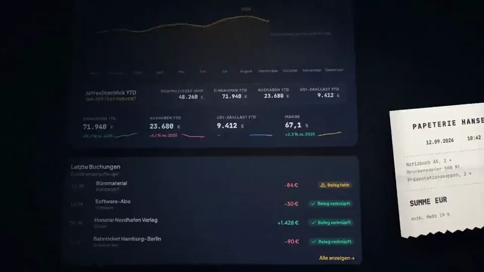
claude code (opus 5.5) made the product film for taxtello, my bookkeeping app

every frame is code: react + remotion, 0 after effects
the soundtrack is code too, synthesized in python from sine waves and noise

1 prompt and 2 rounds of feedback

full prompt below, steal it ↓

You are the senior motion designer, product designer and Remotion engineer for Taxtello.

Your task is to create a genuinely premium, Apple-level product film for Taxtello.

This is NOT a generic SaaS explainer.
This is NOT a feature walkthrough.
This is NOT a startup template animation.

I want a maximum 15-second brand/product showreel that makes Taxtello look like a mature, expensive, beautifully designed financial product.

Think:

Apple product launch film
× premium fintech
× editorial motion design
× restrained Stripe-like product presentation
× Taxtello's own visual identity

The desired reaction is:

“Wait, this is a German bookkeeping app?”

The film should feel expensive.

────────────────────────────────────
REPO / SOURCE OF TRUTH
────────────────────────────────────

First inspect the real repositories before designing anything.

Main product:
  /taxtello/main

Existing Remotion project:
  /taxtello/beta-motion

Important real brand sources:

  /taxtello/main/public/css/app/_00-tokens.css
  /taxtello/main/docs/design/TOKENS.md
  /taxtello/main/public/taxtello-wordmark.png
  /taxtello/main/public/icons.svg

Existing current product screenshots can be found under:

  /taxtello/main/artifacts/smoke-ui-smoke/

Prefer the newest valid screenshots/current source over stale artifacts.

There is already an existing 24-second Remotion hero animation in
/taxtello/beta-motion.

DO NOT replace it.
DO NOT regress it.
DO NOT force its current AI-connections storyline into this new film.

Create a new independent composition for this task, e.g.

  TaxtelloShowreel15

You may reuse good infrastructure, fonts, rendering utilities, motion primitives,
easing curves, asset loading and QA infrastructure from beta-motion where useful.

But creatively this should be a new film.

Before implementation, inspect the actual Taxtello UI and understand the product.

Do not invent functionality that does not exist.

────────────────────────────────────
REAL TAXTELLO VISUAL LANGUAGE
────────────────────────────────────

Use the real design system.

Core palette:

Background:
  #0c0f1a

Elevated surfaces:
  #111525
  #131722
  #1a2032

Primary brand gold:
  #e8b84b

Gold highlight:
  #f5d07a

Gold depth:
  #9b6d18

Primary text:
  #e8eaf2

Strong warm white:
  #f6f4eb

Secondary text:
  #8b93b5

Positive:
  #34d399

Negative/error only where semantically necessary:
  #f87171

Typography:
  Plus Jakarta Sans

Numbers / financial values where appropriate:
  JetBrains Mono

Use the actual Taxtello wordmark and/or Taxtello mark.
Do not redraw or approximate the logo.

Taxtello's gold should feel like a precious accent, not a yellow UI flood.

Think:
dark metal
warm gold
glass
ink
precision
quiet confidence

NOT:
cyberpunk
crypto
neon
gaming
generic AI purple
rainbow gradients

────────────────────────────────────
CORE CREATIVE RULES
────────────────────────────────────

Follow these rules ruthlessly:

1. ONE SHOT = ONE IDEA.

2. Every scene needs room to breathe.

3. The product UI is the hero.

4. Do not plaster explanatory copy everywhere.

5. Do not use hard cuts unless there is a deliberate reason.

6. Prefer object-driven transitions:
   a card becomes the next card,
   a chart line becomes a connector,
   a receipt becomes a booking,
   a number becomes another interface element,
   the camera moves through the product.

7. Use premium easing.
   No linear movement.

8. Motion should overlap naturally.
   Elements should not all start and stop at exactly the same frame.

9. Use depth sparingly:
   perspective,
   soft parallax,
   scale,
   foreground/background separation,
   controlled depth of field if achievable.

10. NO effect exists simply because it looks cool.

11. No particle spam.

12. No fake glassmorphism everywhere.

13. No excessive blur.

14. No pointless 3D spinning cards.

15. No constant zooming.

16. No 20 different animation styles.

17. No bouncing UI.

18. No giant marketing paragraph.

19. Do not imitate a particular Apple commercial shot-for-shot.
    Capture the philosophy and production quality instead.

The visual confidence should come from restraint.

────────────────────────────────────
FORMAT
────────────────────────────────────

Primary master:

1920 × 1080
60 fps
16:9
H.264
maximum duration: 15.0 seconds

Target runtime:
approximately 14.0–15.0 seconds.

It must work as a social-media product reveal even without sound.

If practical AFTER the master is finished, also create a deliberately recomposed
vertical/social variant.

Do not merely crop the desktop composition.

But the desktop master is the priority.

────────────────────────────────────
STORY / EMOTIONAL ARC
────────────────────────────────────

Do not make this a list of five features.

It should feel like one continuous thought:

CHAOS → CONTROL → CLARITY → TAXTELLO

The first 1.5 seconds must already look premium.

The first meaningful product moment should happen by ~2 seconds.

No five-second logo intro.

Possible narrative direction:

“Everything about your business, finally in one place.”

But SHOW this instead of explaining it.

I want approximately four visual ideas across the whole film.

Use the strongest REAL Taxtello surfaces you find in the repository.

Strong candidates include:

• Finanzcockpit / Dashboard
• Rechnungen
• Belege
• Bank / matching
• Steuergesundheit / tax overview

You do NOT need to show all of them.

Choose the visually strongest combination.

────────────────────────────────────
SUGGESTED 15-SECOND STORYBOARD
────────────────────────────────────

Treat this as a strong starting point, not a rigid template.

0.00 – 1.20

BLACK / NAVY.

A tiny warm-gold glint appears.

The glint elegantly reveals either the Taxtello mark or a fragment of the
wordmark.

No generic logo fade.

Think machined precision.

The camera moves through or past the mark and the UI begins to emerge from it.

Very little or no copy.

─────────────────

1.20 – 4.40

FINANCIAL CONTROL.

Reveal the actual Taxtello Cockpit as a dimensional product surface.

Not just a screenshot placed on screen.

Reconstruct/crop/layer it so individual interface regions can animate.

The hero financial number resolves crisply.
The chart draws in.
Supporting metrics settle slightly later.

Use subtle stagger.

A single line of copy may appear, for example:

  “Alles im Blick.”

or another equally short German phrase if you find something more fitting.

Maximum ~3–4 words.

The interface must remain recognizable as the real product.

─────────────────

4.40 – 7.50

DOCUMENT / BOOKKEEPING TRANSFORMATION.

Use a visual object from the previous scene as the transition.

Example:

A gold chart point expands into the corner of a receipt/card.
The camera follows it.
A receipt/document enters.
Taxtello identifies or organizes it.
The document snaps elegantly into its corresponding booking / financial record.

Use magnetic alignment and precision.

No cheesy scanner laser.

No floating paper tornado.

Possible micro-copy:

  “Belege. Erledigt.”

Only if it improves the scene.

─────────────────

7.50 – 10.70

MONEY / INVOICES.

Morph or transition naturally into the real Rechnungen interface.

Use one strong moment:

an invoice status changes,
a payment resolves,
an amount moves into place,
or the overview assembles itself.

Numbers should feel tactile and precise.

Use JetBrains Mono where this matches the actual product.

Gold highlights the active state.

Green is used only for a genuinely positive semantic state.

Potential copy:

  “Geld. Im Griff.”

Again: optional and extremely short.

─────────────────

10.70 – 12.80

TAX / CLARITY.

Transition into the real Taxtello tax-health / financial guidance surface.

Do not claim that Taxtello magically guarantees correct taxes.

Communicate visibility and control.

Example:

multiple noisy signals collapse into one calm, structured tax overview.

Potential copy:

  “Steuern im Blick.”

This scene should feel calmer than the previous scene.

The rhythm briefly slows.

─────────────────

12.80 – 15.00

BRAND PAYOFF.

Pull the camera outward.

The UI compresses or folds into one beautiful Taxtello product object / surface.

Darkness returns around it.

The gold Taxtello wordmark resolves.

One short brand line underneath.

Explore strong final lines such as:

  “Dein Business. Klar.”

  “Buchhaltung. Unter Kontrolle.”

  “Einfach mehr Überblick.”

  “Alles fürs Business. An einem Ort.”

Choose based on the actual product positioning you find in the repo.

Do not use a line simply because I suggested it.

The final frame must have enough stillness to register.

End confidently.

No giant bouncing CTA.

────────────────────────────────────
TRANSITIONS
────────────────────────────────────

This is one of the most important parts.

I want transitions that make the viewer think:

“Of course the next scene came from that.”

Good:

chart line → document edge
gold pill → invoice button
financial number → amount in invoice
card edge → next surface
camera push through interface element
shared geometry
mask reveal using actual product shapes

Bad:

crossfade
random wipe
spin transition
glitch
whip-pan every two seconds
generic SaaS slide-left
zoom-blur spam

Direct cuts are allowed only when a deliberate rhythmic impact benefits the film.

────────────────────────────────────
MOTION
────────────────────────────────────

Motion needs weight.

Use curves comparable to:

cubic-bezier(0.16, 1, 0.3, 1)

where appropriate.

Different elements should have subtly different arrival times.

Prefer:

anticipation
overshoot below ~2%
settling
motion continuation
shared velocity between scenes

Avoid cartoon springiness.

Camera movement should feel like a high-end macro product shoot.

Imagine we are filming a physical premium object even though it is software.

────────────────────────────────────
LIGHTING / MATERIAL
────────────────────────────────────

Use extremely subtle environmental lighting.

Possible treatments:

• soft gold rim lighting
• dark navy falloff
• faint ambient bloom
• soft specular highlight passing across a surface
• restrained vignette
• subtle grain if it materially helps

Keep the interface crisp.

Do NOT blur the product just to look cinematic.

No fake glossy reflections that destroy legibility.

────────────────────────────────────
TYPOGRAPHY
────────────────────────────────────

Use very little copy.

No sentence should compete with the product.

Headlines should generally fit on one line.

Use Plus Jakarta Sans.

Strong typography may occasionally scale very large and become a transition
device itself.

Avoid generic motion-graphics behavior where every word animates independently.

Typography should move as designed objects.

────────────────────────────────────
SOUND / RHYTHM
────────────────────────────────────

Design the motion as if it were cut to approximately 115–120 BPM:
premium, kinetic, sophisticated, not frantic.

Important moments should land musically.

Suggested sound language:

• low soft impact for major reveal
• restrained tactile UI clicks
• subtle metallic/glass tonal tick
• soft low-frequency movement during camera transitions
• elegant resolved tone at the logo payoff

Avoid:

• huge cinematic trailer boom
• EDM risers
• loud whooshes everywhere
• stock “tech interface” sounds
• rap beat
• aggressive bass

If there is no legally safe music/audio asset in the project, DO NOT pull
copyrighted audio from the internet.

Deliver the visual master without copyrighted music and create a concise cue
sheet describing where music/SFX should hit.

If suitable safe/local audio exists, use it.

────────────────────────────────────
REAL PRODUCT ONLY
────────────────────────────────────

This is critical.

Inspect current main.

Do not invent screens.

Do not invent metrics that imply real customer data.

Use clearly synthetic/demo-safe values if required.

Do not accidentally expose any personal, test-user or production information.

Reuse the visual structure of the actual Taxtello UI.

If a screen needs to be motion-separated, recreate it faithfully in React from
the real design system instead of simply scaling a giant screenshot.

The result should still look unmistakably like Taxtello.

────────────────────────────────────
IMPLEMENTATION EXPECTATIONS
────────────────────────────────────

Work directly in:

  /taxtello/beta-motion

Create the new composition alongside the existing one.

Keep existing compositions working.

Structure the new work cleanly.

Prefer reusable primitives for:

• camera surface
• product frame
• masked transitions
• text reveals
• UI region reveals
• ambient lighting
• shared-element transitions

Avoid one 1,500-line component.

Use deterministic Remotion animation driven by frame/time.

No setTimeout.
No nondeterministic animations.

Respect 60 fps throughout.

Use interpolation/spring/easing deliberately.

────────────────────────────────────
DO NOT STOP AFTER FIRST IMPLEMENTATION
────────────────────────────────────

This is a visual task.

You MUST review the actual rendered output.

Required workflow:

1. Inspect repository and real brand/product.

2. Write a concise storyboard with:
   - exact timestamps
   - key visual
   - transition logic
   - copy
   - intended emotional rhythm

3. Implement it.

4. Run typecheck / relevant checks.

5. Render representative frames at roughly:
   0.0 s
   1.0 s
   2.5 s
   4.5 s
   6.5 s
   8.5 s
   10.5 s
   12.5 s
   14.0 s
   14.8 s

6. VISUALLY INSPECT THOSE IMAGES.

Do not merely confirm that rendering succeeded.

Ask:

Does this look like an Apple-tier product film?

Does anything look like a template?

Is there too much on screen?

Is the product legible?

Are transitions logically connected?

Does Taxtello gold feel premium?

Does every frame look composed?

7. Fix visual weaknesses.

8. Render the complete film.

9. Inspect multiple exact decoded frames from the final MP4, not only browser
   screenshots.

10. Iterate again if necessary.

Do not declare success because the code compiles.

The deliverable is the FILM.

────────────────────────────────────
QUALITY BAR
────────────────────────────────────

Reject your own result if it feels like:

• a SaaS template
• a PowerPoint animation
• a website screen recording
• a generic Remotion demo
• a crypto advertisement
• an AI-generated promo template
• five screenshots sliding around
• excessive marketing copy

Every important frame should be good enough to use as a still advertisement.

I would rather have:

3 extraordinary visual moments

than

10 mediocre feature animations.

────────────────────────────────────
FINAL DELIVERABLES
────────────────────────────────────

Provide:

1. Final storyboard
2. New Remotion composition source
3. 1920×1080 / 60fps final MP4
4. Poster/final frame
5. Contact sheet with representative frames from the film
6. Exact runtime
7. List of real Taxtello assets/screens used
8. Brief explanation of the motion language
9. Any remaining visual compromises
10. Commands to reproduce the render

Save outputs in a clearly named directory such as:

  /taxtello/beta-motion/out/showreel-15/

Do not deploy anything.
Do not modify production data.
Do not merge anything.

Go all out creatively, but exercise ruthless restraint.

Make Taxtello look expensive.