FLORA SIGNAL:chrome 人形×CRT 花冠文化海報長提示詞
Orbit/Transit/Port 三合一旗艦文化海報——黑鉻人形 + CRT 花冠 + 粉像素標題,60/30/10 色板與材質語義寫死。高端文化/藝術節海報別堆賽博雜物,先讓花從屏幕頭長出來。
提示詞
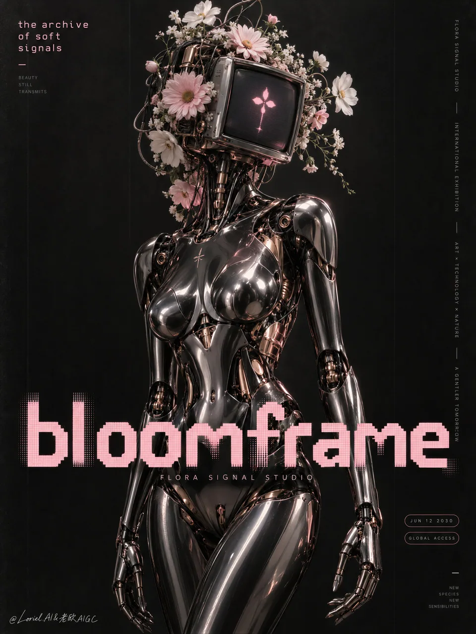
Create a flagship cultural-poster campaign image for a fictional international future-art house named FLORA SIGNAL STUDIO, designed as a single vertically composed master visual that fully merges Orbit, Transit, and Port into one best solution: emotionally haunting, structurally expandable, and curatorially distilled. The image must feel like a Cannes-level festival poster, a collectible gallery print, and a fashion-tech editorial advertisement at once.

The absolute hero is one elegant female-coded humanoid android standing in the central vertical axis, shown from upper thigh to head, occupying most of the poster height with statuesque stillness. The body is refined, sensual, and engineered, built from glossy black chrome, polished graphite metal, and selectively exposed rose-gold inner mechanisms. The silhouette must feel sculptural and premium: elongated neck, elegant shoulder slope, believable torso taper, refined chest contour shaped by armor-like plating, precise waist compression, smooth pelvis logic, and long articulated arms with delicate mechanical fingers. The figure must never become bulky, militarized, or industrially crude. It should read as luxury machine anatomy, not hard sci-fi machinery.

The head is the conceptual centerpiece. Replace the conventional face with a compact retro-futurist CRT monitor head, angled slightly toward the viewer. The screen glows with one tiny soft-pink digital glyph or abstract signal icon, crisp but restrained. Around and behind the CRT housing, build an abundant but controlled floral crown of pale pink daisies, white cosmos, cream petals, and delicate stems interwoven with discreet wires, vents, tiny ports, and subtle mechanical sockets. The flowers must feel fresh, fragile, and species-accurate, as if tenderness has naturally overtaken the machine. The relation between chrome and petals must feel poetic, melancholic, and intimate rather than decorative.

The background is a deep atmospheric near-black field with layered charcoal texture, faint vertical banding, soft analog grain, and extremely subtle tonal variation. It must feel like a printed poster on premium matte stock rather than an empty digital void. Keep the negative space broad and intentional so the hero figure, floral crown, and title dominate with maximum clarity. No extra scenery, no cityscape, no environment clutter.

Typography is a structural pillar and must be entirely newly invented in English only. Do not copy any words from the source image. In the upper-left corner, place one small stacked poetic line in pale pink, set in monospaced or retro-digital type, such as "the archive / of soft signals" or another equally strong phrase. Along the far right edge, place one narrow column of tiny vertical editorial information in restrained pale grey or soft white sans-serif, functioning like exhibition notes. Across the lower-middle zone, place one monumental pixel-formed title such as "aftersignal" or "bloomframe" in large custom soft-pink digital lettering, spanning across the android torso without fully destroying the body read. This title must behave like a graphic bar through the composition, locking the page together. Near the lower right, add two minimal capsule-like tags containing date or access information, quiet and elegant. All typography must feel precise, integrated, and collectible, never busy.

The composition must read instantly. The floral CRT head forms the emotional apex in the upper-middle field. The chrome torso creates the main vertical body mass. The oversized pink pixel title stabilizes the lower half and creates a disruptive but controlled graphic interruption. Upper-left poetic text and right-edge vertical microcopy balance the page. Large negative space around the figure is essential so the poster feels gallery-grade, cold, and rare. The final read must be immediate: one chrome muse, one flowering signal-head, one digital title, one black field.

Orbit: the poster must seduce at first glance through melancholy, beauty, softness invading machinery, and the uncanny dignity of the android. Transit: the structure must feel expandable into a full cultural-poster series where different robotic muses, flower species, screen glyphs, and title colors could generate a wider campaign language. Port: every nonessential element must be stripped away so the composition remains exact, cold, and highly collectible, with no random cyberpunk props and no visual noise.

Lighting must be cinematic and materially exact. Use a controlled top-front key with gentle directional bias so the chrome torso carries long liquid specular bands and soft rolling reflections. Add a faint rose-gold inner glow in selected joints and recesses, while the CRT emits a delicate pink spill onto the nearest petals and metal housing. Flowers must catch soft diffused highlights that preserve petal texture and fragility. Shadows must remain rich, velvety, and dimensional without crushing into dead black. The overall lighting mood should be intimate, nocturnal, and museum-like.

Use a disciplined 60/30/10 palette hierarchy: 60% black, charcoal, graphite, and near-black atmospheric field; 30% chrome silver, gunmetal, pale petals, and soft cream florals; 10% luminous pink typography and screen glow with trace rose-gold accents in the machine interior. The palette must feel restrained, premium, and emotionally charged.

Material semantics are essential. Chrome plating must feel real, heavy, and mirror-smooth with believable reflectance and curved distortion. Darker gunmetal sections should feel dense and precise. Rose-gold internal mechanisms must feel machined and luxurious. Flowers must look fresh, petal-soft, and slightly translucent at the edges. The CRT head must show glass thickness, housing weight, and subtle glow bloom. Typography must feel like a hybrid of printed poster ink and retro-display language. The full image must hold fine-grain texture without becoming dirty.

The final poster should read like a future-culture icon where synthetic elegance, botanical tenderness, and retro information design are fused into one singular hero object. It must be photoreal, fashion-forward, globally premium, and unforgettable in one glance.

Quality target and structured exclusions: photoreal only, correct humanoid mechanical anatomy, elegant finger structure, no broken joints, no warped torso, no cheap robot parts, no cluttered sci-fi background, no plastic flowers, no muddy blacks, no dead black blocks, no unreadable text, no random letters, no childish cyberpunk styling, no overfilled layout, no style drift, no AI artifacts, no watermark, no real person names, no real brand names.

Craft tip: keep the chrome figure precise and stripped back; confine soft flowers to the screen-head and cable cluster so floral growth has one clear origin. Use one pixel-like pink display treatment for title and screen symbol against near-black paper texture.
中文翻譯
爲虛構的國際未來藝術機構 FLORA SIGNAL STUDIO 創作一張旗艦級文化海報宣傳主視覺,設計爲單張豎構圖的主畫面,把 Orbit、Transit、Port 三者完全融合爲一個最佳方案:情緒上令人縈繞難忘、結構上可延展、策展上高度凝練。畫面必須同時具備戛納級電影節海報、可收藏的畫廊版畫,以及時尚科技雜誌廣告的質感。

絕對的視覺主角是一位優雅的、女性化氣質的人形仿生機器人,立於畫面中軸線上,取景從大腿上部到頭部,以雕塑般的靜默佔據海報高度的絕大部分。身體精緻、性感且具工程感,由亮面黑色鍍鉻、拋光石墨金屬,以及選擇性裸露的玫瑰金內部機械構成。輪廓必須具有雕塑感與高級感:修長的頸部、優雅的肩部斜線、可信的軀幹收束、由裝甲式板片塑造的精緻胸部輪廓、精準的腰部收縮、流暢的骨盆結構,以及帶有纖細機械手指的修長鉸接手臂。人物絕不能顯得笨重、軍事化或工業粗陋。它應被讀作奢侈品級的機械解剖,而非硬核科幻機械。

頭部是概念核心。用一顆緊湊的復古未來主義 CRT 顯示器頭替代常規面孔,略微朝向觀者傾斜。屏幕上亮起一個極小的柔和粉色數字字形或抽象信號圖標,清晰而剋制。在 CRT 外殼周圍與後方,構建一個繁盛而受控的花冠,由淺粉色雛菊、白色波斯菊、奶油色花瓣和纖細莖稈組成,並交織着隱蔽的線纜、通風口、微型端口和細微的機械插槽。花必須是新鮮的、脆弱的、物種準確的,彷彿溫柔自然地接管了機器。鉻金屬與花瓣之間的關係必須富有詩意、憂鬱而親密,而非裝飾性的。

背景是一片深邃、富有空氣感的近黑色場域,帶有層次分明的炭灰色質感、隱約的豎向條帶、柔和的模擬顆粒,以及極其細微的色調變化。它必須像印在高級啞光紙上的海報,而不是空蕩的數字虛空。保持大面積且刻意的留白,讓主角人物、花冠與標題以最大清晰度主導畫面。不要多餘場景,不要城市景觀,不要環境雜物。

字體排版是一根結構性支柱,必須全部爲全新原創且僅使用英文。不要從源圖像中複製任何詞句。在左上角放置一行小型堆疊的詩意短句,淺粉色調,使用等寬或復古數字字體,例如 "the archive / of soft signals",或其他同樣有力的短語。沿最右側邊緣放置一列窄窄的、極小的豎排編輯信息,使用剋制的淺灰色或柔白色無襯線字體,起到展覽說明的作用。橫跨下部中間區域,放置一個紀念碑式的像素構成標題,例如 "aftersignal" 或 "bloomframe",用大型定製柔和粉色數字字體,橫跨仿生人軀幹但不完全破壞身體的可讀性。這個標題必須像一條貫穿構圖的圖形橫條,把整個版面鎖合在一起。在右下角附近,添加兩個極簡的膠囊狀標籤,包含日期或訪問信息,安靜而優雅。所有排版都必須精確、融爲一體且具收藏感,絕不雜亂。

構圖必須一眼即讀。花朵 CRT 頭部在上中部場域構成情緒頂點。鉻金屬軀幹形成主要的豎向體量。超大粉色像素標題穩定下半部分,並製造一次具破壞性但受控的圖形打斷。左上角詩意文字與右緣豎排微文案平衡版面。人物周圍的大面積留白至關重要,讓海報具備畫廊級、冷峻、稀有的氣質。最終的閱讀必須即時完成:一個鉻金屬繆斯、一個開花信號頭、一個數字標題、一片黑色場域。

Orbit:海報必須憑藉憂鬱感、美感、柔軟對機械的侵入,以及仿生人那種詭異而可敬的尊嚴,在第一時間吸引人。Transit:結構必須讓人感覺可以延展爲一整套文化海報系列,讓不同的機器人繆斯、花卉物種、屏幕字形和標題顏色生成更廣闊的宣傳語言。Port:所有非必要元素都必須剝離,使構圖保持精確、冷峻、極具收藏性,沒有隨意的賽博朋克道具,也沒有視覺噪音。

燈光必須具電影感且材質準確。使用受控的正前方頂部主光,帶有輕微的方向性偏移,讓鉻金屬軀幹承載修長的液態高光帶和柔和滾動的反射。在選定的關節和凹槽處添加微弱的玫瑰金內發光,同時 CRT 向最近的花瓣和金屬外殼散發出精緻的粉色溢光。花朵必須接收到柔和漫射的高光,以保留花瓣的質感與脆弱感。陰影必須保持濃鬱、天鵝絨般、有體積感,但不能壓死成死黑。整體燈光氛圍應是親密、夜行、美術館式的。

採用嚴謹的 60/30/10 配色層級:60% 黑色、炭灰、石墨與近黑的大氣場域;30% 鉻銀、槍灰色、淺色花瓣與柔和奶油色花卉;10% 發光粉色排版與屏幕輝光,並帶有一絲機器內部的玫瑰金點綴。調色板必須顯得剋制、高級且充滿情緒張力。

材質語義至關重要。鍍鉻層必須真實、厚重、鏡面般平滑,具有可信的反射率與曲面畸變。較深的槍灰色部件應顯得密實而精準。玫瑰金內部機械必須顯得經機加工且奢華。花朵必須看起來新鮮、花瓣柔軟,邊緣略帶半透明。CRT 頭部必須呈現玻璃厚度、外殼重量與細微的輝光泛光。字體排版必須像印刷海報油墨與復古顯示語言的混合體。整張圖像必須保持細顆粒質感,但不能顯得髒。

最終海報應像一個未來文化圖標,把合成優雅、植物柔情與復古信息設計融合爲一件獨一無二的主角級物件。它必須是照片級真實、時尚前衛、全球高級感,並且一眼難忘。

質量目標與結構化排除項:僅限照片級真實、正確的人形機械解剖、優雅的手指結構、無斷裂關節、無扭曲軀幹、無廉價機器人零件、無雜亂科幻背景、無塑料花、無渾濁黑位、無死黑塊、無不可讀文字、無隨機字母、無幼稚賽博朋克風格、無過度堆砌的版面、無風格漂移、無 AI 瑕疵、無水印、無真實人物姓名、無真實品牌名稱。

工藝提示:讓鉻金屬人物保持精確與精簡;把柔花限制在屏幕頭部與線纜簇周圍,讓花卉生長有一個明確的源頭。標題與屏幕符號使用同一種像素感粉色顯示處理,置於近黑色紙張紋理之上。
溯源
- 原作者
- ou_zhen599
- 發佈日期
- 2026-09-25
- 原始出處
- 查看原帖 ↗
- 收錄來源
- xianyu110/awesome-gpt-image2.5 · 2103388889675149767 · MIT