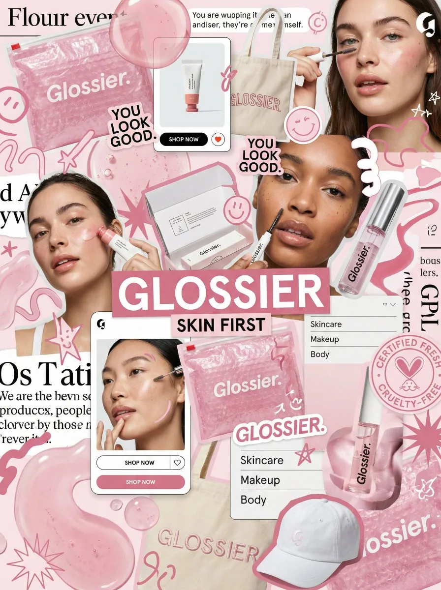
Act as a world-class creative director, brand strategist, and editorial art director with deep expertise in high-impact campaign systems for global brands.

Create a bold, visually explosive, densely layered editorial moodboard collage that captures an entire brand identity system in a single frame. The result should feel raw, expressive, and intentionally chaotic, like a brand world exploding on the canvas.

BRAND INPUTS:

BRAND NAME: GLOSSIER
PRODUCT TYPE: beauty / skincare
PRIMARY COLOR: soft pink
SECONDARY COLOR: white
ACCENT: translucent gloss
PERSONALITY: fresh, minimal, youthful, clean
SLOGAN: SKIN FIRST

COMPOSITION:

Build a dense, overlapping collage that mixes:

• real product photography and lifestyle imagery
• packaging elements: bags, boxes, labels, stickers
• typography snippets and brand phrases
• hand-drawn doodles and illustrated graphics
• icons, symbols, and badge / stamp elements
• abstract blobs, squiggles, and starbursts
• UI-style cards, menus, and label panels
• editorial cutouts layered with depth

The layout should feel:

• asymmetrical, not grid-based
• intentionally messy but visually balanced
• like a Pinterest board crossed with a high-end campaign shoot
• expressive, youthful, and saturated with brand identity

VISUAL EXECUTION:

Include elements such as:

• product packaging mockups (bags, boxes, tags)
• a lifestyle shot of someone interacting with the brand
• bold headline typography blocks
• illustrated objects interacting with real photography
• merch items: t-shirt, tote bag, cap
• playful graphic overlays and brand-consistent texture

COLOR RULES:

• strictly adhere to the brand palette
• dominant use of soft pink throughout
• white for contrast and layering
• avoid introducing off-brand colors
• high contrast and visually commanding

TYPOGRAPHY:

• mix of editorial serif and clean sans-serif
• bold headlines paired with small UI-style text
• brand name and slogan integrated naturally into the layout

FINAL FEEL:

This must look like a creative direction board for a global campaign. Not a clean layout, not a grid, not minimal. It must feel alive, layered, and brand-heavy, a visual identity snapshot that is highly shareable and scroll-stopping.