IG 旅遊廣告 [LOCATION] 可替換模板
4:5 豎屏 + 手機導航錨點構圖,換地名就能出一波 scroll-stopping 海報。出海投放直接改。
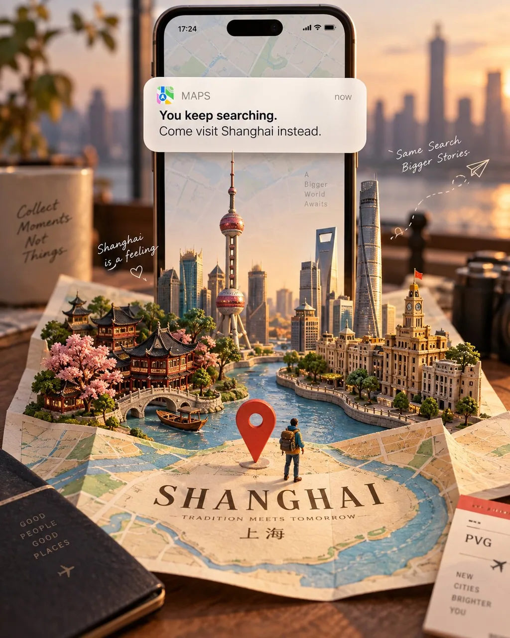
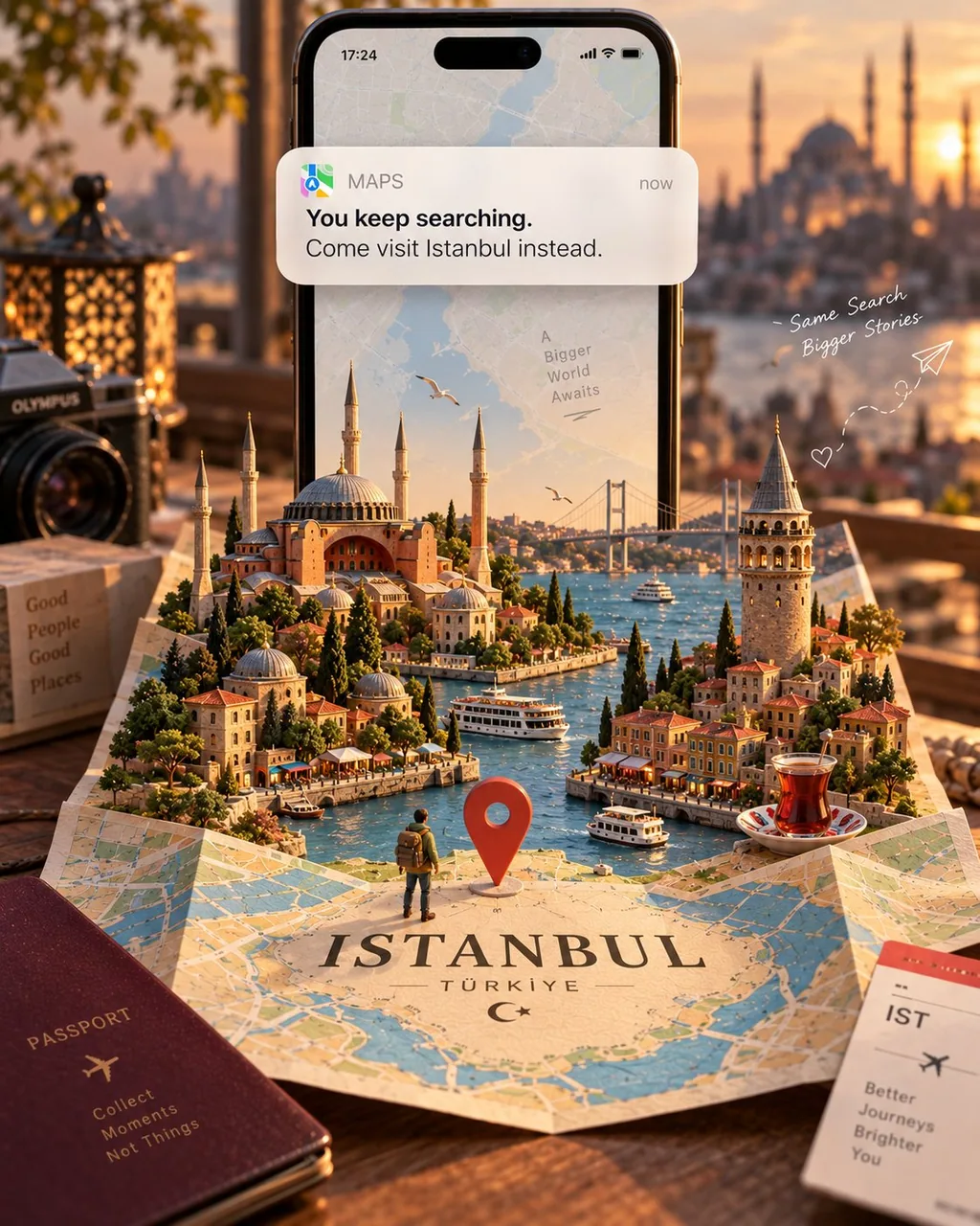
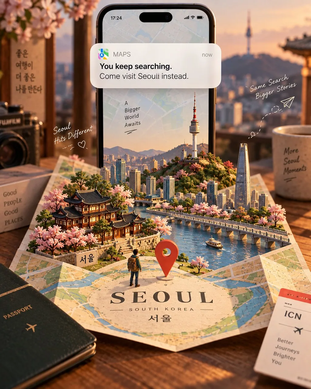
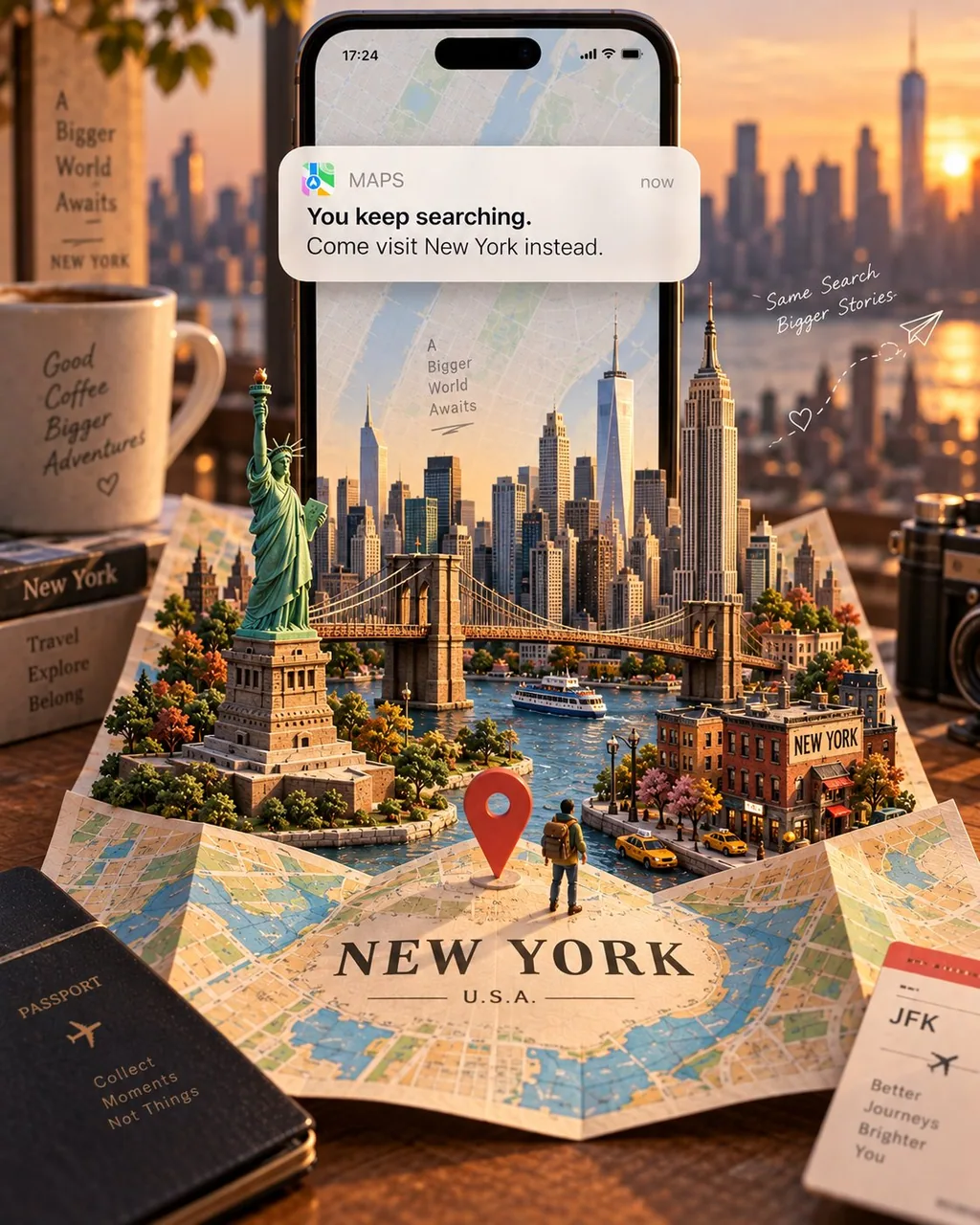
提示詞
Create a premium, scroll-stopping Instagram travel campaign for [LOCATION] in a 4:5 vertical portrait format.

A large modern smartphone stands vertically near the upper center, acting as the main visual anchor. A single elegant map-navigation notification card overlaps the upper-middle of the phone, integrated naturally with realistic depth, soft shadows, and subtle reflections.

The notification should feature a warm-white, lightly frosted rounded rectangle with a refined mobile UI aesthetic and perfectly legible typography:

[map icon] MAPS — now
You keep searching.
Come visit [LOCATION] instead.

Keep the notification within the upper 25–40% of the composition. It should feel physically connected to the phone and must not cover the miniature destination scene.

Below the smartphone, a folded papercraft map labeled “[LOCATION]” unfolds into a handcrafted miniature world. Include only 4–6 highly recognizable elements that naturally represent the destination—such as iconic architecture, landscapes, nature, food, culture, or atmosphere.

Visual Materials

- Phone & distant background: realistic photography
- Buildings & landmarks: handcrafted painted 3D clay
- Map, terrain, roads & water: layered hand-cut paper
- Vegetation & small details: miniature clay and paper

Make the physical materials clearly visible through paper fibers, cut edges, layered surfaces, subtle clay texture, tiny imperfections, and soft dimensional shadows.

Add one large location pin and a tiny backpacked traveler standing on the map, looking toward the miniature world. Keep the traveler small and secondary, like a hidden discovery detail.

Use only 2–3 subtle travel doodles, such as a paper airplane with a dotted path, a tiny heart, and a simple hand-drawn route arrow. Keep them thin, imperfect, and journal-like.

Visual Hierarchy

1. Notification
2. Miniature [LOCATION] world
3. Location pin
4. Tiny traveler
5. Folded map

Maintain generous negative space and avoid clutter, excessive landmarks, unnecessary text, icons, props, or competing focal points.

Use a refined 3–5 color palette inspired by [LOCATION], warm cinematic or golden-hour lighting, shallow depth of field, realistic miniature photography, tactile materials, and sophisticated editorial advertising composition.

The final image should feel like a world-class handcrafted travel campaign-instantly recognizable, destination-specific, clean, emotionally inviting, and rich with subtle details worth discovering.
中文翻譯
爲 [LOCATION] 打造一支高端、令人停下滑動的 Instagram 旅遊廣告,採用 4:5 豎版人像格式。

一部大型現代智能手機垂直立於畫面中上部附近,作爲主要的視覺錨點。一張優雅的地圖導航通知卡片疊在手機中上部,以真實的景深、柔和陰影和微妙反光自然融入。

通知應爲暖白色、輕微磨砂的圓角矩形,具有精緻的移動端 UI 美學和完全清晰易讀的字體排版:

[map icon] MAPS — now
你一直在搜索。
不如改去 [LOCATION] 看看。

讓通知保持在構圖上部的 25–40% 範圍內。它應與手機有物理連接感,且不得遮擋微縮目的地場景。

在智能手機下方,一張標有“[LOCATION]”的摺疊紙藝地圖展開成一個手工微縮世界。只包含 4–6 個高度易辨識、能自然代表該目的地的元素——例如標誌性建築、風景、自然、美食、文化或氛圍。

視覺材質

- 手機與遠景背景:寫實攝影
- 建築與地標:手工上色的 3D 黏土
- 地圖、地形、道路與水域:分層手工剪紙
- 植被與小細節:微縮黏土與紙

通過紙張纖維、裁剪邊緣、層疊表面、微妙的黏土質感、細微瑕疵和柔和立體陰影,讓實體材質清晰可見。

添加一個大號位置圖釘,以及一個揹着背包的微小旅行者站在地圖上,望向這個微縮世界。讓旅行者保持小巧、次要,如同一個隱藏的探索細節。

只使用 2–3 個微妙的旅行塗鴉,例如帶虛線路線的紙飛機、一顆小愛心,以及一個簡單的手繪路線箭頭。保持它們纖細、不完美、有手賬感。

視覺層級

1. 通知
2. 微縮 [LOCATION] 世界
3. 位置圖釘
4. 微小旅行者
5. 摺疊地圖

保持充足的留白,避免雜亂、過多地標、不必要的文字、圖標、道具或相互爭奪焦點的元素。

使用受 [LOCATION] 啓發的精緻 3–5 色配色、溫暖電影感或黃金時刻光線、淺景深、寫實微縮攝影、有觸感的材質,以及考究的廣告大片構圖。

最終圖像應像一支世界級的手工旅遊廣告——一眼即可辨識、目的地特徵明確、乾淨、富有情感吸引力,並充滿值得發現的微妙細節。
溯源
- 原作者
- Goodmanprotocol
- 發佈日期
- 2026-09-10
- 原始出處
- 查看原帖 ↗
- 收錄來源
- xianyu110/awesome-gpt-image2.5 · 2097890291860865291 · MIT