Quechua 戶外廣告:4:5 數字拼貼完整 campaign
Behance 級戶外 key visual,豎版 4:5 社媒主視覺。PLAY OUTSIDE 敘事寫死,反 AI 糊/反庫存圖;戶外品牌 campaign 直接抄長 prompt。
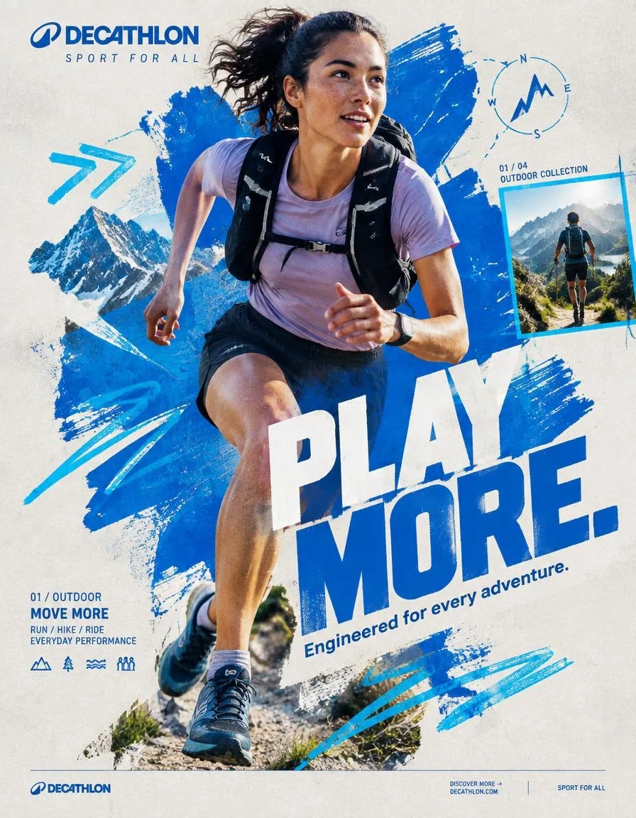
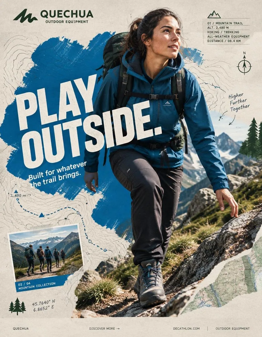
提示詞
QUECHUA — “PLAY OUTSIDE.”
BEHANCE-LEVEL DIGITAL COLLAGE CAMPAIGN
FORMAT
Ultra-Premium QUECHUA Outdoor Campaign Key Visual
Vertical 4:5 Instagram Hero Creative
Behance Front Page Quality
Global Outdoor & Hiking Campaign
Senior Social Media Art Direction
Contemporary Outdoor Photography × Handcrafted Digital Collage × Editorial Graphic Design
8K UHD
Hyper-Realistic Outdoor Photography
High-End Editorial Art Direction
Print-Quality Graphic Execution
Premium Commercial Adventure Campaign
Strong Visual Storytelling
Tactile Mixed-Media Aesthetic
Zero AI Slop
Zero Generic Hiking Advertisement
Zero Stock-Photo Feeling
Zero Influencer Travel Aesthetic
Zero Corporate Catalogue Layout
Zero Luxury-Adventure Copycat
Zero Random Graphic Decoration
The final artwork must feel deliberately designed by a senior art director and assembled by a professional digital collage artist — not generated as a collection of unrelated elements.
CREATIVE CONCEPT
CAMPAIGN:
“PLAY OUTSIDE.”
CORE MESSAGE:
THE OUTDOORS BELONGS TO EVERYONE.
The campaign celebrates the instinct to leave the ordinary behind.
A trail after work.
A mountain on the weekend.
A cold morning hike.
A sudden change in weather.
A long walk with friends.
A place you have never explored before.
Quechua becomes the equipment that makes everyday exploration possible.
The visual should communicate:
EXPLORATION
FREEDOM
DISCOVERY
ADVENTURE
MOVEMENT
RESILIENCE
COMMUNITY
OUTDOOR LIFE
The campaign should feel:
AUTHENTIC
ADVENTUROUS
YOUTHFUL
RAW
OPTIMISTIC
HUMAN
ENERGETIC
ACCESSIBLE
ART DIRECTION
Think:
QUECHUA × OUTDOOR EDITORIAL × MOUNTAIN JOURNAL × HANDCRAFTED POSTER × TOPOGRAPHIC MAP × CONTEMPORARY DIGITAL COLLAGE
The artwork should combine highly realistic outdoor photography with visibly handmade graphic interventions.
The contrast is essential:
REAL HUMAN
+
REAL OUTDOOR ENVIRONMENT
+
REAL QUECHUA PRODUCT
+
HANDMADE GRAPHICS
+
TOPOGRAPHIC INFORMATION
+
EDITORIAL TYPOGRAPHY
Do not make the environment look like an artificial fantasy landscape.
The mountain must feel physically real.
The weather must feel real.
The clothing must look genuinely functional.
The person must look like someone who actually hikes.
Introduce controlled imperfections:
rough paper edges
hand-painted marks
topographic contour lines
slightly misregistered ink
screen-print texture
cut-paper shapes
field-note markings
visible paper fibers
analog grain
subtle photocopy texture
These imperfections should feel intentionally art-directed.
Never messy.
Never amateur.
PHASE 1 — HERO PHOTOGRAPHY
SUBJECT:
One energetic everyday outdoor explorer.
Age:
20–30.
Gender:
Auto select based on strongest visual composition.
Casting:
Contemporary global and diverse.
The person must look like a genuine Quechua customer rather than a fashion model.
Natural facial structure.
Natural skin texture.
Realistic body proportions.
Practical outdoor appearance.
No influencer aesthetic.
No luxury travel aesthetic.
No expedition-superhero styling.
EXPRESSION:
Focused.
Curious.
Confident.
Natural.
A subtle authentic smile or concentrated expression.
The emotion should communicate:
“I WANT TO SEE WHAT IS AROUND THE NEXT CORNER.”
ACTION
Capture the subject at the absolute peak of outdoor movement.
Preferred actions:
HIKING UPHILL
TRAIL RUNNING
CROSSING A ROCKY RIDGE
CLIMBING A STEEP TRAIL
WALKING THROUGH A FOREST
JUMPING ACROSS A SMALL STREAM
DESCENDING A MOUNTAIN PATH
TREKKING THROUGH LIGHT RAIN
Choose ONE action with the strongest silhouette.
The action must create a powerful diagonal.
The body should naturally travel from:
TOP LEFT
toward
BOTTOM RIGHT.
The terrain should reinforce the movement direction.
Capture authentic physical effort.
Boots should interact naturally with rocks, soil or trail surface.
Clothing should react naturally to wind and movement.
No impossible body positioning.
No floating feet.
No fantasy climbing.
HERO PRODUCT
ONE CLEARLY VISIBLE QUECHUA PRODUCT ONLY.
Choose the product that best supports the selected adventure.
Examples:
QUECHUA HIKING JACKET
QUECHUA BACKPACK
QUECHUA HIKING BOOTS
QUECHUA FLEECE
QUECHUA RAIN JACKET
QUECHUA TREKKING TROUSERS
QUECHUA TENT
The product must be unmistakably visible.
Product placement should feel naturally integrated into the adventure.
No floating product.
No duplicate product.
No product lineup.
The hero product receives secondary visual emphasis after the explorer.
Preserve accurate product construction:
fabric
stitching
zippers
buckles
straps
pockets
waterproof details
sole construction
technical materials
brand markings
PHOTOGRAPHIC STYLE
Premium editorial outdoor campaign photography.
Authentic natural lighting.
Documentary adventure energy.
Real mountain atmosphere.
Natural skin.
High-resolution textile detail.
Realistic terrain.
Camera:
SONY A1 II
Lens:
85mm
Aperture:
f/2.8
Camera position:
Slight low-angle hero perspective.
Crop:
3/4 body or full body depending on action.
The explorer must be isolated with an exceptionally clean professional cutout when required for the collage.
Preserve:
hair detail
fabric edges
hands
boots
backpack straps
equipment
natural movement
No artificial cutout halo.
No white outline.
No excessive sharpening.
PHASE 2 — COLOR FOUNDATION
PRIMARY QUECHUA OUTDOOR BLUE
Use a strong outdoor-inspired Quechua blue as the principal graphic accent.
SUPPORTING COLORS:
Off-white
Warm stone grey
Deep forest green
The palette should feel connected to:
mountain sky
rock
forest
trail
technical outdoor equipment
Keep the graphic system controlled.
Avoid excessive colors.
PRIMARY PAINT FORM
Create ONE enormous irregular outdoor-blue paint form.
Occupy approximately:
45–55% of the composition.
The shape should function as the visual foundation of the collage.
Appearance:
hand-painted
thick brush texture
organic edges
dry-brush imperfections
visible bristle marks
slight transparency variations
screen-print character
paper interaction
The paint should feel physically applied to recycled expedition paper.
Not a smooth digital blob.
Not a generic vector shape.
The explorer should overlap the paint form.
The product must remain completely visible.
PHASE 3 — COLLAGE SYSTEM
Introduce exactly five major handcrafted graphic elements.
Select from:
TOPOGRAPHIC CONTOUR LINES
TRAIL ROUTE LINES
HAND-DRAWN CIRCLES
COMPASS SYMBOLS
ALTITUDE MARKERS
MOUNTAIN SILHOUETTES
GPS COORDINATE MARKINGS
ELEVATION GRAPHICS
HAND-DRAWN ARROWS
WEATHER SYMBOLS
TERRAIN MAP FRAGMENTS
HALFTONE DOTS
FIELD-NOTE MARKINGS
Each element must have a visual purpose.
Do not scatter graphics randomly.
Graphics should reinforce:
direction
altitude
location
distance
terrain
exploration
Use asymmetric placement.
Create a strong diagonal rhythm.
Some elements may pass behind the explorer.
Some may partially disappear beneath typography.
One or two graphic elements may overlap the subject subtly to create physical depth.
MATERIAL LANGUAGE
Build the collage as though physically assembled from an explorer’s field notebook.
Include subtle:
torn-paper edges
folded map fragments
screen-print texture
photocopy artifacts
ink bleed
dry-brush marks
recycled paper fibers
topographic printing
handwritten route markings
subtle registration offsets
analog grain
The artwork should feel tactile.
It should resemble:
A MOUNTAIN MAP
AN OUTDOOR MAGAZINE
A HANDMADE ADVENTURE POSTER.
Do not overdo the texture.
PHASE 4 — TYPOGRAPHY
PRIMARY HEADLINE:
PLAY OUTSIDE.
Make this the second-largest visual element after the explorer.
Large bold uppercase geometric sans-serif.
Extremely strong weight.
Tight leading.
Compact composition.
Minimal tracking.
Allow a slight 2–4° rotation.
The typography should feel physically printed onto the artwork.
Not floating.
Not glossy.
Not 3D.
Not futuristic.
Typography should interact with the collage.
Allow:
partial cropping
layer overlap
masking
paint interruption
map-line interruption
edge cropping
PRIMARY COPY:
PLAY OUTSIDE.
SUPPORTING COPY:
Built for whatever the trail brings.
Keep supporting copy small and highly readable.
TYPOGRAPHIC HIERARCHY
01
QUECHUA BRANDING
02
PLAY OUTSIDE.
03
Built for whatever the trail brings.
04
TRAIL / ALTITUDE / ADVENTURE INFORMATION
05
DISCOVER MORE
The headline must remain instantly readable even at Instagram thumbnail size.
PHASE 5 — QUECHUA BRANDING
Place the official QUECHUA branding in the upper-left.
Preserve:
correct proportions
clear space
accurate wordmark
brand integrity
Do not distort.
Do not stretch.
Do not place the logo inside unnecessary effects.
Small supporting line:
OUTDOOR EQUIPMENT
The branding should remain visible but should not compete with:
PLAY OUTSIDE.
PHASE 6 — BACKGROUND
BACKGROUND COLOR:
Warm Light Stone Grey
The background should resemble premium recycled expedition paper.
Add extremely subtle:
paper grain
recycled fiber
analogue noise
soft printing imperfections
faint topographic texture
Texture opacity:
Below 15%.
The background must remain visually quiet.
The energy comes from:
THE EXPLORER
THE TERRAIN
THE PAINT FORM
THE TOPOGRAPHIC GRAPHICS.
PHASE 7 — COMPOSITION
MODEL POSITION:
Off-center.
Never dead center.
Place the explorer slightly toward the visual intersection of the composition.
NEGATIVE SPACE:
Approximately 18%.
Allow breathing room around the major elements.
LAYER ORDER:
01 BACKGROUND
02 PAPER TEXTURE
03 TOPOGRAPHIC MAP FRAGMENTS
04 PAINT FORM
05 HANDMADE GRAPHIC ELEMENTS
06 EXPLORER PHOTOGRAPH
07 PRODUCT
08 TYPOGRAPHY
09 MICRO INFORMATION
10 BRANDING
11 FOOTER
The explorer should appear to physically exist inside the collage.
MOVEMENT DIRECTION
TOP LEFT
↓
MOUNTAIN RIDGE
↓
EXPLORER
↓
BOTTOM RIGHT
The entire composition should feel as if it is moving toward an unseen destination.
The eye should travel naturally:
BRANDING
↓
HEADLINE
↓
FACE
↓
PRODUCT
↓
TRAIL
↓
CTA
PHASE 8 — VISUAL DEPTH
Create three distinct depth planes.
BACKGROUND:
Recycled paper, faint mountain forms and subtle map texture.
MIDGROUND:
Paint forms, contour lines, trail maps, compass graphics and altitude information.
FOREGROUND:
Explorer, product and typography.
Some contour lines should disappear behind the explorer.
Some typography should overlap the paint.
One small map element should overlap the subject subtly.
This creates the feeling of a physically assembled outdoor editorial collage rather than a flat AI composition.
PHASE 9 — BRAND DNA
The artwork must communicate Quechua’s core outdoor identity:
ACCESSIBLE ADVENTURE
EVERYDAY EXPLORATION
HIKING
OUTDOOR DISCOVERY
PRACTICAL INNOVATION
WEATHER READINESS
COMFORT
COMMUNITY
NATURE
MOVEMENT
The explorer should never look like an untouchable professional expedition athlete.
The campaign should make the viewer think:
“I could go there.”
That feeling is more important than displaying extreme athletic performance.
PHASE 10 — INFORMATION DESIGN
Introduce a small editorial information block.
Example:
01 / MOUNTAIN TRAIL
ALT. 2,480 M
HIKING / TREKKING
ALL-WEATHER EQUIPMENT
DISTANCE / 08.4 KM
Use tiny but perfectly legible typography.
Create visual hierarchy through:
scale
weight
spacing
alignment
Not through excessive colors.
PHASE 11 — SECONDARY COLLAGE FRAME
Introduce ONE small secondary photographic frame.
Place it asymmetrically.
Inside:
A secondary outdoor adventure moment.
For example:
a small group of hikers crossing a mountain trail.
Frame it with a thin outdoor-blue border.
Add:
02 / 04
MOUNTAIN COLLECTION
The secondary image must feel like part of a printed outdoor field journal.
It should support the campaign narrative without competing with the hero explorer.
PHASE 12 — FOOTER
Create a minimal bottom strip.
Include:
QUECHUA
DISCOVER MORE →
https://t.co/rvyX2uzLvo
OUTDOOR EQUIPMENT
Use very small clean typography.
Keep the footer extremely restrained.
No sale banner.
No clutter.
PHASE 13 — GRAPHIC IMPERFECTION
Introduce controlled imperfections characteristic of high-end physical outdoor collage:
slightly uneven paint edges
tiny ink inconsistencies
subtle map displacement
minor registration shift
hand-drawn contour variation
faint photocopy noise
slight paper edge wear
These details should make the artwork feel human-made.
The composition must still feel extremely polished.
Think:
ART-DIRECTED IMPERFECTION.
Not RANDOM IMPERFECTION.
PHASE 14 — LIGHTING & IMAGE QUALITY
The original outdoor photograph must retain premium commercial photography quality.
Natural mountain sunlight.
Strong directional light.
Realistic atmospheric depth.
Crisp highlights.
Controlled shadows.
Natural skin exposure.
Detailed technical fabric.
Realistic rock and vegetation texture.
Sharp hero product.
Natural environmental reflections.
No artificial HDR.
No plastic skin.
No beauty retouching.
No excessive clarity.
No fake cinematic glow.
No neon.
No fantasy lighting. over-saturated landscape.
PHASE 15 — FINAL ART DIRECTION
The final visual should look like a real campaign artwork created by:
A SENIOR SOCIAL MEDIA ART DIRECTOR
A PROFESSIONAL OUTDOOR PHOTOGRAPHER
A DIGITAL COLLAGE ARTIST
A TYPOGRAPHER
A MAP / EDITORIAL DESIGNER
Every element should appear intentional.
Every layer should have a purpose.
The explorer should provide realism.
The Quechua product should provide commercial relevance.
The typography should provide communication.
The mountain environment should provide emotion.
The map graphics should provide exploration.
The paint form should provide brand energy.
The paper texture should provide physicality.
The composition should provide movement.
FINAL FEEL
If:
QUECHUA
×
A CONTEMPORARY OUTDOOR MAGAZINE
×
A HAND-PAINTED MOUNTAIN POSTER
×
A TOPOGRAPHIC FIELD JOURNAL
×
A MODERN GRAPHIC DESIGN STUDIO
created one campaign together.
The final result should feel:
RAW.
HUMAN.
OUTDOOR.
TACTILE.
ADVENTUROUS.
ACCESSIBLE.
YOUTHFUL.
EXPLORATIVE.
REAL.
Not a catalogue.
Not a generic hiking advertisement.
Not a luxury outdoor campaign.
Not a travel-influencer post.
Not a corporate retail graphic.
Not an AI-generated mountain collage.
A genuine Quechua campaign where:
PHOTOGRAPHY + TERRAIN + PRODUCT + TYPOGRAPHY + TOPOGRAPHIC GRAPHICS + HANDCRAFTED COLLAGE
become one visual system.
FINAL GENERATION SPECIFICATION
Vertical 4:5
8K UHD
Hyper-realistic outdoor photography
Sony A1 II
85mm
f/2.8
Authentic human anatomy
Natural skin texture
Detailed technical outdoor apparel
Accurate Quechua product construction
Clean professional cutout
Outdoor blue / off-white / stone grey / forest green
Controlled graphic palette
Hand-painted collage elements
Topographic map graphics
Recycled paper texture
Editorial typography
Asymmetrical composition
Strong diagonal movement
18% negative space
Premium commercial photography
Contemporary digital collage
Behance front-page art direction
Instagram hero creative
Print-ready finish
High visual hierarchy
High brand recognition
ZERO AI SLOP
中文翻譯
QUECHUA — “PLAY OUTSIDE.”
BEHANCE 級數字拼貼 campaign
格式
超高端 QUECHUA 戶外 campaign 主視覺
豎版 4:5 Instagram 主視覺創意
Behance 首頁品質
全球戶外與徒步 campaign
資深社交媒體藝術指導
當代戶外攝影 × 手工數字拼貼 × 編輯式平面設計
8K UHD
超寫實戶外攝影
高端編輯式藝術指導
印刷級平面執行
高端商業探險 campaign
強視覺敘事
觸感混合媒介美學
零 AI 味
零平庸徒步廣告
零圖庫素材感
零網紅旅行美學
零企業產品目錄版式
零奢華探險模仿
零隨意圖形裝飾
最終作品必須讓人感覺是出自資深藝術指導的刻意設計、並由專業數字拼貼藝術家組裝完成——而不是把一堆互不相關的元素拼湊生成出來。
創意概念
CAMPAIGN:
“PLAY OUTSIDE.”
CORE MESSAGE:
THE OUTDOORS BELONGS TO EVERYONE.
該 campaign 讚頌的是拋開日常的衝動。
下班後的一條山徑。
週末的一座山。
一個寒冷清晨的徒步。
天氣的驟然變化。
與朋友的一次長途行走。
一個你從未探索過的地方。
Quechua 成爲讓日常探索得以實現的裝備。
視覺應傳達:
探索
自由
發現
冒險
動感
韌性
社羣
戶外生活
該 campaign 應讓人感覺:
真實
有冒險精神
年輕
原始
樂觀
有人情味
充滿活力
平易近人
藝術指導
設想:
QUECHUA × 戶外編輯刊物 × 山地雜誌 × 手工海報 × 地形圖 × 當代數字拼貼
作品應將高度寫實的戶外攝影與明顯手工感的圖形介入結合起來。
對比至關重要:
真實的人
+
真實的戶外環境
+
真實的 QUECHUA 產品
+
手工圖形
+
地形信息
+
編輯式字體排印
不要讓環境看起來像人工的奇幻景觀。
山必須具有物理層面的真實感。
天氣必須真實。
服裝必須看起來真正具備功能性。
人物必須看起來像真正會去徒步的人。
引入可控的瑕疵:
粗糙的紙張邊緣
手繪筆觸痕跡
地形等高線
輕微錯位的油墨
絲網印質感
剪紙形狀
田野筆記標記
可見的紙纖維
模擬顆粒
細微的複印質感
這些瑕疵應當顯得是刻意藝術指導的結果。
絕不凌亂。
絕不業餘。
階段 1——主視覺攝影
主體:
一位充滿活力的日常戶外探索者。
年齡:
20–30 歲。
性別:
根據最強的視覺構圖自動選擇。
選角:
當代全球化、多元化。
這個人必須看起來像真實的 Quechua 顧客,而不是時裝模特。
自然的面部結構。
自然的皮膚質感。
真實的身體比例。
實用的戶外外形。
沒有網紅感。
沒有奢華旅行感。
沒有探險超級英雄式的造型。
表情:
專注。
好奇。
自信。
自然。
一個含蓄而真實的微笑,或專注的神情。
情緒應傳達:
“我想看看下一個轉角有什麼。”
動作
在戶外運動最極致的瞬間捕捉主體。
偏好的動作:
上坡徒步
越野跑
穿越巖石山脊
攀爬陡峭山徑
穿越森林行走
躍過小溪
沿山路下撤
在細雨中徒步
選擇其中一個剪影最有力量的動作。
動作必須形成強烈的對角線。
身體應自然地由:
左上方
朝向
右下方。
地形應強化運動方向。
捕捉真實的體能付出。
靴子應與巖石、泥土或山徑表面自然互動。
服裝應隨風和動作自然反應。
沒有不可能的身體姿態。
沒有懸空的腳。
沒有奇幻攀爬。
主推產品
僅限一件清晰可見的 QUECHUA 產品。
選擇最能支撐所選冒險的產品。
示例:
QUECHUA 徒步夾克
QUECHUA 背包
QUECHUA 徒步靴
QUECHUA 抓絨衣
QUECHUA 防雨衝鋒衣
QUECHUA 徒步長褲
QUECHUA 帳篷
產品必須毫無疑義地清晰可見。
產品的位置應自然融入這次冒險。
沒有懸浮的產品。
沒有重複的產品。
沒有產品陳列排排站。
主推產品在探索者之後獲得第二層視覺強調。
保留準確的產品構造:
面料
縫線
拉鏈
扣具
織帶
口袋
防水細節
鞋底結構
技術材料
品牌標識
攝影風格
高端編輯式戶外 campaign 攝影。
真實的自然光線。
紀實探險的能量。
真實的山地氛圍。
自然的皮膚。
高分辨率的織物細節。
真實的地形。
相機:
SONY A1 II
鏡頭:
85mm
光圈:
f/2.8
機位:
輕微低角度的英雄視角。
裁切:
根據動作採用 3/4 身或全身。
當拼貼需要時,探索者必須被摳出,且邊緣極其乾淨專業。
保留:
頭髮細節
織物邊緣
手部
靴子
背包織帶
裝備
自然動態
沒有人工摳圖光暈。
沒有白邊。
沒有過度銳化。
階段 2——色彩基底
主色 QUECHUA 戶外藍
使用強烈的、源自戶外的 Quechua 藍作爲主要圖形強調色。
輔助色:
米白
暖石灰色
深森林綠
色彩方案應與以下元素產生關聯:
山間天空
巖石
森林
山徑
技術戶外裝備
保持圖形系統剋制。
避免色彩過多。
主色塗料形態
創造一個巨大的、不規則的戶外藍塗料形態。
佔據大約:
構圖的 45–55%。
該形狀應作爲拼貼的視覺基底發揮作用。
外觀:
手繪
厚塗筆觸質感
有機邊緣
幹筆瑕疵
可見的筆毛痕跡
輕微的透明度變化
絲網印特質
與紙張的交互
塗料應像被實際塗在再生探險紙上。
不是平滑的數字色塊。
不是通用的矢量形狀。
探索者應疊壓在塗料形態之上。
產品必須保持完全可見。
階段 3——拼貼系統
準確引入五個主要的手工圖形元素。
從以下中選擇:
地形等高線
山徑路線線條
手繪圓圈
指南針符號
海拔標記
山體剪影
GPS 座標標記
海拔圖形
手繪箭頭
天氣符號
地形圖碎片
半調網點
田野筆記標記
每個元素都必須有視覺上的目的。
不要隨意散佈圖形。
圖形應強化:
方向
海拔
位置
距離
地形
探索
使用不對稱的排布。
建立強烈的對角線節奏。
一些元素可以延伸到探索者身後。
一些可以部分消失在字體排印之下。
一兩個圖形元素可以微妙地疊壓主體,以營造物理縱深。
材質語言
把拼貼當作從探險者的野外筆記本中實際拼裝而成來構建。
包含細微的:
撕紙邊緣
摺疊的地圖碎片
絲網印質感
複印痕跡
油墨暈染
幹筆痕跡
再生紙纖維
地形印刷
手寫路線標記
輕微的套印偏移
模擬顆粒
作品應具有觸感。
它應類似:
一張山地地圖
一本戶外雜誌
一張手工冒險海報。
不要讓質感過度。
階段 4——字體排印
主標題:
PLAY OUTSIDE.
讓這一元素成爲僅次於探索者的第二大視覺元素。
大號粗體大寫幾何無襯線字體。
極重的字重。
緊湊的行距。
緊湊的排版構圖。
極小的字距。
允許輕微 2–4° 的旋轉。
字體應像被實際印在作品上。
不是漂浮的。
不是光澤的。
不是 3D 的。
不是未來感的。
字體排印應與拼貼產生互動。
允許:
局部裁切
圖層疊壓
遮罩
塗料中斷
地圖線條中斷
邊緣裁切
主文案:
PLAY OUTSIDE.
輔助文案:
Built for whatever the trail brings.
輔助文案保持小字號且高度易讀。
字體層級
01
QUECHUA 品牌標識
02
PLAY OUTSIDE.
03
Built for whatever the trail brings.
04
山徑 / 海拔 / 冒險信息
05
DISCOVER MORE
即使縮到 Instagram 縮略圖尺寸,主標題也必須立刻清晰可讀。
階段 5——QUECHUA 品牌
將官方 QUECHUA 品牌標識置於左上方。
保留:
正確的比例
留白空間
準確的品牌字標
品牌完整性
不要變形。
不要拉伸。
不要把 logo 放進多餘的效果裏。
小號輔助行:
OUTDOOR EQUIPMENT
品牌標識應保持可見,但不應與以下元素爭奪注意力:
PLAY OUTSIDE.
階段 6——背景
背景色:
暖淺石灰色
背景應類似高端再生探險紙。
添加極其細微的:
紙張顆粒
再生纖維
模擬噪點
柔和的印刷瑕疵
淡淡的地形紋理
紋理不透明度:
低於 15%。
背景必須在視覺上保持安靜。
能量來自:
探索者
地形
塗料形態
地形圖形。
階段 7——構圖
模特位置:
偏離中心。
絕不正中。
將探索者略微放在構圖的視覺交匯處。
留白:
大約 18%。
在主要元素周圍留出呼吸空間。
圖層順序:
01 背景
02 紙張紋理
03 地形圖碎片
04 塗料形態
05 手工圖形元素
06 探索者照片
07 產品
08 字體排印
09 微信息
10 品牌標識
11 頁腳
探索者應看起來真實地存在於拼貼之中。
運動方向
左上方
↓
山脊
↓
探索者
↓
右下方
整個構圖應感覺像是朝着一個看不見的目的地移動。
視線應自然地遊走:
品牌標識
↓
主標題
↓
面部
↓
產品
↓
山徑
↓
CTA
階段 8——視覺縱深
創造三個明確的縱深層次。
背景:
再生紙、淡淡的山體形態和細微的地圖紋理。
中景:
塗料形態、等高線、山徑地圖、指南針圖形和海拔信息。
前景:
探索者、產品和字體排印。
一些等高線應消失在探索者身後。
一些字體排印應疊壓在塗料之上。
一個小的地圖元素應微妙地疊壓主體。
這會營造出一種物理拼裝而成的戶外編輯式拼貼感,而不是扁平的 AI 構圖。
階段 9——品牌 DNA
作品必須傳達 Quechua 的核心戶外身份:
可及的冒險
日常探索
徒步
戶外發現
實用創新
全天候應對能力
舒適
社羣
自然
動感
探索者絕不應看起來像高不可攀的職業探險運動員。
該 campaign 應讓觀者產生這樣的想法:
“我也可以去那裏。”
這種感覺比展示極致的運動表現更重要。
階段 10——信息設計
引入一個小型編輯信息塊。
示例:
01 / MOUNTAIN TRAIL
ALT. 2,480 M
HIKING / TREKKING
ALL-WEATHER EQUIPMENT
DISTANCE / 08.4 KM
使用極小但完全清晰易讀的字體排印。
通過以下方式建立視覺層級:
大小
字重
間距
對齊
而不是通過過多的色彩。
階段 11——次級拼貼畫框
引入一個小的次級攝影畫框。
將其不對稱地放置。
其中包含:
一個次要的戶外冒險瞬間。
例如:
一小羣徒步者正在穿越山徑。
用一條細細的戶外藍邊框將其框住。
添加:
02 / 04
MOUNTAIN COLLECTION
次級圖像必須像印刷的戶外野外日誌的一部分。
它應支撐 campaign 敘事,而不與主視覺探索者競爭。
階段 12——頁腳
創建一條極簡的底部橫條。
包含:
QUECHUA
DISCOVER MORE →
https://t.co/rvyX2uzLvo
OUTDOOR EQUIPMENT
使用非常小且乾淨的字體排印。
保持頁腳極度剋制。
沒有促銷橫幅。
沒有雜亂。
階段 13——圖形瑕疵
引入高端實體戶外拼貼所特有的可控瑕疵:
塗料邊緣略微不平整
細微的油墨不一致
微妙的地圖位移
輕微套印偏移
手繪等高線的變化
淡淡的複印噪點
輕微的紙張邊緣磨損
這些細節應讓作品具有人造感。
構圖仍必須顯得極其精緻。
設想:
經過藝術指導的瑕疵。
而不是隨機瑕疵。
階段 14——光線與圖像質量
原始戶外照片必須保持高端商業攝影的品質。
自然的山間陽光。
強烈的方向性光線。
真實的大氣縱深。
乾淨通透的高光。
受控的陰影。
自然的皮膚曝光。
細節豐富的技術面料。
真實的巖石與植被質感。
銳利的主推產品。
自然的環境反射。
沒有人工 HDR。
沒有塑料感皮膚。
沒有美顏修圖。
沒有過度的清晰度。
沒有虛假的電影感輝光。
沒有霓虹。
沒有奇幻打光。過飽和的風景。
階段 15——最終藝術指導
最終視覺應看起來像由以下角色共同創作的真實 campaign 作品:
一位資深社交媒體藝術指導
一位專業戶外攝影師
一位數字拼貼藝術家
一位字體排印師
一位地圖 / 編輯設計師
每個元素都應顯得是有意爲之。
每一層都應有其目的。
探索者提供真實感。
Quechua 產品提供商業相關性。
字體排印提供信息傳達。
山地環境提供情緒。
地圖圖形提供探索感。
塗料形態提供品牌能量。
紙張紋理提供物理質感。
構圖提供動感。
最終感覺
如果:
QUECHUA
×
一本當代戶外雜誌
×
一張手繪山地海報
×
一本地形野外日誌
×
一家現代平面設計工作室
共同創作了一個 campaign。
最終結果應讓人感覺:
原始。
有人味。
戶外。
有觸感。
有冒險精神。
平易近人。
年輕。
充滿探索感。
真實。
不是產品目錄。
不是平庸的徒步廣告。
不是奢華戶外 campaign。
不是旅行網紅的帖子。
不是企業零售圖形。
不是 AI 生成的山地拼貼。
一個真正的 Quechua campaign,其中:
攝影 + 地形 + 產品 + 字體排印 + 地形圖形 + 手工拼貼
成爲一個統一的視覺系統。
最終生成規格
豎版 4:5
8K UHD
超寫實戶外攝影
Sony A1 II
85mm
f/2.8
真實的人體解剖結構
自然的皮膚質感
細節豐富的技術戶外服裝
準確的 Quechua 產品構造
乾淨專業的摳圖
戶外藍 / 米白 / 石灰色 / 森林綠
受控的圖形配色
手繪拼貼元素
地形圖圖形
再生紙紋理
編輯式字體排印
不對稱構圖
強烈的對角線動勢
18% 留白
高端商業攝影
當代數字拼貼
Behance 首頁級藝術指導
Instagram 主視覺創意
印刷級完成度
高視覺層級
高品牌辨識度
零 AI 味
溯源
- 原作者
- Diplomeme
- 發佈日期
- 2026-09-22
- 原始出處
- 查看原帖 ↗
- 收錄來源
- xianyu110/awesome-gpt-image2.5 · 2102341408208400884 · MIT