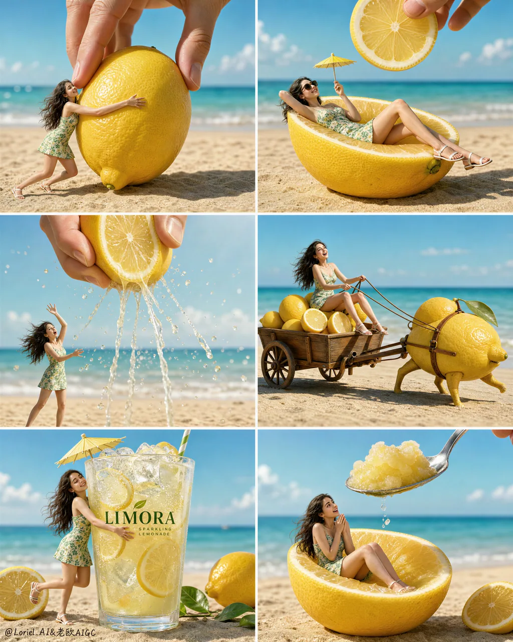
Create a Cannes-level premium summer beverage campaign poster for a fictional lemon drink brand called "LIMORA", using a strict 2-column by 3-row grid layout with six perfectly aligned panels. Preserve the exact structural logic of the composition: each panel shows the same tiny ultra-realistic young woman on a bright sandy beach interacting with oversized lemons, lemon slices, lemon juice, or the final branded drink, while selected panels include a giant realistic human hand entering from above. The full poster must feel like one unified high-end advertising storyboard in motion, where the eye flows continuously from fresh citrus fruit to crafted beverage desire. The lemon product world must remain the absolute visual hero across all six panels.

Overall composition:
Use a clean six-panel grid with thin white dividers, equal panel proportions, consistent horizon line, consistent beach-ocean background, and unified lighting. Every panel should feel self-contained yet rhythmically connected, as if six consecutive scenes from the same luxury summer commercial were frozen at their most iconic moments. Keep the miniature woman and the oversized lemon-related object centered in each frame, with the sea softly blurred in the background and the sand sharply rendered in the foreground. The full page must read instantly from a distance, with strong commercial clarity and polished editorial control.

Orbit visual flow:
Design the entire set around one strong circulation of motion from panel 1 to panel 6. The action should escalate visually: touch, recline, squeeze, travel, embrace, taste. Use repeating directional rhythms in hair movement, arm gestures, leg angles, juice droplets, spoon angle, lemon slice placement, straw tilt, and the position of the entering hand so the eye naturally sweeps across the poster in a flowing wave. Build subtle diagonal energy inside every panel, making the citrus world feel alive, breezy, sparkling, and in motion. The whole set should feel like summer energy orbiting around the brand’s lemon drink.

Narrative panel sequence:
Panel 1: the tiny woman hugs a giant whole lemon on the sand while a giant adult hand descends from above, delicately positioning the lemon. Her pose is lively and slightly off-balance, as if the scene has just begun.
Panel 2: she reclines elegantly inside a halved lemon as though it were a luxury beach chaise, wearing dark sunglasses and holding a tiny parasol drink pick, while a floating lemon slice is lowered from above like a radiant citrus sun.
Panel 3: a giant hand squeezes a vertically cut lemon from above, sending translucent juice streams and droplets downward in a sparkling arc. The woman reacts dynamically beneath it, arms raised, body tilted, caught in the middle of the citrus action.
Panel 4: she rides in a small refined wooden cart piled with lemons, being pulled by a whimsical premium lemon-shaped creature or rolling lemon harness. The cart must feel physically grounded, artisanal, and stylish rather than cartoonish.
Panel 5: the hero climax panel. A tall branded LIMORA lemonade glass dominates the frame, packed with ice cubes, lemon slices, pale sparkling liquid, condensation, a fresh green straw, and a refined cocktail umbrella. The tiny woman hugs the cold glass joyfully, and this panel must be the strongest product-selling moment in the entire composition.
Panel 6: she sits inside a halved lemon while a large polished spoon descends from above carrying glossy lemon sorbet or crushed lemon ice, creating a final delicious serving beat with playful anticipation.

Hero product focus:
The real hero is the lemon beverage system: whole citrus fruit, sliced fruit, squeezed juice, ice, sparkling drink, sorbet, and premium serving details. Every lemon must feel hyper-real, fragrant, sunlit, juicy, and tactile, with detailed skin pores, subtle waxy oil sheen, translucent membranes, wet cut surfaces, and bright natural citrus pulp. The branded glass in panel 5 must be the most visually dominant product object in the set, with crystal-clear glass, refined original English branding reading "LIMORA", elegant condensation, premium ice refraction, and luminous pale-yellow drink clarity.

Character design:
Depict one recurring ultra-realistic miniature young woman across all six panels, wearing the same fitted green floral mini dress and white sandals, with long dark wavy hair and naturally expressive features. She must look like a real scaled-down human placed into a surreal oversized citrus world. Keep anatomy coherent and believable in every frame: correct head-to-body proportion, realistic shoulders, collarbones, arms, waist, hips, thighs, knees, calves, ankles, and feet, with perfectly formed hands and five fingers clearly visible. Her expressions should shift panel by panel: surprised delight, relaxed confidence, playful alarm, exhilaration, joyful refreshment, amused anticipation. Skin must remain photorealistic with pores, natural tonal shifts, faint knee and elbow texture, realistic skin elasticity, and no plastic AI beauty finish.

Lighting:
Use bright premium seaside daylight with a soft upper-left sun direction and gentle atmospheric diffusion. Maintain luminous fresh summer lighting across all six scenes, with short, soft-edged shadows and crisp dimensional highlights. Juice droplets, lemon pulp, ice cubes, spoon edges, sunglasses, glass rim, and condensation should all catch clean sparkling highlights. Lighting must feel luxurious, refreshing, and physically consistent from panel to panel.

Materials:
Lemons: ultra-detailed peel pores, subtle dimpling, natural rind thickness, glistening wet pulp, believable cut translucency, realistic juice behavior.
Drink glass: high-clarity premium glass, accurate refraction, heavy base, condensation beads, crisp logo print, ice transparency, sparkling carbonated liquid feel.
Sorbet and juice: glossy, semi-translucent, cold, wet, appetizing, physically accurate.
Dress: lightweight summer cotton with tiny green floral print, natural wrinkles, fabric tension, and wind-responsive edges.
Hair and skin: realistic strands, fine flyaways, natural shine, believable skin texture.
Large hand: realistic adult fingers, soft skin compression, natural nails, coherent scale perspective.
Cart and props: refined warm wood grain, polished wheels, believable joints and harness elements.
Beach environment: fine sunlit sand with miniature footprints and pressure marks, soft shoreline blur, clean turquoise sea with pale foam.

Color system:
Build the palette around lemon yellow, fresh citrus green, turquoise sea, pale sky blue, warm beach beige, crisp white highlights, and restrained natural skin tones. Yellow must remain the dominant hero color, supported by green and turquoise. Keep the image bright, appetizing, summery, clean, and internationally commercial. Avoid random accent colors.

Typography and branding:
Do not copy any text from the sample. Keep typography minimal and original. Place refined English branding only on the hero glass and optionally a tiny campaign line below the full grid, such as: "LIMORA — Bright in Motion". Typography must feel premium, modern, minimal, and secondary to the visual storytelling.

Art direction:
Hyper-real premium surreal advertising photography, luxury FMCG campaign, storyboard energy, elegant humor, cinematic micro-world illusion, high-end beverage styling, global summer launch poster, polished magazine-grade finish, sharp product realism, strong narrative rhythm, premium brand coherence.

Negative prompt:
copied text, Chinese text, existing brand names, cartoon style, toy-like figure, grotesque oversized head, deformed anatomy, extra fingers, missing fingers, fused fingers, twisted wrists, broken limbs, distorted feet, AI plastic skin, over-smoothed skin, fake citrus texture, unrealistic juice physics, muddy lemon pulp, cloudy glass, weak product focus, inconsistent lighting, inconsistent horizon, messy grid, cluttered props, meme aesthetic, cheap humor, childish illustration, low-resolution detail, oversaturated colors, dead black patches, distorted giant hand perspective