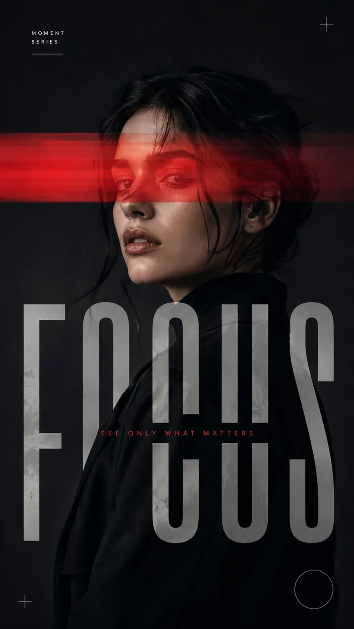
Create a medium-sized 9:16 experimental editorial portrait poster using the following customizable inputs:

Subject: [Adult Male or Female Portrait]
Interference: [Color Split / Narrow Light Beam / Horizontal Cut / Motion Veil]
Title: [Title]
Palette: [Main Neutral Tones + One Accent Color]
Mood: [Sharp / Cinematic / Restrained / Experimental]

Create a striking close-up or waist-up portrait with the subject occupying a strong portion of the frame. Preserve realistic facial features, natural skin texture, authentic hair, realistic proportions, clear emotion, and a strong silhouette. The portrait must work visually as a fashion photograph before the graphic intervention is applied.

Use only one primary interference method:

Color Split: Uneven translucent bands selectively shift, reveal, separate, or distort portions of the portrait.

Narrow Light Beam: A single controlled beam cuts across the face or body and continues naturally into the surrounding space.

Horizontal Cut: Bold horizontal bands interrupt selected areas of the portrait and interact with oversized typography.

Motion Veil: Keep the main portrait sharp while selected areas create subtle horizontal photographic motion trails.

Make typography an integral part of the composition. Use one dominant headline, allowing letters to crop beyond the frame, overlap the subject, disappear behind the body, or interact with the interference.

Keep supporting text minimal: one small series label and one short phrase.

Use mostly black, white, grey, charcoal, or deep neutral tones, plus one accent color. Keep skin tones natural and avoid excessive warmth or yellow grading.

Add only a few subtle graphic details such as fine lines, circles, or open corner marks when necessary.

The final composition should feel like a premium fashion editorial, contemporary photography poster, or experimental art-direction piece—clean, intentional, sophisticated, and visually balanced.

Avoid multiple competing effects, dense text, UI elements, heavy glitches, random collage, excessive decoration, numbering, “Vol.” or “Issue” labels, sparkle symbols, logos, watermarks, distorted anatomy, plastic skin, oversaturation, and generic template aesthetics.

Keep the overall treatment medium in scale, refined, adaptable, and universally applicable to different people, titles, themes, palettes, and editorial concepts.