[CITY] = Seoul
[COUNTRY] = South Korea
[LANDMARK] = a recognizable landmark or scenic element of [CITY]

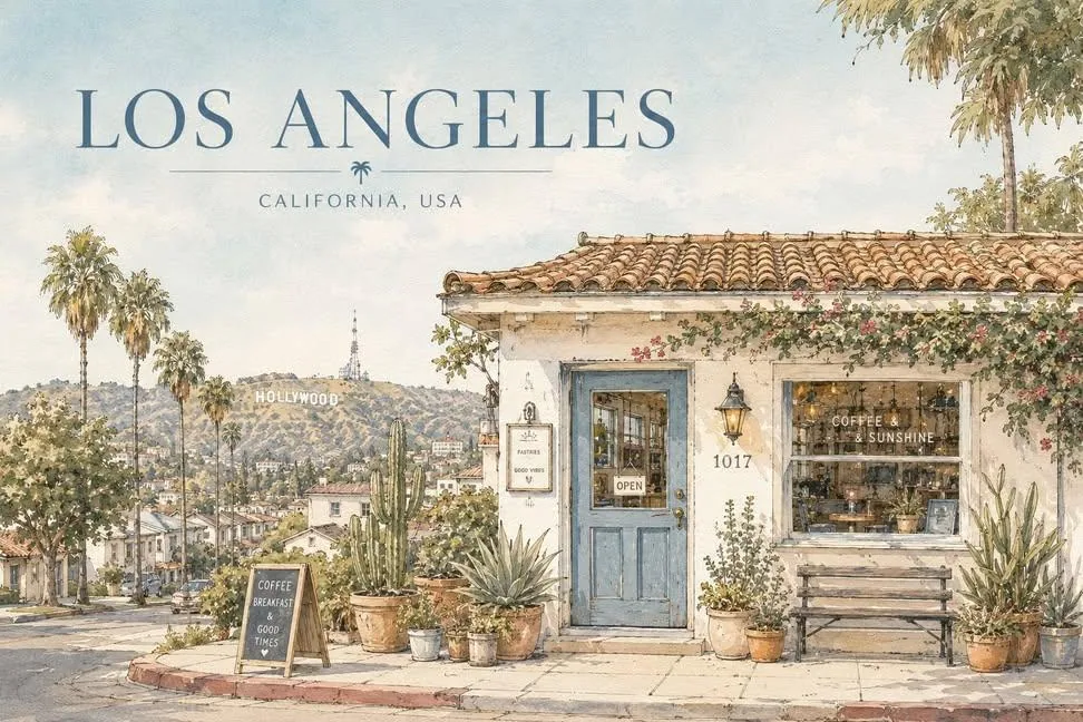
Create a serene architectural travel illustration inspired by [CITY], [COUNTRY], in a soft hand-drawn watercolor and ink style.

Main concept:
Show a quiet, charming street-side house or small building inspired by the everyday atmosphere of [CITY], [COUNTRY], while subtly incorporating [LANDMARK] in the composition.
The landmark should appear naturally in the background, distance, or surrounding scenery, so the image clearly feels connected to [CITY], [COUNTRY] without losing the calm residential mood.

Visual style:
delicate hand-drawn architectural illustration,
soft watercolor washes,
thin ink outlines,
slightly imperfect sketch lines,
warm sunlit atmosphere,
gentle pastel palette,
subtle paper texture,
quiet travel sketchbook aesthetic,
minimal yet detailed composition,
calm editorial illustration mood,
poetic everyday scenery,
cozy and refined visual tone,
no photorealism,
no harsh contrast,
no saturated colors,
no dramatic lighting.

Scene:
A peaceful small house, café, studio, or local building with simple walls, a tiled or regionally inspired roof, painted doors or windows, and several potted plants arranged naturally in front.
Include subtle local architectural details and everyday design elements that feel authentic to [CITY], [COUNTRY].
Incorporate [LANDMARK] as a softly integrated city symbol — for example, visible above rooftops, in the distance, or as part of the surrounding skyline or landscape.
The overall scene should feel quiet, elegant, warm, and locally rooted.

Composition:
landscape travel-poster format,
wide horizontal layout,
large open sky occupying the upper half or upper-left area,
main building placed across the lower portion of the composition,
balanced negative space,
front-facing or slightly angled composition,
potted plants and small objects along the base,
landmark subtly placed in the background or upper distance,
clean and spacious layout,
minimal but emotionally rich composition.

Typography:
Include the city name “[CITY]” clearly in the image.
Render “[CITY]” as elegant travel-poster typography, large but refined, placed prominently in the sky area or upper portion of the composition.
Optionally include “[COUNTRY]” in smaller text beneath or near the city name.
The text should feel integrated into the poster design, not like a random overlay.
Use clean, tasteful lettering that matches the calm watercolor travel-poster mood.

Color palette:
pale sky blue,
warm cream,
terracotta,
muted blue accents,
olive and soft green,
light earthy browns,
soft natural neutrals.

Texture:
visible watercolor paper grain,
transparent paint layering,
soft handmade brush texture,
gentle ink-and-wash finish.

Mood:
peaceful,
sunny,
quiet,
nostalgic,
cozy,
refined,
poetic,
calm everyday travel atmosphere.

Important:
The image should express both the intimate charm of a local building and the identity of [CITY], [COUNTRY] through the inclusion of [LANDMARK].
Do not make the landmark too dominant; it should support the mood rather than overpower the house scene.
The city name “[CITY]” must be visible and clearly readable in the final image.

Aspect ratio: 4:3 or 3:2

Creator: @hermes_agent_kr on Threads