旅行海报 [LOCATION] 系列模板:构图锁死只换城
4:5 插画旅行海报,植被→步道→水面→地标→字体条全锁死,只换 [LOCATION]。目的地 KV 批产神器。
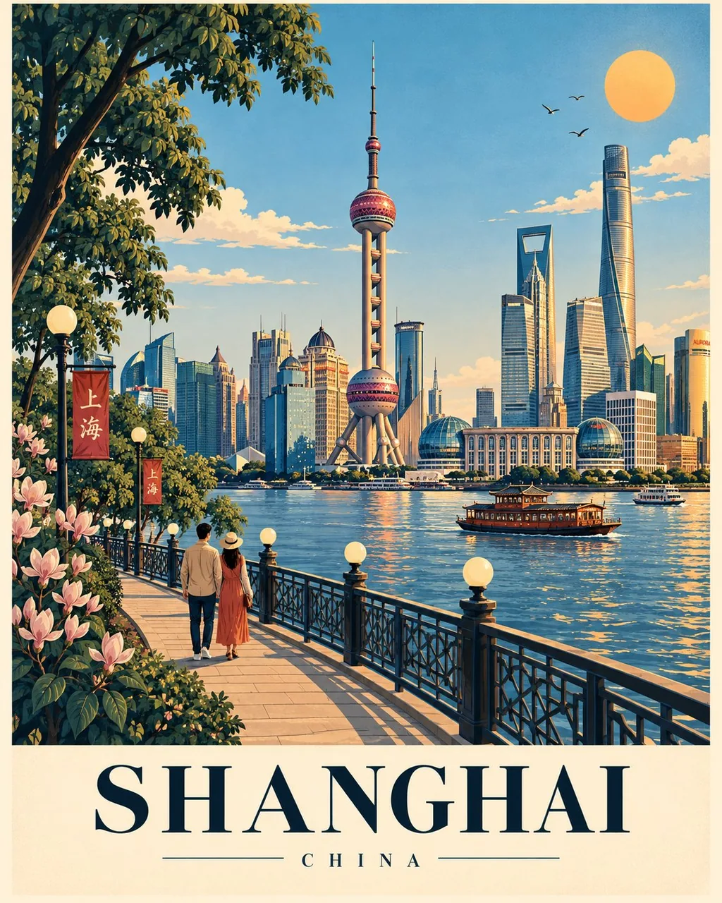
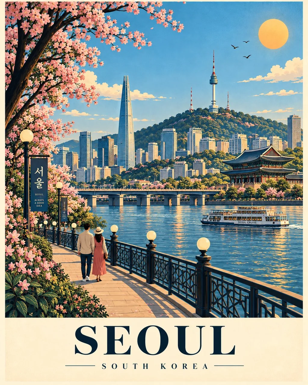
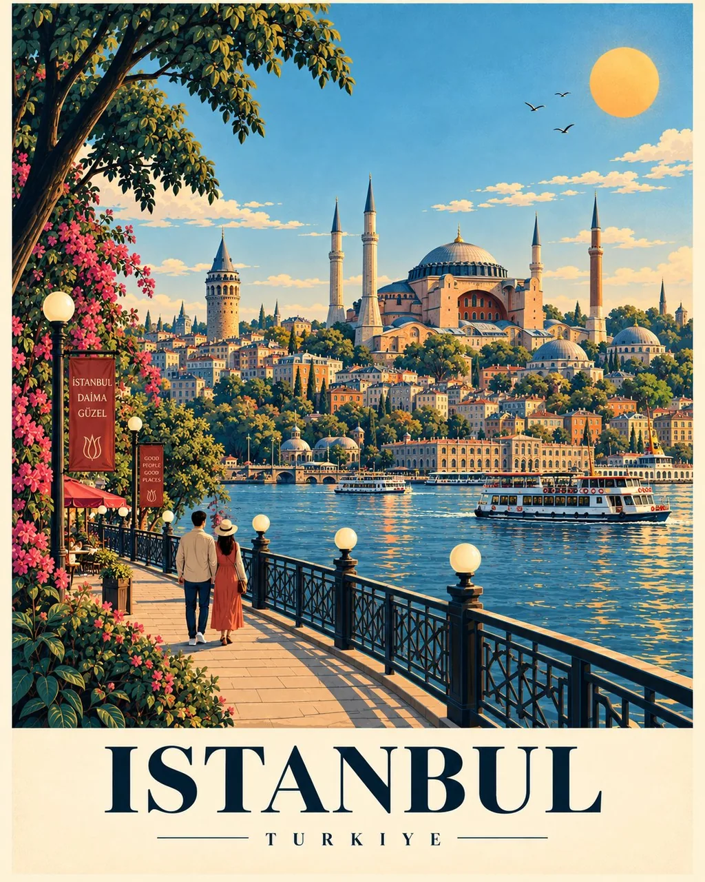
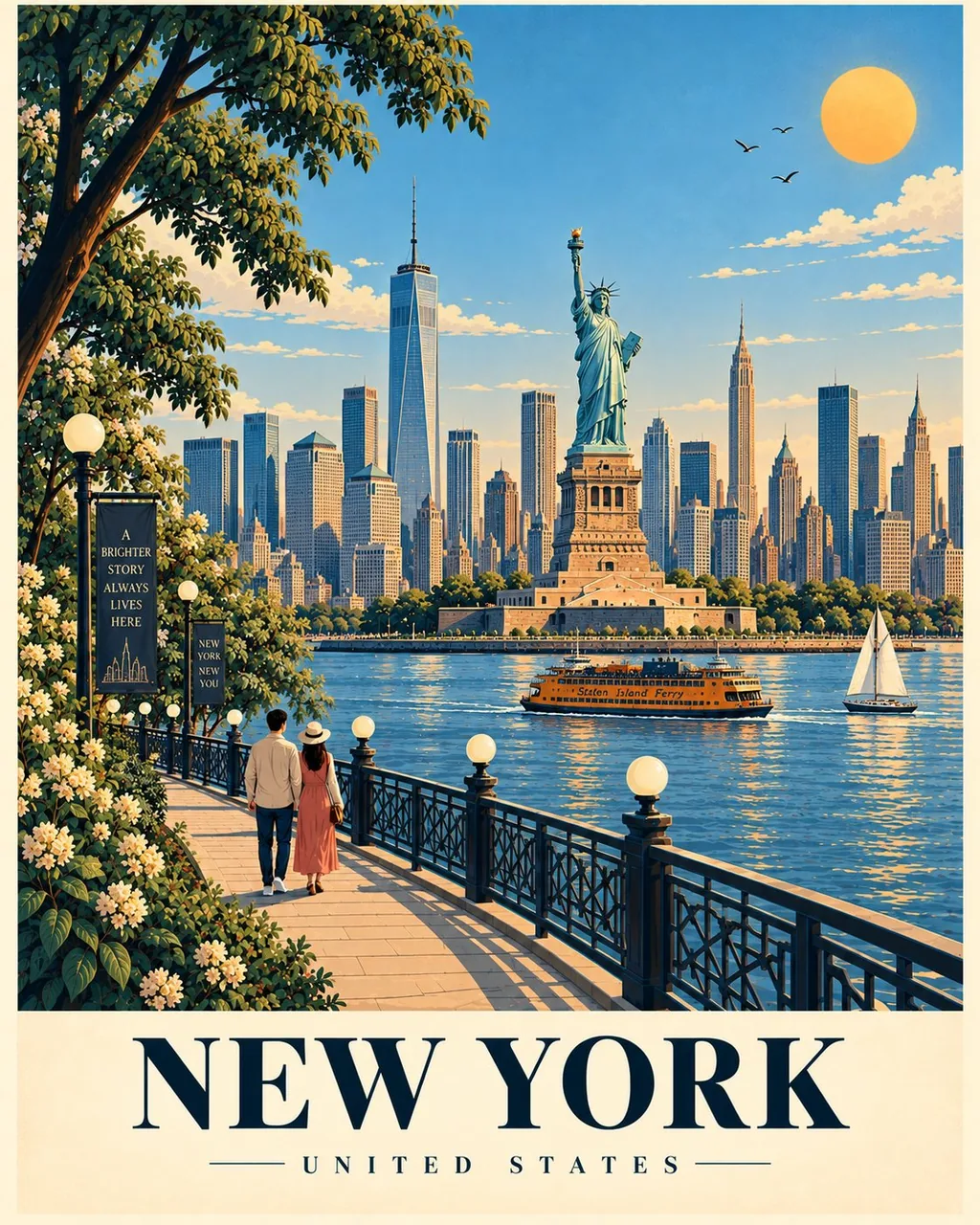
提示词
Create a premium illustrated travel poster for [LOCATION] in an exact 4:5 vertical format. This is part of a cohesive global poster series, so keep the composition fixed across every destination; only adapt the landmarks, architecture, landscape, vegetation, and cultural details.

COMPOSITION

Illustration fills 82–85%; reserve the bottom for a warm cream typography panel.

Dense vegetation frames the left edge, with one tall natural anchor in the upper-left.

A curved promenade sweeps from the lower-left toward the center, with globe lamps, dark decorative railing, and a small strolling couple.

A broad water/open-space field occupies the lower-middle; use authentic boats when appropriate.

Place the single most iconic landmark of [LOCATION] as the central hero, with the clearest silhouette and strongest visual focus.

Add one major horizontal landmark behind/beside it for balance.

Build a simplified layered local skyline/landscape with 6–12 major forms.

Add one distinctive tall local landmark near the upper-center as a vertical counterweight.

Keep the upper sky open, bright, and uncluttered, with 2–4 soft clouds, a few birds, and a warm sun in the upper-right.

VISUAL FLOW

Vegetation → promenade/couple → water/open space → central landmark → horizontal landmark → sky/sun → typography.

Never let secondary elements compete with the hero.

STYLE

Sophisticated contemporary travel-poster illustration; clean vector shapes + subtle gouache/screen-print texture, crisp dark-navy outlines, softly shaded color blocks, slight organic imperfection, refined editorial aesthetic, premium collectible quality.

No photorealism, 3D, CGI, glossy rendering, or generic clip-art.

COLOR

Harmonious destination-specific palette using dark navy outlines, natural greens, cool environmental tones, warm architectural tones, and one restrained warm accent.

AUTHENTICITY

Use only genuinely recognizable features of [LOCATION]. Prioritize iconic silhouettes and authenticity over excessive detail. Do not invent landmarks.

TYPOGRAPHY

Bottom cream panel:
[LOCATION] — large elegant uppercase serif
Thin horizontal rule
[COUNTRY / REGION] — small widely spaced uppercase text.

COMPOSITION LOCK

4:5 • left vegetation • upper-left anchor • curved promenade • couple • globe lamps • railing • lower-middle water/open space • central hero • horizontal anchor • layered background • upper-center vertical counterweight • open sky • upper-right sun • bottom typography.

Keep this structure identical for every destination. Adapt the content, never the composition.
中文译文
为 [LOCATION] 创作一张高品质插画旅行海报,严格采用 4:5 竖版格式。这是风格统一的全球海报系列之一,因此每个目的地都要保持构图固定不变;只调整地标、建筑、景观、植被和文化细节。

构图

插画占画面 82–85%;底部预留为暖奶油色的文字排版面板。

茂密植被构成左侧边缘的画框,左上方有一个高大的自然视觉锚点。

一条弧形步道从左下方向中央延伸,沿途有球形路灯、深色装饰栏杆,以及一对散步的小情侣。

开阔的水面/留白区域占据中下部;适当时使用真实的船只。

将 [LOCATION] 唯一最具标志性的地标作为中央主体,拥有最清晰的轮廓和最强的视觉焦点。

在其后方/旁边添加一个主要的横向地标以取得平衡。

用 6–12 个主要形体构建简化、分层的当地天际线/景观。

在上方中部附近添加一个独特的当地高耸地标,作为纵向配重。

保持上方天空开阔、明亮、不杂乱,有 2–4 朵柔和的云、几只飞鸟,右上方有一轮暖阳。

视觉动线

植被 → 步道/情侣 → 水面/留白 → 中央地标 → 横向地标 → 天空/太阳 → 文字排版。

绝不能让次要元素与主体争夺注意力。

风格

精致考究的当代旅行海报插画;干净的矢量造型 + 微妙的水粉/丝网印质感,清晰利落的深藏青色轮廓线,柔和晕染的色块,轻微的手工不完美感,精致的编辑设计美学,高级收藏品品质。

无照片写实、无 3D、无 CGI、无光泽渲染、无通用剪贴画。

色彩

和谐且针对目的地专属的配色,使用深藏青轮廓、自然绿色、冷调环境色、暖调建筑色,以及一个克制的暖色点缀。

真实性

只使用 [LOCATION] 真正可辨识的特征。优先保证标志性轮廓与真实性,而非过度细节。不得虚构地标。

文字排版

底部奶油色面板:
[LOCATION] — 优雅的大型大写衬线字体
细分隔横线
[COUNTRY / REGION] — 小型、字距宽松的大写文字。

构图锁定

4:5 • 左侧植被 • 左上锚点 • 弧形步道 • 情侣 • 球形路灯 • 栏杆 • 中下部水面/留白 • 中央主体 • 横向锚点 • 分层背景 • 上方中部纵向配重 • 开阔天空 • 右上太阳 • 底部文字排版。

每个目的地都保持这一结构完全一致。只调整内容,绝不改动构图。
溯源
- 原作者
- Goodmanprotocol
- 发布日期
- 2026-09-14
- 原始出处
- 查看原帖 ↗
- 收录来源
- xianyu110/awesome-gpt-image2.5 · 2099352799893172430 · MIT