Design a contemporary Swiss Style editorial poster for Moscow, Russia. Use a large bold sans-serif capital letter “M” as the main typographic structure. The “M” must be very clear, clean, geometric, solid, and dominant, with no stroke outline, no border, no shadow outline, and no decorative treatment. The silhouette of the letter “M” must remain easy to read at first glance. Do not let the illustration obscure or distort the shape of the letter. The poster should follow a precise left-aligned Swiss grid system with generous negative space.

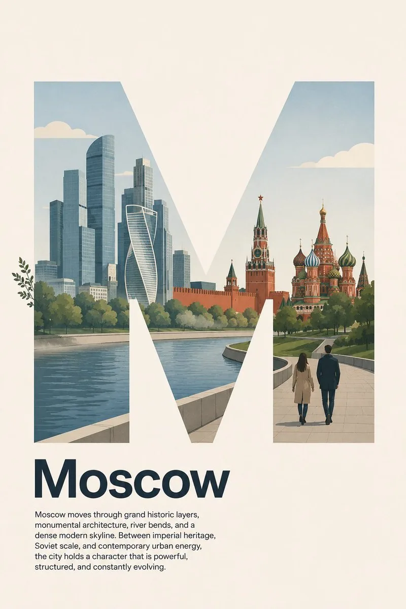
Inside the “M”, create a simple, logical, and restrained flat illustration of Moscow’s city landscape character. Use only a few essential visual elements: simplified modern skyscrapers inspired by Moscow City business district, the calm curve of the Moscow River, a subtle silhouette of the Kremlin walls and towers, onion domes of Saint Basil’s Cathedral in a simplified geometric form, a soft green park landscape inspired by Gorky Park or Zaryadye Park, and two pedestrians on a clean riverside walkway. Keep the composition minimal, spacious, and easy to understand. Do not add too many landmarks, people, signs, vehicles, monuments, statues, fountains, trains, buses, or small decorative objects.

The illustration should suggest Moscow’s identity as a capital city where imperial history, Soviet monumental scale, modern glass skyscrapers, riverfront public spaces, and vast urban rhythm coexist in a clean contemporary way. Use flat vector shapes, clean silhouettes, minimal linework, simplified architecture, and believable scale relationships. Keep the scene lightly lively but not busy. The illustration should support the letter “M”, not compete with it.

Allow only extremely subtle overlap outside the “M” frame using simple organic or atmospheric elements only: a few leaves from riverside trees or soft atmospheric mist over the river may slightly extend beyond the letter edge. Keep 97% of the illustration inside the “M”. Do not let people, buildings, domes, towers, vehicles, faces, paths, signage, or complex objects overlap outside the letter. The “M” must remain clearly readable and visually dominant.

Place the headline “Moscow” below the letter in bold sans-serif type, title case, not all caps, left aligned to the same grid. Under the headline, add this short body paragraph in small regular sans-serif text, also left aligned, with clean spacing and refined editorial hierarchy:

“Moscow moves through grand historic layers, monumental architecture, river bends, and a dense modern skyline. Between imperial heritage, Soviet scale, and contemporary urban energy, the city holds a character that is powerful, structured, and constantly evolving.”

No icons, no badges, no decorative symbols. The overall design should feel Swiss minimalist: strong grid, precise alignment, asymmetrical balance, clean typography, generous negative space, restrained composition, and modern cultural city poster aesthetics.

Color palette: warm ivory background, deep navy or charcoal typography, concrete gray, glass blue, pine green, Kremlin red accents, river blue-gray, pale beige, and soft black accents. Matte paper finish, subtle paper grain, crisp edges, flat contemporary illustration, modern Moscow metropolitan mood, calm but strong, sophisticated, balanced, and print-ready.

Negative prompt: photorealistic, 3D render, glossy, maximalist, overcrowded city, complex illustration, too many details, too many landmarks
中文译文
为俄罗斯莫斯科设计一张当代瑞士风格编辑海报。使用一个巨大的粗体无衬线大写字母“M”作为主要排版结构。“M”必须非常清晰、干净、几何化、坚实且占据主导,不得有描边轮廓、不得有边框、不得有阴影描边,也不得有装饰性处理。字母“M”的剪影必须一眼就能轻松辨认。不要让插画遮挡或扭曲字母的形状。海报应遵循精确的左对齐瑞士网格系统,并留出充裕的负空间。

在“M”内部,创作一幅简洁、合乎逻辑且克制的扁平插画,表现莫斯科城市景观的特色。只使用少量必要的视觉元素:受莫斯科城商务区启发的简化现代摩天大楼、莫斯科河平静的弯道、克里姆林宫城墙与塔楼的含蓄剪影、以简化几何形式呈现的圣瓦西里大教堂洋葱穹顶、受高尔基公园或扎里亚季耶公园启发的柔和绿色公园景观,以及干净河滨步道上的两位行人。保持构图极简、疏朗、易于理解。不要添加过多的地标、人物、标识、车辆、纪念碑、雕像、喷泉、火车、公交车或小型装饰物件。

插画应传达莫斯科作为首都的身份:帝国历史、苏联时期的宏伟尺度、现代玻璃摩天大楼、滨河公共空间与广阔的城市节奏,以干净的当代方式共存。使用扁平矢量形状、干净的剪影、极简线条、简化建筑以及可信的比例关系。让场景略带生动感但不繁杂。插画应衬托字母“M”,而不是与之竞争。

仅允许使用简单的有机或氛围元素,在“M”框架外做极其细微的溢出:河畔树木的几片叶子或河面上柔和的大气薄雾可以略微超出字母边缘。将 97% 的插画保持在“M”内部。不要让人物、建筑、穹顶、塔楼、车辆、面孔、路径、标牌或复杂物体溢出到字母之外。“M”必须保持清晰可读并在视觉上占主导。

将标题“Moscow”以粗体无衬线字体置于字母下方,采用标题式大小写,不用全大写,并与同一网格左对齐。在标题下方,添加下面这段短正文,使用小号常规无衬线字体,同样左对齐,间距干净,呈现精致的编辑层级:

“Moscow moves through grand historic layers, monumental architecture, river bends, and a dense modern skyline. Between imperial heritage, Soviet scale, and contemporary urban energy, the city holds a character that is powerful, structured, and constantly evolving.”

不要图标、不要徽章、不要装饰性符号。整体设计应具有瑞士极简主义的感觉:强烈的网格、精确的对齐、非对称平衡、干净的字体排印、充裕的负空间、克制的构图,以及现代文化城市海报美学。

配色方案:暖象牙色背景、深海军蓝或炭灰色字体、混凝土灰、玻璃蓝、松绿、克里姆林宫红点缀、河蓝灰、浅米色以及柔和的黑色点缀。哑光纸张质感、细微纸纹、边缘利落、扁平当代插画、现代莫斯科大都会氛围、平静而有力、精致、平衡且可直接付印。

负面提示词:照片级写实、3D 渲染、光泽感、极繁主义、拥挤的城市、复杂插画、过多细节、过多地标