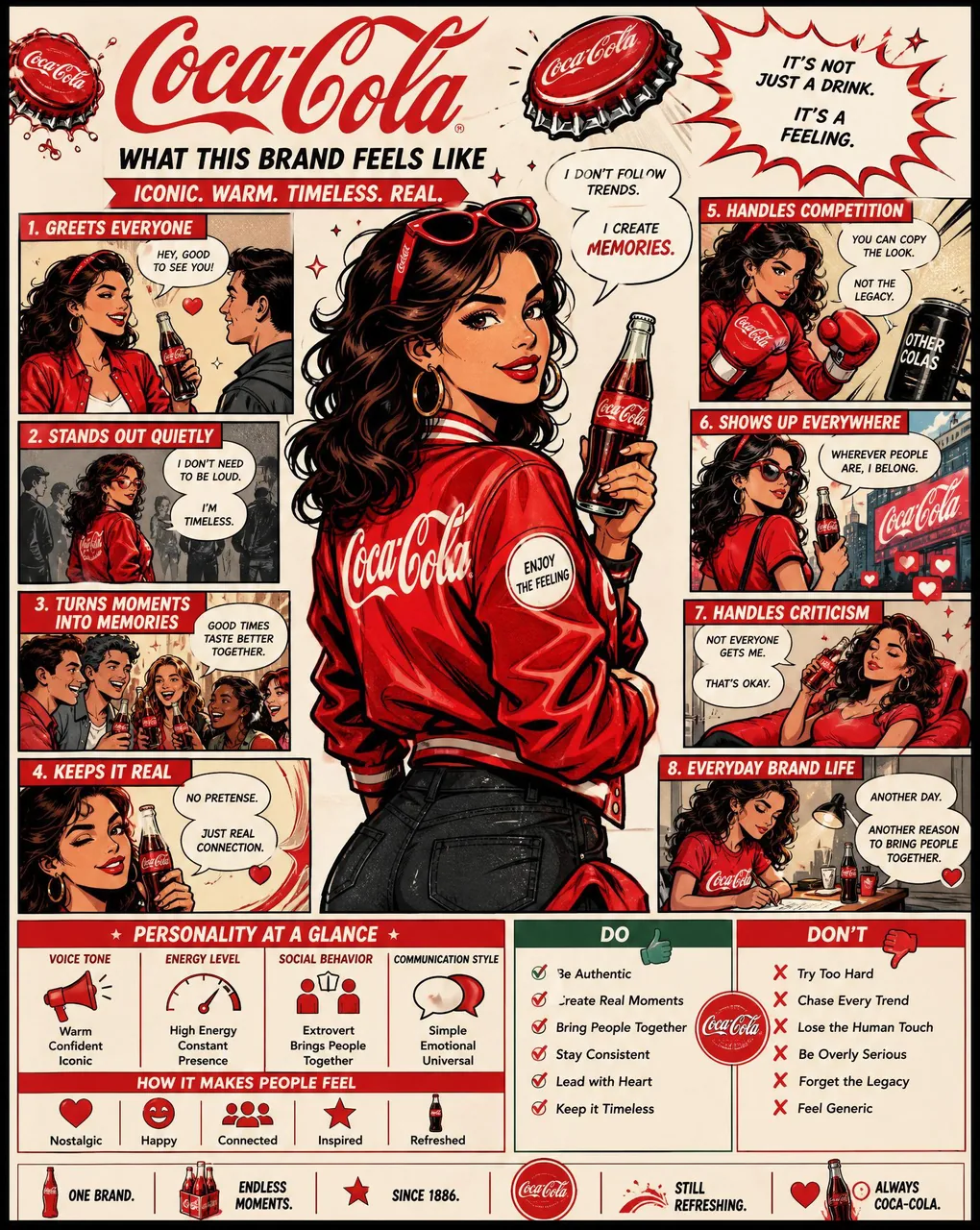
Using the uploaded logo, create a highly detailed, comic-style infographic poster:

“What This Brand Feels Like”

GOAL:
Turn the brand into a living personality and visually explain how it behaves, speaks, and interacts with the world.
This must feel like a mix of: brand strategy + character design + comic storytelling.

---

CORE RULE:
Everything must come from the logo:
- colors
- style
- tone
- personality

No generic personality traits.

---

MAIN STRUCTURE:
Vertical 4:5 poster
Dense layout with multiple panels
Comic + infographic hybrid

---

TOP SECTION:
- Brand name
- Short personality statement (max 6 words)
Example: “Quiet confidence with sharp edges”

---

MAIN CHARACTER (VERY IMPORTANT):
Create a central character representing the brand:
- humanized version of the brand
- outfit reflects brand style
- posture + expression reflect personality

---

AROUND THE CHARACTER:
Create 6–8 comic panels showing how the brand behaves in different situations.

---

SCENARIO IDEAS:
- Talking to customers
- Handling competition
- Selling a product
- Social media presence
- Reacting to criticism
- Daily “brand life” moment

---

FOR EACH PANEL:
Include:
- short caption (max 6 words)
- speech bubble or internal thought
- clear visual action

---

TONE EXAMPLES:
Luxury brand: calm, confident, minimal speech
Playful brand: loud, chaotic, expressive
Tech brand: precise, logical, clean

---

PERSONALITY TRAITS SECTION:
Add small labeled blocks:
- Voice tone (e.g. calm, bold, playful)
- Energy level (low / medium / high)
- Social behavior (introvert / extrovert)
- Communication style

Use:
- icons
- short labels

---

DO / DON’T SECTION:
Add a split block:
DO:
- how the brand should act
DON’T:
- what breaks the identity

Keep:
- very short phrases

---

VISUAL ELEMENTS:
- speech bubbles
- icons
- arrows
- small reactions
- exaggerated comic expressions

---

STYLE:
- comic + editorial hybrid
- slightly exaggerated but still premium
- expressive but not childish

---

COLOR:
- strictly based on logo palette
- use color to reinforce personality

---

DEPTH:
- 20–40 visual elements
- multiple small panels
- layered composition

---

IMPORTANT RULES:
- must feel alive
- must feel specific
- no generic marketing words
- no empty areas
- keep text short but impactful

---

FINAL FEEL:
Like:
- a brand strategy turned into a character
- a visual storytelling board
- something people save and study

NOT:
- flat
- generic
- minimal