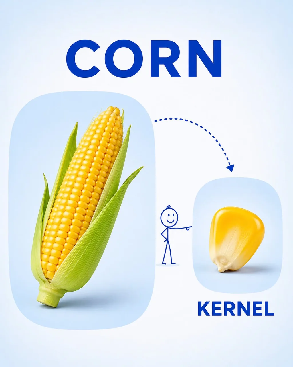
Create a clean, child-friendly educational vocabulary poster for preschool/kindergarten children, inspired by a simple visual learning card.

Feature [FRUIT] as the main large realistic object on the left, and show a [PART / SLICE / SEGMENT] of the same fruit on the right. Connect the two with a playful dotted curved arrow and a tiny simple stick-figure child pointing toward the smaller part.

Add the word “[FRUIT NAME]” in large bold uppercase letters at the top and “[PART NAME]” in large bold uppercase letters underneath the smaller image. Use a soft white and very light pastel-blue background, rounded image panels, clean spacing, realistic fruit photography, simple blue typography, and minimal playful illustrations.

The overall design should feel bright, educational, modern, uncluttered, and easy for young children to understand, like a premium preschool vocabulary learning card. Vertical 4:5 composition, high resolution, soft lighting, clear labels, no unnecessary decorations.