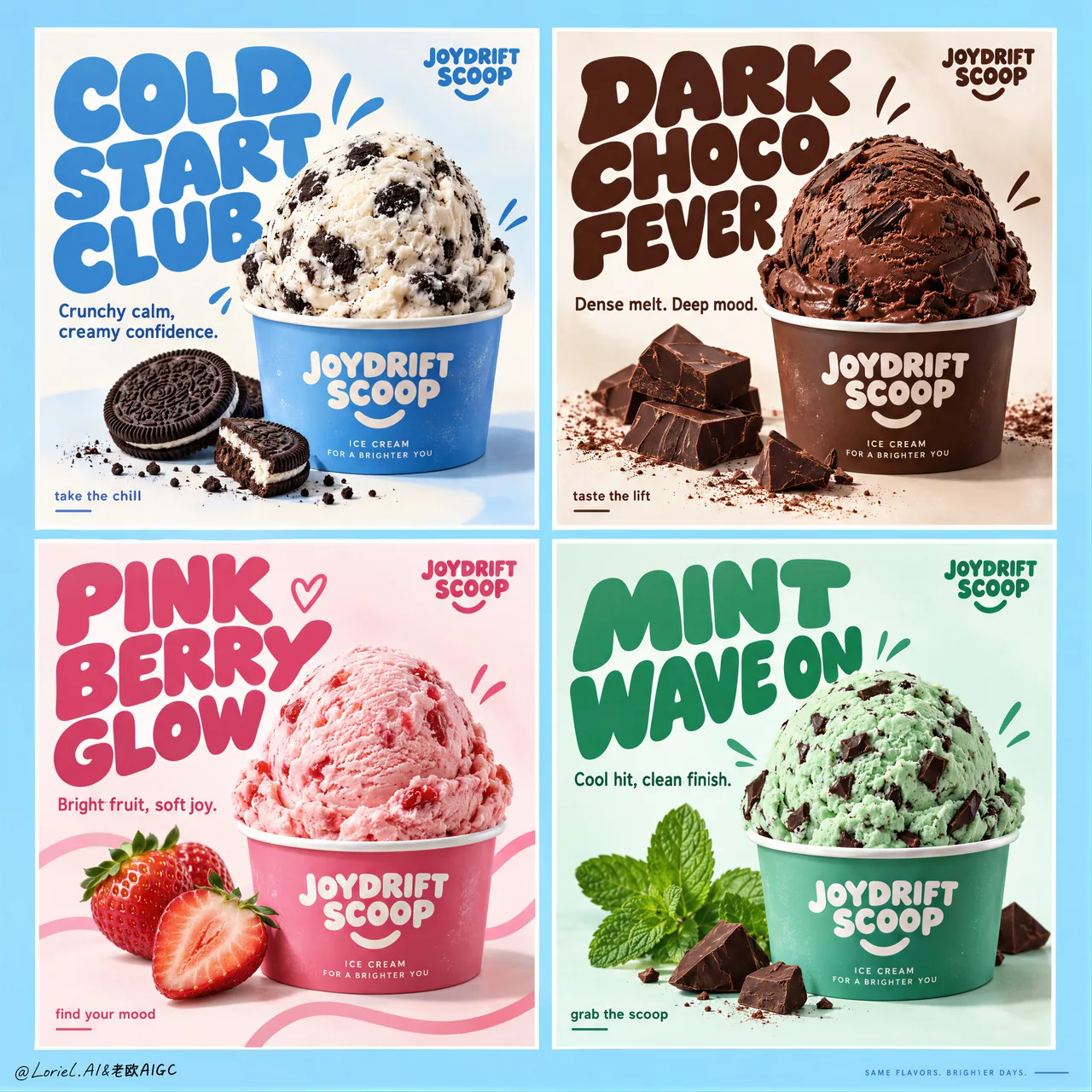
饮料口味 2×2 栅格广告:只改 flavor 变量
等分四格、同杯比例、固定标题区与角标、白缝对齐——结构锁死只换口味色与道具。系列产品海报/FMCG 战役板可直接抄,附完整英文 campaign prompt。
提示词
Create a premium commercial poster board for a fictional ice cream brand called JOYDRIFT SCOOP, redesigned into a unified four-panel campaign grid that merges Orbit-level commercial punch with Port-level curated restraint. The full composition is a strict 2x2 poster system on a soft sky-blue master background, with four equal rectangular panels, clean white gutters, perfect alignment, and a highly controlled visual rhythm. Each panel behaves like an individual flavor advertisement, but the whole page reads as one collectible brand campaign with stronger hierarchy, cleaner negative space, larger typography, fewer decorative distractions, and a more gallery-like sense of control. The ice cream remains the absolute hero in every panel.

The campaign concept is flavor as mood architecture. Each panel contains one centered or lower-centered hero scoop in a branded paper cup, oversized custom display typography, one concise support line, a few restrained doodle accents, and only the most essential ingredient props. Keep the composition bold, product-led, playful, and premium. Reduce unnecessary splash clutter and busy micro-elements; every graphic mark must support the scoop, not compete with it.

Panel system:
Top-left panel: cookies-and-cream scoop in a branded paper cup, cool blue-and-cream flavor world, minimal cookie crumb accents, campaign headline exactly: "COLD START CLUB". Support copy exactly: "Crunchy calm, creamy confidence."
Top-right panel: rich chocolate scoop in a branded cup with a few dark chocolate chunks and restrained cocoa accents, campaign headline exactly: "DARK CHOCO FEVER". Support copy exactly: "Dense melt. Deep mood."
Bottom-left panel: strawberry scoop in a branded cup with two or three clean fresh strawberry elements and restrained pink ribbon-like graphic curves, campaign headline exactly: "PINK BERRY GLOW". Support copy exactly: "Bright fruit, soft joy."
Bottom-right panel: mint chocolate scoop in a branded cup with crisp mint leaves and a few precise chocolate chip cues, campaign headline exactly: "MINT WAVE ON". Support copy exactly: "Cool hit, clean finish."

Brand design and typography: every panel includes a small consistent top-corner brand mark reading exactly: "JOYDRIFT SCOOP". Use large rounded custom display lettering with flavor-specific color shifts, thicker mass, tighter hierarchy, and stronger sculptural presence than before. Use a smaller clean sans-serif for support lines and tiny CTA microcopy such as "take the chill", "taste the lift", "find your mood", or "grab the scoop", but keep these sparse and secondary. Typography must behave as a graphic object integrated into the composition, wrapping around the scoop without touching the main product silhouette.

Product styling: ultra-real premium ice cream with believable scoop geometry, creamy micro-texture, gentle edge softness, realistic inclusions, minimal appetizing melt, and crisp branded cups. Cookies-and-cream shows visible cookie chunks in cool white cream; chocolate feels velvety, dense, and dark; strawberry feels airy, fruit-forward, and luminous; mint feels cool, fresh, and slightly sharper in texture with chocolate fragments. The scoops must feel physically convincing and highly edible, with no collapse, over-melt, or messy drips.

Color system: each panel operates as its own controlled flavor universe while the whole board remains harmonized. Use a refined 60/30/10 balance inside each quadrant: dominant flavor hue, white/cream support, and one accent note. Across the full four-panel board, maintain a candy-clean campaign palette built from sky blue, cream white, cocoa brown, berry pink, and mint green, with the overall master background tying the set together. The image should feel brighter, more premium, and more curated than a typical FMCG flavor poster sheet.

Lighting and finish: bright studio-commercial lighting with soft frontal fill, subtle top highlights on each scoop, gentle shadow grounding under the cups, clean white handling inside the panels, and extremely polished product retouching. Show creamy micro-texture, matte paper cup print, fresh mint leaf surfaces, glossy berry freshness, and crisp chocolate edges. The final image should feel like a Cannes-level FMCG campaign: playful yet disciplined, tactile yet clean, youthful yet art-directed.

Output and constraints: one complete four-panel ice cream campaign board, product-first, highly graphic, clean luxury execution, no people, no extra unrelated props, no copied original poster text, no real brand names, no cluttered doodle overload, no broken grid alignment, no unreadable text, no malformed scoops, no duplicated ingredients, no warped cups, no muddy colors, no messy drips, no cheap clip-art feel, no AI text gibberish, and no style drift between panels.
中文译文
为一个名为 JOYDRIFT SCOOP 的虚构冰淇淋品牌创作一张高级商业海报板,重新设计为统一的四格广告网格,融合 Orbit 级别的商业冲击力与 Port 级别的策展式克制。整体构图是一个严格 2x2 的海报体系,主背景为柔和的天蓝色,四个等大的矩形分格,干净的白色间隔,完美对齐,视觉节奏高度可控。每一格都像一则独立的口味广告,而整页读起来是一套值得收藏的品牌战役:层级更强、留白更干净、字体更大、装饰干扰更少,更具画廊般的高级控制感。冰淇淋在每一格中始终是绝对主角。

创意概念是「口味即情绪建筑」。每一格包含一个居中或偏下居中的主角冰淇淋球,装在品牌纸杯中,超大定制展示字体,一句简洁的辅助文案,几处克制的涂鸦点缀,以及最必要的原料道具。保持构图大胆、以产品为主导、俏皮且高级。减少多余的飞溅杂物与繁复的微小元素;每一个图形标记都必须衬托冰淇淋球,而不是与之争抢。

分格系统:
左上格:曲奇奶油冰淇淋球装在品牌纸杯中,冷调蓝与奶白构成的口味世界,极简的曲奇碎点缀,广告主标题必须精确为:"COLD START CLUB"。辅助文案必须精确为:"Crunchy calm, creamy confidence."
右上格:浓郁巧克力冰淇淋球装在品牌杯中,配几块黑巧克力碎和克制的可可点缀,广告主标题必须精确为:"DARK CHOCO FEVER"。辅助文案必须精确为:"Dense melt. Deep mood."
左下格:草莓冰淇淋球装在品牌杯中,配两三个干净的新鲜草莓元素和克制的粉色缎带般图形曲线,广告主标题必须精确为:"PINK BERRY GLOW"。辅助文案必须精确为:"Bright fruit, soft joy."
右下格:薄荷巧克力冰淇淋球装在品牌杯中,配清新的薄荷叶和几处精准的巧克力豆提示,广告主标题必须精确为:"MINT WAVE ON"。辅助文案必须精确为:"Cool hit, clean finish."

品牌设计与字体:每一格都包含一个统一的小号角落品牌标识,文字必须精确为:"JOYDRIFT SCOOP"。使用大号圆角定制展示字体,配合各口味专属的色彩变化,字重更厚、层级更紧凑,比之前更具雕塑感。辅助文案和极小的 CTA 微文案(例如 "take the chill"、"taste the lift"、"find your mood" 或 "grab the scoop")使用更小、更干净的无衬线字体,但要保持稀疏、次要。字体必须作为融入构图的图形元素,环绕冰淇淋球排布,但不触碰产品主体的轮廓。

产品造型:超写实的高级冰淇淋,球体几何形态可信,奶油般的微质感,边缘柔和,内含物真实,只有极少量诱人的融化,品牌纸杯挺括。曲奇奶油口味在冷调白色奶油中可见曲奇碎块;巧克力口味丝滑、浓郁、深沉;草莓口味轻盈、果味突出、通透有光泽;薄荷口味清凉、新鲜,质地略微更锐利,并带有巧克力碎屑。冰淇淋球必须在物理上可信、极具食欲,不得塌陷、过度融化或出现凌乱的滴落。

色彩系统:每一格都是自成一体的受控口味宇宙,同时整块海报保持和谐统一。每个象限内部采用精致的 60/30/10 配比:口味主色、白色/奶油色辅助、一处强调色。在整块四格海报中,保持由天蓝、奶白、可可棕、莓果粉和薄荷绿构成的糖果般干净的广告色调,并由整体主背景将整套画面串联起来。画面应比典型的快消口味海报更明亮、更高级、更具策展感。

光线与质感:明亮的影棚商业布光,柔和正面补光,每个冰淇淋球上方有细微高光,杯底有柔和的落地阴影,分格内部白色处理干净利落,产品修图极为精细。呈现奶油般的微质感、哑光纸杯印刷、新鲜薄荷叶表面、莓果的光泽新鲜感,以及清晰的巧克力边缘。最终画面应像戛纳级别的快消广告:俏皮而有纪律,有质感而干净,年轻而富有艺术指导。

输出与约束:一张完整的四格冰淇淋广告海报,以产品为先,图形感强烈,执行干净高级;无人物,无额外无关道具,无照搬原始海报文字,无真实品牌名,无杂乱涂鸦堆砌,无网格错位,无不可读文字,无形变的冰淇淋球,无重复原料,无扭曲的杯子,无浑浊的色彩,无凌乱的滴落,无廉价剪贴画感,无 AI 乱码文字,各格之间无风格漂移。
溯源
- 原作者
- ou_zhen599
- 发布日期
- 2026-09-17
- 原始出处
- 查看原帖 ↗
- 收录来源
- xianyu110/awesome-gpt-image2.5 · 2100525164324913662 · MIT