巨型字体当遮罩:目的地海报字母即风景
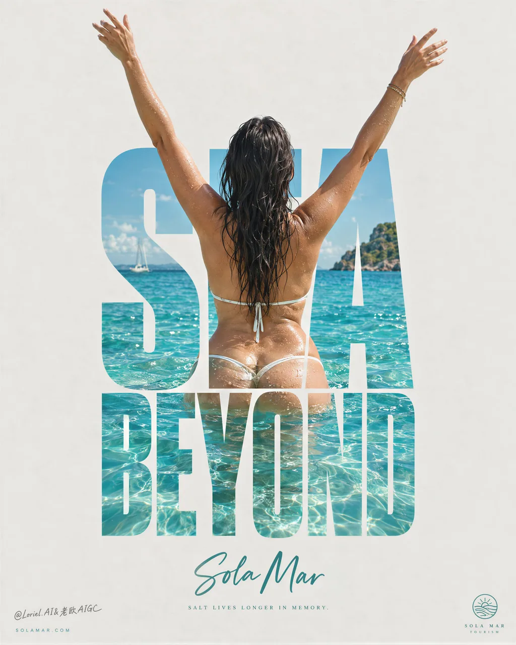
双词巨标题做水景蒙版,背影人物手臂冲出字顶——字不是标签,是入口。旅行 KV / 目的地主视觉的字体即场景打法。
Prompt
A destination poster gets stronger when the type becomes the view.
🌊 use a towering, condensed two-word title as a mask filled with crystalline turquoise water, shoreline, and sunlit ripples
The destination is visible before anyone reads the name. The letters become a portal instead of a label.
✨ let one back-facing figure stand inside the title block, with raised arms extending beyond the top edges of the letterforms
The figure breaks the grid just once, turning the type from a graphic device into a moment of arrival.

GPT- image 2.5 prompt👇
Create a premium destination advertising poster for a fictional coastal tourism brand named SOLA MAR, designed as a single vertical minimalist campaign image with monumental negative space and one central typographic-body composition. The destination itself is the product. The poster must feel like a Cannes-level travel key visual, a collectible editorial print, and a gallery-grade graphic tourism poster at the same time.

The whole image is built around one exact visual idea: a mature woman seen from behind standing in brilliant tropical water with both arms lifted upward in a liberated V-shape, perfectly fused with a towering stacked word block at the center of the page. The typography acts as an architectural mask: the photographic ocean scene, the woman’s back, wet skin, dark hair, and turquoise water appear inside the giant letters, while her two raised arms extend beyond the top edges of the letterforms and become the main kinetic silhouette against the pale empty background. This body-and-type fusion is the hero composition and must feel exact, elegant, and internationally iconic.

Use a pale sun-bleached warm-grey paper background with very large clean negative space. At the center, build one tall stacked uppercase title in bold condensed letterforms reading "SEA / BEYOND" or another equally strong original two-word construction, arranged as a compact vertical typographic monument. The letters must be thick enough to contain a vivid tropical image within them. The scene inside the letters and around the lower body should show premium coastal material realism: crystalline turquoise shallows, sunlit aquamarine ripples, subtle refraction around the waist and hips, small glittering highlights on the water surface, and bright tropical clarity. The water must feel warm, clean, luxurious, and irresistible.

The woman is a real mature female figure, photographed from behind, with wet dark hair falling naturally down the upper back. She stands waist-deep or high-hip-deep in clear tropical sea, torso centered within the letter block, spine and shoulder blades elegantly aligned with the typography. Her arms stretch upward beyond the text with refined asymmetry in the hands and wrists so the pose feels free and alive rather than mechanical. Anatomy must be correct and natural: realistic head-neck-shoulder relationship, natural mature back and waist structure, believable hips, smooth lower-back-to-glute transition, realistic pelvic structure, naturally full buttocks if visible, soft curvy hips, natural fleshy lower-body volume, subtle skin texture, faint real skin variation, no plastic smoothing. If hands are visible, keep all five fingers anatomically correct, separated, elegant, and undistorted. The pose must communicate freedom, salt air, warmth, and self-possession, never vulgarity.

Lighting is bright coastal daylight, crisp but soft enough to keep the poster premium rather than postcard-cheap. The skin carries luminous wet highlights and fine water droplets. The sea inside the typography should have layered cyan, turquoise, and pale teal depth, with sunlight hitting the wavelets and subtle transparency around the submerged lower body. Keep the water image vivid, but let the surrounding poster field stay quiet and restrained. The composition must feel like the typography has become a portal into the destination.

Below the central typographic monument, place the destination line "Sola Mar" in an elegant hand-script or refined brush-script, cool teal or sea-glass green, centered and much smaller than the main title. Beneath it, add only one very short poetic line in tiny editorial text, something like a restrained thought about salt, warmth, and memory. At the bottom corners, keep only minimal micro-elements: a discreet website on the left and a tiny tourism mark or seal on the right. No extra brochure-style information, no paragraph copy, no cluttered taglines.

Color hierarchy: 55% pale paper-grey and sun-bleached neutral negative space, 25% luminous tropical turquoise and aquamarine water, 15% warm bronze skin and dark wet hair contrast, 5% cool sea-glass green script accent and tiny editorial microtype. The graphic language must feel luxury-print minimal, central, clean, and collectible. The poster should read immediately from far away through its giant text silhouette, but reward close viewing through water detail, skin highlights, and precise typographic framing.

Rendering target: photoreal luxury travel campaign, premium poster layout, product-dominant destination identity, giant type as image container, elegant central composition, airy negative space, and world-class print-finish clarity.

Quality control and structured exclusions: photoreal only inside the image area, correct female anatomy, natural mature softness, realistic shoulders, back, waist, pelvis, hips, hands, and fingers, no extra fingers, no missing fingers, no fused fingers, no broken wrists, no warped spine, no distorted pelvis, no plastic skin, no muddy water, no dirty haze, no unreadable typography, no random letters, no copied destination names, no cluttered brochure layout, no cheap vacation-ad styling, no style drift, no AI slop.
Attribution
- Author
- ou_zhen599
- Published
- 2026-09-21
- Original post
- View original ↗
- Collected from
- xianyu110/awesome-gpt-image2.5 · 2101957480620453907 · MIT