거대 활자를 마스크로: 여행지 포스터에서 글자가 곧 풍경
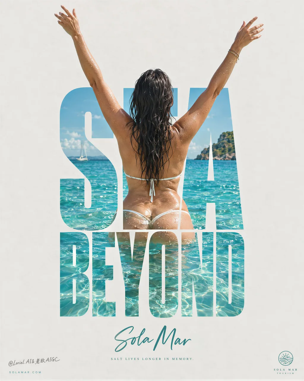
두 단어 거대 제목을 물 풍경 마스크로 쓰고, 뒷모습 인물의 팔이 글자 상단을 뚫고 나온다 — 글자는 라벨이 아니라 입구다. 여행 KV / 여행지 키비주얼에서 타이포그래피가 곧 장면이 되는 공식.
프롬프트
A destination poster gets stronger when the type becomes the view.
🌊 use a towering, condensed two-word title as a mask filled with crystalline turquoise water, shoreline, and sunlit ripples
The destination is visible before anyone reads the name. The letters become a portal instead of a label.
✨ let one back-facing figure stand inside the title block, with raised arms extending beyond the top edges of the letterforms
The figure breaks the grid just once, turning the type from a graphic device into a moment of arrival.

GPT- image 2.5 prompt👇
Create a premium destination advertising poster for a fictional coastal tourism brand named SOLA MAR, designed as a single vertical minimalist campaign image with monumental negative space and one central typographic-body composition. The destination itself is the product. The poster must feel like a Cannes-level travel key visual, a collectible editorial print, and a gallery-grade graphic tourism poster at the same time.

The whole image is built around one exact visual idea: a mature woman seen from behind standing in brilliant tropical water with both arms lifted upward in a liberated V-shape, perfectly fused with a towering stacked word block at the center of the page. The typography acts as an architectural mask: the photographic ocean scene, the woman’s back, wet skin, dark hair, and turquoise water appear inside the giant letters, while her two raised arms extend beyond the top edges of the letterforms and become the main kinetic silhouette against the pale empty background. This body-and-type fusion is the hero composition and must feel exact, elegant, and internationally iconic.

Use a pale sun-bleached warm-grey paper background with very large clean negative space. At the center, build one tall stacked uppercase title in bold condensed letterforms reading "SEA / BEYOND" or another equally strong original two-word construction, arranged as a compact vertical typographic monument. The letters must be thick enough to contain a vivid tropical image within them. The scene inside the letters and around the lower body should show premium coastal material realism: crystalline turquoise shallows, sunlit aquamarine ripples, subtle refraction around the waist and hips, small glittering highlights on the water surface, and bright tropical clarity. The water must feel warm, clean, luxurious, and irresistible.

The woman is a real mature female figure, photographed from behind, with wet dark hair falling naturally down the upper back. She stands waist-deep or high-hip-deep in clear tropical sea, torso centered within the letter block, spine and shoulder blades elegantly aligned with the typography. Her arms stretch upward beyond the text with refined asymmetry in the hands and wrists so the pose feels free and alive rather than mechanical. Anatomy must be correct and natural: realistic head-neck-shoulder relationship, natural mature back and waist structure, believable hips, smooth lower-back-to-glute transition, realistic pelvic structure, naturally full buttocks if visible, soft curvy hips, natural fleshy lower-body volume, subtle skin texture, faint real skin variation, no plastic smoothing. If hands are visible, keep all five fingers anatomically correct, separated, elegant, and undistorted. The pose must communicate freedom, salt air, warmth, and self-possession, never vulgarity.

Lighting is bright coastal daylight, crisp but soft enough to keep the poster premium rather than postcard-cheap. The skin carries luminous wet highlights and fine water droplets. The sea inside the typography should have layered cyan, turquoise, and pale teal depth, with sunlight hitting the wavelets and subtle transparency around the submerged lower body. Keep the water image vivid, but let the surrounding poster field stay quiet and restrained. The composition must feel like the typography has become a portal into the destination.

Below the central typographic monument, place the destination line "Sola Mar" in an elegant hand-script or refined brush-script, cool teal or sea-glass green, centered and much smaller than the main title. Beneath it, add only one very short poetic line in tiny editorial text, something like a restrained thought about salt, warmth, and memory. At the bottom corners, keep only minimal micro-elements: a discreet website on the left and a tiny tourism mark or seal on the right. No extra brochure-style information, no paragraph copy, no cluttered taglines.

Color hierarchy: 55% pale paper-grey and sun-bleached neutral negative space, 25% luminous tropical turquoise and aquamarine water, 15% warm bronze skin and dark wet hair contrast, 5% cool sea-glass green script accent and tiny editorial microtype. The graphic language must feel luxury-print minimal, central, clean, and collectible. The poster should read immediately from far away through its giant text silhouette, but reward close viewing through water detail, skin highlights, and precise typographic framing.

Rendering target: photoreal luxury travel campaign, premium poster layout, product-dominant destination identity, giant type as image container, elegant central composition, airy negative space, and world-class print-finish clarity.

Quality control and structured exclusions: photoreal only inside the image area, correct female anatomy, natural mature softness, realistic shoulders, back, waist, pelvis, hips, hands, and fingers, no extra fingers, no missing fingers, no fused fingers, no broken wrists, no warped spine, no distorted pelvis, no plastic skin, no muddy water, no dirty haze, no unreadable typography, no random letters, no copied destination names, no cluttered brochure layout, no cheap vacation-ad styling, no style drift, no AI slop.
한국어 번역
타이포그래피가 곧 풍경이 될 때 여행지 포스터는 더 강해진다.
🌊 우뚝 솟은 콘덴스드 두 단어 제목을 마스크로 삼아, 수정처럼 맑은 터키색 바다와 해안선, 햇빛에 반짝이는 물결로 채워라
이름을 읽기도 전에 여행지가 먼저 보인다. 글자는 라벨이 아니라 통로가 된다.
✨ 뒷모습을 보이는 인물 하나를 제목 블록 안에 세우고, 치켜든 두 팔이 글자 상단 가장자리를 넘어 뻗어 나가게 하라
인물이 그리드를 단 한 번 깨뜨리고, 그로써 타이포그래피는 그래픽 장치에서 '도착의 순간'으로 바뀐다.

GPT- image 2.5 프롬프트👇
SOLA MAR라는 가상의 해안 관광 브랜드를 위한 프리미엄 여행지 광고 포스터를 제작하라. 거대한 여백과 화면 중앙의 타이포그래피-인체 결합 구도를 갖춘 단일 세로형 미니멀 캠페인 이미지로 설계한다. 여행지 자체가 곧 제품이다. 이 포스터는 칸 수준의 트래블 키비주얼, 소장 가치가 있는 에디토리얼 프린트, 갤러리 등급의 그래픽 관광 포스터라는 세 가지 느낌을 동시에 줘야 한다.

전체 이미지는 하나의 정확한 시각적 아이디어를 중심으로 구성된다: 성숙한 여성이 뒷모습으로 눈부신 열대 바다에 서서 두 팔을 해방된 V자로 들어 올리고 있고, 화면 중앙의 우뚝 쌓인 단어 블록과 완벽하게 융합되어 있다. 타이포그래피는 건축적 마스크로 작동한다: 사진 같은 바다 장면, 여성의 등, 젖은 피부, 어두운 머리카락, 터키색 물이 거대한 글자 안에 나타나고, 치켜든 두 팔은 글자 상단 가장자리를 넘어 뻗어 창백하고 텅 빈 배경 위에서 주요한 역동적 실루엣이 된다. 이 인체와 활자의 융합이 히어로 구도이며, 정확하고 우아하며 국제적으로 아이코닉하게 느껴져야 한다.

햇빛에 바랜 듯한 창백한 웜그레이 종이 배경과 매우 크고 깨끗한 여백을 사용하라. 중앙에는 굵은 콘덴스드 대문자로 "SEA / BEYOND" 또는 이에 못지않게 강한 독창적 두 단어 조합을 세로로 쌓아 올린 제목을 배치하고, 응축된 수직 타이포그래픽 기념비처럼 구성하라. 글자는 그 안에 선명한 열대 이미지를 담을 수 있을 만큼 두꺼워야 한다. 글자 내부와 하체 주변 장면은 프리미엄 해안 소재의 사실감을 보여줘야 한다: 수정처럼 맑은 터키색 얕은 물, 햇빛을 받은 아쿠아마린 물결, 허리와 엉덩이 주변의 미세한 굴절, 수면 위 작은 반짝임, 그리고 밝고 열대적인 청명함. 물은 따뜻하고 깨끗하며 사치스럽고 저항할 수 없을 만큼 매혹적으로 느껴져야 한다.

여성은 실제 성숙한 여성 인체로, 뒷모습에서 촬영되었으며 젖은 어두운 머리카락이 등 상부로 자연스럽게 흘러내린다. 그녀는 맑은 열대 바다에 허리 깊이 또는 골반 위까지 잠겨 서 있고, 상체는 글자 블록 안에 중앙 정렬되며 척추와 견갑골이 타이포그래피와 우아하게 나란히 맞춰진다. 두 팔은 텍스트 위로 뻗어 나가되 손과 손목에 세련된 비대칭이 있어, 포즈가 기계적이지 않고 자유롭고 살아 있게 느껴져야 한다. 해부학은 정확하고 자연스러워야 한다: 사실적인 머리-목-어깨 관계, 자연스러운 성숙한 등과 허리 구조, 설득력 있는 골반, 허리에서 엉덩이로 이어지는 매끄러운 전환, 사실적인 골반 구조, 보이는 경우 자연스럽게 풍만한 둔부, 부드럽고 굴곡 있는 엉덩이, 자연스러운 살집 있는 하체 볼륨, 미세한 피부 질감, 희미한 실제 피부 변화, 플라스틱 같은 스무딩 없음. 손이 보인다면 다섯 손가락 모두 해부학적으로 정확하고, 서로 분리되어 있으며, 우아하고 왜곡되지 않게 유지하라. 포즈는 자유, 바닷바람, 따뜻함, 자기 확신을 전달해야 하며 결코 저속해서는 안 된다.

조명은 밝은 해안의 자연광으로, 선명하되 엽서처럼 싸구려가 아니라 프리미엄하게 유지될 만큼 부드러워야 한다. 피부에는 빛나는 젖은 하이라이트와 미세한 물방울이 맺힌다. 타이포그래피 안의 바다는 시안, 터키색, 옅은 틸의 층진 깊이감을 가져야 하며, 햇빛이 잔물결에 부딪히고 물에 잠긴 하체 주변으로 미묘한 투명감이 생긴다. 물 이미지는 선명하게 유지하되, 주변의 포스터 여백은 조용하고 절제되게 두라. 구도는 타이포그래피가 여행지로 통하는 통로가 된 듯한 느낌을 줘야 한다.

중앙의 타이포그래픽 기념비 아래에는 여행지명 "Sola Mar"를 우아한 필기체 또는 세련된 붓글씨체로, 쿨한 틸 또는 씨글라스 그린 색으로 배치하되 가운데 정렬하고 메인 제목보다 훨씬 작게 하라. 그 아래에는 아주 짧은 시적 한 줄을 아주 작은 에디토리얼 텍스트로만 덧붙이되, 소금과 따뜻함과 기억에 대한 절제된 단상 같은 내용으로 한다. 하단 모서리에는 최소한의 초소형 요소만 남긴다: 왼쪽에 눈에 띄지 않는 웹사이트, 오른쪽에 작은 관광 마크나 인장. 추가 브로슈어식 정보, 문단 형태의 카피, 어수선한 태그라인은 없다.

색 비중: 55% 창백한 페이퍼 그레이와 햇빛에 바랜 중성 여백, 25% 빛나는 열대 터키색과 아쿠아마린 물, 15% 따뜻한 브론즈 피부와 어둡고 젖은 머리카락의 대비, 5% 쿨한 씨글라스 그린 필기체 악센트와 아주 작은 에디토리얼 마이크로 타이포. 그래픽 언어는 럭셔리 프린트처럼 미니멀하고, 중앙 집중적이고, 깨끗하고, 소장하고 싶은 느낌이어야 한다. 포스터는 거대한 텍스트 실루엣으로 멀리서도 즉시 읽히되, 물의 디테일과 피부 하이라이트, 정교한 타이포그래피 프레이밍으로 가까이 볼수록 보상이 있어야 한다.

렌더링 목표: 사실적인 럭셔리 여행 캠페인, 프리미엄 포스터 레이아웃, 제품이 주도하는 여행지 아이덴티티, 이미지 컨테이너로서의 거대 활자, 우아한 중앙 구도, 공기감 있는 여백, 그리고 세계적 수준의 인쇄 마감 선명도.

품질 관리 및 구조적 제외 항목: 사진적 사실성은 이미지 영역 안에서만, 정확한 여성 해부학, 자연스러운 성숙한 부드러움, 사실적인 어깨·등·허리·골반·엉덩이·손·손가락, 여분의 손가락 없음, 빠진 손가락 없음, 붙은 손가락 없음, 부러진 손목 없음, 뒤틀린 척추 없음, 왜곡된 골반 없음, 플라스틱 피부 없음, 탁한 물 없음, 지저분한 안개 없음, 읽을 수 없는 타이포그래피 없음, 무작위 글자 없음, 복사된 여행지 이름 없음, 어수선한 브로슈어 레이아웃 없음, 싸구려 휴양지 광고 스타일 없음, 스타일 이탈 없음, AI slop 없음.
출처
- 원작자
- ou_zhen599
- 게시일
- 2026-09-21
- 원문 출처
- 원문 보기 ↗
- 수록 출처
- xianyu110/awesome-gpt-image2.5 · 2101957480620453907 · MIT