スナックポスター:gooey ではなく麺の糸引き構造を書く
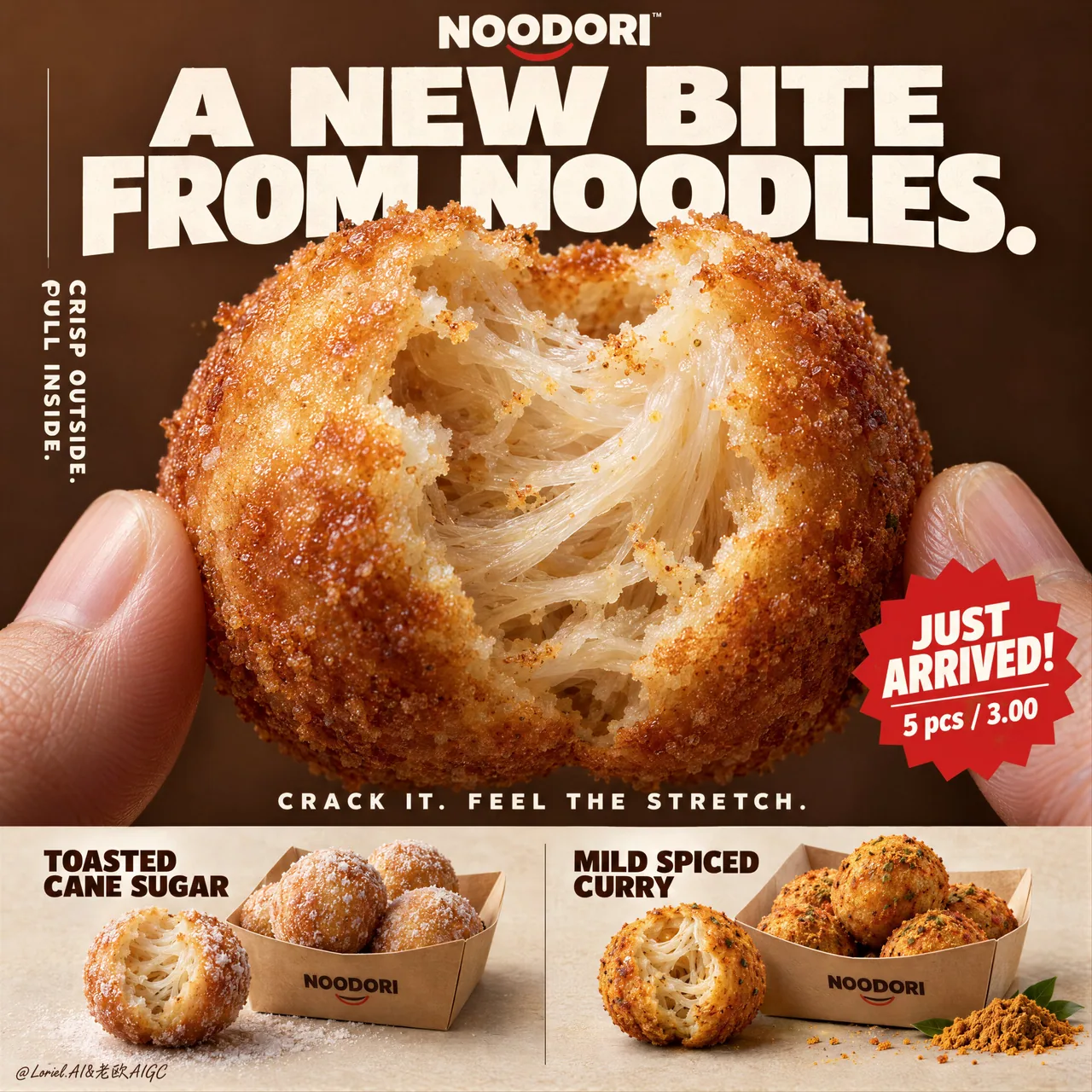
かじり口に半透明のデンプン麺の糸と弾力ある引き——「とろけるフィリング」と書くとチーズパンになってしまう。NOODORI 架空ブランド KV の完全版ロング prompt、食品 EC ポスターは構造をそのまま流用可。
プロンプト
Don’t write “gooey filling.” That turns this into cheese bread.
🧊 a naturally torn bite edge revealing translucent noodle strands, layered starch threads, and elastic pull inside the shell
This makes the center read as a real noodle structure—not a generic soft crumb.
🍊 thin blistered golden crust with fine fried granularity, light oil sheen, and a sharp material contrast against the pale interior
The bite becomes instantly legible: crisp outside, stretch inside.

A hyper-real premium poster advertisement for a fictional snack brand called NOODORI, designed in an Orbit-plus-Port direction: a bold product-launch key visual with one monumental macro food hero, highly controlled graphic typography, and a refined lower product strip. The core product is a fried noodle-dough snack ball called "Noodle Puff", presented as an ultra-real edible object with intense tactile realism and a surprising internal structure. One giant bitten snack ball dominates the center of the frame, delicately held between two natural human fingertips entering from the lower left and lower right edges. The bite opening reveals an airy fibrous interior with visible noodle-like stretch, layered starch threads, and a soft elastic pull inside a thin crisp golden shell. The product is the absolute visual hero.

Framing and composition: vertical poster layout, strong central macro composition, oversized hero product cropped large enough to feel immediate and almost architectural. Keep the upper field as a warm chestnut-brown poster plane with large white typographic mass, a cleaner vertical support text column on the left, one sharp promotional badge on the lower right of the hero area, and a highly disciplined product information strip running across the bottom. Preserve the original retail-poster logic, but reduce noise and make the entire page more sculptural, gallery-like, and premium. The fingers act only as scale and human interaction cues, never competing with the food.

Product design: the hero snack is a perfectly round fried noodle puff with a thin blistered golden crust, subtle fried granularity, light oil sheen, and a naturally torn bite edge exposing a mochi-like noodle matrix inside. The interior should feel surprising, soft, and layered rather than bread-like. In the bottom product strip, present two flavor variants in a clean side-by-side system: one pale sugar-dusted version and one deeper warm curry-spiced version. Each flavor sits beside a simple folded kraft takeaway tray with a few neatly arranged full snack balls. The lower strip must feel tidy, retail-ready, and secondary to the hero bite.

Lighting and color: soft but directional premium food lighting from upper front-right, gentle warm fill from the left, crisp readability inside the torn interior, elegant highlights on the crust, and subtle shadows under the bottom flavor presentations. Build stronger light-dark separation than a typical snack poster so the shell volume, interior fibers, and headline typography gain sculptural force. Palette balance: 60% chestnut brown, toasted amber, and warm golden crust; 30% creamy ivory interior and kraft-paper neutrals; 10% saturated red promotion accents and spice-yellow flavor notes. No muddy browns, no dead black patches, no greasy over-darkness.

Materials and finish: hyper-real food photography fused with premium Japanese-style poster design. Show crisp fried crust grain, delicate starch translucency in the inner layers, realistic soft tear fibers, matte paper tray texture, natural fingertip skin texture, and clean print-like typography integration. The final finish should feel like a Cannes-level convenience-food launch poster: tactile, surprising, minimal yet commercially explosive.

Typography: all visible copy in English only, highly art-directed and integrated into the poster. Top brand mark reads exactly: "NOODORI". Main headline at the top reads exactly: "A NEW BITE FROM NOODLES." Left vertical support line reads exactly: "CRISP OUTSIDE. PULL INSIDE." Small excitement line above the bottom strip reads exactly: "CRACK IT. FEEL THE STRETCH." Promotional burst on the lower right of the hero area reads exactly: "JUST ARRIVED!" and beneath it exactly: "5 pcs / 3.00". In the bottom strip, the left flavor label reads exactly: "TOASTED CANE SUGAR" and the right flavor label reads exactly: "MILD SPICED CURRY". Typography should be bold, soft-edged, graphic, and beautifully spaced, with large white forms against the brown field and restrained red accents.

Output and constraints: polished premium snack poster, product-first hierarchy, no copied source text, no real brand names, no extra props, no cluttered background scene, no people beyond the partial fingertips. Keep the hands anatomically correct with natural finger joints and correct finger count. Keep the hero snack spherical and believable, the bite natural, the lower strip orderly, and the overall page clean and high-end. Avoid fused fingers, swollen joints, broken snack geometry, messy crumb explosions, excessive oil, warped trays, duplicated snack balls, unreadable text, plastic-looking crust, oversharpening, AI gibberish text, muddy color cast, or drift away from premium commercial food realism.
日本語訳
「とろとろのフィリング」とは書かないこと。そう書くとこれはチーズパンになってしまう。
🧊 自然にちぎれたかじり口。半透明の麺の筋、層をなすデンプンの糸、そして殻の内側の弾力ある引きが見える
これにより中心部は本物の麺の構造として読める——ありきたりな柔らかい生地の内層ではない。
🍊 薄くふくれた黄金色の殻。細かな揚げの粒立ち、軽い油の艶、そして淡い内側との鋭い素材コントラスト
かじり口が瞬時に読み取れる:外はクリスプ、中は伸びる。

NOODORI という架空のスナックブランドの超リアルなプレミアムポスター広告。Orbit-plus-Port の方向性でデザインされた、大胆な製品ローンチのキービジュアル:ひとつの記念碑的なマクロフードの主役、高度に制御されたグラフィックタイポグラフィ、そして洗練された下部の製品ストリップ。中核製品は「Noodle Puff」と呼ばれる揚げ麺生地のスナックボールで、強烈な触感のリアリズムと意外な内部構造を備えた超リアルな可食物として提示される。ひとかじりされた巨大なスナックボールが画面中央を占め、左下と右下の端から入り込む2本の自然な人間の指先の間に繊細に保持されている。かじり口は、目に見える麺のような伸び、層をなすデンプンの糸、そして薄くクリスプな黄金の殻の内側にある柔らかな弾力の引きを伴う、空気を含んだ繊維質の内部を露わにする。製品は絶対的な視覚的主役である。

フレーミングと構図:縦型ポスターのレイアウト、強い中央マクロ構図、即時性とほとんど建築的な印象を与えるほど大きくトリミングされた特大の主役製品。上部領域は温かい栗褐色のポスター面として保ち、大きな白いタイポグラフィの塊、左側にすっきりした縦組みのサポートテキスト列、ヒーロー領域の右下に鋭いプロモーションバッジをひとつ、そして下部を横切って走る高度に規律ある製品情報ストリップを配置する。元の小売ポスターの論理を保ちつつ、ノイズを減らし、ページ全体をより彫刻的でギャラリー的、そしてプレミアムにする。指はスケールと人間のインタラクションの手がかりとしてのみ機能し、決して食品と競合しない。

製品デザイン:主役のスナックは完璧に丸い揚げ麺パフで、薄くふくれた黄金の殻、繊細な揚げの粒立ち、軽い油の艶、そして内側の餅のような麺のマトリクスを露わにする自然にちぎれたかじり口を持つ。内部はパンのようではなく、意外で柔らかく、層をなしていると感じられるべきである。下部の製品ストリップでは、2つのフレーバーバリエーションをすっきりとした横並びのシステムで提示する:淡いシュガーダストをまぶしたバージョンと、より深い温かなカレースパイスのバージョン。各フレーバーは、いくつかの整然と並べられた完全なスナックボールを添えた、シンプルな折りたたみクラフト紙のテイクアウトトレイの横に置かれる。下部ストリップは整然とし、小売向けに仕上がり、主役のかじり口に対して二次的であること。

ライティングとカラー:上前方右からの柔らかくも方向性のあるプレミアムなフードライティング、左からの穏やかな温かいフィル、ちぎれた内部のくっきりとした可読性、殻の上のエレガントなハイライト、そして下部のフレーバー展示の下の繊細な影。典型的なスナックポスターよりも強い明暗分離を構築し、殻のボリューム、内部の繊維、見出しのタイポグラフィが彫刻的な力を得るようにする。パレットバランス:60% 栗褐色、トーストアンバー、温かい黄金の殻;30% クリーミーなアイボリーの内部とクラフト紙のニュートラル;10% 彩度の高い赤のプロモーションアクセントとスパイスイエローのフレーバーノート。濁った茶色、死んだ黒い部分、脂っこい暗がりは禁止。

素材と仕上げ:超リアルなフードフォトグラフィーとプレミアムな和風ポスターデザインの融合。クリスプな揚げ殻の粒立ち、内層の繊細なデンプンの半透明感、リアルで柔らかなちぎれ繊維、マットな紙トレイの質感、自然な指先の皮膚の質感、そしてクリーンで印刷物のようなタイポグラフィの統合を見せる。最終的な仕上げは、カンヌ水準のコンビニ食品ローンチポスターのように感じられるべきである:触感的、意外、ミニマルでありながら商業的に爆発的。

タイポグラフィ:可視されるコピーはすべて英語のみで、高度にアートディレクションされ、ポスターに統合される。上部のブランドマークは正確に「NOODORI」と読める。上部のメイン見出しは正確に「A NEW BITE FROM NOODLES.」と読める。左側の縦組みサポート行は正確に「CRISP OUTSIDE. PULL INSIDE.」と読める。下部ストリップの上の小さな煽り行は正確に「CRACK IT. FEEL THE STRETCH.」と読める。ヒーロー領域の右下のプロモーション用バーストは正確に「JUST ARRIVED!」と読め、そのすぐ下は正確に「5 pcs / 3.00」と読める。下部ストリップでは、左のフレーバーラベルは正確に「TOASTED CANE SUGAR」、右のフレーバーラベルは正確に「MILD SPICED CURRY」と読める。タイポグラフィは大胆で、柔らかなエッジを持ち、グラフィックで、美しい字間を持ち、褐色の面に対して大きな白いフォルムと抑制された赤のアクセントを配する。

出力と制約:洗練されたプレミアムスナックポスター、製品第一のヒエラルキー、転載元テキストなし、実在ブランド名なし、余計な小道具なし、雑然とした背景シーンなし、部分的な指先以外の人物なし。手は解剖学的に正しく、自然な指の関節と正しい指の数で保つこと。主役のスナックは球形で説得力があること、かじり口は自然、下部ストリップは整然、ページ全体はクリーンでハイエンドに保つこと。融合した指、腫れた関節、壊れたスナックの形状、雑然としたパンくずの飛散、過剰な油、歪んだトレイ、重複したスナックボール、読めないテキスト、プラスチックのような殻、過剰なシャープ化、AI の意味不明なテキスト、濁った色被り、プレミアムな商業フードリアリズムからの逸脱を避けること。
出典
- 原作者
- ou_zhen599
- 公開日
- 2026-09-17
- 原典
- 元の投稿を見る ↗
- 収録元
- xianyu110/awesome-gpt-image2.5 · 2100554719274119461 · MIT