零食海報:別寫 gooey,寫麪條拉絲結構
咬口露出半透明澱粉絲與彈性拉扯——別用「粘糊餡」寫成芝士麪包。NOODORI 虛構品牌 KV 完整長 prompt,食品電商海報可抄結構。
提示詞
Don’t write “gooey filling.” That turns this into cheese bread.
🧊 a naturally torn bite edge revealing translucent noodle strands, layered starch threads, and elastic pull inside the shell
This makes the center read as a real noodle structure—not a generic soft crumb.
🍊 thin blistered golden crust with fine fried granularity, light oil sheen, and a sharp material contrast against the pale interior
The bite becomes instantly legible: crisp outside, stretch inside.

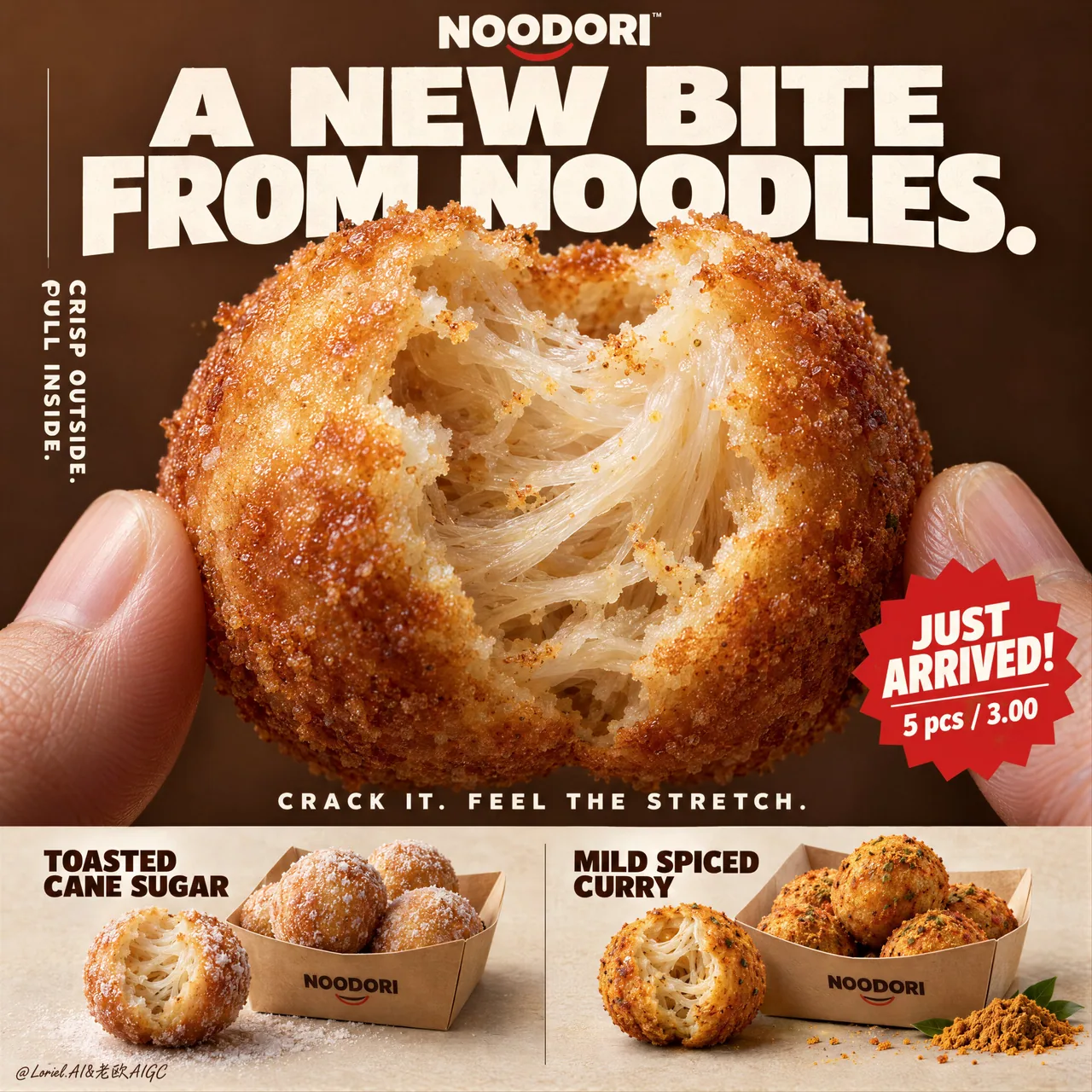
A hyper-real premium poster advertisement for a fictional snack brand called NOODORI, designed in an Orbit-plus-Port direction: a bold product-launch key visual with one monumental macro food hero, highly controlled graphic typography, and a refined lower product strip. The core product is a fried noodle-dough snack ball called "Noodle Puff", presented as an ultra-real edible object with intense tactile realism and a surprising internal structure. One giant bitten snack ball dominates the center of the frame, delicately held between two natural human fingertips entering from the lower left and lower right edges. The bite opening reveals an airy fibrous interior with visible noodle-like stretch, layered starch threads, and a soft elastic pull inside a thin crisp golden shell. The product is the absolute visual hero.

Framing and composition: vertical poster layout, strong central macro composition, oversized hero product cropped large enough to feel immediate and almost architectural. Keep the upper field as a warm chestnut-brown poster plane with large white typographic mass, a cleaner vertical support text column on the left, one sharp promotional badge on the lower right of the hero area, and a highly disciplined product information strip running across the bottom. Preserve the original retail-poster logic, but reduce noise and make the entire page more sculptural, gallery-like, and premium. The fingers act only as scale and human interaction cues, never competing with the food.

Product design: the hero snack is a perfectly round fried noodle puff with a thin blistered golden crust, subtle fried granularity, light oil sheen, and a naturally torn bite edge exposing a mochi-like noodle matrix inside. The interior should feel surprising, soft, and layered rather than bread-like. In the bottom product strip, present two flavor variants in a clean side-by-side system: one pale sugar-dusted version and one deeper warm curry-spiced version. Each flavor sits beside a simple folded kraft takeaway tray with a few neatly arranged full snack balls. The lower strip must feel tidy, retail-ready, and secondary to the hero bite.

Lighting and color: soft but directional premium food lighting from upper front-right, gentle warm fill from the left, crisp readability inside the torn interior, elegant highlights on the crust, and subtle shadows under the bottom flavor presentations. Build stronger light-dark separation than a typical snack poster so the shell volume, interior fibers, and headline typography gain sculptural force. Palette balance: 60% chestnut brown, toasted amber, and warm golden crust; 30% creamy ivory interior and kraft-paper neutrals; 10% saturated red promotion accents and spice-yellow flavor notes. No muddy browns, no dead black patches, no greasy over-darkness.

Materials and finish: hyper-real food photography fused with premium Japanese-style poster design. Show crisp fried crust grain, delicate starch translucency in the inner layers, realistic soft tear fibers, matte paper tray texture, natural fingertip skin texture, and clean print-like typography integration. The final finish should feel like a Cannes-level convenience-food launch poster: tactile, surprising, minimal yet commercially explosive.

Typography: all visible copy in English only, highly art-directed and integrated into the poster. Top brand mark reads exactly: "NOODORI". Main headline at the top reads exactly: "A NEW BITE FROM NOODLES." Left vertical support line reads exactly: "CRISP OUTSIDE. PULL INSIDE." Small excitement line above the bottom strip reads exactly: "CRACK IT. FEEL THE STRETCH." Promotional burst on the lower right of the hero area reads exactly: "JUST ARRIVED!" and beneath it exactly: "5 pcs / 3.00". In the bottom strip, the left flavor label reads exactly: "TOASTED CANE SUGAR" and the right flavor label reads exactly: "MILD SPICED CURRY". Typography should be bold, soft-edged, graphic, and beautifully spaced, with large white forms against the brown field and restrained red accents.

Output and constraints: polished premium snack poster, product-first hierarchy, no copied source text, no real brand names, no extra props, no cluttered background scene, no people beyond the partial fingertips. Keep the hands anatomically correct with natural finger joints and correct finger count. Keep the hero snack spherical and believable, the bite natural, the lower strip orderly, and the overall page clean and high-end. Avoid fused fingers, swollen joints, broken snack geometry, messy crumb explosions, excessive oil, warped trays, duplicated snack balls, unreadable text, plastic-looking crust, oversharpening, AI gibberish text, muddy color cast, or drift away from premium commercial food realism.
中文翻譯
不要寫 “gooey filling”。那會讓這張圖變成芝士麪包。
🧊 自然撕開的咬口邊緣,露出半透明的麪條纖維、層疊的澱粉絲,以及外殼內部的彈性拉絲
這會讓中心部位呈現出真正的麪條結構——而不是普通的鬆軟麪包屑感。
🍊 薄而起泡的金黃外殼,細密的油炸顆粒感,淡淡油光,與淺色內芯形成強烈的材質對比
咬口一眼就能讀懂:外脆內拉絲。

一張超寫實的高級海報廣告,爲虛構零食品牌 NOODORI 而作,採用 Orbit-plus-Port 方向設計:大膽的產品發佈主視覺,一個紀念碑式的微距食物主角,高度控制的圖形化字體排版,以及下方精緻的產品條帶。核心產品是一款名爲 “Noodle Puff” 的油炸麪條麪糰零食球,以超真實的可食用物形態呈現,具有強烈的觸感寫實和令人驚喜的內部結構。一顆巨大的被咬過的零食球佔據畫面中心,由從左側和右側下邊緣伸入的兩根自然的人指尖輕輕夾住。咬口露出蓬鬆的纖維狀內部,可見類似麪條的拉絲、層疊的澱粉絲,以及薄脆金黃外殼內部的柔軟彈性。產品是絕對的視覺主角。

取景與構圖:豎版海報佈局,強烈的中心微距構圖,超大的主體產品裁切得足夠大,給人撲面而來、近乎建築般的感覺。上部區域保持爲溫暖的栗棕色海報平面,配以大塊白色字體;左側是一條更簡潔的豎排輔助文字欄;主體區域右下方有一個利落的促銷徽章;底部橫貫一條高度剋制規範的產品信息條帶。保留原本的零售海報邏輯,但減少雜亂,讓整頁更具雕塑感、畫廊感和高級感。手指只作爲比例與人類互動的提示,絕不與食物爭奪視線。

產品設計:主體零食是一顆完美圓形的油炸麪條泡芙,薄而起泡的金黃外殼,細膩的油炸顆粒感,淡淡油光,自然撕開的咬口露出內部類似麻薯的麪條基質。內部應當有驚喜感、柔軟且層次分明,而不是麪包般的質感。底部產品條帶中,以乾淨並排的方式呈現兩種口味版本:一款淺色撒糖版本,一款更深色、溫暖的咖喱香料版本。每個口味旁邊放着一個簡單的摺疊牛皮紙外帶托盤,裏面整齊擺放着幾顆完整的零食球。下方條帶要整潔、可直接上架,並且次於主體咬口。

燈光與色彩:來自右前上方的柔和但有方向性的高級食物燈光,左側溫和的暖色補光,撕開的內部清晰可讀,外殼上有優雅的高光,底部口味展示下方有微妙的陰影。比典型零食海報建立更強的明暗分離,讓外殼體積、內部纖維和標題字體獲得雕塑般的力量感。配色比例:60% 栗棕、烘烤琥珀色與溫暖的金黃外殼;30% 奶油象牙色內部與牛皮紙中性色;10% 飽和的紅色促銷點綴與香料黃的風味提示。無渾濁的棕色,無死黑斑塊,無油膩的過度暗沉。

材質與質感:超寫實食物攝影與高級日式海報設計融合。展現清晰的油炸外殼顆粒、內層細膩的澱粉半透明感、真實的柔軟撕裂纖維、啞光紙托盤質感、自然的指尖皮膚紋理,以及乾淨的印刷級字體整合。最終成品應像戛納級別的便利食品發佈海報:觸感強烈、出人意料、極簡卻極具商業爆發力。

字體排版:所有可見文案僅用英文,經過高度藝術指導並融入海報。頂部品牌標識精確爲:“NOODORI”。頂部主標題精確爲:“A NEW BITE FROM NOODLES.” 左側豎排輔助行精確爲:“CRISP OUTSIDE. PULL INSIDE.” 底部條帶上方的小型煽動性文字精確爲:“CRACK IT. FEEL THE STRETCH.” 主體區域右下方的促銷爆炸標籤精確爲:“JUST ARRIVED!”,其下方精確爲:“5 pcs / 3.00”。底部條帶中,左側口味標籤精確爲:“TOASTED CANE SUGAR”,右側口味標籤精確爲:“MILD SPICED CURRY”。字體應粗壯、邊緣柔和、圖形化且間距優美,大塊白色字形置於棕色底色之上,配以剋制的紅色點綴。

輸出與約束:精緻的高級零食海報,產品優先的層級,無照搬的源文本,無真實品牌名,無額外道具,無雜亂的背景場景,除局部指尖外無人物。保持手部解剖正確,手指關節自然、數量正確。保持主體零食呈球形且可信,咬口自然,下方條帶整齊,整體頁面乾淨而高級。避免手指粘連、關節腫脹、零食幾何結構破形、碎屑四濺、油量過多、托盤變形、零食球重複、文字不可讀、外殼像塑料、過度銳化、AI 亂碼文字、色彩渾濁偏色,或偏離高級商業食物寫實感。
溯源
- 原作者
- ou_zhen599
- 發佈日期
- 2026-09-17
- 原始出處
- 查看原帖 ↗
- 收錄來源
- xianyu110/awesome-gpt-image2.5 · 2100554719274119461 · MIT