[BRAND NAME].
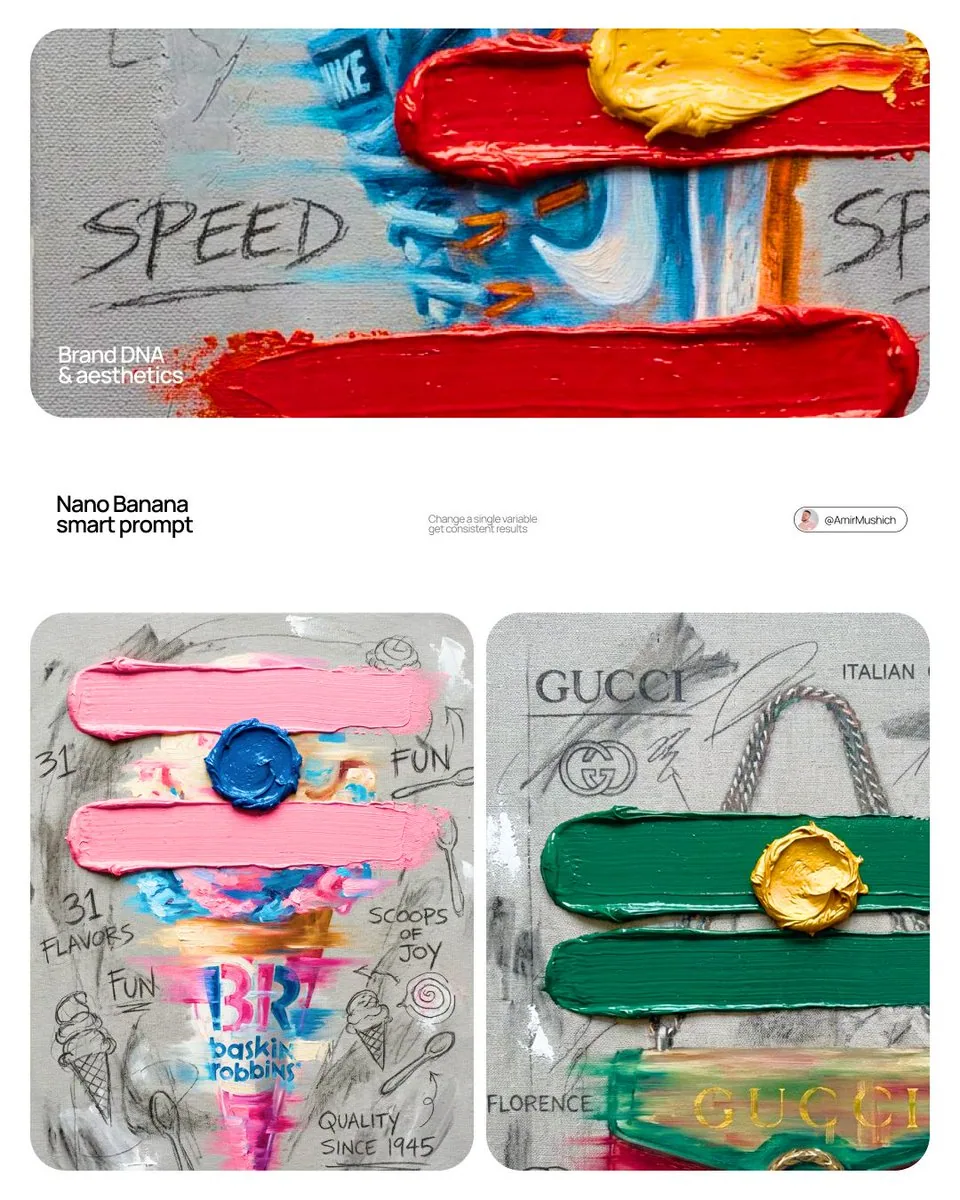
Create a professional mixed-media oil painting on raw textured canvas where the color palette and visual elements are dynamically adapted to match the brand's identity.

1. BRAND COLOR ADAPTATION
Identify the primary and secondary colors of [BRAND NAME]. Use the primary brand color for two thick horizontal impasto brushstrokes. Use the secondary brand color for a raised central paint dollop. Replace generic colors with this brand-specific palette.

2. PAINTED SUBJECT AND MOTION
Paint a central product related to [BRAND NAME] vertically on the canvas using oil painting technique. Apply a horizontal motion blur effect with visible brushstrokes to convey dynamic movement. The product must integrate directly into the canvas texture, not as an overlay. Paint the "[BRAND NAME]" logo using distressed semi-transparent oil layers within the product's silhouette.

3. IMPASTO AND CANVAS TEXTURE
Two thick physical horizontal impasto strokes in the brand's primary color over the painted subject. One heavily textured raised dollop of secondary color oil paint centered on the middle stroke. Background: raw heavy-grain grey canvas with visible weave, charcoal smudges, and gesso dabs.

4. BRAND GRAPHICS AND TYPOGRAPHY
Scrawl brand keywords, slogans, and values in charcoal and graphite across the canvas. Replace generic doodles with hand-drawn abstract icons representing [BRAND NAME], all scratched over dried oil paint layers.

5. STYLE
Contemporary mixed-media pop-art. 8K macro photography highlighting the physical thickness of the oil paint and raw canvas grain texture.