[BRAND NAME].
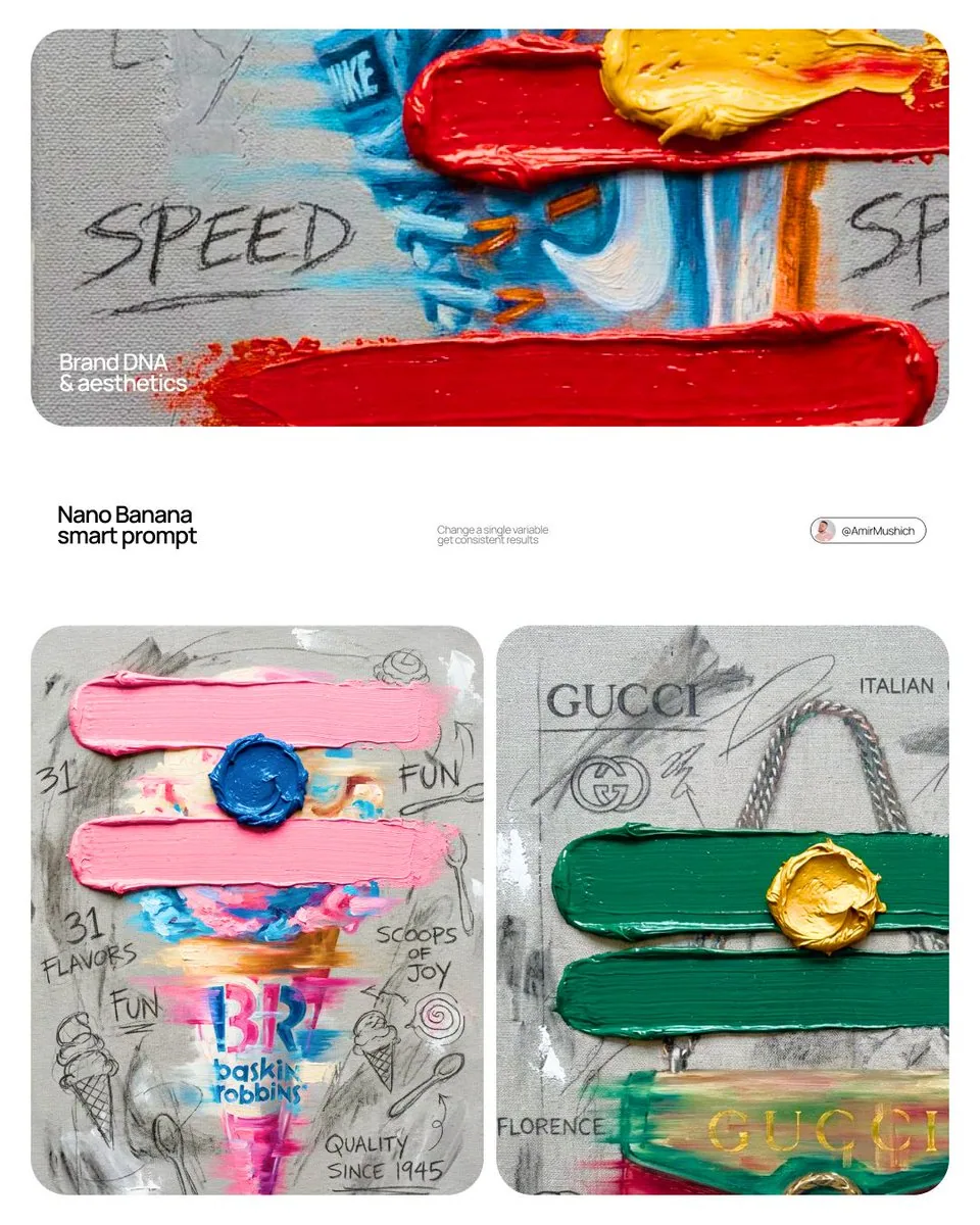
Create a professional mixed-media oil painting on raw textured canvas where the color palette and visual elements are dynamically adapted to match the brand's identity.

1. BRAND COLOR ADAPTATION
Identify the primary and secondary colors of [BRAND NAME]. Use the primary brand color for two thick horizontal impasto brushstrokes. Use the secondary brand color for a raised central paint dollop. Replace generic colors with this brand-specific palette.

2. PAINTED SUBJECT AND MOTION
Paint a central product related to [BRAND NAME] vertically on the canvas using oil painting technique. Apply a horizontal motion blur effect with visible brushstrokes to convey dynamic movement. The product must integrate directly into the canvas texture, not as an overlay. Paint the "[BRAND NAME]" logo using distressed semi-transparent oil layers within the product's silhouette.

3. IMPASTO AND CANVAS TEXTURE
Two thick physical horizontal impasto strokes in the brand's primary color over the painted subject. One heavily textured raised dollop of secondary color oil paint centered on the middle stroke. Background: raw heavy-grain grey canvas with visible weave, charcoal smudges, and gesso dabs.

4. BRAND GRAPHICS AND TYPOGRAPHY
Scrawl brand keywords, slogans, and values in charcoal and graphite across the canvas. Replace generic doodles with hand-drawn abstract icons representing [BRAND NAME], all scratched over dried oil paint layers.

5. STYLE
Contemporary mixed-media pop-art. 8K macro photography highlighting the physical thickness of the oil paint and raw canvas grain texture.
한국어 번역
[BRAND NAME].
거친 질감의 원시 캔버스 위에 컬러 팔레트와 시각적 요소가 브랜드 아이덴티티에 맞춰 역동적으로 조정된 전문적인 혼합 매체 유화를 제작하세요.

1. 브랜드 컬러 적응
[BRAND NAME]의 주 색상과 보조 색상을 식별하세요. 브랜드 주 색상을 사용해 두 개의 두꺼운 가로 임파스토 붓자국을 그리세요. 브랜드 보조 색상은 중앙에 솟은 물감 덩어리에 사용하세요. 일반적인 색상을 이 브랜드 고유의 팔레트로 대체하세요.

2. 그려진 피사체와 움직임
[BRAND NAME]과 관련된 중앙 제품을 유화 기법으로 캔버스에 수직으로 그리세요. 눈에 보이는 붓자국과 함께 가로 방향 모션 블러 효과를 적용해 역동적인 움직임을 전달하세요. 제품은 오버레이가 아니라 캔버스 질감에 직접 통합되어야 합니다. 제품 실루엣 안에 "[BRAND NAME]" 로고를 거칠고 반투명한 유화 레이어로 그리세요.

3. 임파스토와 캔버스 질감
그려진 피사체 위에 브랜드 주 색상의 두꺼운 물리적 가로 임파스토 붓자국 두 개. 가운데 붓자국 중앙에 보조 색상 유화 물감의 질감이 강하게 살아있는 솟은 덩어리 하나. 배경: 직조가 보이는 거친 굵은 결의 회색 원시 캔버스, 목탄 번짐, 젯소 자국.

4. 브랜드 그래픽과 타이포그래피
캔버스 전체에 브랜드 키워드, 슬로건, 가치를 목탄과 흑연으로 휘갈겨 쓰세요. 일반적인 낙서 대신 [BRAND NAME]을 나타내는 손으로 그린 추상 아이콘으로 대체하고, 모두 마른 유화 레이어 위에 긁어 새기세요.

5. 스타일
현대적인 혼합 매체 팝아트. 유화 물감의 물리적 두께와 원시 캔버스의 결 질감을 강조한 8K 매크로 사진.