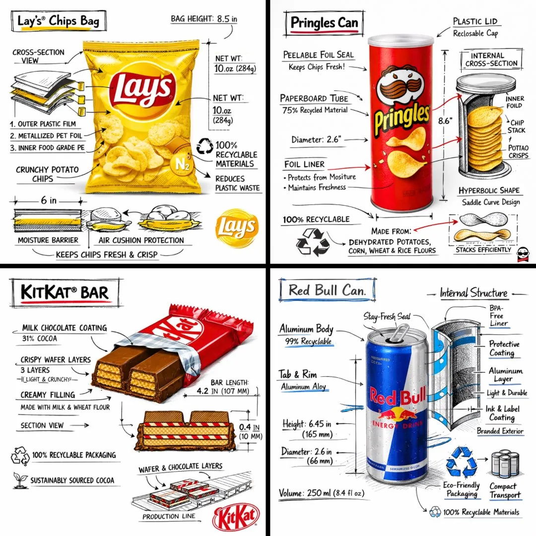
Create a branded technical infographic of a [SNACK], combining a realistic photograph or photoreal render of the product with technical annotation overlays placed directly on top. Use black ink–style line drawings with strategic [BRAND COLOR] accents (architectural sketch look) on a pure white studio background, including:
• Key component labels
• Internal cross-section showing structure, layering, or internal design
• Measurements, dimensions, and specifications
• Material callouts with composition and quantities
• Arrows indicating function for primary features and structural integrity
• Simple schematic or sectional diagram showing key mechanical or design elements
• Sustainability callouts
Title placement: Inside a hand-drawn technical annotation box with accent border reading the product name in bold font, positioned in upper corner.
Style & layout rules:
• The realistic product remains clearly visible
• Annotations feel sketched, technical, and architectural
• Accents used for highlight (20-30% of linework), black for primary technical lines (70-80%)
• Clean composition with balanced negative space
• Educational, food-engineering vibe with premium branding
• Include subtle brand logo mark in corner
Visual style: Minimal technical illustration aesthetic, black linework with accents over realistic imagery, precise but slightly hand-drawn feel.
Color palette: White background, black annotation lines/text, [BRAND COLOR] for accents and key callouts only.
Output: 1080×1080, ultra-crisp, social-feed optimized, no watermark.