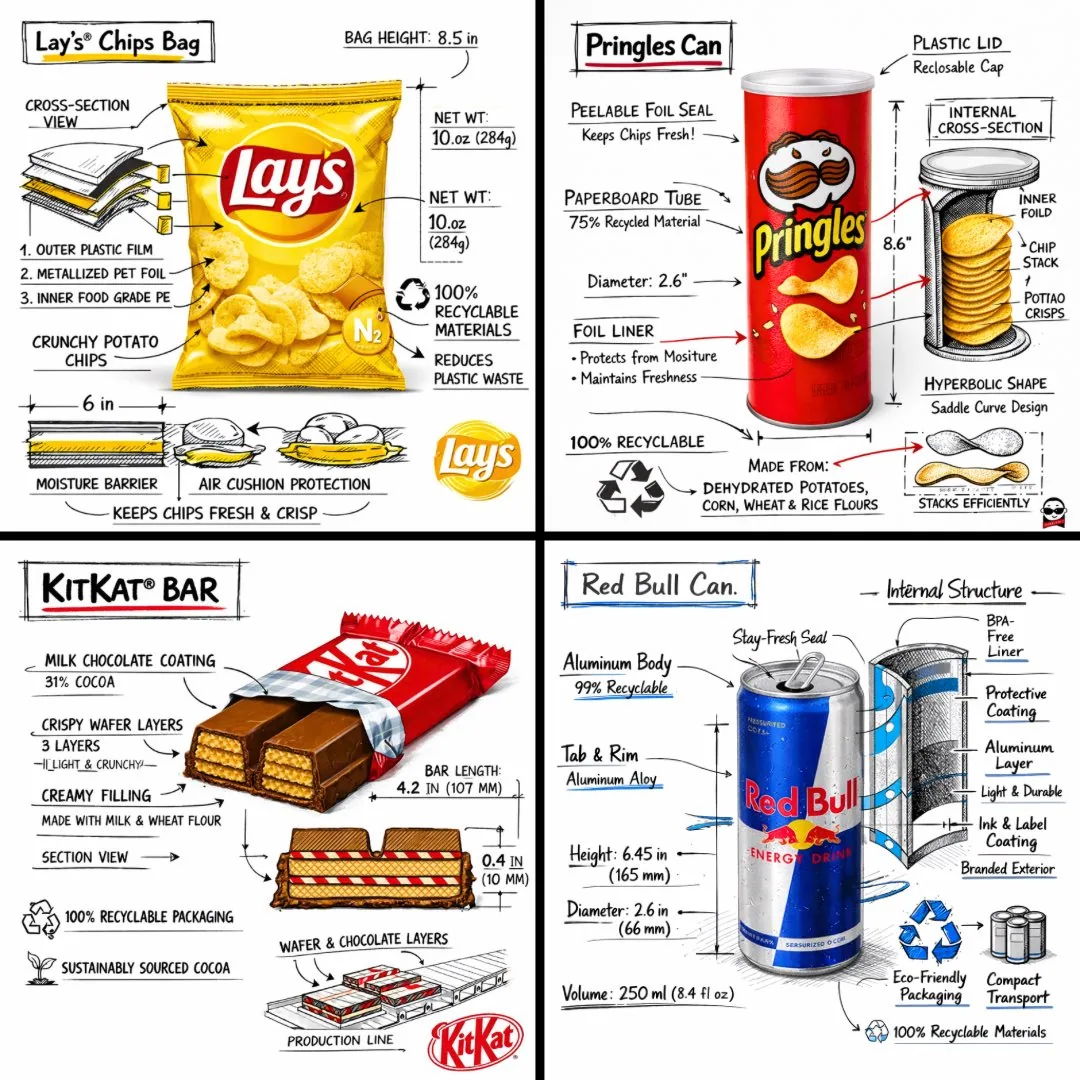
Create a branded technical infographic of a [SNACK], combining a realistic photograph or photoreal render of the product with technical annotation overlays placed directly on top. Use black ink–style line drawings with strategic [BRAND COLOR] accents (architectural sketch look) on a pure white studio background, including:
• Key component labels
• Internal cross-section showing structure, layering, or internal design
• Measurements, dimensions, and specifications
• Material callouts with composition and quantities
• Arrows indicating function for primary features and structural integrity
• Simple schematic or sectional diagram showing key mechanical or design elements
• Sustainability callouts
Title placement: Inside a hand-drawn technical annotation box with accent border reading the product name in bold font, positioned in upper corner.
Style & layout rules:
• The realistic product remains clearly visible
• Annotations feel sketched, technical, and architectural
• Accents used for highlight (20-30% of linework), black for primary technical lines (70-80%)
• Clean composition with balanced negative space
• Educational, food-engineering vibe with premium branding
• Include subtle brand logo mark in corner
Visual style: Minimal technical illustration aesthetic, black linework with accents over realistic imagery, precise but slightly hand-drawn feel.
Color palette: White background, black annotation lines/text, [BRAND COLOR] for accents and key callouts only.
Output: 1080×1080, ultra-crisp, social-feed optimized, no watermark.
한국어 번역
[SNACK]의 브랜드 기술 인포그래픽을 제작하세요. 제품의 실제 사진 또는 포토리얼 렌더링 위에 기술 주석 오버레이를 바로 얹은 형태로 구성합니다. 순수한 흰색 스튜디오 배경에 검정 잉크 스타일의 선화와 전략적인 [BRAND COLOR] 포인트(건축 스케치 느낌)를 사용하고, 다음을 포함하세요:
• 주요 구성 요소 라벨
• 구조, 층, 내부 설계를 보여주는 내부 단면
• 측정값, 치수 및 사양
• 구성과 수량이 표기된 재료 콜아웃
• 주요 기능과 구조적 견고성을 나타내는 기능 화살표
• 핵심 기계적 또는 설계 요소를 보여주는 간단한 도식 또는 단면 다이어그램
• 지속가능성 콜아웃
제목 배치: 포인트 테두리가 있는 손으로 그린 기술 주석 박스 안에 굵은 글씨로 제품명을 적어 상단 모서리에 배치.
스타일 및 레이아웃 규칙:
• 사실적인 제품이 선명하게 보여야 함
• 주석은 스케치처럼 기술적이고 건축적으로 느껴져야 함
• 포인트 색은 강조용(선 작업의 20-30%), 검정은 주요 기술 선용(70-80%)
• 균형 잡힌 여백의 깔끔한 구성
• 프리미엄 브랜딩이 느껴지는 교육적이고 식품공학적인 분위기
• 모서리에 은은한 브랜드 로고 마크 포함
시각 스타일: 미니멀한 기술 일러스트 미학, 사실적 이미지 위의 검정 선과 포인트, 정밀하지만 약간 손으로 그린 느낌.
색상 팔레트: 흰색 배경, 검정 주석 선/텍스트, 포인트와 핵심 콜아웃에만 [BRAND COLOR].
출력: 1080×1080, 초고선명, 소셜 피드 최적화, 워터마크 없음.