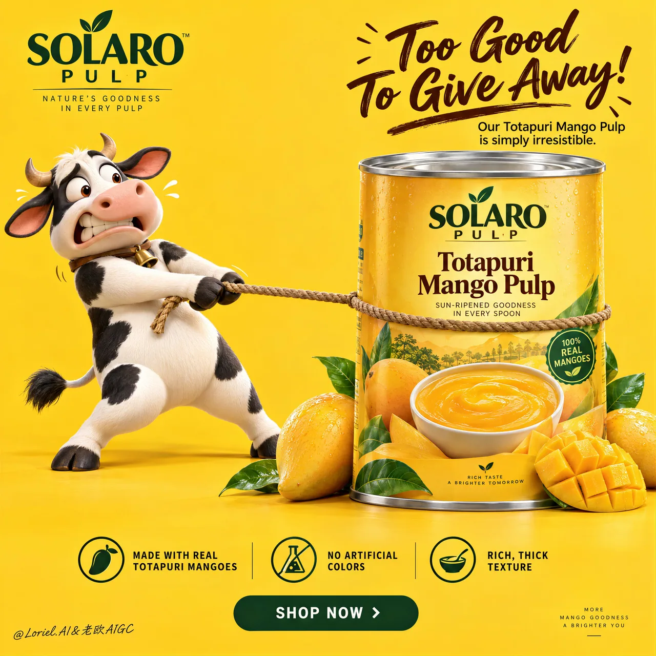
マンゴー缶の物理ジョークポスター:牛が引いても動かない製品ヒーロー
ポーズのテンションだけでジョークが成立:牛が必死にロープを引いても缶は微動だにしない。Cannes級のFMCGプロンプト完全版、パッケージ広告として丸ごと再利用可。
プロンプト
Create a Cannes-level ultra-premium mango FMCG advertising poster for a fictional tropical food house called SOLARO PULP, preserving the exact structural logic of a bright high-conversion product campaign while merging narrative humor, forensic packaging realism, and curatorial restraint. The composition is vertical and highly controlled: a saturated full-frame mango-yellow studio background, one expressive 3D dairy-cow mascot on the left pulling a rope with comic desperation, one large premium mango-pulp can dominating the right side, a bold witty headline block in the upper-right quadrant, one clean three-part benefit strip near the bottom, and one centered call-to-action plaque beneath it. The final image must feel playful, memorable, and globally polished, while keeping the can as the unquestioned commercial hero.

Core composition: use a vivid monochrome mango-yellow background with a seamless floor-to-wall studio transition and generous negative space. On the left, place one premium 3D cow mascot standing upright, leaning backward with visible effort while gripping a rope that is tied tightly around the can. The rope creates the main directional tension across the frame, but the can must visually win the struggle through scale, weight, and authority. On the right, position one large front-facing can of mango pulp, cleanly isolated and slightly forward in the composition, surrounded at the base by a small curated cluster of real mangoes, one scored mango cheek, several glossy leaves, and nothing more. Keep the frame open, breathable, and conversion-driven.

Orbit atmosphere: the emotional hook should feel like the product is so rich and irresistible that even the farm mascot refuses to let it go. The humor must feel brand-smart, not childish. The mascot’s expression should communicate eager panic, possessiveness, and comic frustration, while the product remains calm, solid, and desirable. The poster should create instant recall through one simple story: desire meets abundance, and the can becomes the source of the joke. The mood is bright, cheerful, and high-confidence, but still clean enough to feel premium.

Transit realism: render every material with world-class FMCG precision. The can must show accurate cylindrical geometry, crisp top-lid metal reflections, subtle rolled-edge seams, flawless label registration, believable print contrast, and premium finish. The label should contain only elegant built-in branding such as “SOLARO PULP” and the product name “Totapuri Mango Pulp,” supported by a realistic mango visual and a bowl of dense puree. The mangoes at the base must show taut skin gloss, ripe yellow-orange gradients, natural dimples, juicy fiber in the cut fruit, and fresh green leaves with visible veins. The rope should show twisted fiber detail, tension compression where it presses into the can, and believable contact with the mascot’s hooves. The mascot must carry smooth premium 3D surfacing, soft matte-to-satin shading, correct hoof anatomy, natural limb articulation, subtle skin/fur transition, and expressive but clean facial sculpting with no animation slop.

Port restraint: simplify the campaign into a more gallery-like FMCG statement. Remove extra decorative fruit clutter, excessive footer information, and unnecessary small promotional noise. Keep only the logo block, the upper-right witty headline, the left mascot, the right hero can, one restrained fruit cluster, the bottom benefit strip, and the CTA plaque. Let the yellow field, the rope tension, and the can scale create the luxury. The frame should feel edited, intelligent, and immediately readable.

Mascot design: create a lovable premium-cartoon dairy cow with rounded proportions, black-and-white patches, small horns, expressive wide eyes, a slightly open mouth, lifted brows, and a tense pulling posture. The character should feel physically grounded, with believable weight shift through the legs, stretched arms or forelimbs gripping the rope, and clear contact shadows. The cow is a narrative device, not the hero product. It supports the brand story but never steals dominance from the can.

Typography and message layout: in the upper-left corner, place one compact brand block for SOLARO PULP. In the upper-right quadrant, place a large playful English headline such as “Too Good To Give Away” or “So Rich, Nobody Wants To Share,” with one short supporting line beneath it describing the richness of Totapuri mango pulp. The main phrase can be rendered in expressive brush-script or lively premium handwriting, while the secondary line uses a clean modern sans-serif. Typography must feel art-directed, witty, and compositionally integrated, not generic or overly retail.

Bottom information architecture: near the bottom, include one clean three-part benefits band with elegant icons and concise copy such as “Made with real Totapuri mangoes,” “No artificial colors,” and “Rich, thick texture.” Beneath it, place one centered rounded CTA plaque such as “SHOP NOW” or “TASTE THE GOLD.” Keep the band crisp, symmetrical, and highly legible, but avoid a noisy marketplace-flyer feel. If a tiny footer exists, it should be minimal and peripheral.

Lighting: use bright premium studio lighting with soft frontal clarity and subtle upper-left shaping. The yellow background must remain luminous and even, without dirty gradients. The can should receive the cleanest highlight structure, with crisp label readability and controlled metallic sheen on the lid. The mascot should have smooth dimensional modeling and soft contact shadows. The mangoes should catch small glossy highlights and juicy speculars. Keep the image cheerful and dimensional, but never harsh or cluttered.

Color hierarchy: 60% saturated mango yellow and warm golden-orange tones; 30% black, white, deep brown, and warm neutral accents from the mascot, rope, and label typography; 10% green leaf accents and silver metallic can-top highlights. The palette must feel fruity, bright, trustworthy, and internationally premium.

Design intent: the final poster must preserve the exact impact logic of the reference structure—full yellow background, left-side mascot action, right-side hero can, upper-right witty text block, bottom benefits strip, and centered CTA—while merging Orbit narrative charm, Transit material realism, and Port curatorial restraint into one resolved luxury FMCG campaign. The humor creates memorability, but the product remains the true visual and commercial center.

Rendering style: ultra-polished FMCG advertising, premium 3D mascot branding, bright studio product poster, clean global retail campaign, high-end packaging realism, appetizing fruit detail, elegant graphic hierarchy, world-class commercial retouching, immaculate print-ready finish.

Negative prompt: copied source text, real brand names, low-detail mascot, creepy cow face, malformed limbs, bad hoof anatomy, unreadable label, cheap flyer styling, muddy yellow background, warped can geometry, fake mango texture, cluttered footer, poor typography spacing, flat lighting, black blotches, watermark
日本語訳
SOLARO PULPという架空のトロピカルフードハウスのための、Cannes級の超プレミアムなマンゴーFMCG広告ポスターを作成する。明るくコンバージョン率の高い製品キャンペーンの構造ロジックを正確に保ちつつ、物語的なユーモア、パッケージの徹底したリアリズム、キュレーショナルな抑制を融合させる。構図は縦位置で高度に制御されている:彩度の高いマンゴーイエローの全面スタジオ背景、左側でロープを必死に引く表情豊かな3D乳牛マスコット、右側を支配する大きなプレミアムなマンゴーピューレ缶、右上象限の大胆で機知に富んだヘッドラインブロック、下部近くのすっきりした3分割ベネフィット帯、その下の中央揃えのCTAプレート。最終的な画像は遊び心があり、記憶に残り、グローバルに洗練されていること。ただし缶は疑いようのない商業的ヒーローであり続ける。

コア構図:鮮やかなモノクロームのマンゴーイエロー背景を使い、床から壁へのシームレスなスタジオの切り替えと、ゆとりあるネガティブスペースを確保する。左側には、プレミアムな3D牛マスコットを1体、直立させ、目に見える努力で後ろにのけぞらせ、缶にきつく結びつけられたロープを握らせる。ロープがフレームを横切る主要な方向性のテンションを生むが、缶はスケール、重量感、権威によってこの綱引きに視覚的に勝たなければならない。右側には、正面を向いた大きなマンゴーピューレ缶を1つ配置し、構図の中で少し前に出してクリーンに孤立させ、その基部を、厳選された少量の本物のマンゴー、切り込みを入れたマンゴーの房1つ、光沢のある葉数枚だけで囲む。それ以上は置かない。フレームは開放的で呼吸感があり、コンバージョン重視に保つ。

オービットの雰囲気:感情的なフックは、この製品があまりに濃厚で抗いがたく、農場のマスコットさえ手放すのを拒むように感じられること。ユーモアは子どもっぽくなく、ブランドらしくスマートに感じられること。マスコットの表情は、切実なパニック、所有欲、コミカルな苛立ちを伝え、製品は冷静で、どっしりとして、魅力的であり続ける。ポスターは「欲望が豊かさに出会う」という1つのシンプルな物語を通じて即座の想起を生み、缶がジョークの源になる。ムードは明るく陽気で自信に満ちているが、プレミアムに感じられるほどクリーンであること。

トランジットのリアリズム:あらゆる素材を世界水準のFMCG精度でレンダリングする。缶は正確な円筒形状、鮮明な上蓋の金属反射、繊細な巻き締めエッジの継ぎ目、完璧なラベルの見当合わせ、説得力のある印刷コントラスト、プレミアムな仕上げを示すこと。ラベルには「SOLARO PULP」や製品名「Totapuri Mango Pulp」といったエレガントで作り込まれたブランディングのみを含め、リアルなマンゴーのビジュアルと濃厚なピューレのボウルで支える。基部のマンゴーは、張りのある皮の光沢、熟した黄橙色のグラデーション、自然なくぼみ、カットした果肉のジューシーな繊維、葉脈の見える新鮮な緑の葉を示すこと。ロープは撚られた繊維のディテール、缶に食い込む部分の圧縮によるテンション、マスコットのひづめとの説得力のある接触を示すこと。マスコットは滑らかでプレミアムな3Dサーフェス、柔らかなマットからサテンのシェーディング、正確なひづめの解剖、自然な四肢の関節、繊細な肌/毛の移行、表情豊かだがクリーンな顔の造形を持ち、アニメーションの雑さがあってはならない。

ポートの抑制:キャンペーンをよりギャラリー的なFMCGの表現に簡素化する。余分な装飾的な果物の雑多さ、過剰なフッター情報、不要な小さな販促ノイズを削除する。残すのはロゴブロック、右上の機知に富んだヘッドライン、左のマスコット、右のヒーロー缶、抑制された果物のクラスター1つ、下部のベネフィット帯、CTAプレートのみ。黄色のフィールド、ロープのテンション、缶のスケールにラグジュアリーを生み出させる。フレームは編集が効いていて知的で、即座に読めること。

マスコットのデザイン:丸みのあるプロポーション、白黒の斑模様、小さな角、表情豊かな大きな目、少し開いた口、上がった眉、緊張して引くポーズを持つ、愛らしいプレミアムカートゥーン調の乳牛を作る。キャラクターは物理的に地に足がついて感じられ、脚を通じた説得力のある重心移動、ロープを握る伸びた腕(前肢)、明確な接地影を備えること。牛は物語の装置であり、ヒーロー製品ではない。ブランドストーリーを支えるが、缶から主役の座を奪ってはならない。

タイポグラフィとメッセージレイアウト:左上隅に、SOLARO PULPのコンパクトなブランドブロックを1つ配置する。右上象限には、「Too Good To Give Away」や「So Rich, Nobody Wants To Share」のような大きな遊び心のある英語ヘッドラインを置き、その下にTotapuriマンゴーピューレの濃厚さを説明する短い補足行を1行添える。メインのフレーズは表情豊かなブラシスクリプトや活気あるプレミアムな手書き文字で、副次的な行はクリーンでモダンなサンセリフで表現してよい。タイポグラフィはアートディレクションが効いていて機知に富み、構図に統合されていること。凡庸だったり過度に小売的だったりしてはならない。

下部の情報設計:下部近くに、エレガントなアイコンと簡潔なコピーを伴う3分割のベネフィット帯を1つ入れる。コピーは「Made with real Totapuri mangoes」「No artificial colors」「Rich, thick texture」など。その下に、「SHOP NOW」や「TASTE THE GOLD」のような中央揃えの角丸CTAプレートを1つ配置する。帯は鮮明で対称的、非常に読みやすく保ちつつ、騒がしいチラシのような雑然とした印象は避ける。小さなフッターを置く場合は、最小限で周辺的なものにする。

ライティング:明るいプレミアムなスタジオ照明を使い、柔らかな正面の明瞭さと、左上からの繊細なシェーピングを加える。黄色の背景は濁ったグラデーションなく、輝きと均一性を保つこと。缶は最もクリーンなハイライト構造を受け、ラベルは鮮明に読め、蓋には制御された金属的な艶があること。マスコットは滑らかで立体的なモデリングと柔らかな接地影を持つこと。マンゴーは小さな光沢ハイライトとジューシーなスペキュラを捉えること。画像は快活で立体的に保ちつつ、決して硬すぎたり雑然としたりさせない。

色の階層:60%は彩度の高いマンゴーイエローと温かいゴールデンオレンジのトーン、30%はマスコット・ロープ・ラベルのタイポグラフィによる黒、白、深い茶、温かみのあるニュートラルなアクセント、10%は緑の葉のアクセントと缶上面の銀色の金属ハイライト。パレットはフルーティーで明るく、信頼でき、国際的にプレミアムに感じられること。

デザイン意図:最終ポスターは、リファレンス構造の正確なインパクトロジック — 全面黄色背景、左側のマスコットのアクション、右側のヒーロー缶、右上の機知に富んだテキストブロック、下部のベネフィット帯、中央のCTA — を保ちつつ、Orbitの物語的な魅力、Transitの素材リアリズム、Portのキュレーショナルな抑制を、1つの完成されたラグジュアリーFMCGキャンペーンに融合させること。ユーモアが記憶性を生むが、製品は真の視覚的・商業的中心であり続ける。

レンダリングスタイル:超洗練されたFMCG広告、プレミアムな3Dマスコットブランディング、明るいスタジオ製品ポスター、クリーンなグローバル小売キャンペーン、ハイエンドなパッケージリアリズム、食欲をそそる果物のディテール、エレガントなグラフィック階層、世界水準の商業レタッチ、完璧な印刷対応仕上げ。

ネガティブプロンプト:コピーされた元テキスト、実在のブランド名、低ディテールのマスコット、気味の悪い牛の顔、変形した四肢、誤ったひづめの解剖、読めないラベル、安っぽいチラシ風のスタイル、濁った黄色背景、歪んだ缶の形状、偽のマンゴー質感、雑然としたフッター、悪いタイポグラフィの字間、フラットなライティング、黒い染み、ウォーターマーク
出典
- 原作者
- ou_zhen599
- 公開日
- 2026-09-14
- 原典
- 元の投稿を見る ↗
- 収録元
- xianyu110/awesome-gpt-image2.5 · 2099500411455721969 · MIT