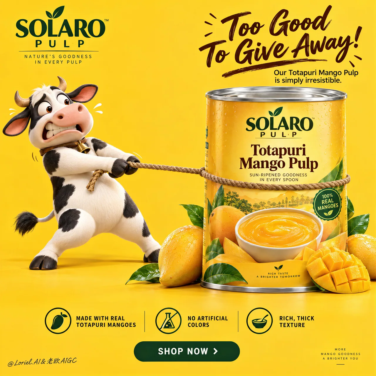
芒果罐物理笑话海报:牛拽不动的产品英雄
姿势张力讲完笑话:牛拼命拉绳、罐子纹丝不动。完整 Cannes 级 FMCG prompt,包装广告可整段复用。
提示词
Create a Cannes-level ultra-premium mango FMCG advertising poster for a fictional tropical food house called SOLARO PULP, preserving the exact structural logic of a bright high-conversion product campaign while merging narrative humor, forensic packaging realism, and curatorial restraint. The composition is vertical and highly controlled: a saturated full-frame mango-yellow studio background, one expressive 3D dairy-cow mascot on the left pulling a rope with comic desperation, one large premium mango-pulp can dominating the right side, a bold witty headline block in the upper-right quadrant, one clean three-part benefit strip near the bottom, and one centered call-to-action plaque beneath it. The final image must feel playful, memorable, and globally polished, while keeping the can as the unquestioned commercial hero.

Core composition: use a vivid monochrome mango-yellow background with a seamless floor-to-wall studio transition and generous negative space. On the left, place one premium 3D cow mascot standing upright, leaning backward with visible effort while gripping a rope that is tied tightly around the can. The rope creates the main directional tension across the frame, but the can must visually win the struggle through scale, weight, and authority. On the right, position one large front-facing can of mango pulp, cleanly isolated and slightly forward in the composition, surrounded at the base by a small curated cluster of real mangoes, one scored mango cheek, several glossy leaves, and nothing more. Keep the frame open, breathable, and conversion-driven.

Orbit atmosphere: the emotional hook should feel like the product is so rich and irresistible that even the farm mascot refuses to let it go. The humor must feel brand-smart, not childish. The mascot’s expression should communicate eager panic, possessiveness, and comic frustration, while the product remains calm, solid, and desirable. The poster should create instant recall through one simple story: desire meets abundance, and the can becomes the source of the joke. The mood is bright, cheerful, and high-confidence, but still clean enough to feel premium.

Transit realism: render every material with world-class FMCG precision. The can must show accurate cylindrical geometry, crisp top-lid metal reflections, subtle rolled-edge seams, flawless label registration, believable print contrast, and premium finish. The label should contain only elegant built-in branding such as “SOLARO PULP” and the product name “Totapuri Mango Pulp,” supported by a realistic mango visual and a bowl of dense puree. The mangoes at the base must show taut skin gloss, ripe yellow-orange gradients, natural dimples, juicy fiber in the cut fruit, and fresh green leaves with visible veins. The rope should show twisted fiber detail, tension compression where it presses into the can, and believable contact with the mascot’s hooves. The mascot must carry smooth premium 3D surfacing, soft matte-to-satin shading, correct hoof anatomy, natural limb articulation, subtle skin/fur transition, and expressive but clean facial sculpting with no animation slop.

Port restraint: simplify the campaign into a more gallery-like FMCG statement. Remove extra decorative fruit clutter, excessive footer information, and unnecessary small promotional noise. Keep only the logo block, the upper-right witty headline, the left mascot, the right hero can, one restrained fruit cluster, the bottom benefit strip, and the CTA plaque. Let the yellow field, the rope tension, and the can scale create the luxury. The frame should feel edited, intelligent, and immediately readable.

Mascot design: create a lovable premium-cartoon dairy cow with rounded proportions, black-and-white patches, small horns, expressive wide eyes, a slightly open mouth, lifted brows, and a tense pulling posture. The character should feel physically grounded, with believable weight shift through the legs, stretched arms or forelimbs gripping the rope, and clear contact shadows. The cow is a narrative device, not the hero product. It supports the brand story but never steals dominance from the can.

Typography and message layout: in the upper-left corner, place one compact brand block for SOLARO PULP. In the upper-right quadrant, place a large playful English headline such as “Too Good To Give Away” or “So Rich, Nobody Wants To Share,” with one short supporting line beneath it describing the richness of Totapuri mango pulp. The main phrase can be rendered in expressive brush-script or lively premium handwriting, while the secondary line uses a clean modern sans-serif. Typography must feel art-directed, witty, and compositionally integrated, not generic or overly retail.

Bottom information architecture: near the bottom, include one clean three-part benefits band with elegant icons and concise copy such as “Made with real Totapuri mangoes,” “No artificial colors,” and “Rich, thick texture.” Beneath it, place one centered rounded CTA plaque such as “SHOP NOW” or “TASTE THE GOLD.” Keep the band crisp, symmetrical, and highly legible, but avoid a noisy marketplace-flyer feel. If a tiny footer exists, it should be minimal and peripheral.

Lighting: use bright premium studio lighting with soft frontal clarity and subtle upper-left shaping. The yellow background must remain luminous and even, without dirty gradients. The can should receive the cleanest highlight structure, with crisp label readability and controlled metallic sheen on the lid. The mascot should have smooth dimensional modeling and soft contact shadows. The mangoes should catch small glossy highlights and juicy speculars. Keep the image cheerful and dimensional, but never harsh or cluttered.

Color hierarchy: 60% saturated mango yellow and warm golden-orange tones; 30% black, white, deep brown, and warm neutral accents from the mascot, rope, and label typography; 10% green leaf accents and silver metallic can-top highlights. The palette must feel fruity, bright, trustworthy, and internationally premium.

Design intent: the final poster must preserve the exact impact logic of the reference structure—full yellow background, left-side mascot action, right-side hero can, upper-right witty text block, bottom benefits strip, and centered CTA—while merging Orbit narrative charm, Transit material realism, and Port curatorial restraint into one resolved luxury FMCG campaign. The humor creates memorability, but the product remains the true visual and commercial center.

Rendering style: ultra-polished FMCG advertising, premium 3D mascot branding, bright studio product poster, clean global retail campaign, high-end packaging realism, appetizing fruit detail, elegant graphic hierarchy, world-class commercial retouching, immaculate print-ready finish.

Negative prompt: copied source text, real brand names, low-detail mascot, creepy cow face, malformed limbs, bad hoof anatomy, unreadable label, cheap flyer styling, muddy yellow background, warped can geometry, fake mango texture, cluttered footer, poor typography spacing, flat lighting, black blotches, watermark
中文译文
为一家名为 SOLARO PULP 的虚构热带食品品牌创作一张戛纳级别的超高端芒果快消品广告海报,保留明亮高转化率产品 campaign 的精确结构逻辑,同时融合叙事幽默、鉴定级包装写实感与策展式的克制。构图采用竖版且高度受控:饱和的满幅芒果黄摄影棚背景,左侧一个富有表现力的 3D 奶牛吉祥物以滑稽的绝望姿态拉拽绳索,右侧由一罐大型高端芒果果泥罐头主导画面,右上象限一个醒目机敏的主标题区块,底部附近一条干净的三段式卖点条,其下方一块居中的行动号召铭牌。最终画面必须显得俏皮、令人难忘且具备全球化的精致感,同时让罐头始终是无可争议的商业主角。

核心构图:使用鲜活的单色芒果黄背景,地面到墙面无缝过渡的摄影棚质感,并留出充裕的负空间。在左侧,放置一个直立的高端 3D 奶牛吉祥物,身体向后倾斜、明显在使力,紧握一根紧紧绑在罐头上的绳索。绳索在画面中形成主要的方向性张力,但罐头必须在视觉上凭借体量、重量与气场赢得这场角力。在右侧,放置一罐正面朝向的大型芒果果泥罐头,干净地孤立出来并略微前置于构图,底部环绕一小簇精选的真实芒果、一块划开的芒果瓣、几片光泽叶片,除此之外别无他物。保持画面开阔、透气,并以转化为导向。

Orbit 氛围:情感钩子应让人感觉这款产品如此浓郁诱人,连农场吉祥物都不肯松手。幽默必须显得聪明、有品牌感,而非幼稚。吉祥物的表情应传达出急切的慌乱、占有欲与滑稽的挫败感,而产品始终保持平静、扎实、令人渴望。海报应通过一个简单的故事制造即时记忆点:渴望遇上丰盛,而罐头成为笑点的源头。情绪明亮、欢快、自信十足,但仍足够干净以显得高端。

Transit 写实:以世界级快消品的精度渲染每一种材质。罐头必须呈现准确的圆柱几何、清晰的上盖金属反光、微妙的卷边接缝、完美的标签套准、可信的印刷对比度与高端质感。标签上只应包含优雅的内置品牌元素,如“SOLARO PULP”与产品名“Totapuri Mango Pulp”,并以真实的芒果视觉与一碗浓稠果泥作为支撑。底部的芒果必须表现出紧绷的果皮光泽、成熟的黄橙渐变、自然的凹点、切开果肉中多汁的纤维,以及叶脉清晰的新鲜绿叶。绳索应展示捻股的纤维细节、压入罐头处的张力挤压感,以及与吉祥物蹄子之间可信的接触。吉祥物必须具备光滑的高端 3D 表面处理、柔和的哑光到缎面过渡、正确的蹄部解剖、自然的肢体关节、微妙的皮肤与毛发过渡,以及富有表现力但干净的面部塑形,绝不能有动画式的糊烂感。

Port 克制:将这场 campaign 简化为更具画廊感的快消品宣言。移除多余的装饰性水果杂物、过多的页脚信息以及不必要的小促销噪音。只保留 logo 区块、右上方的机敏主标题、左侧吉祥物、右侧主视觉罐头、一簇克制的果实、底部的卖点条以及 CTA 铭牌。让黄色场域、绳索张力与罐头的体量感营造奢华。画面应显得经过编辑、聪明且一目了然。

吉祥物设计:创作一只讨喜的高端卡通奶牛,比例圆润,黑白花斑,小角,富有表现力的圆睁大眼,微微张开的嘴,挑起的眉毛,以及紧绷拉拽的姿态。角色应有物理上的扎实感,腿部重量转移可信,伸展的手臂或前肢紧握绳索,接触阴影清晰。奶牛是叙事装置,而非主角产品。它支撑品牌故事,但绝不能抢走罐头的支配地位。

字体与信息布局:在左上角放置一个紧凑的 SOLARO PULP 品牌区块。在右上象限放置一个大型俏皮的英文主标题,例如“Too Good To Give Away”或“So Rich, Nobody Wants To Share”,其下方配一行简短的辅助文案,描述 Totapuri 芒果果泥的浓郁。主标语可用富有表现力的笔刷手写体或活泼的高端手写体呈现,辅助行则使用干净的现代无衬线体。字体排印必须显得经过艺术指导、机敏且与构图融为一体,不能泛泛或过于零售感。

底部信息架构:在底部附近加入一条干净的三段式卖点带,配优雅图标与简洁文案,例如“Made with real Totapuri mangoes”“No artificial colors”“Rich, thick texture”。其下方放置一块居中的圆角 CTA 铭牌,例如“SHOP NOW”或“TASTE THE GOLD”。保持这条带子利落、对称、高度易读,但避免嘈杂的超市传单感。若存在极小的页脚,应保持极简且处于边缘位置。

光照:使用明亮的高端摄影棚布光,柔和的正向清晰度,并在左上角做微妙的塑形。黄色背景必须保持明亮均匀,不能有脏污的渐变。罐头应获得最干净的高光结构,标签清晰易读,盖子上的金属光泽受控。吉祥物应有平滑的立体建模与柔和的接触阴影。芒果应捕捉到细小的光泽高光与多汁的镜面反射。让画面保持欢快与立体感,但绝不刺眼或杂乱。

色彩层级:60% 饱和芒果黄与暖金橙色调;30% 来自吉祥物、绳索与标签排印的黑、白、深棕与暖中性色点缀;10% 绿叶点缀与罐顶银色金属高光。色板必须显得果香、明亮、可信赖且具备国际高端感。

设计意图:最终海报必须保留参考结构的精确冲击逻辑——满幅黄色背景、左侧吉祥物动作、右侧主视觉罐头、右上机敏文字区块、底部卖点条与居中 CTA——同时将 Orbit 的叙事魅力、Transit 的材质写实与 Port 的策展式克制融合为一场完整的高端快消品 campaign。幽默制造记忆点,但产品始终是真正的视觉与商业中心。

渲染风格:极致精致的快消品广告、高端 3D 吉祥物品牌化、明亮摄影棚产品海报、干净的全球零售 campaign、高端包装写实、诱人的水果细节、优雅的图形层级、世界级商业修图、无瑕的印刷级完成度。

负面提示词:照抄的源文本、真实品牌名称、低细节吉祥物、诡异的牛脸、畸形的肢体、错误的蹄部解剖、不可读的标签、廉价传单风格、浑浊的黄色背景、扭曲的罐头几何、虚假的芒果质感、杂乱的页脚、糟糕的字体间距、平淡的光照、黑色斑块、水印
溯源
- 原作者
- ou_zhen599
- 发布日期
- 2026-09-14
- 原始出处
- 查看原帖 ↗
- 收录来源
- xianyu110/awesome-gpt-image2.5 · 2099500411455721969 · MIT