遠近法こそデザイン:4つの奥行きシステムポスター
FRAME SHIFT / VANISH POINT / LEVEL SHIFT / STRATA——人と建築が同一の遠近空間に重なり合う。イベントKV/ファッションキャンペーンの空間設計は、このスロット式をそのまま流用できる。
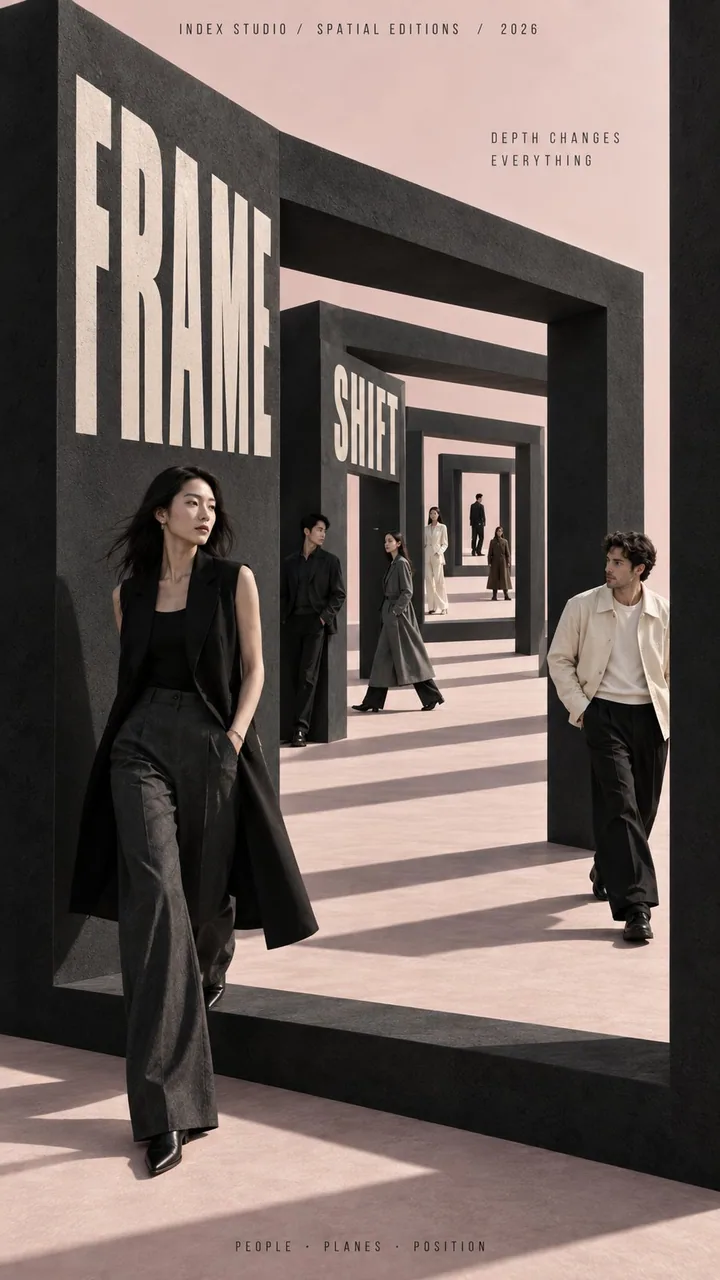
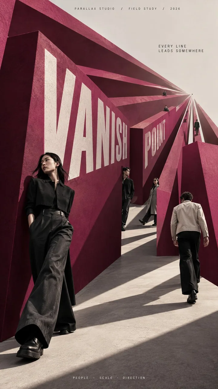
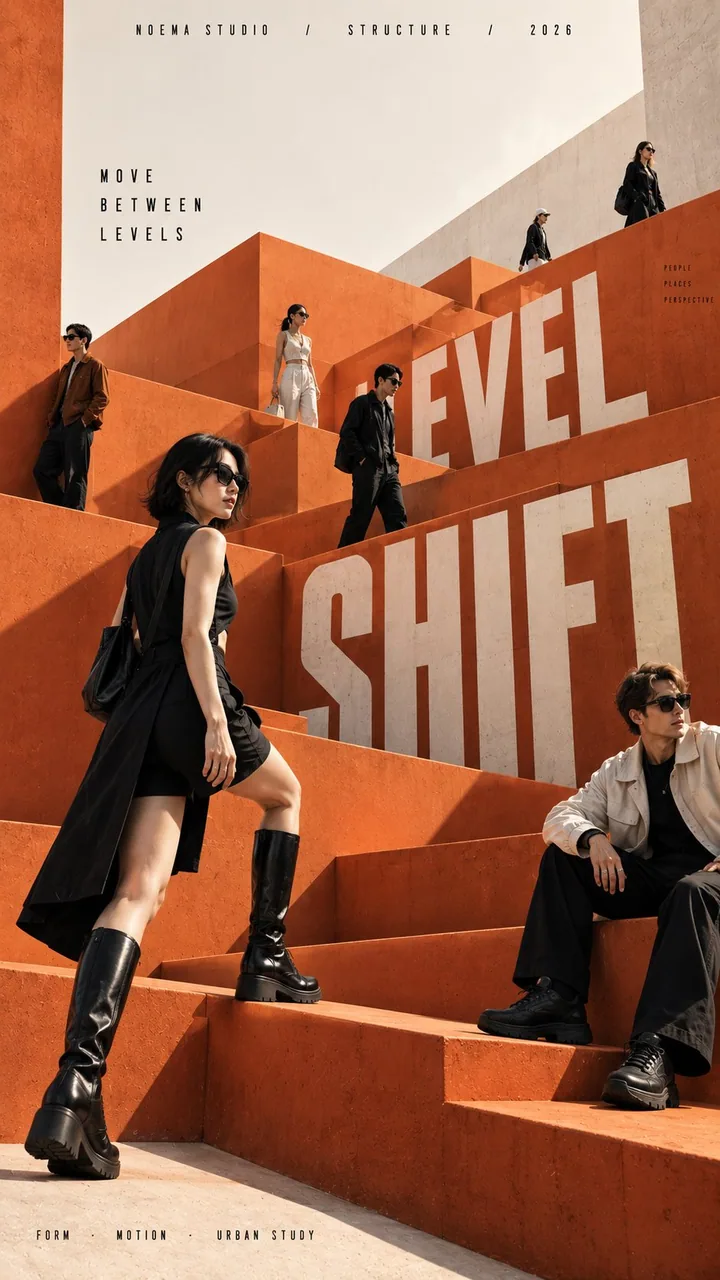
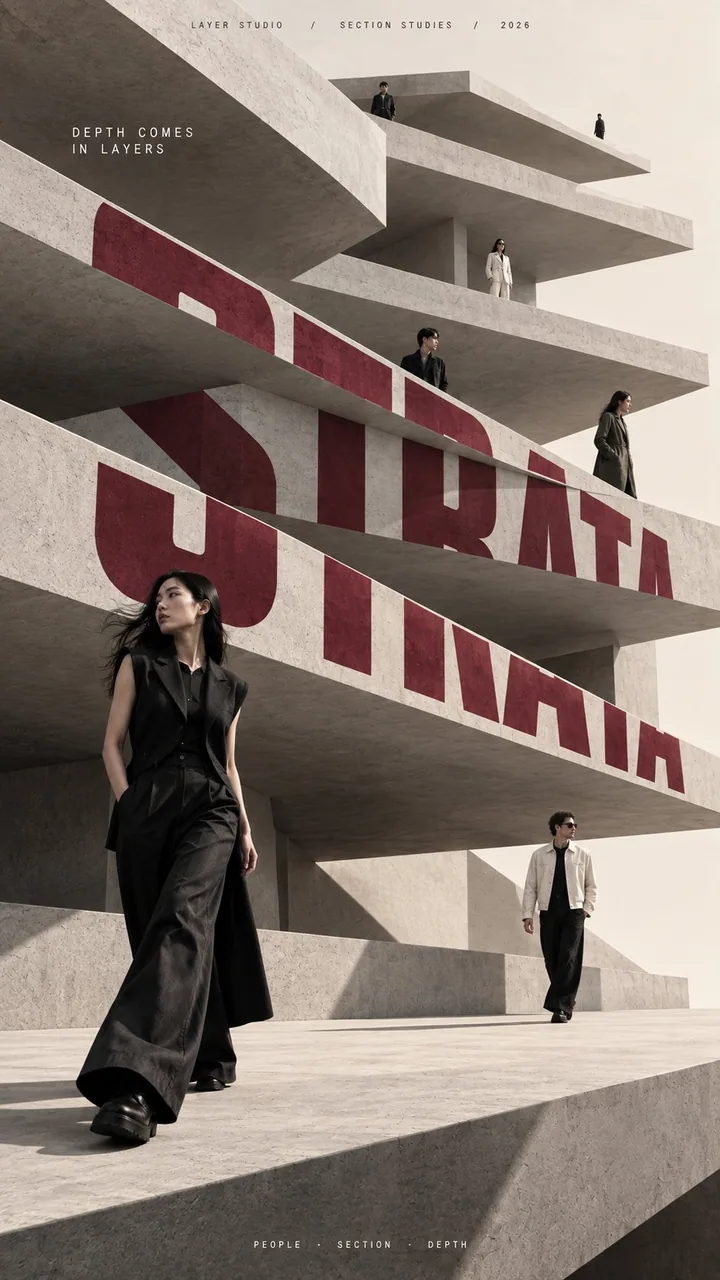
プロンプト
[BRAND NAME]: {fill in}
[CAMPAIGN / SERIES]: {fill in}
[MAIN TITLE]: {fill in}
[TAGLINE]: {fill in}
[DEPTH SYSTEM]: {nested frames / converging perspective / stacked levels / layered slabs}
[PRIMARY COLOR]: {fill in}
[ACCENT COLOR]: {fill in}
[NUMBER OF PEOPLE]: {6–8 adults}
[ASPECT RATIO]: {9:16}

Create a high-end multi-person editorial campaign poster where depth and perspective become the main design system.

Build the scene around one strong spatial structure, such as nested architectural frames, lines converging toward a vanishing point, irregular stacked platforms, or large horizontal layers. The architecture should immediately create a clear foreground, middle ground, and background.

Place multiple adult figures at different distances and heights within the same coherent perspective field. Their scale must change naturally with depth. Use one or two strong foreground figures, several smaller midground figures, and a few distant figures. Avoid evenly spaced people, grids, lineups, or team-photo compositions.

Make people and architecture physically overlap. Some figures should pass through frames, disappear behind walls, be partially hidden by platforms, appear between layers, or emerge from deeper spaces. The result should feel like one real photographed environment, not separate people pasted onto a layout.

Integrate the main title into the architecture whenever possible. Let typography follow the perspective of a frame, wall, platform, or structural edge. It may change scale, become partially occluded, or stretch across several depth planes, but it should remain readable.

Keep the environment minimal and sculptural. Use large geometric forms, controlled negative space, one dominant color system, realistic directional daylight, and consistent architectural shadows. The spatial idea should still read clearly at thumbnail size.

Use realistic fashion photography for the cast: natural skin texture, believable anatomy, real hair, accurate hands and feet, natural fabric folds, varied poses, and subtle movement. Avoid duplicated figures, plastic skin, floating bodies, or overly staged model poses.

Supporting typography should stay minimal and secondary. The final image should feel like a real contemporary fashion, cultural, or brand campaign where people, architecture, type, and perspective are all part of the same composition.
日本語訳
[BRAND NAME]: {記入}
[CAMPAIGN / SERIES]: {記入}
[MAIN TITLE]: {記入}
[TAGLINE]: {記入}
[DEPTH SYSTEM]: {入れ子状フレーム / 消失点へ収束する遠近 / 段状に積み重なったレベル / 層状のスラブ}
[PRIMARY COLOR]: {記入}
[ACCENT COLOR]: {記入}
[NUMBER OF PEOPLE]: {6〜8人の成人}
[ASPECT RATIO]: {9:16}

奥行きと遠近法そのものを主要なデザインシステムとする、ハイエンドな複数人エディトリアルキャンペーンポスターを制作する。

入れ子状の建築フレーム、消失点へ収束する線、不規則に積み重なったプラットフォーム、大きな水平レイヤーなど、強力な空間構造をひとつ軸にシーンを構築する。建築は、明確な前景・中景・背景を即座に生み出すものにする。

同じ一貫した遠近空間の中に、異なる距離と高さで複数の成人人物を配置する。そのスケールは奥行きに応じて自然に変化させる。力強い前景の人物を1〜2人、やや小さな中景の人物を数人、そして遠景の人物を少数。均等間隔の人物、グリッド、整列、チーム写真のような構図は避ける。

人と建築を物理的に重ね合わせる。フレームをくぐる、壁の後ろで消える、プラットフォームに一部隠れる、レイヤーの間に現れる、奥の空間から現れる。結果として、別々の人物をレイアウトに貼り付けたのではなく、実際に撮影されたひとつの環境のように感じられること。

メインタイトルは可能な限り建築に統合する。タイポグラフィはフレーム、壁、プラットフォーム、構造的なエッジの遠近法に従わせる。スケールが変わる、一部が遮蔽される、複数の奥行き平面にまたがって伸びるのは構わないが、可読性は保つ。

環境はミニマルで彫刻的に保つ。大きな幾何学形態、制御されたネガティブスペース、ひとつの支配的な配色、リアルな指向性の日光、一貫した建築の影を用いる。サムネイルサイズでも空間のアイデアが明確に読めるようにする。

キャストにはリアルなファッション写真を用いる。自然な肌の質感、説得力のある人体、本物の髪、正確な手足、自然な布のシワ、多様なポーズ、さりげない動き。人物の重複、プラスチックのような肌、浮遊する身体、過度に演出されたモデルポーズは避ける。

補助的なタイポグラフィはミニマルで二次的なものにとどめる。最終的なイメージは、人・建築・文字・遠近法がすべて同じ構図の一部となった、現代のリアルなファッション/カルチャー/ブランドキャンペーンとして感じられるものにする。
出典
- 原作者
- MrLarus
- 公開日
- 2026-09-15
- 原典
- 元の投稿を見る ↗
- 収録元
- xianyu110/awesome-gpt-image2.5 · 2099880009053917543 · MIT