원근이 곧 디자인: 네 가지 심도 시스템 포스터
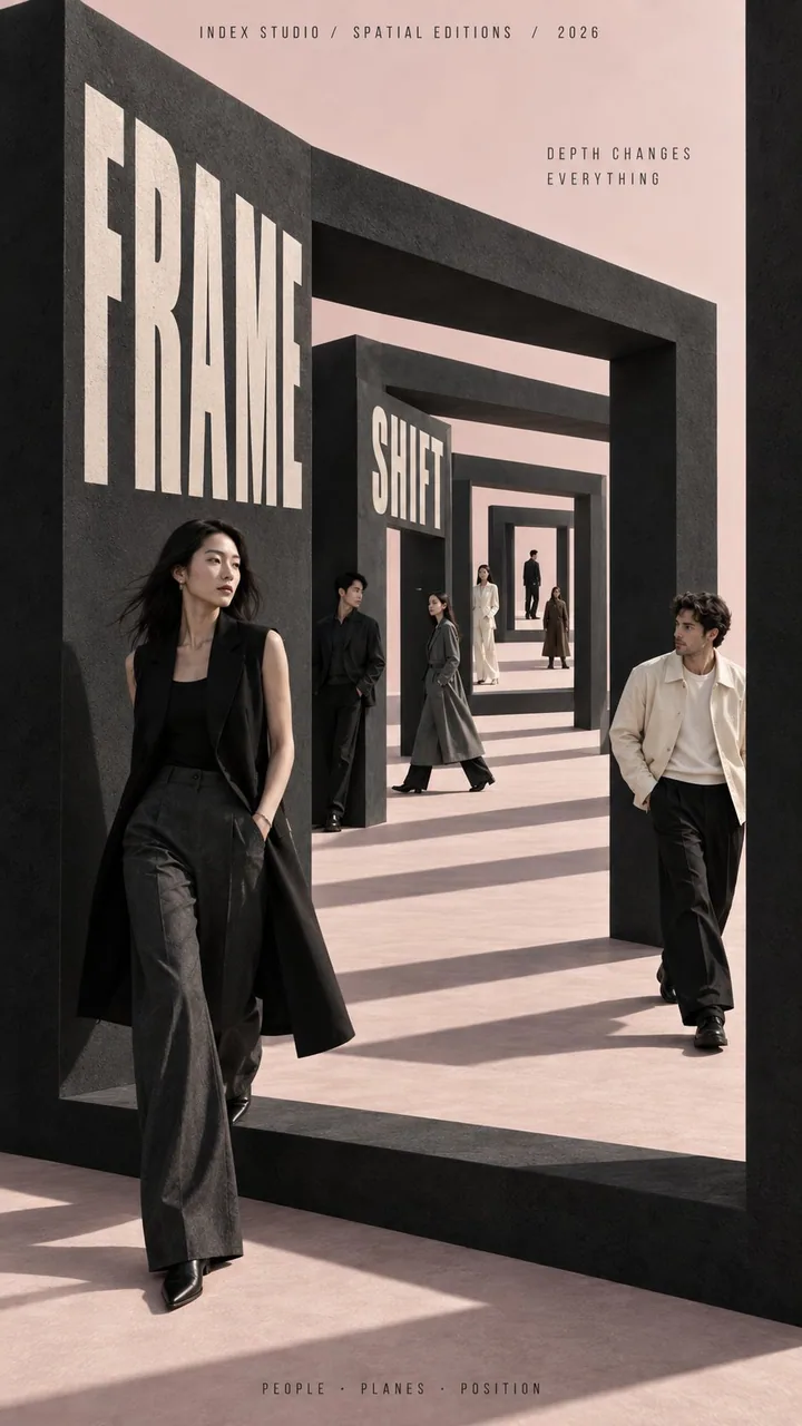
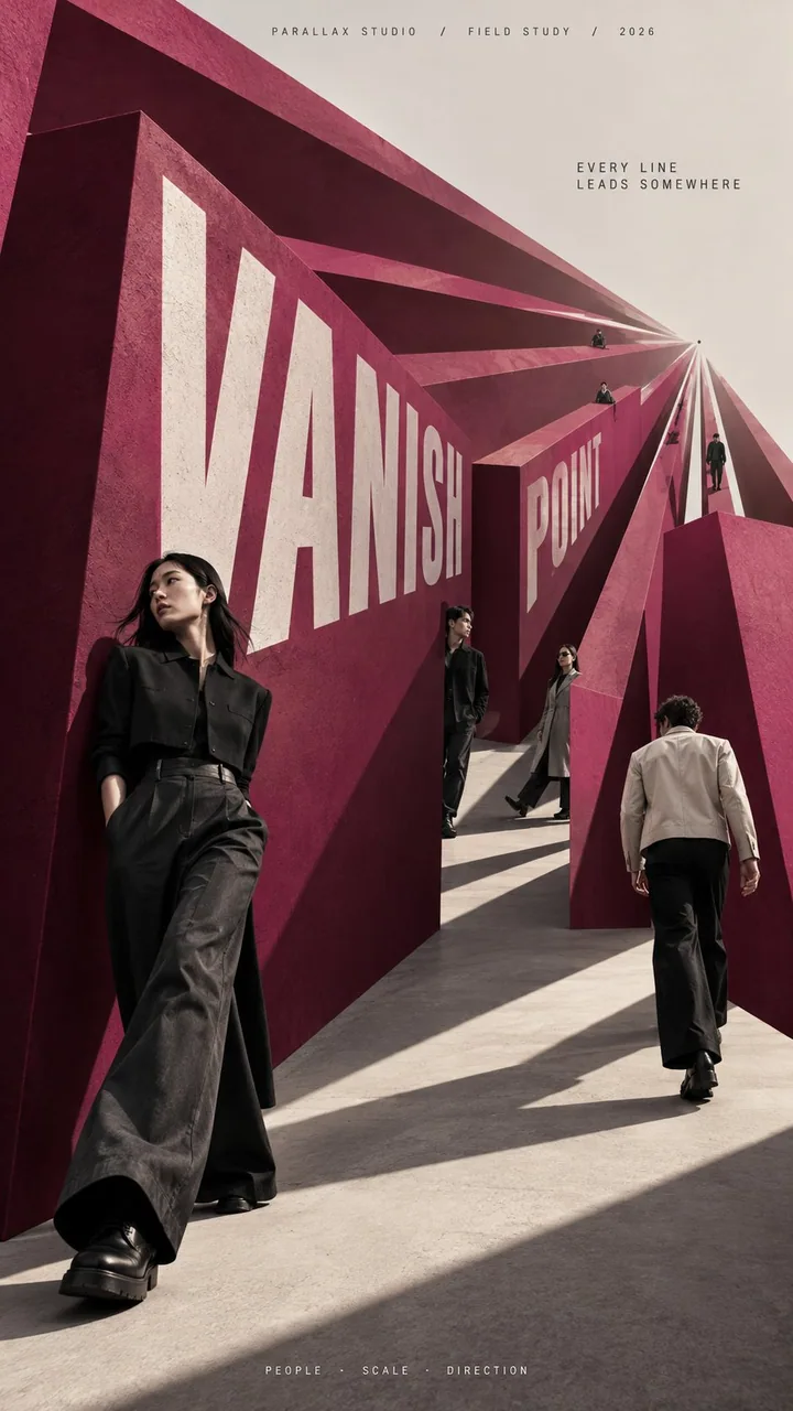
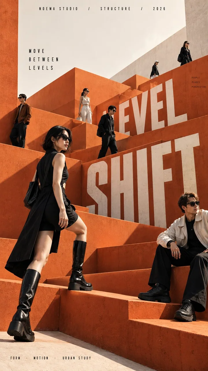
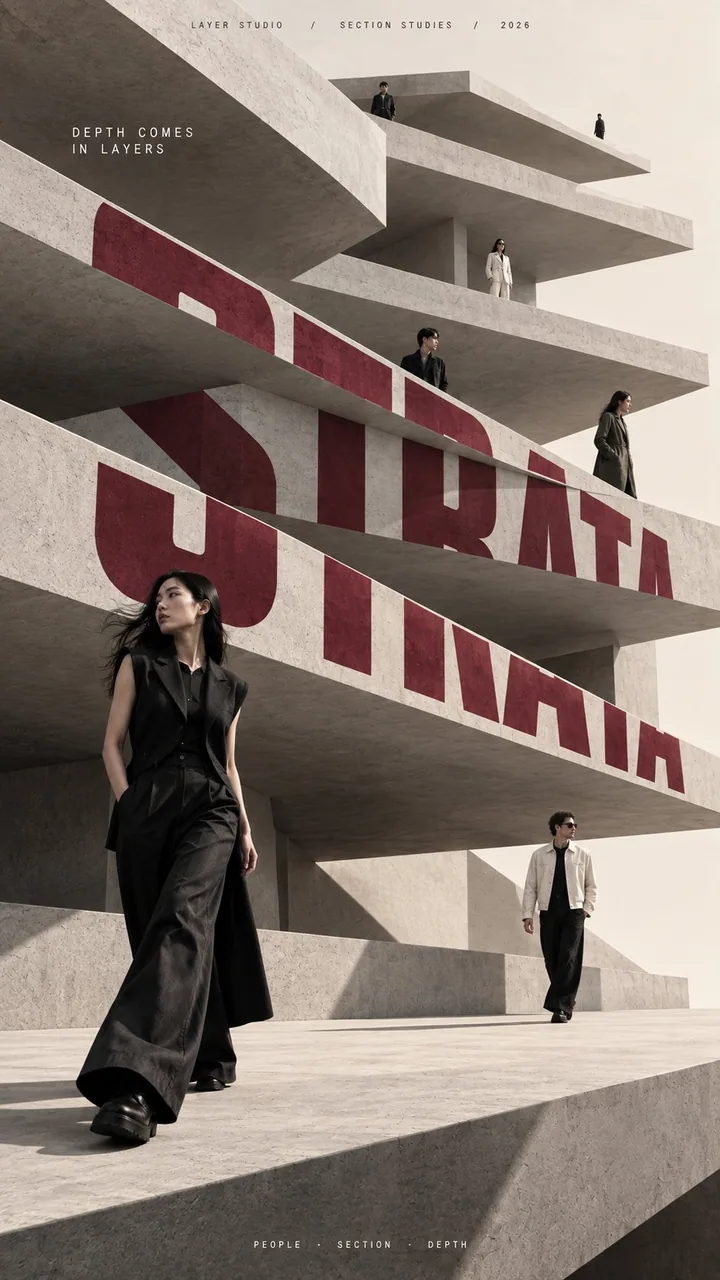
FRAME SHIFT / VANISH POINT / LEVEL SHIFT / STRATA——사람과 건축이 같은 원근 필드에 겹쳐진다. 이벤트 KV / 패션 campaign의 공간 연출은 이 슬롯 공식을 그대로 참고하면 된다.
프롬프트
[BRAND NAME]: {fill in}
[CAMPAIGN / SERIES]: {fill in}
[MAIN TITLE]: {fill in}
[TAGLINE]: {fill in}
[DEPTH SYSTEM]: {nested frames / converging perspective / stacked levels / layered slabs}
[PRIMARY COLOR]: {fill in}
[ACCENT COLOR]: {fill in}
[NUMBER OF PEOPLE]: {6–8 adults}
[ASPECT RATIO]: {9:16}

Create a high-end multi-person editorial campaign poster where depth and perspective become the main design system.

Build the scene around one strong spatial structure, such as nested architectural frames, lines converging toward a vanishing point, irregular stacked platforms, or large horizontal layers. The architecture should immediately create a clear foreground, middle ground, and background.

Place multiple adult figures at different distances and heights within the same coherent perspective field. Their scale must change naturally with depth. Use one or two strong foreground figures, several smaller midground figures, and a few distant figures. Avoid evenly spaced people, grids, lineups, or team-photo compositions.

Make people and architecture physically overlap. Some figures should pass through frames, disappear behind walls, be partially hidden by platforms, appear between layers, or emerge from deeper spaces. The result should feel like one real photographed environment, not separate people pasted onto a layout.

Integrate the main title into the architecture whenever possible. Let typography follow the perspective of a frame, wall, platform, or structural edge. It may change scale, become partially occluded, or stretch across several depth planes, but it should remain readable.

Keep the environment minimal and sculptural. Use large geometric forms, controlled negative space, one dominant color system, realistic directional daylight, and consistent architectural shadows. The spatial idea should still read clearly at thumbnail size.

Use realistic fashion photography for the cast: natural skin texture, believable anatomy, real hair, accurate hands and feet, natural fabric folds, varied poses, and subtle movement. Avoid duplicated figures, plastic skin, floating bodies, or overly staged model poses.

Supporting typography should stay minimal and secondary. The final image should feel like a real contemporary fashion, cultural, or brand campaign where people, architecture, type, and perspective are all part of the same composition.
한국어 번역
[BRAND NAME]: {채우기}
[CAMPAIGN / SERIES]: {채우기}
[MAIN TITLE]: {채우기}
[TAGLINE]: {채우기}
[DEPTH SYSTEM]: {중첩된 프레임 / 수렴하는 원근 / 쌓인 레벨 / 겹친 슬래브}
[PRIMARY COLOR]: {채우기}
[ACCENT COLOR]: {채우기}
[NUMBER OF PEOPLE]: {성인 6–8명}
[ASPECT RATIO]: {9:16}

깊이와 원근이 핵심 디자인 시스템이 되는 하이엔드 다인 에디토리얼 캠페인 포스터를 만들어라.

중첩된 건축 프레임, 소실점으로 수렴하는 선, 불규칙하게 쌓인 플랫폼, 큰 수평 레이어처럼 하나의 강력한 공간 구조를 중심으로 장면을 구성하라. 건축이 곧바로 명확한 전경, 중경, 배경을 만들어내야 한다.

같은 하나의 일관된 원근 필드 안에서 서로 다른 거리와 높이에 여러 성인 인물을 배치하라. 인물의 크기는 깊이에 따라 자연스럽게 달라져야 한다. 강한 전경 인물 한두 명, 더 작은 중경 인물 여러 명, 멀리 있는 인물 몇 명을 사용하라. 일정한 간격으로 늘어선 사람, 그리드, 줄 세우기, 단체 사진 같은 구도는 피하라.

사람과 건축이 물리적으로 겹치게 하라. 일부 인물은 프레임을 통과하고, 벽 뒤로 사라지고, 플랫폼에 부분적으로 가려지고, 레이어 사이에 나타나거나 더 깊은 공간에서 나오게 하라. 결과물은 레이아웃 위에 사람을 따로 붙여 넣은 것이 아니라 하나의 실제 촬영 환경처럼 느껴져야 한다.

가능하면 메인 타이틀을 건축물에 통합하라. 타이포그래피가 프레임, 벽, 플랫폼, 구조적 모서리의 원근을 따르게 하라. 크기가 변하고, 부분적으로 가려지고, 여러 깊이 평면에 걸쳐 늘어나도 되지만 가독성은 유지되어야 한다.

환경은 미니멀하고 조형적으로 유지하라. 큰 기하학적 형태, 절제된 네거티브 스페이스, 하나의 지배적인 색상 시스템, 사실적인 방향성 자연광, 일관된 건축적 그림자를 사용하라. 썸네일 크기에서도 공간적 아이디어가 명확히 읽혀야 한다.

출연진은 사실적인 패션 사진으로 표현하라: 자연스러운 피부 질감, 믿을 수 있는 해부학, 실제 같은 머리카락, 정확한 손과 발, 자연스러운 옷 주름, 다양한 포즈, 미세한 움직임. 복제된 인물, 플라스틱 같은 피부, 공중에 뜬 몸, 지나치게 연출된 모델 포즈는 피하라.

보조 타이포그래피는 최소한으로, 부차적으로 유지하라. 최종 이미지는 사람, 건축, 활자, 원근이 모두 하나의 구성 안에 속한 실제 현대 패션, 문화, 브랜드 캠페인처럼 느껴져야 한다.
출처
- 원작자
- MrLarus
- 게시일
- 2026-09-15
- 원문 출처
- 원문 보기 ↗
- 수록 출처
- xianyu110/awesome-gpt-image2.5 · 2099880009053917543 · MIT