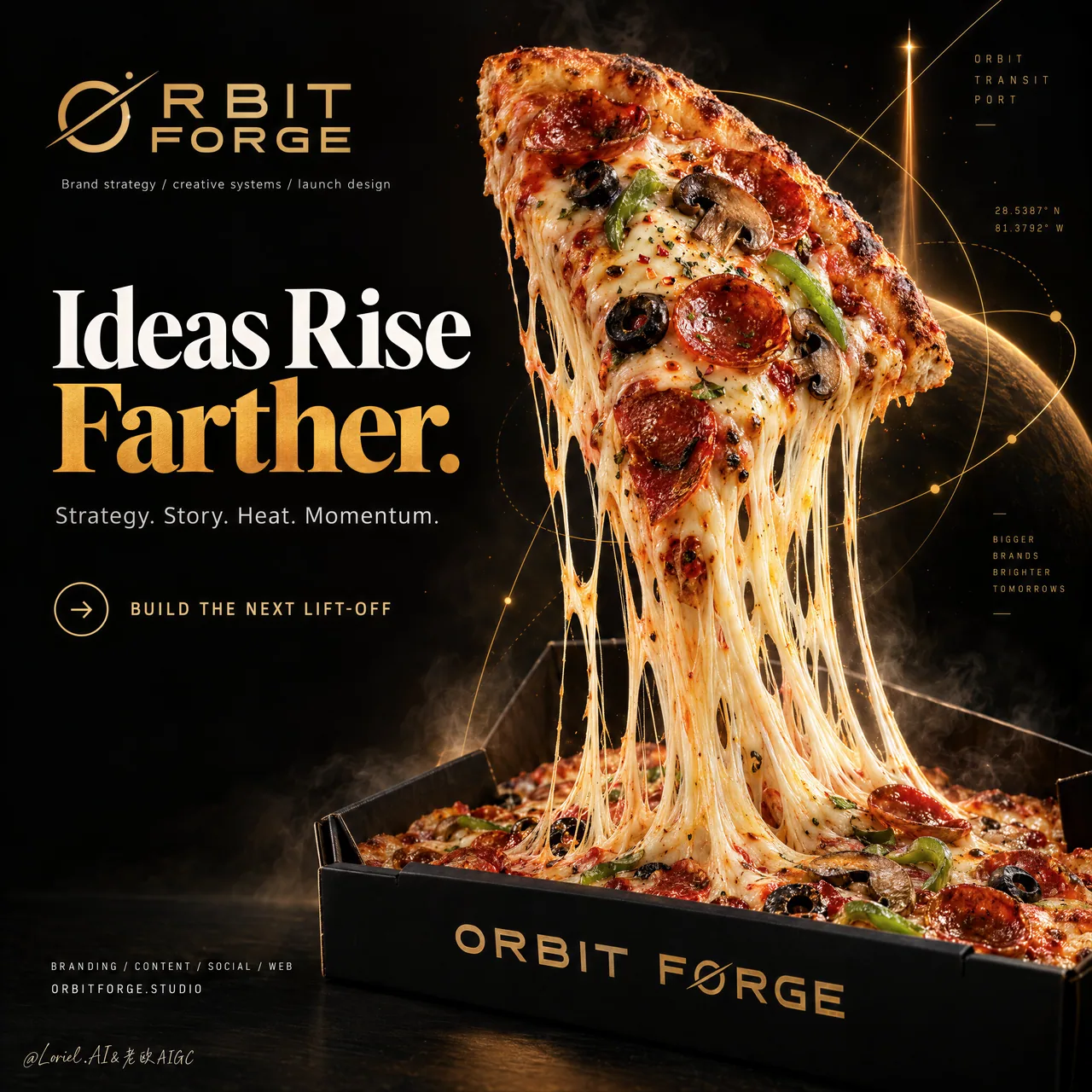
ピザ打ち上げメタファーポスター:物理的な動作がブランドストーリーを担う
チーズの伸びを推進ノズルに、斜めに切ったピザをロケットに——メタファーは物理的に成立して初めて安っぽくならない。クリエイティブエージェンシーのKV/食品コンセプト広告はこの構成をそのまま流用可。超長尺の完全プロンプト付き。
プロンプト
A hyper-real premium poster advertisement for a fictional creative launch agency called ORBIT FORGE, designed as a single iconic black-and-gold campaign image where a real pizza slice becomes a metaphor for brand lift-off. The composition fuses food photography, strategic brand storytelling, and curator-grade poster design into one high-impact visual. A giant triangular pepperoni pizza slice rises diagonally from an open matte-black pizza box like a rocket leaving its launch cradle, while long molten cheese strands stretch downward in powerful elastic ribbons, transforming the cheese pull into a convincing propulsion trail. The pizza slice remains the absolute visual hero.

Framing and composition: vertical hero poster, strict left-right division, with a bold editorial text system occupying the left third and the product spectacle dominating the right two-thirds. The slice launches from the lower right box area toward the upper center-right, creating strong upward momentum. The pizza box anchors the bottom frame, while the cheese connects slice and box in one continuous vertical energy line. Preserve broad black negative space and high-end luxury breathing room. Behind the slice, integrate a restrained abstract system of sharp orbital linework, launch vectors, geometric arcs, and subtle coordinate-like marks in metallic amber-gold, merging Orbit, Transit, and Port into one unified visual language: strategic, directional, and slightly futuristic without clutter.

Subject design: the slice is extremely appetizing and ultra-real, with blistered crust, bubbling browned mozzarella, crisp pepperoni cups, black olive rings, mushroom slices, green pepper strips, subtle herb flakes, chili oil gloss, and realistic tomato richness. The cheese pull must be long, heavy, layered, and physically believable, with varied strand thickness, translucent gloss, stretching tension, and molten pooling inside the box. The pizza box is premium matte black with clean sharp geometry, soft edge reflections, and refined gold brand printing on the front lip.

Spatial staging and atmosphere: capture one exact frozen instant of launch. The slice tilts like a thrusting spacecraft, slightly rotated toward camera, with toppings fully seated and no visual collapse. The cheese forms the main movement axis. Add only a minimal amount of steam, faint heat haze, a few tiny ember-like particles, and subtle smoke around the base, kept sparse and controlled. The background remains a deep studio black with cinematic depth and no restaurant clutter, tablescape, plates, or extra props.

Lighting and color: intense warm key light from upper right, soft controlled fill from front left, edge highlights across the crust and glossy cheese, and a faint amber glow catching the geometric launch linework. Build stronger light-dark contrast than standard food advertising so the slice feels sculptural and elevated, but avoid dirty shadows and dead black patches. Palette balance: 60% deep black and charred espresso tones, 30% amber-gold launch light and baked crust warmth, 10% red-orange pepperoni and green topping accents. The image should feel hot, premium, precise, and cinematic.

Materials and finish: hyper-real food advertising texture with glossy melted cheese, crisp browned crust bubbles, realistic oil sheen, subtle smoke diffusion, matte-black coated cardboard box, and thin metallic gold print. The final finish should feel like a Cannes-level creative-agency poster where product realism meets conceptual brand design. The abstract orbital graphics should feel integrated into the atmosphere, not pasted over it.

Typography: all copy in English only, art-directed and highly controlled. At the upper left place the brand mark reading exactly: "ORBIT FORGE". Below it set a small descriptor line reading exactly: "Brand strategy / creative systems / launch design". The main headline on the left reads exactly: "Ideas Rise Farther." with "Farther." in rich amber-gold emphasis. Supporting copy below reads exactly: "Strategy. Story. Heat. Momentum." Add a refined call-to-action line with a small circular arrow icon reading exactly: "BUILD THE NEXT LIFT-OFF". On the front lip of the pizza box print exactly: "ORBIT FORGE". At the lower left add a compact service line reading exactly: "BRANDING / CONTENT / SOCIAL / WEB" and beneath it the website line exactly: "ORBITFORGE.STUDIO". Typography should be bold, modern, premium, and spacious, with strict hierarchy and generous safe margins away from the pizza silhouette.

Output and constraints: polished premium brand poster, product-led composition, real pizza photography fused with launch-themed strategic design, no copied slogans, no real brand names, no people, no extra props, no chaotic sparks, no excessive smoke, no random icons. Avoid malformed cheese geometry, duplicated toppings, floating ingredients, broken crust structure, unreadable text, cheap fast-food styling, oversharpened texture, muddy blacks, incorrect box perspective, inconsistent lighting, or any drift away from a high-end commercial advertising finish.
日本語訳
ORBIT FORGE という架空のクリエイティブ・ローンチ・エージェンシーのための、超リアルでプレミアムなポスター広告。ひとつの象徴的な黒×金のキャンペーン画像として設計し、本物のピザ1切れがブランドの打ち上げのメタファーとなる。構図はフードフォトグラフィー、戦略的ブランドストーリーテリング、キュレーター級のポスターデザインを融合させ、ひとつの高インパクトなビジュアルに仕上げる。巨大な三角形のペパロニピザ1切れが、開いたマットブラックのピザボックスから、ロケットが発射台を離れるように斜めに上昇し、長く溶けたチーズの繊維が力強く伸縮するリボンとなって下へ伸び、チーズの伸びを説得力のある推進トレイルへと変える。ピザ1切れは絶対的な視覚的主役であり続ける。

フレーミングと構図:縦型のヒーローポスター、厳格な左右分割。左3分の1に大胆なエディトリアル書体システムを置き、右3分の2は製品のスペクタクルが支配する。1切れは右下のボックス付近から右上中央へ向かって打ち上がり、強い上昇の勢いを生む。ピザボックスは画面下部を固定し、チーズは1切れとボックスを1本の連続した縦のエネルギーラインでつなぐ。広い黒のネガティブスペースとハイエンドな余白を保つ。1切れの背後には、鋭い軌道の線画、打ち上げベクトル、幾何学的な弧、微かな座標風のマークによる抑制された抽象システムをメタリックなアンバーゴールドで統合し、Orbit、Transit、Port をひとつの統一された視覚言語に融合させる。戦略的で方向的、わずかに未来的、しかし雑然としない。

被写体デザイン:1切れは極めて美味しそうで超リアル。膨れたクラスト、泡立つ焼き色のモッツァレラ、クリスピーなペパロニカップ、ブラックオリーブの輪切り、マッシュルームスライス、グリーンペッパーの細切り、ほのかなハーブフレーク、チリオイルの艶、リアルなトマトの濃厚さを備える。チーズの伸びは長く、重く、層をなし、物理的に信じられるものでなければならない。太さの変化、半透明の艶、張力、ボックス内に溶けて溜まる様子を描く。ピザボックスはプレミアムなマットブラックで、クリーンで鋭い幾何学、柔らかなエッジの反射、前面の縁に洗練された金のブランド印刷。

空間演出と雰囲気:打ち上げの正確な一瞬を凍結して捉える。1切れは推力を放つ宇宙船のように傾き、カメラに向かってわずかに回転し、トッピングは完全に載ったままで視覚的な崩れがない。チーズが主要な動きの軸を形成する。蒸気、かすかな陽炎、いくつかの小さな火の粉のような粒子、根元の周りの繊細な煙を最小限だけ加え、まばらで制御された状態に保つ。背景は深いスタジオブラックのままとし、映画的な奥行きを与え、レストランの雑然としたもの、テーブルセッティング、皿、余分な小道具は一切置かない。

ライティングと色彩:右上からの強烈な暖色のキーライト、前面左からの柔らかく制御されたフィル、クラストと艶やかなチーズを横切るエッジハイライト、幾何学的な打ち上げラインを捉えるかすかなアンバーの輝き。標準的なフード広告よりも強い明暗コントラストを構築し、1切れが彫刻的で高められた印象を与えるようにする。ただし汚い影や死んだ黒い部分は避ける。パレットバランス:深い黒と焦がしたエスプレッソの色調60%、アンバーゴールドの打ち上げ光と焼けたクラストの温かみ30%、赤オレンジのペパロニとグリーンのトッピングのアクセント10%。画像は熱く、プレミアムで、精密で、映画的に感じられるべき。

素材と仕上げ:艶やかに溶けたチーズ、クリスピーに焼けたクラストの気泡、リアルな油の艶、繊細な煙の拡散、マットブラックのコーティング段ボール箱、細い金属の金印刷を備えた超リアルなフード広告の質感。最終的な仕上げは、製品のリアリズムとコンセプト的なブランドデザインが出会う、カンヌ級のクリエイティブエージェンシーポスターのように感じられるべき。抽象的な軌道グラフィックは、上から貼り付けたのではなく、雰囲気に溶け込んでいるように感じられるべき。

タイポグラフィ:コピーはすべて英語のみ、アートディレクションされ高度に制御されたもの。左上にブランドマークを配置し、正確に "ORBIT FORGE" と読ませる。その下に小さな説明行を置き、正確に "Brand strategy / creative systems / launch design" と読ませる。左側のメインヘッドラインは正確に "Ideas Rise Farther." とし、"Farther." は濃いアンバーゴールドで強調する。その下の補助コピーは正確に "Strategy. Story. Heat. Momentum."。小さな円形の矢印アイコンを伴う洗練された行動喚起行を加え、正確に "BUILD THE NEXT LIFT-OFF" と読ませる。ピザボックスの前面の縁には正確に "ORBIT FORGE" と印刷する。左下には簡潔なサービス行を加え、正確に "BRANDING / CONTENT / SOCIAL / WEB"、その下にウェブサイト行を正確に "ORBITFORGE.STUDIO" と読ませる。タイポグラフィは大胆でモダン、プレミアムで余裕のあるものとし、厳格なヒエラルキーと、ピザのシルエットから離れた十分なセーフマージンを持たせる。

出力と制約:洗練されたプレミアムブランドポスター、製品主導の構図、本物のピザ写真と打ち上げテーマの戦略的デザインの融合。既存スローガンの盗用なし、実在ブランド名なし、人物なし、余分な小道具なし、乱れた火花なし、過剰な煙なし、ランダムなアイコンなし。崩れたチーズの形状、重複したトッピング、浮遊する食材、壊れたクラスト構造、読めない文字、安っぽいファストフード的スタイル、過度にシャープ化されたテクスチャ、濁った黒、不正確なボックスのパース、不整合なライティング、その他ハイエンドな商業広告の仕上げからの逸脱を避ける。
出典
- 原作者
- ou_zhen599
- 公開日
- 2026-09-17
- 原典
- 元の投稿を見る ↗
- 収録元
- xianyu110/awesome-gpt-image2.5 · 2100487987762962656 · MIT