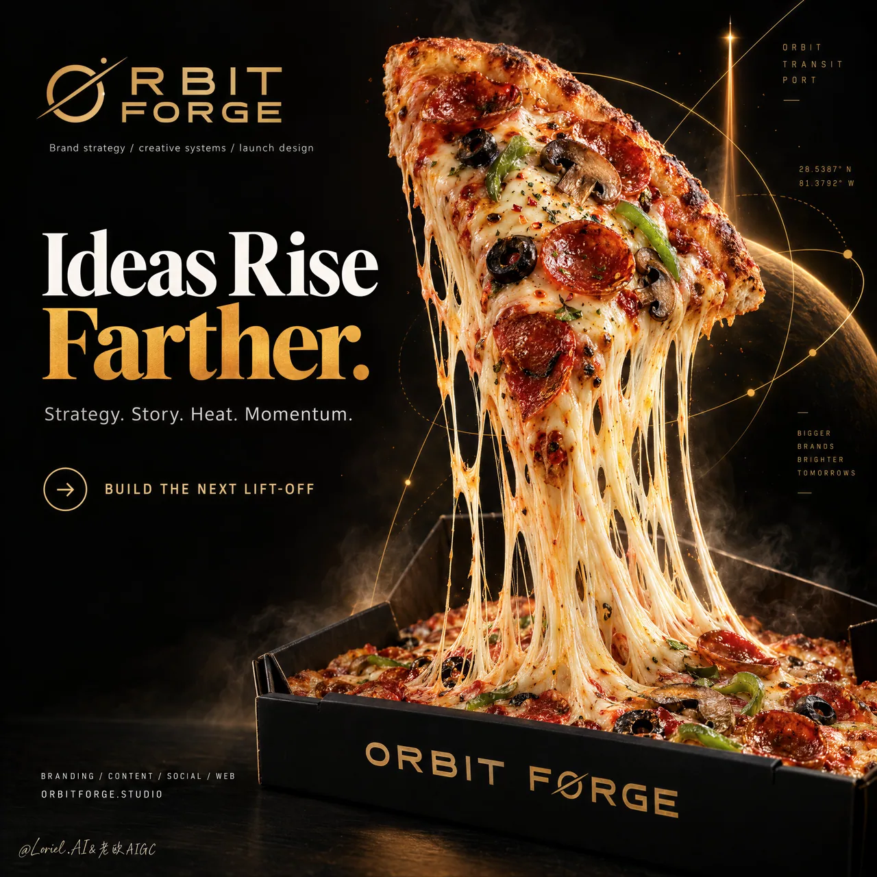
披薩升空隱喻海報:物理動作扛起品牌故事
芝士拉絲當推進尾焰、斜切披薩當火箭——隱喻靠物理成立纔不貼皮。創意機構 KV / 食品概念廣告直接抄結構,附超長完整 prompt。
提示詞
A hyper-real premium poster advertisement for a fictional creative launch agency called ORBIT FORGE, designed as a single iconic black-and-gold campaign image where a real pizza slice becomes a metaphor for brand lift-off. The composition fuses food photography, strategic brand storytelling, and curator-grade poster design into one high-impact visual. A giant triangular pepperoni pizza slice rises diagonally from an open matte-black pizza box like a rocket leaving its launch cradle, while long molten cheese strands stretch downward in powerful elastic ribbons, transforming the cheese pull into a convincing propulsion trail. The pizza slice remains the absolute visual hero.

Framing and composition: vertical hero poster, strict left-right division, with a bold editorial text system occupying the left third and the product spectacle dominating the right two-thirds. The slice launches from the lower right box area toward the upper center-right, creating strong upward momentum. The pizza box anchors the bottom frame, while the cheese connects slice and box in one continuous vertical energy line. Preserve broad black negative space and high-end luxury breathing room. Behind the slice, integrate a restrained abstract system of sharp orbital linework, launch vectors, geometric arcs, and subtle coordinate-like marks in metallic amber-gold, merging Orbit, Transit, and Port into one unified visual language: strategic, directional, and slightly futuristic without clutter.

Subject design: the slice is extremely appetizing and ultra-real, with blistered crust, bubbling browned mozzarella, crisp pepperoni cups, black olive rings, mushroom slices, green pepper strips, subtle herb flakes, chili oil gloss, and realistic tomato richness. The cheese pull must be long, heavy, layered, and physically believable, with varied strand thickness, translucent gloss, stretching tension, and molten pooling inside the box. The pizza box is premium matte black with clean sharp geometry, soft edge reflections, and refined gold brand printing on the front lip.

Spatial staging and atmosphere: capture one exact frozen instant of launch. The slice tilts like a thrusting spacecraft, slightly rotated toward camera, with toppings fully seated and no visual collapse. The cheese forms the main movement axis. Add only a minimal amount of steam, faint heat haze, a few tiny ember-like particles, and subtle smoke around the base, kept sparse and controlled. The background remains a deep studio black with cinematic depth and no restaurant clutter, tablescape, plates, or extra props.

Lighting and color: intense warm key light from upper right, soft controlled fill from front left, edge highlights across the crust and glossy cheese, and a faint amber glow catching the geometric launch linework. Build stronger light-dark contrast than standard food advertising so the slice feels sculptural and elevated, but avoid dirty shadows and dead black patches. Palette balance: 60% deep black and charred espresso tones, 30% amber-gold launch light and baked crust warmth, 10% red-orange pepperoni and green topping accents. The image should feel hot, premium, precise, and cinematic.

Materials and finish: hyper-real food advertising texture with glossy melted cheese, crisp browned crust bubbles, realistic oil sheen, subtle smoke diffusion, matte-black coated cardboard box, and thin metallic gold print. The final finish should feel like a Cannes-level creative-agency poster where product realism meets conceptual brand design. The abstract orbital graphics should feel integrated into the atmosphere, not pasted over it.

Typography: all copy in English only, art-directed and highly controlled. At the upper left place the brand mark reading exactly: "ORBIT FORGE". Below it set a small descriptor line reading exactly: "Brand strategy / creative systems / launch design". The main headline on the left reads exactly: "Ideas Rise Farther." with "Farther." in rich amber-gold emphasis. Supporting copy below reads exactly: "Strategy. Story. Heat. Momentum." Add a refined call-to-action line with a small circular arrow icon reading exactly: "BUILD THE NEXT LIFT-OFF". On the front lip of the pizza box print exactly: "ORBIT FORGE". At the lower left add a compact service line reading exactly: "BRANDING / CONTENT / SOCIAL / WEB" and beneath it the website line exactly: "ORBITFORGE.STUDIO". Typography should be bold, modern, premium, and spacious, with strict hierarchy and generous safe margins away from the pizza silhouette.

Output and constraints: polished premium brand poster, product-led composition, real pizza photography fused with launch-themed strategic design, no copied slogans, no real brand names, no people, no extra props, no chaotic sparks, no excessive smoke, no random icons. Avoid malformed cheese geometry, duplicated toppings, floating ingredients, broken crust structure, unreadable text, cheap fast-food styling, oversharpened texture, muddy blacks, incorrect box perspective, inconsistent lighting, or any drift away from a high-end commercial advertising finish.
中文翻譯
一張超寫實的高級海報廣告,爲虛構的創意發佈機構 ORBIT FORGE 而作,設計爲單張標誌性的黑金主視覺,讓一片真實的披薩成爲品牌升空的隱喻。構圖將食物攝影、策略性品牌敘事與策展級海報設計融合爲一個高衝擊力的畫面。一大片三角形意式辣香腸披薩斜向從打開的啞光黑披薩盒中升起,如同一枚離開發射架的火箭,而長長的融化奶酪以充滿力量的彈性絲帶向下拉伸,把奶酪拉絲變成令人信服的推進尾跡。披薩片始終是絕對的視覺主角。

取景與構圖:豎版主視覺海報,嚴格的左右分區,左側三分之一由大膽的編輯式文字系統佔據,右側三分之二由產品的奇觀主導。披薩片從右下方的披薩盒區域朝右上中部發射,形成強烈的向上動能。披薩盒錨定畫面底部,奶酪則以一條連續的垂直能量線連接披薩片與盒子。保留大面積的黑色負空間和高級奢華的呼吸感。在披薩片後方,融入一套剋制的抽象系統:銳利的軌道線條、發射向量、幾何弧線,以及金屬琥珀金色的微妙座標式標記,將 Orbit、Transit 和 Port 融合爲統一的視覺語言:有策略性、有方向感、略帶未來主義,且不雜亂。

主體設計:披薩片極其誘人且超寫實,有起泡的餅邊、冒泡焦褐的馬蘇裏拉、酥脆的意式辣香腸杯、黑橄欖圈、蘑菇片、青椒條、細微的香草碎、辣椒油光澤,以及真實的番茄濃鬱感。奶酪拉絲必須長、厚重、有層次且物理可信,絲狀粗細不一,半透明有光澤,帶拉伸張力,並在盒內融化成池。披薩盒爲高級啞光黑,幾何形狀乾淨銳利,邊緣有柔和反光,前側折邊上有精緻的金色品牌印刷。

空間調度與氛圍:捕捉發射瞬間的一個精確定格。披薩片像一艘推進中的航天器般傾斜,略微朝鏡頭轉動,配料完全貼合,沒有視覺上的塌陷。奶酪構成主要的運動軸線。僅添加極少量的蒸汽、微弱的熱浪、幾顆細小的餘燼狀顆粒,以及底部周圍微妙的煙霧,保持稀疏而剋制。背景保持深沉的影棚黑,具有電影般的縱深感,沒有餐廳雜物、桌面佈置、盤子或額外道具。

燈光與色彩:來自右上方強烈的暖色主光,左前方柔和可控的補光,餅邊和光澤奶酪上的輪廓高光,以及掠過幾何發射線條的微弱琥珀色輝光。建立比標準食品廣告更強的明暗對比,讓披薩片顯得有雕塑感、被抬升,但避免髒陰影和死黑斑塊。配色比例:60% 深黑與焦褐濃縮咖啡色調,30% 琥珀金發射光與烘烤餅邊的暖意,10% 紅橙色辣香腸與綠色配料點綴。畫面應感覺熾熱、高級、精準且富有電影感。

材質與質感:超寫實食品廣告質感,帶光澤的融化奶酪、酥脆焦褐的餅邊氣泡、真實的油光、微妙的煙霧擴散、啞光黑塗層紙板盒,以及纖細的金屬金色印刷。最終成品應像戛納級別的創意機構海報,讓產品寫實與概念性品牌設計相遇。抽象的軌道圖形應感覺融入氛圍之中,而不是貼上去的。

字體排版:所有文案僅用英文,經過藝術指導且高度剋制。左上方放置品牌標識,精確爲:“ORBIT FORGE”。其下方設置一行小型描述文字,精確爲:“Brand strategy / creative systems / launch design”。左側主標題精確爲:“Ideas Rise Farther.”,其中 “Farther.” 以濃鬱的琥珀金色強調。下方輔助文案精確爲:“Strategy. Story. Heat. Momentum.” 添加一行精緻的行動號召,配一個小圓形箭頭圖標,精確爲:“BUILD THE NEXT LIFT-OFF”。披薩盒前側折邊上精確印有:“ORBIT FORGE”。左下方添加一行緊湊的服務列表,精確爲:“BRANDING / CONTENT / SOCIAL / WEB”,其下方爲網址行,精確爲:“ORBITFORGE.STUDIO”。字體應粗壯、現代、高級且疏朗,層級嚴格,並與披薩輪廓保持充裕的安全邊距。

輸出與約束:精緻的高級品牌海報,產品主導的構圖,真實披薩攝影與發射主題的策略設計融合,無照搬的標語,無真實品牌名,無人物,無額外道具,無混亂的火花,無過量煙霧,無隨機圖標。避免奶酪幾何結構畸形、配料重複、食材懸浮、餅邊結構破形、文字不可讀、廉價快餐風格、紋理過度銳化、黑色渾濁、盒子透視錯誤、光照不一致,或任何偏離高端商業廣告完成度的表現。
溯源
- 原作者
- ou_zhen599
- 發佈日期
- 2026-09-17
- 原始出處
- 查看原帖 ↗
- 收錄來源
- xianyu110/awesome-gpt-image2.5 · 2100487987762962656 · MIT