ガラス切片の観察窓:ファッション・ビューティー製品キャンペーンポスター
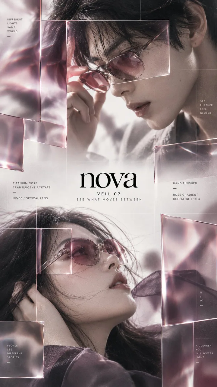
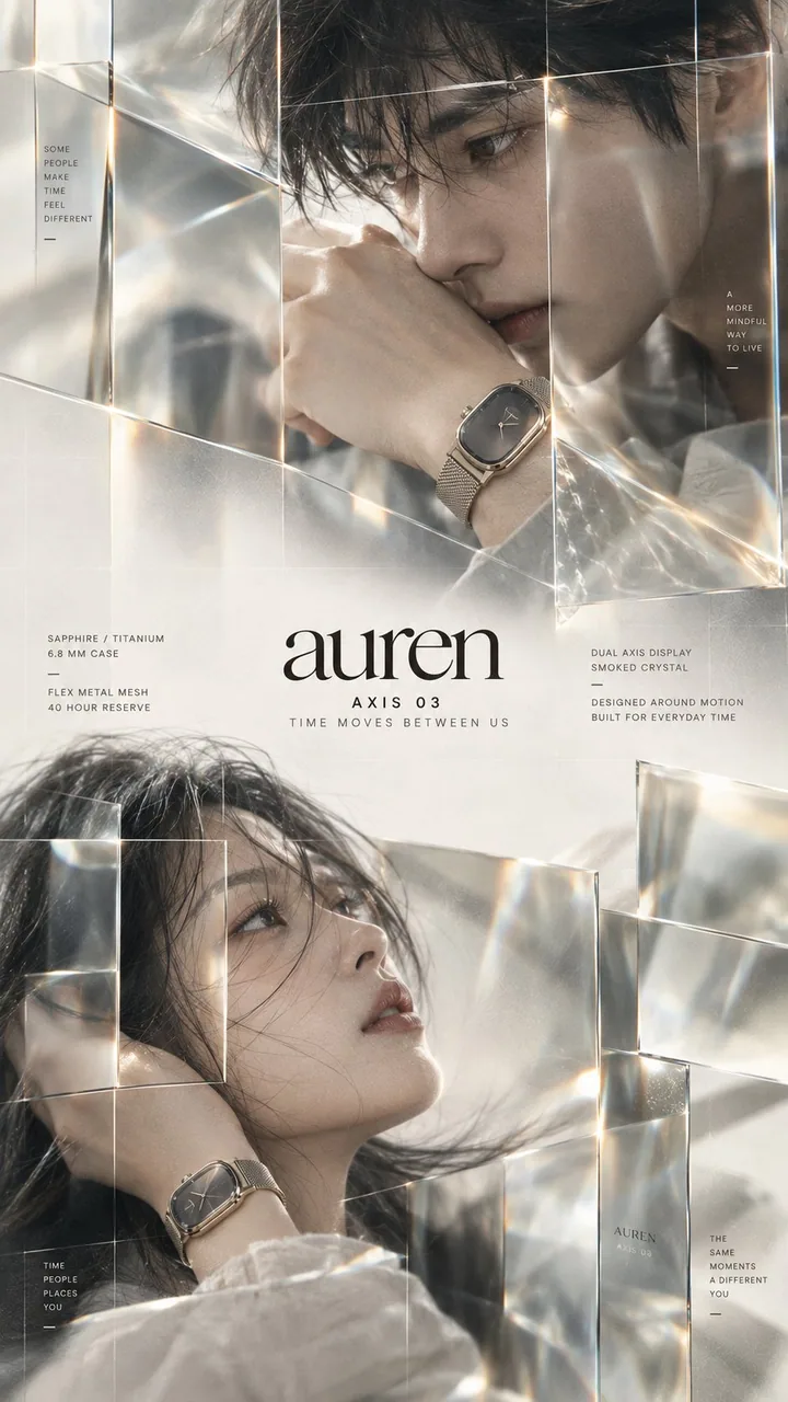
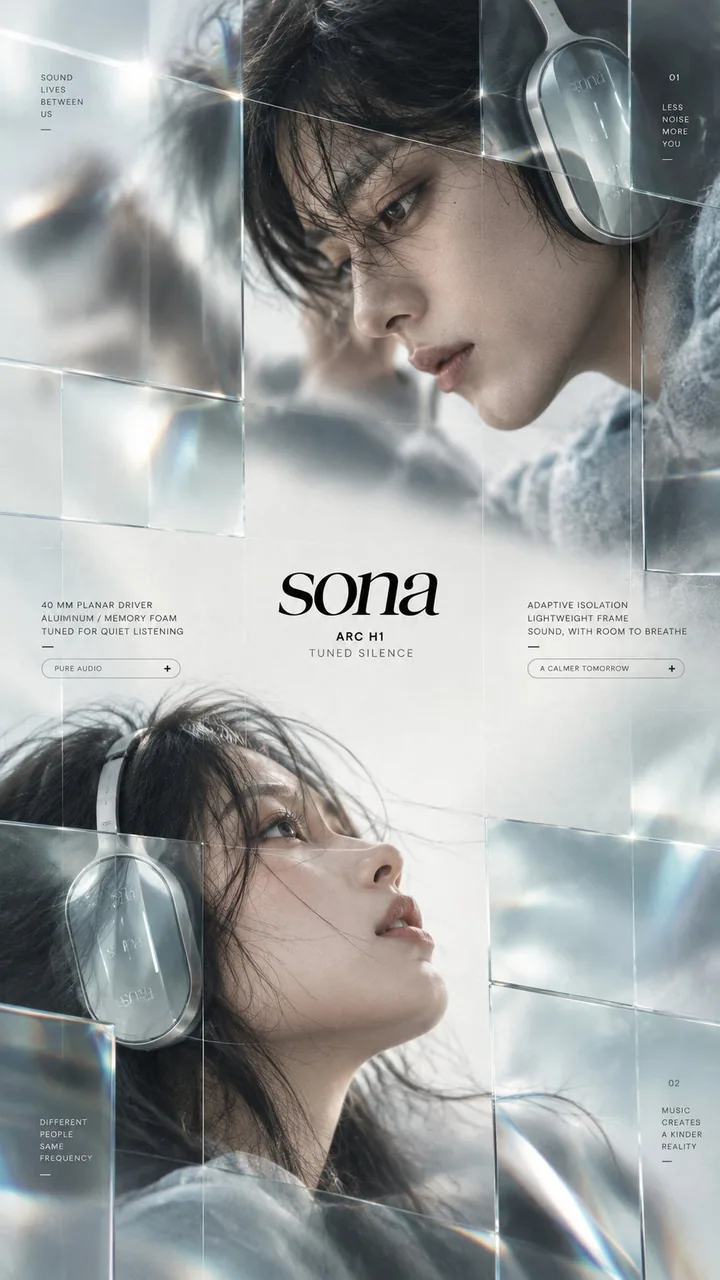
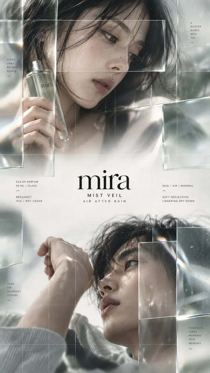
上下に二人が内側を見つめ合う+中央の情報帯。一部のグリッドにのみ本物の光学ガラスを重ねる(屈折/位置ずれ/選択的シャープ化)。アイマスク、腕時計、ヘッドホン、フレグランスで検証済み——ハイエンドファッション/ビューティー/製品 KV はブランド枠をそのまま差し替え可能。
プロンプト
Brand: [BRAND NAME]
Product: [PRODUCT]
Theme: [CAMPAIGN THEME]
Accent palette: [COLOR PALETTE]
Product details: [MATERIAL / FEATURES]

Create a premium 9:16 editorial campaign poster with two adult fashion models arranged vertically, one in the upper section and one in the lower section.

Both subjects must face inward toward the center: the upper portrait looks diagonally down toward the middle, while the lower portrait looks diagonally upward toward the middle. Keep them asymmetrically positioned rather than vertically centered.

Leave a clean editorial information band between the two portraits for the brand name, product name, short campaign line and minimal technical copy.

Use extreme close-up fashion photography with natural skin texture, shallow depth of field, soft motion blur and intentionally out-of-focus areas.

Overlay only a few selected grid sections with real optical glass panels. Mix clear glass, lightly tinted glass, smoked glass and subtle magnification. The glass should physically affect the image behind it through refraction, slight displacement, selective sharpening, soft distortion and restrained edge reflections.

Some areas behind the glass become noticeably sharper while the surrounding photography stays blurred, creating a strong contrast between soft imagery and precise observation windows.

Add an extremely fine modular grid across the entire composition. Keep the lines subtle and low-contrast.

Use refined high-contrast serif typography for the brand and very small spaced sans-serif typography for product details. Keep the layout minimal, airy and editorial rather than UI-heavy.

Match the glass tint, product materials and accent colors to the chosen theme. Keep most of the poster light and restrained, using darker tones only as controlled visual weight.

The final image should feel like a high-end independent fashion, beauty or product campaign: cinematic, tactile, photographic and contemporary.

Avoid generic luxury ads, centered portraits, subjects facing outward, excessive glass panels, heavy UI graphics, thick grid lines, cyberpunk styling, excessive lens flare, plastic skin, CGI faces and overly sharp photography.
日本語訳
Brand: [BRAND NAME]
Product: [PRODUCT]
Theme: [CAMPAIGN THEME]
Accent palette: [COLOR PALETTE]
Product details: [MATERIAL / FEATURES]

大人のファッションモデルを縦に二人、上部に一人、下部に一人配置した、プレミアムな 9:16 のエディトリアル・キャンペーンポスターを制作する。

二人の被写体は必ず内側の中央を向くこと:上部のポートレートは斜め下へ中央を見つめ、下部のポートレートは斜め上へ中央を見つめる。垂直方向の中央揃えではなく、非対称に配置する。

二人のポートレートの間に、ブランド名、製品名、短いキャンペーンコピー、最小限の技術的な文言のための、すっきりとしたエディトリアルな情報帯を空けておく。

自然な肌の質感、浅い被写界深度、柔らかなモーションブラー、意図的にピントを外した領域を備えた、極端なクローズアップのファッション写真を用いる。

選択した一部のグリッド区画にのみ、本物の光学ガラスパネルを重ねる。クリアガラス、薄く色づいたガラス、スモークガラス、微妙な拡大を混在させる。ガラスは屈折、わずかな位置ずれ、選択的なシャープ化、穏やかな歪み、抑制されたエッジ反射によって、その背後の画像に物理的に影響を与えるべきである。

ガラスの背後にある一部の領域は目に見えてシャープになり、周囲の写真はぼけたままとなり、柔らかな映像と精密な観察窓の間に強いコントラストを生み出す。

構図全体に極めて細いモジュラールグリッドを加える。線は控えめで低コントラストに保つ。

ブランドには洗練された高コントラストのセリフ体、製品の詳細には非常に小さく字間を空けたサンセリフ体を使用する。レイアウトは UI 過多ではなく、最小限で余白がありエディトリアルに保つ。

ガラスの色味、製品の素材、アクセントカラーを選んだテーマに合わせる。ポスターの大部分は明るく抑制的に保ち、暗いトーンは制御された視覚的な重みとしてのみ用いる。

最終的な画像は、ハイエンドなインディペンデント・ファッション、ビューティー、または製品キャンペーンのように感じられるべきである:シネマティックで、触覚的で、写真的で、現代的。

凡庸なラグジュアリー広告、中央揃えのポートレート、外側を向く被写体、過剰なガラスパネル、重い UI グラフィック、太いグリッド線、サイバーパンク調、過度なレンズフレア、プラスチックのような肌、CGI の顔、過度にシャープな写真は避ける。
出典
- 原作者
- MrLarus
- 公開日
- 2026-09-20
- 原典
- 元の投稿を見る ↗
- 収録元
- xianyu110/awesome-gpt-image2.5 · 2101644997460213894 · MIT